Participant
June 9, 2025
Answered

Indesign Text and Base Line Grids

  • June 9, 2025
  • 5 replies
  • 469 views

Hello,

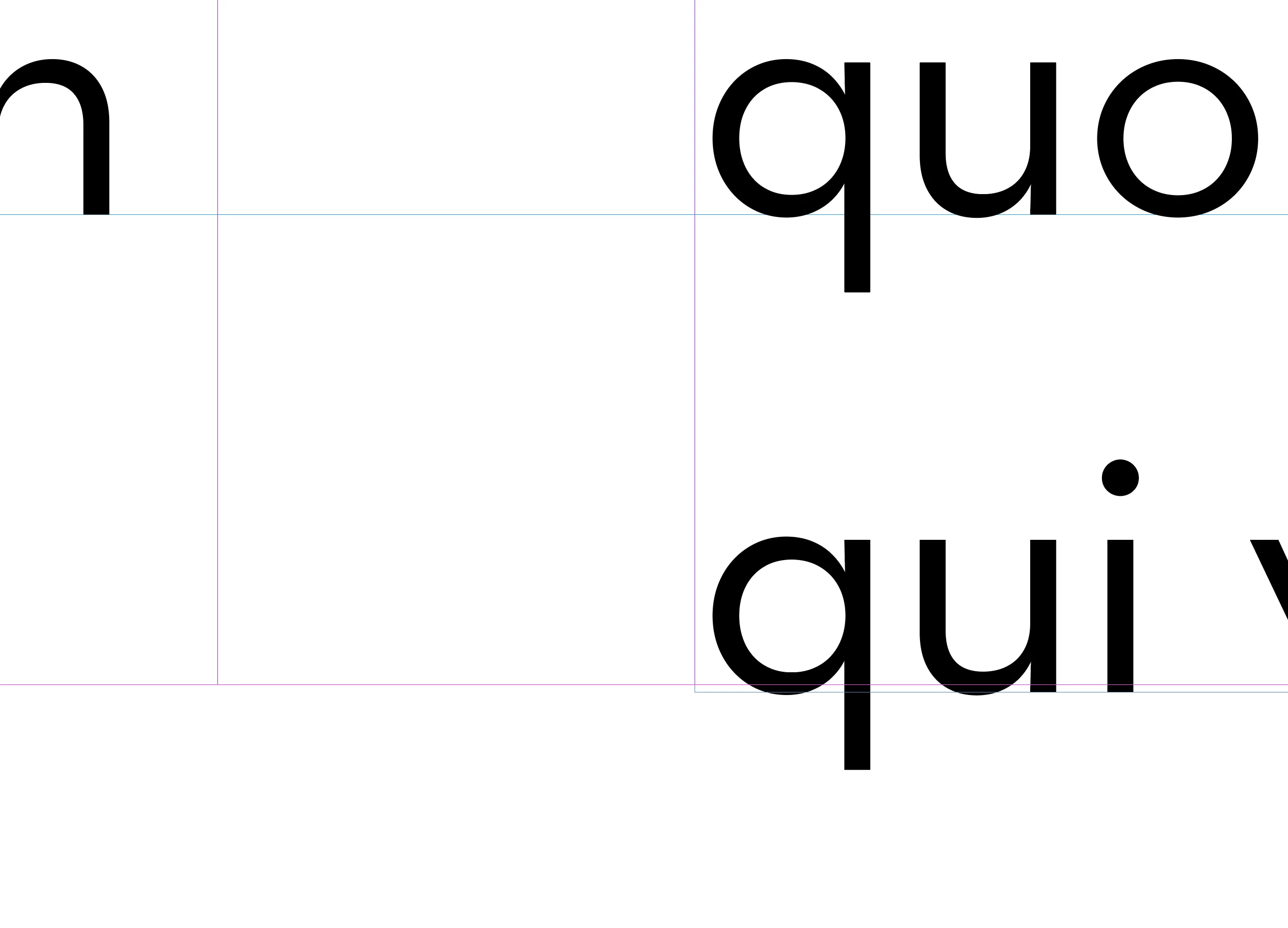
    I have an issue with the text boxes on the bottom of my margin. My grids are at 13 pt leading and looks great. This issue is at the bottom of the margin when my text box snaps to it the copy does not line up across. I have to pull my text box down for the text to show. How do I fix this issue? 2 images here, 1 is a full view and the other is close up. Thanks in advance.
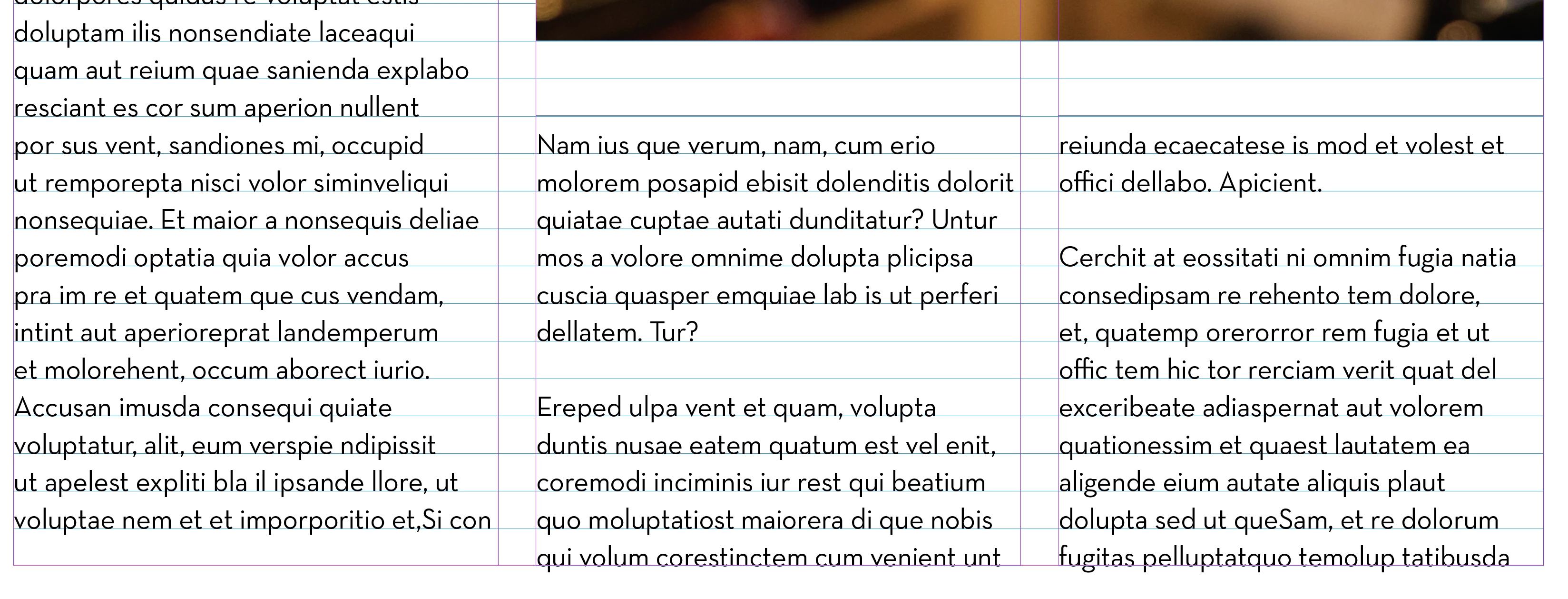
 See attached. 

Correct answer Jason33212095pso1

Ah. I was just a little off on my margins. I got it now. Thanks.

5 replies

rob day
Community Expert
Community Expert
June 9, 2025

Hi @Jason33212095pso1 , Also, maybe to illustrate @Peter Spier  and @Susan Culligan ’s post, the height your text frame in Points, set to the margins would have to be evenly divisible by 13.


Here the text frame height is 648 pt and the last line does not fit.


I have to set the text frame height to 650 (13 x 50) for the last line to fit in the frame and sit on the baseline. My baseline grid and leading would to be 12.96 (648/50) for a perfect fit to these margins


Mike Witherell
Community Expert
Community Expert
June 9, 2025

To me, the planned use of Baseline grid means that you thought about the basic Baseline leading distance multiplied by the number of lines on the page to equal the height of the text frame, which leads you to decisions about top and bottom margin distances so that you have that correct textframe height in the page. A lot of basic carpentry math going on in your page design.

Mike Witherell
Susan Culligan
Inspiring
June 9, 2025

Your screenshot is showing the grid lines in blue and the text frame guides in magenta. It looks like the text is lining with the baseline but your text frame is a little too short.

Participant
June 9, 2025

I was off on my margin size.

 
Randy Hagan
Community Expert
Community Expert
June 9, 2025

Are you using Keep Options in your paragraph styles? 


Using those options will help you from getting widows (the first line of a paragraph starts at the end of a column, with all the rest in the next column) or orphans (everything but the last line of the paragraph is in one column, with the last line starting the next column) in your layout. But it does that by forcing the next paragraph to start in the next column, as shown in your example.


Turning off the Keep Options for your paragraph style would let the first line of the next paragraph start at the bottom of the column and flush your copy block, but leave that widow at the bottom of your first column. In that case, you'll have to make a judgement call on which typographic offense is more egregious to your design sensibilities.


Hope this helps,


Randy

Peter Spier
Community Expert
Community Expert
June 9, 2025

@Randy Hagan if you look at the screen shot there's a blank line at the bottom of the first column, and the next column starts with a capital letter, so it appears to me that Jason is using keep options. That said, the problem is the margin was too high.

Peter Spier
Community Expert
Community Expert
June 9, 2025

Well, at a guess looking at the screen shot, I woold say the text frame is a multiple of the grid in height, but the bottom margin does not actually fall on a grid line.

What do you see if you extend the frame down just a few points so the bottom grid line shows?

Jason33212095pso1AuthorCorrect answer
Participant
June 9, 2025

Ah. I was just a little off on my margins. I got it now. Thanks.