Copy link to clipboard
Copied
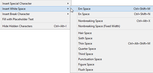
Does anyone have any experience with Adobe InDesign CC 2015 and its Inserting White Space option?

 1 Correct answer
Yes. What is the question?
And here is a blog post I wrote on them from a few years ago:
https://www.rockymountaintraining.com/adobe-indesign-working-with-spaces/
Copy link to clipboard
Copied
What's the issue?
Copy link to clipboard
Copied
Yes. What is the question?
And here is a blog post I wrote on them from a few years ago:
https://www.rockymountaintraining.com/adobe-indesign-working-with-spaces/
Copy link to clipboard
Copied
Good info, except a thin space is normally considered a fifth of an em and an em is not the width of a capital M, for example imagine a condensed face.
Copy link to clipboard
Copied
Thanks for the feedback, Derek! I though I said "typically" for the em space, I guess I better go back and check!
Copy link to clipboard
Copied
I've been checking as well, in metal typesetting a thin space is a fifth of an em, but I see in InDesign it's an eighth!
Copy link to clipboard
Copied
Sorry, Derek, I was busy googling!
Meanwhile AnotherMe , don't let us distract you from your question! ![]()
Copy link to clipboard
Copied
Here are a couple of source docs from Adobe, Derek:
Adobe InDesign CS5, Advanced Typography and Special Characters
http://datades.com/indesign-theres-spacing-space-bar/
How to work with special characters in Illustrator
From the online help files:
- Em Space The space is equal to the size of the type. For example, in 12‑point type, an em space is 12 points wide.
- En Space The space is half the width of an em space. For example, in 12-point type, an en space is 6 points wide.
- Hair Space The space is one‑twenty‑fourth the width of an em space. For example, in 12-point type, a hair space is 0.5 point wide.
- Thin Space The space is one‑eighth the width of an em space. For example, in 12-point type, a thin space is 1.5 points wide.
Copy link to clipboard
Copied
Indeed, but as mentioned this is the order of spacing for (metal) typesetting; and not helpful to the OP at all, but it's, hopefully, interesting to nerds like us! Justification and Spacing- The Happy Dragons' Press
Copy link to clipboard
Copied
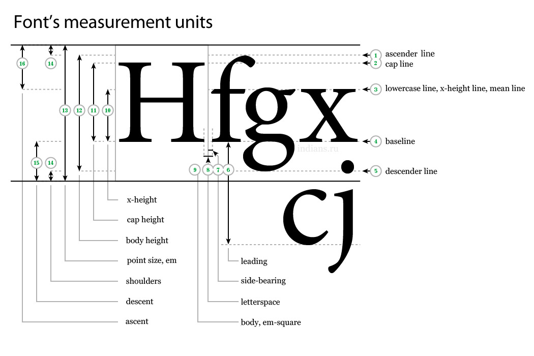
>>>an em is not the width of a capital M,
Funny, but I was taught in school that an "em" space was equal to the width of a capital "M" and an "en" space was equal to a capital "N".
And, the point size is the height of the lead that must account for ascenders, descenders and capital letters.
I see that Wikipedia defines the em as the point size, but then why not just call it that. I think my teachers had it right; but then, we almost all take ofter our teachers, don't we?
Copy link to clipboard
Copied
The size of a typeface is calculated from the top of the ascenders to the bottom on the descenders,
The typeface can appear larger or smaller depending on the x height.
Copy link to clipboard
Copied

Copy link to clipboard
Copied
Copy link to clipboard
Copied
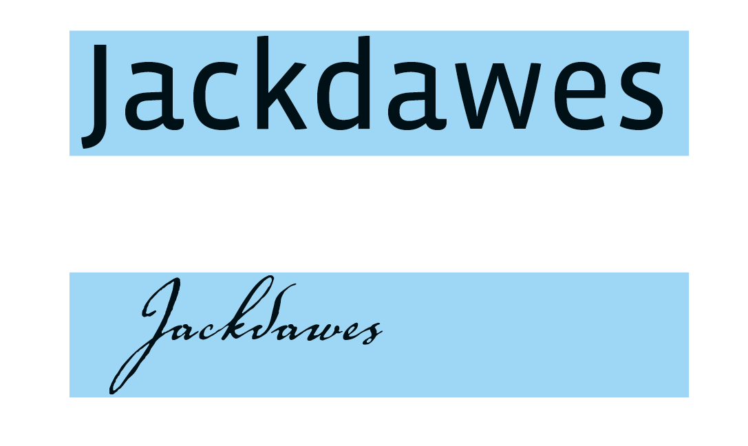
All digital fonts (at least all of mine) include the shoulder space above the ascender and below the descender, so the actual measured font size is close to, but a bit larger than, the distance from the top of the ascenders to the bottom on the descenders.
60pt type over a 60pt tall rectangle

Copy link to clipboard
Copied
Sorry I was not clear with a question. I suppose I wanted a 101 introduction into the subject. ![]()
Copy link to clipboard
Copied
I should think Sandee Cohen's Quick Start Guide should cover this (and more!).
Copy link to clipboard
Copied
Sorry I was not clear with a question. I suppose I wanted a 101 introduction into the subject.
So hopefully we managed to do that for you—I'm just happy we didn't scare you away! If you have any other questions, just come back and ask. (Although if it's a new topic, you will want to start a new thread.) In the meantime, enjoy exploring all the new white space options! ![]()
Copy link to clipboard
Copied
>>>The size of a typeface is calculated from the top of the ascenders to the bottom on the descenders
True, unless, of course, the capital letter is taller than the ascender for a particular typeface. And, in hot metal type, I believe it was the actual size of the lead, yes?
Copy link to clipboard
Copied
Typeface designs vary, but with some typefaces the ascenders of lower case letters are slightly higher than the capital letters. There is also a slight bevel in metal type to prevent descenders and ascenders touching. There are a few typefaces that consist of capital letters only, so these vary in size from the norm and don't have the "shoulder" where the descenders would normally be.
Leading (line spacing) is additional.


