

- Home
- InDesign
- Discussions
- Re: Is there widow/orphan control in indesign?
- Re: Is there widow/orphan control in indesign?

Copy link to clipboard
Copied
Hi, is there an orphan/widow (???) function in indesign? I am creating a document, with three to four paragraphs per page, and a blank line between paragraphs, but I don't want any blank lines at the bottom or top of any pages. Is this something one has to sort out manually, page by page? Just curious 


 1 Correct answer

Only when humanly possible, I fill pages all the way to the end. Rather than changing the leading or blank line heights (which is extremely visible if you have two plain text pages next to eachother), I scan for long paragraphs with either short or very long last lines. Minimally adjusting the tracking (never more than -2 or +10! never in two consecutive paragraphs!) may just "win" or "loose" a line, effectively hiding that extra space at the bottom.
How do I remember what I changed? I don't -- i
... 41
Replies
41
41
Replies
41
Copy link to clipboard
Copied
Harbs. wrote:
P Spier wrote:
Why Adobe lists an "as designed" word space as being desired at 100%, and the letter space as desired at 0% is a mystery to me. Perhaps someone else has a good explanation.My guess would be that there really is no letter spacing. The side bearings are part of the metrics of the font. If there is no kerning applied, the side bearings of one letter precisely abut the side bearings of the next letter. So standard is 0, less is negative (they overlap) and more is positive...
Makes sense?
Harbs
Don't spaces have side bearings? I suppose to some degree I follow your logic, but by the same token I could easily see saying 100% for letter spacing means make the letters touch and use the designed side bearing, 95% means make them overlap, and 105% menas spread them out.

Copy link to clipboard
Copied
Well, not all glyphs have side bearings at all (cursive script fonts
for example, or the underscore glyph).
Spaces have defined widths, but not really side bearings per se...
Harbs

Copy link to clipboard
Copied
Back on March 28th, when Peter said this, a little alarm went off in my head and I couldn't place it, so I said nothing:
I do think, though, that you'll find most people do NOT use optical kerning except when dealing with combinations of text in different faces, or perhaps in headlines. If the font metrics as designed are so bad that you want to throw them out, then you probably want a different font. For one or two pairs, a GREP style added to the paragraph style to change the tracking on the pair is not out of the question.
One place where fonts often seem to screw up their kerning metrics is between numbers and hyphens (not emdashes or endashes). Such as in sports scores. I struggle to find a great example, but here's a quarter-way passable one.
From todays' Times, though I've chosen to set it Utopia, which has this problem to a much lesser-but-still-significant degree:

Or zooming in:
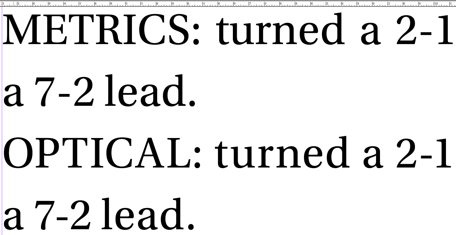
Anyhow, it may be hard to see, but the metric-based kerning tends to define the left edge of the one figure where the extreme left of the top left serif juts out, but for the hyphen, what tends to look best is if the left edge is more defined by the main vertical stroke of the figure.
This problem is quite noticable with sevens (both to the left and right of a hyphen), and also with ones.
I suppose my personal preference may also be at odds with the font's designer, and I will sometimes close them up even more than optical kerning wants to do.
Copy link to clipboard
Copied
I certainly wouldn't disagree with using a GREP style or optical kerning to change the kerning values for hyphen/digit combinations you don't like, or any other special case. That's quite different from using optical kerning throughout the text, which I thought I had made clear in my previous post. Nor would I tell anyone they shouldn't use optical kerning throughout. That's a matter of personal choice. My observation was about the habits of most users regarding optical kerning, not an attempt to establish any sort of rule.
I notice that the word spacing in your optical lines seems smaller, and the spaces between letters within the words larger than it is in the Metrics lines. Is that something you also wanted to happen? It might also be a function of your justification settings, which I can't see.
Also, for the record, I would consider typesetting a newspaper to be something of an atypical (though admittedly common) use, as by their nature narrow columns throw in all sorts of added difficulties and generally violate what I've been taught are the optimal ratio ranges for type size and glyph count to line length. My newspaper experience is somewhat limited, but I've never worked on a paper where beauty took precedence over fit.
Copy link to clipboard
Copied
Sorry, I didn't mean to imply anything about optical kerning throughout. (Though I will say I haven't seen a case where it does bad things, but I also haven't experimented with it throughout, rather than on letter-pairs).
The only things different in those two lines were optical kerning versus metrics kerning. Typically we optical-kern indvidual "words" (like "7-2") rather than the whole line they are in, so this example was even more artificial. I'd be surprised if the narrow newspaper columns have much effect on thie issue of whether or not to optical kern things like scores. I guess I've not experiemented, but I would expect it to be much the same.
I am mildly annoyed that the metrics kerning doesn't handle these cases properly. I'm not sure what the font designers are thinking...or maybe my eyes work differently than theirs do. I suppose one could Just Email Them And Ask? Any experience with that?
Copy link to clipboard
Copied
John, remember that tabular lining digits are designed to all have the same width. Perhaps the font designer wouldn't want to mis-align a sequence like
1-0
2-7
8-8
One of Adobe's standard fonts (and I never can remember which one! it is one of the sanses) has regular even-width digits but goes way too far with kerning: its default Metrics include kern pairs for "11", "10", and "74", making it look better in text but it's useless in tables. For that, you cannot choose "Optical" either (it would do about the same), you have to manually select "None".
"Super-complete" Opentype fonts such as Minion Pro come with a set of tabular digits as well as 'proportional lining' digits. Since you can set the numbering style just about every which way you want -- in paragraph styles, in character styles, in nested styles etc. -- you can have the right set applied wherever you want.
Copy link to clipboard
Copied
And of course there may also be the other answer, that you are mis-using a hyphen when you should be using an en-dash to specify a range. I don't know that it would work any better, but it might explain why the kerning is bad. What type designer would expect you to break a "word" made of numbers, so they probably didn't figure kerning values were needed.
Copy link to clipboard
Copied
No!
Why does everyone get this wrong? (sorry, pet peeve).
Scores are not ranges. They are numbers in opposition. I won the game two-against-one, not from two to one. They get a hyphen not an endash.
Copy link to clipboard
Copied
Hear, hear!
I feel the same about phone numbers with dashes (perhaps just a little bit less  )
)
Copy link to clipboard
Copied
Ouch!
I'm standing in the corner now. You guys are perfectly correct, but I might still be right about the reason. Do type designers read the sports page?
Copy link to clipboard
Copied
Well, they should (I was "born without the sports gene"). Sports presents some fascinating issues in design in general, and even for typography in specific, because of the large amount of tabular data. It's similar to the financial pages in that regards.
Please see the discussion in Edward Tufte's book Beautiful Evidence, in part excerpted in the "Sports graphics" thread on edwardtufte.com — scroll down to the 5th reply, from Tufte himself, with page images from the book.
Copy link to clipboard
Copied
If I understand correctly, tracking adds an equal amount of space between letters, while kerning adds space between words only, but not necessarily all of the words in a given paragraph (even if the whole paragraph is selected). Based on the fact that kerning already varies within a single justified paragraph (the screencap below shows a paragraph which has kerning increased once by shortcut, which affected only the middle five lines, by the way, not the whole paragraph), adjusting kerning seems to me most suitable for dealing with bad breaks. In other words, by adjusting kerning, within limits, you're not doing anything that isn't already being done to the text (the extra spacing you create would be similar to the spacing in another similar paragraph, and even within the same paragraph); whereas adjusting tracking does change the text in a new way, inconsistent with all or nearly all other paragraphs, and is therefore more likely to affect readability (though likely not noticably).

This leaves me with a few questions. Metric kerning is (?) required to make kerning adjustments with keyboard shortcuts. Which means no optical kerning; is that bad? Second, I take it that optical kerning is different from optical margin alignment (which is still applied to my text regardless of type of kerning). Lastly, Peter, I notice that if I increase or decrease kerning more than two times, things start to look weird. Are those your limits too? (before, as you said, you start to adjust tracking?) Also, if I increase kerning twice (with custom tracking/kerning turned on), and then later return to that paragraph after some revisions to a previous paragraph, there is no way, as far as I can tell, of telling how much kerning has been done on the paragraph except by opening up justification options (whereas tracking is always easy to figure out, just by looking at the character menu; and at "0" the custom tracking color disappears). Kerning settings in the paragraph menu would be helpful in this regard.
Copy link to clipboard
Copied
If I understand correctly, tracking adds an equal amount of space between letters, while kerning adds space between words only,
Wait! Stop! Hold the phone...TERMINOLOGY POLICE!
Kerning is the spacing between a pair of characters. Tracking is loosening and tightening across a block of text. Both are measured in units of ems (one one-thosandth of an em width in a font), and it's important not to confusing them. And confusing them is easy.
For metrical kerning, the norm, kerning is a lookup into a table that is part of the font. The displayed kerning value (default zero) is an offset into the looked up value that you can use to adjust it on a case-by-case basis. The only
For optical kerning, the situation is the same, exacpt that the baseline value is not looked up in table, but is instead measured based on the shape of the letterforms in the font. This is slower but gives better results in a variety of special situations.
Tracking is an adjustment of the intercharacter spacing in a block of text. Ultimately it is the same spacing that kerning adjusts, but it is on a block basis, not on an individual character pair basis. Adjust tracking by selecting multiple characters (e.g. a whole paragraph) and adjusting the tracking, again with the keyboard or with the character panel.
So the actual space between any two characters is the sum, as measured in ems, of the baseline value (from metrical kerning lookup or optical kerning measurement), plus the applied kern, plus the applied tracking.
Now we have a special case of InDesign's "word kerning." This is the
I did some measurements this afternoon of "word kerning" versus tracking for copyfitting text. My conclusion is that it might look ok, but it is simply not practical in the real world, at least for newspaper column sizes. I took 4 example stories that were tracked in by up to -20 (I know, someone broke our -15 rule), and found that to achieve the same copyfit (in both cases I think it was one line of text only), I had to word kern the story by -155, -125, -10, and -435. The -10 looked just fine. The others, of course, looked horrible. The -435 even had overlapping letters.
So my conclusion is that, practically speaking, if you have to gain or lose any significant number of lines, word kerning isn't going to do it for you. But it's a good thing to have in your toolbox, if you can stand to remember the keyboard shortcut  .
.
Optical kerning does not preclude the use of manual kerning shortcuts, not at all. We do it all the time. Did you perhaps make an error?
We should be careful with with the units. InDesigns' default is 20 ems. This is FAR TOO MUCH. Around here, we use 5 ems (you can set this in Preferences > Units and Increments). 1 em is probably more appropriate (especially as there is a shortcut to go at 5x the increment), but we inherited a default from Quark and people did not want to change.
Based on the fact that [WORD] kerning already varies within a single justified paragraph (the screencap below shows a paragraph which has [WORD] kerning increased once by shortcut, which affected only the middle five lines, by the way, not the whole paragraph), adjusting [WORD] kerning seems to me most suitable for dealing with bad breaks.
I've added "[WORD]." I agree, based on testing, that word kerning is probably better for dealing with bad breaks. But I don't think you will find it gets the job done in mos cases (see my testing).
This leaves me with a few questions. Metric kerning is (?) required to make kerning adjustments with keyboard shortcuts. Which means no optical kerning; is that bad? Second, I take it that optical kerning is different from optical margin alignment (which is still applied to my text regardless of type of kerning). Lastly, Peter, I notice that if I increase or decrease kerning more than two times, things start to look weird. Are those your limits too? (before, as you said, you start to adjust tracking?)
These I answer above.
Also, if I increase kerning twice (with custom tracking/kerning turned on), and then later return to that paragraph after some revisions to a previous paragraph, there is no way, as far as I can tell, of telling how much [word] kerning has been done on the paragraph except by opening up justification options (whereas tracking is always easy to figure out, just by looking at the character menu; and at "0" the custom tracking color disappears).
That's not correct. You have to place the cursor to the left of the first letter of a word. Then you will see the interword kerning.
Hope this is helpful. I have to run, back in a few hours.
Copy link to clipboard
Copied
I see John types much faster than I do (nearly everyone does). One more word about the effectiveness of adjusting word spacing as compared to adjusting tracking: John is working in a newspaper, which by definition uses narrow columns and doing any adjustment in a narrow column is more difficult that doing the same kind of adjustment in a wider column (trying to eliminate hyphens, for example, in a narrow newspaper column and have readable text is an exercise in futility, but the same thing is pretty doable in a page-width column in a novel), so it isn't surprising that he would prefer to use tracking -- he needs to.
Copy link to clipboard
Copied
No, you don't understand correctly about tracking and kerning. The two are very similar. Kerning affects only the space between a single pair of glyphs and is available only if you insert the cursor between them (if you select one or more glyphs, your choices are limited to metrics, optical, or 0). Tracking is the same thing, but applied to a group of glyphs, and is added on top of whatever kerning values are specified for individual pairs, so you can adjust the kerning for individual pairs in a headline, for example, and then apply tracking to the whole thing which will add or subtract an equal amount from all spaces between glyphs.
I just did some experimentation to determine exactly what those KB Shortcuts are doing and it turns out it is adjusting the kerning between all space/following glyph pairs. How much the kerning is adjusted depends on the increment you set in your preferences for the document (mine are set to increment tracking & kerning by 10/1000 em), so there is no way to say that 2 times is the limit. (in contrast, I think the default increment in Quark Xpress, which as far as I know you can't adjust, is 20/1000 em). If you want really fine adjustments, set the increment smaller, but I think in most cases less than 10/1000 is really too small to be worth using. Do you understand measurements in EMs? How much is too much is always going to be a judgement call, and it's going to vary with the size and weight of the type, I think, as well as the face. I do agree, though that kerning the spaces is preferable than tracking the whole paragraph, if it will work, which was why I mentioned it.
You noted that that when you tried it, some lines didn't seem to change. That would indicate to me that the justification algorithm had already dertemined a space that fell within the range, even with the extra kerning applied (remember, you told ID it could adjust spacing already, within certain limits). If you used the defaults, and changing letter spaces (kerning between the glyph in words) is not allowed as part of the justification options, tracking is always going to affect the letter spaces, but might not affect the word spaces, so your words might just get spread out or pushed together without changing how many of them are on the line.
Metric kerning means using the values for each glyph pair combination that were programmed into the font by the designer. Optical kerning is different from optical margin alignment (which moves glyphs relative to the column edge to try to give a more visually even line -- essentially kerning the first or last glyph in the row to the column edge -- which you cant do manually, so you would otherwise have the designed "side bearing" amount built into the glyph -- and hangs the punctuation, to a greater or lesser degree, outside the column edge). Optical kerning is meant to give an even visual weight to the glyph spacing when the neighboring glyphs don't "match" in terms of type specification. It's a purely mathematical construct, as far as I know, and lack the subtlety that a good type designer may add to a well designed font. If you set the kerning for a block of text to metrics or optical you will see the values being used between pairs, either by the designer (metrics) or ID's math (optical).
I hope that helps a bit.

Copy link to clipboard
Copied
[Jongware] wrote:
Only when humanly possible, I fill pages all the way to the end. Rather than changing the leading or blank line heights (which is extremely visible if you have two plain text pages next to eachother), I scan for long paragraphs with either short or very long last lines. Minimally adjusting the tracking (never more than -2 or +10! never in two consecutive paragraphs!) may just "win" or "loose" a line, effectively hiding that extra space at the bottom.
Personally, I prefer to tinker with the Justification settings (mainly word spacing) as it affects the entire paragraph and can be changed for an entire page without any drastic changes, only where paragraph composer deems necessary based on new settings.
If you are looking for a commercial solution, see http://www.teacupsoftware.com/products/TypeFitterPro.html
Copy link to clipboard
Copied
I should add that when we adjust tracking for copyfitting purposes (we're a newspaper), generally speaking we do so only on an entire paragraph
-basis, not individual words within a paragraph -- otherwise the eye sees the transition and it's unpleasant.. Frequently all the paragraphs of a story (e.g. track out the entire story to +5, which might gain 1 or 2 lines over the course of it), or maybe just one particular one if we only need a small number of lines looser or tighter. I do try to have all paragraphs in view have the same tracking, either on a column basis or a page basis.
-
- 1
- 2

Find more inspiration, events, and resources on the new Adobe Community
Explore Now
 AdChoices