Participant
November 20, 2017
Answered

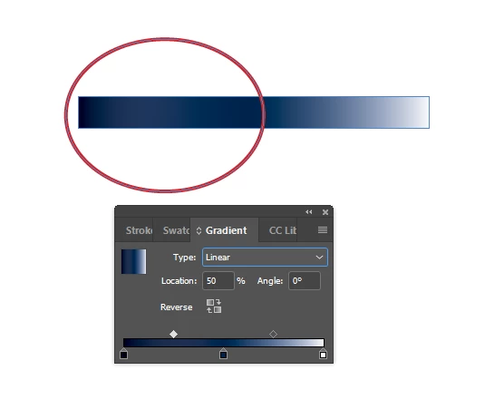
Lighter color showing up between two dark gradient points?

  • November 20, 2017
  • 3 replies
  • 2389 views

I'm tried to create a gradient that has my primary color in the center and fades to white on the right side and +20% black of the primary color on the left side. When I set this up, the color actually looks lighter than the primary color for a time between the primary color and the +20% black color. I tried adding a mid-way color between the primary color and 20% black but the lighter hue still shows up between them. I tried removing the primary color, but I need it to be represented right in the center. How do I stop the gradient from getting lighter before it gets darker?
    This topic has been closed for replies.
    Correct answer jane-e

    Yay that it's working!

    (Best practices for InDesign, just to mention it, are to use named swatches for everything. You would then use the named swatches in the gradient.)

    3 replies

    macpawel
    Participating Frequently
    November 20, 2017

    Please check your left and central Gradient stop. Sometimes you can find there two or even more points laying one on another

    What is your white?

    Two of these blue colors - is it tint or new swatch?

    pawel

    klewisrfaAuthor
    Participant
    November 20, 2017

    Hm, I shut InDesign down earlier and just restarted it to get this information and now the gradients don't seem to be having the issue anymore. They're smooth from the darkest color to the primary color. Maybe it was just my session of Indesign?

    All of the colors are CMYK, white = 0, 0, 0, 0, the primary dark blue is 94, 55, 0, 74, and the darkest blue was 94, 55, 0, 94. I did not use the tint property on the darkest swatch.

    Here's the exact same setup as the above, now:

    Maybe just a hiccup?

    jane-e
    Community Expert
    jane-eCommunity ExpertCorrect answer
    Community Expert
    November 20, 2017

    Yay that it's working!

    (Best practices for InDesign, just to mention it, are to use named swatches for everything. You would then use the named swatches in the gradient.)

    jane-e
    Community Expert
    Community Expert
    November 20, 2017

    Can you show the Swatch definitions so we can try to reproduce this?

    1. Is white actually paper or is it white?


    2. Show your Swatch definition for the dark color. Is it Pantone? CMYK? Something else?


    3. Show your definition for the 20%. Is it a Tint Swatch?