- Home
- InDesign
- Discussions
- Re: Matchprints too dark: is sGray a safer choice?
- Re: Matchprints too dark: is sGray a safer choice?
Matchprints too dark: is sGray a safer choice?
Copy link to clipboard
Copied
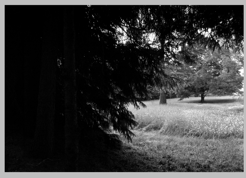
A printer mailed me some matchprints for my next project, which will be printed on offset (uncoated), but they turned out too dark for my taste.
I don't know if we can call this a contract-proof, since the printer didn't ask me to sign anything and I don't know how accurate this is.
All I know is that Matchprint is a prepress proofing system based on inkjet technology. These prints were made on a harder paper. I couldn't order a press-proof, usualy that's too expensive and complicated.
My screen is not professionally calibrated. I picked the darkest images in my layout and I checked the percents in Acrobat's Output Preview. The darkest areas are in the 90s, so maybe these matchprints are accurate. But I'm not sure.
I also checked the document on another computer. On screen it looked a bit brighter than the matchprints, but relatively close to them.
I've prepared the images in Photoshop, by converting them to Black Ink of the CMYK profile required by the printer. Previously, they were sGray (for screen use). As a result of the conversion, they turned out "fuller" and "more meaty".
I assume that this is normal (correct me if I'm wrong). Probably this is why they became so dark.
I also made a test-version, where the images are nominally CMYK (not grayscale), but they actually use K only (CMY=0). I did this by using the option Promote Gray to CMYK Black in Acrobat. As I expected, the matchprint for this version turned out the same as for the grayscale version.
Now I'm thinking what should I do:
a) Asking the printer to set the offset press for a brighter print. I don't even know how to phrase this, I don't know the tech lingo (lowering the ink density?). I also don't know if this is considered a breach of standard, an improvisation.
b) Replacing these Black Ink images in the layout with their sGray equivalents. I tried it and this way the images look "washed out" and kind of "weak" in the soft-proof, but maybe this is a safer choice. I'm seriously considering this solution.
c) Leave everything as it is and just hope that things will turn out fine in the final product. Cause these matchprints are not press-proofs, so maybe there will be some difference in the end. Maybe things will turn out brighter in the end.
Thanks for your opinions
Copy link to clipboard
Copied
Why not ask the printer if they will be able to match their proofs on press? If they say yes, you would have to correct the output numbers.
Copy link to clipboard
Copied
@rob day, thank you for your reply.
I just don't understand what do you mean by correcting the output numbers?
Maybe you meant just setting the brightness / contrast / midtones / shadows, applying curves or something? Or maybe I'm missing something.
Thanks
Copy link to clipboard
Copied
You can change the output numbers via a conversion to a different output profile, which will maintain the displayed appearance, but change the output numbers. So, here’s a conversion from Coated GRACoL Black to US Sheetfed Coated Black—the US Sheetfed profile allows for more dot gain so the output numbers are lowered—50% becomes 42%:
Or you can change the output numbers via a color correction, which will adjust the output numbers and change the displayed soft proof:
Copy link to clipboard
Copied
Thank you, @rob day.
I'm also thinking about this:
How about using some fixup or some 3rd party Acrobat plugin such as Pitstop Pro that will lower the K percentage in all the images in the PDF by, say, 10%?
For example, you click somewhere on an image (let's call this Point A) and it shows K=100%, then you click somewhere else on the image (Point B) and it shows K=85%, and then you apply this fixup and point A becomes K=90% and point B becomes K=75%.
But this should work on the whole image equally, without messing up its balance.
Pitstop Pro offers contrast/brightness (like you can brighten everything by 10%), but I'm not sure is this exactly what I'm looking for.
Thanks
Copy link to clipboard
Copied
Have you decided the printed proofs are accurate and your display is not (the gray output profile you’ve been using is wrong)? If that’s the case you should make a correction to the output values somewhere—I’ve never used Pitstop.
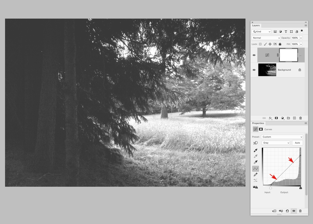
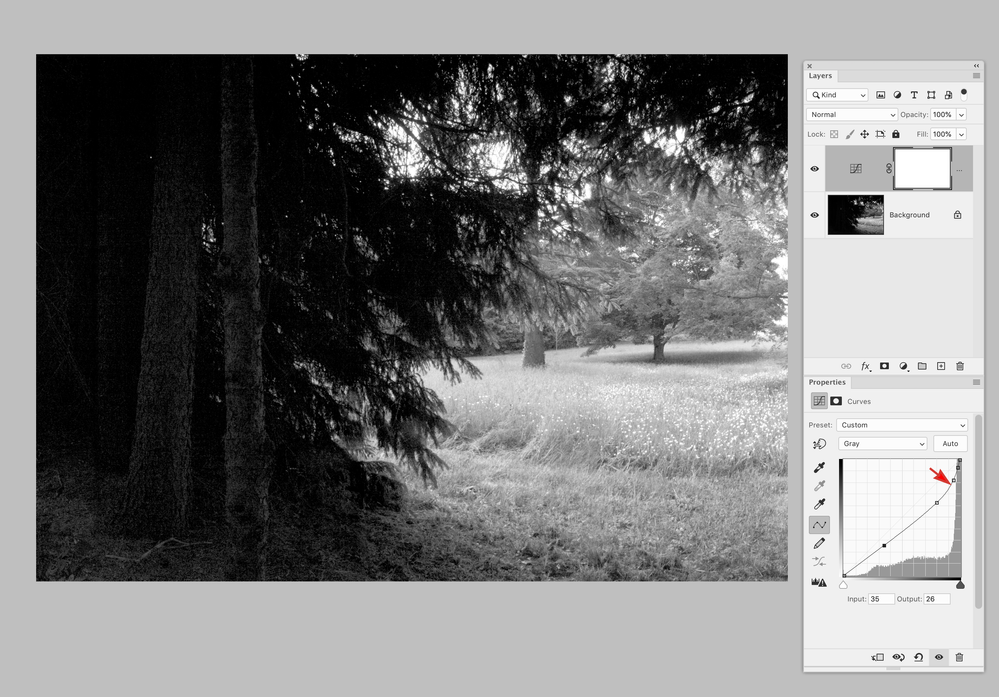
If you uniformly lower the values, so the black point becomes 90% K, you will limit the dynamic range of the grayscale, which is already being limited by the uncoated sheet. So unless you purposefully want a “flat” appearance, I would think a curve adjustment would be better.
Copy link to clipboard
Copied
A uniform correction vs. a Curve correction where I’ve opened the shadows and held the mid and quarter tones:
Copy link to clipboard
Copied
UPDATE:
The book came out (offset) and it turned out that the matchprints are not accurate.
The colors in the book are different to the ones on the matchprints, but are close to the colors on my screen (my screen is not so inaccurate, though it's far from perfect).
Why the matchprints do not actually match the final product - I don't know. Maybe the proof-printer was not properly calibrated or it ignored the ICC profile in the PDF/X file (Output Intent). Who knows...
I was thinking, would it been different if I tagged every object with an ICC profile, instead of using a single ICC profile for the whole document, but I got tired of thinking.
From now on I will not rely on this matchprint thing.
But it's good that the b/w content turned out too dark on the matchprints. How accurate that was - I don't know, but it scared me, so in the end I decided to use sGray and it worked well.
I've already used sGray in the past (succesfully), but for a moment I thought that it's not a very professional choice. It's for screen, not for print.
But it's a safe choice and it worked well, at least for this particular project. Otherwise, the b/w content could turn out too dark.
So if you are not very experienced like me, sGray will be just fine.


