


Copy link to clipboard
Copied
Hey guys,
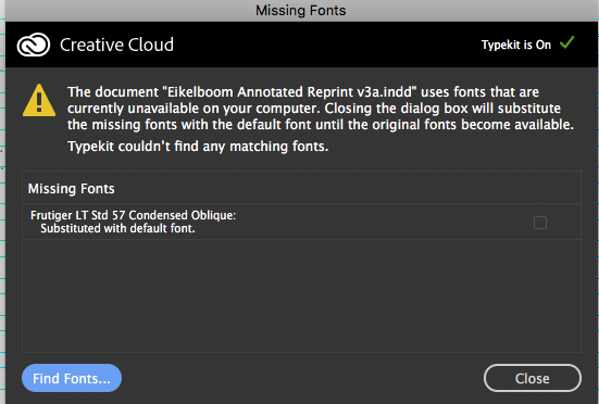
i am searching for something that i am not sure exist..i need help, please. i am gettign the error below. but i can't find Futiger LT std 57 condensed oblique for sale, anybody know where to find it?


 1 Correct answer

How was the Oblique applied? If it's through a character style, the original designer may have overseen it, and it's an error. In that case, just replace it with the correct font.
For what it's worth: knowing other of Frutiger's fonts, his fonts usually had a number increased by 1 for the italics, which indeed makes it unlikely there was ever a "57 Italic" (or Oblique, or Slanted) when there also was a "57 Regular".
 19
Replies
19
19
Replies
19
Copy link to clipboard
Copied
for got to say i found Frutiger std 58 condensed italic. which i think will work the same. thoughts?

Copy link to clipboard
Copied
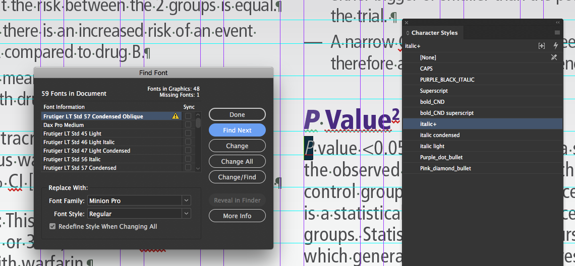
57 is Condensed. There is no condensed oblique for that font as far as I know.
I'd look at that document without substituting it first. Something's not right.
Copy link to clipboard
Copied
i did, take a look. they even made it a style. i got this from the client. i received the packaged files and its been like this for month. i been exporting a .pdf for proofs to get edits and ignoring the dialog for missing fonts just to get things back and forth. but now they want to go to print. so i can skew it at a 45 angle. which i don't like to do. or buy the Frutiger std 58 condensed italic, right?
Copy link to clipboard
Copied
That looks like very familiar legalize for pharma. I did a whole bunch of that back in my DPS days.
Copy link to clipboard
Copied
thats right. thats what i been doing for 7 years, Pharma.
Copy link to clipboard
Copied
Who do you work for?
Feel free to send it privately.
Copy link to clipboard
Copied
I work for SPRINGERNATURE. they own Scientific American, Nature Journal, Mcmillan, Springer publishing.
My department is part of the Springer Healthcare brand..
Copy link to clipboard
Copied
First DPS project I ever worked on was for SA. Origins and Endings.
Did it toward the end of 2010.
Copy link to clipboard
Copied
i was selling a lot of DPS from 2010 to 2012. than it went down dramatically. now nobody is asking for it. IN5 and full browser based html layouts is what all of the pharma wants.
who did you work with at SA?
Copy link to clipboard
Copied
That was a long time ago. I don’t remember who I was working with there but I wasn’t working alone on that project.
It was huge and we were using very early tools.
Copy link to clipboard
Copied
thats cool Bob. you sure have the experience on DPS. i learned everything i know from your LYNDA.COM videos on top of sitting down with Jeff Witchel for training.
I was very excited about learning DPS and i just saw it loose momentum. but i am happy that IN5 allows me to use everything i learned. and i still go back to your MSO video course since i get lost at times.

Copy link to clipboard
Copied
Yes. The term oblique indicates a roman font that has been skewed a certain number of degrees vs. italic which is designed to be slanted, and more calligraphic. Purists shy away from obliques and use italics.
~Barb

Copy link to clipboard
Copied
I am sorry Barb, but it is not always true. Univers font (designed by Adrian Frutiger, as well as Frutiger font) exists as oblique:
Copy link to clipboard
Copied
Adobe's original Helvetica Oblique and Courier Oblique were officially the slanted version of their upstanding outlines. (Not to mention the infernal Helvetica Narrow, which even never existed as a real font.)
But surely Barb is mentioning this in relation to manually slanting a font, rather than using one designed (and hopefully approved) by its designer, and in reaction to JonathanArias's "so i can skew it at a 45 angle", which indeed sounds quite excessive:

Copy link to clipboard
Copied
sorry. 15 degree angle ...

Copy link to clipboard
Copied
Depending on the font's design they can be called a Sloped Roman or Italic, and of course there are automatic sometimes called fake italic, which is the Roman font slanted.

Copy link to clipboard
Copied
The full Frutiger family is at https://www.linotype.com/1270238/frutiger-family.html
Copy link to clipboard
Copied
thats right. but it means replacing "Frutiger LT std 57 condensed oblique" with "Frutiger std 58 condensed italic" which is want i am talking about.
Copy link to clipboard
Copied
How was the Oblique applied? If it's through a character style, the original designer may have overseen it, and it's an error. In that case, just replace it with the correct font.
For what it's worth: knowing other of Frutiger's fonts, his fonts usually had a number increased by 1 for the italics, which indeed makes it unlikely there was ever a "57 Italic" (or Oblique, or Slanted) when there also was a "57 Regular".

Find more inspiration, events, and resources on the new Adobe Community
Explore Now
 AdChoices