• Global community
    • Language:
      • Deutsch
      • English
      • Español
      • Français
      • Português
  • 日本語コミュニティ
    Dedicated community for Japanese speakers
  • 한국 커뮤니티
    Dedicated community for Korean speakers
Exit
0

Nanum Gothic TypeKit font baseline shift bug on a single letter

Community Beginner ,
Oct 21, 2022 Oct 21, 2022

Copy link to clipboard

Copied

This problem happens with all weights, both upper and lower case, only on "i" character.

The font family in question is Nanum Gothic.

If I load a physical copy of the TrueType 3.020 font using Universal Type Client, there is no baseline shift:

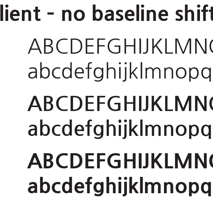
Screen Shot 2022-10-21 at 12.35.13 PM.png

Screen Shot 2022-10-21 at 12.45.21 PM.png

If I use the TypeKit version, the "i" character shifts down, in all three weights, both upper and lower case.

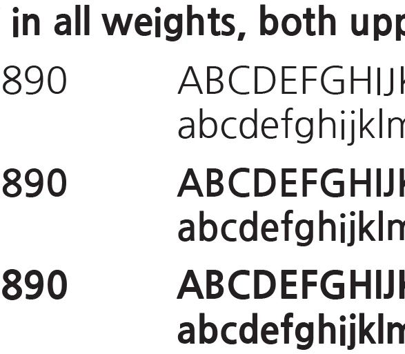
Screen Shot 2022-10-21 at 12.33.32 PM.png

Screen Shot 2022-10-21 at 12.46.03 PM.png

"I is the only affected letter.

The font works normally in Illustrator.

TOPICS
Bug , Type

Views

657

Translate

Translate

Report

Report
Community guidelines
Be kind and respectful, give credit to the original source of content, and search for duplicates before posting. Learn more
community guidelines
Community Expert ,
Oct 21, 2022 Oct 21, 2022

Copy link to clipboard

Copied

I just loaded Nanum Gothic from Adobe Fonts (formerly called Typekit) and I'm getting the same result (shown below):


Screen Shot 2022-10-21 at 11.20.03 AM.png

I also see another discrepancy, also shown in your example. In the Regular weight capital letters IJ are also baseline shifted.


Votes

Translate

Translate

Report

Report
Community guidelines
Be kind and respectful, give credit to the original source of content, and search for duplicates before posting. Learn more
community guidelines
Community Expert ,
Oct 21, 2022 Oct 21, 2022

Copy link to clipboard

Copied

To be clearer, I tested this in the newly released InDesign CC 2023 (version 18).

Votes

Translate

Translate

Report

Report
Community guidelines
Be kind and respectful, give credit to the original source of content, and search for duplicates before posting. Learn more
community guidelines
Community Beginner ,
Oct 21, 2022 Oct 21, 2022

Copy link to clipboard

Copied

I am in version 18 as well.

Good eye! Lower case "j" in regular weight is moved down as well, if you compare the dots.

I wonder if someone was trying to get the descender on the capital j to be more below baseline and saved (some of) the changes to the other weights.

Votes

Translate

Translate

Report

Report
Community guidelines
Be kind and respectful, give credit to the original source of content, and search for duplicates before posting. Learn more
community guidelines
Community Expert ,
Oct 21, 2022 Oct 21, 2022

Copy link to clipboard

Copied

However, in Illustrator CC 2023, I see the same imperfections as I see in InDesign:


Screen Shot 2022-10-21 at 11.36.36 AM.png


That suggests that it's an imperfection in the font design. It seems that this is a Japanese font. In Illustrator, I had to go to Type Preferences to see it in the menu. Illustrator by default doesn't display non-English fonts alphabetized in English order but has a preference to turn on English spelling.

Votes

Translate

Translate

Report

Report
Community guidelines
Be kind and respectful, give credit to the original source of content, and search for duplicates before posting. Learn more
community guidelines
Community Beginner ,
Oct 21, 2022 Oct 21, 2022

Copy link to clipboard

Copied

For me, in Illustrator the font is named 나눔고딕, but I don't see the problem there.

I copied the text from InDesign and pasted it into Illustrator rather than manually selecting the font, so I did not experience the name not appearing like you did.

If I use a local copy of the font, I do not have the problem either, and neither does our customer (based on the pdf they sent to me).

Votes

Translate

Translate

Report

Report
Community guidelines
Be kind and respectful, give credit to the original source of content, and search for duplicates before posting. Learn more
community guidelines
Community Expert ,
Oct 21, 2022 Oct 21, 2022

Copy link to clipboard

Copied

One other variable could be the VERSION of the font. Illustrator doesn't show this but InDesign does.


Choose Type > Find/Replace Font. Highlight NanumGothic Regular. Click the More Info button. It shows the version in the Info section. Does it match mine?:


Screen Shot 2022-10-21 at 12.07.18 PM.png


Votes

Translate

Translate

Report

Report
Community guidelines
Be kind and respectful, give credit to the original source of content, and search for duplicates before posting. Learn more
community guidelines
Adobe Employee ,
Oct 21, 2022 Oct 21, 2022

Copy link to clipboard

Copied

Hello @Tim Schatz 


Thank you for reaching out and highlighting the issue. This seems to be a font-specific issue on both the most recent and older versions of Illustrator and InDesign. 


We're checking with our Typekit team to review this font.


We'll keep you posted and will try our best to help.


Thank you, @Steve Werner, for your observation on this issue. We really appreciate it.


Thanks,

Harshika

Votes

Translate

Translate

Report

Report
Community guidelines
Be kind and respectful, give credit to the original source of content, and search for duplicates before posting. Learn more
community guidelines
Community Beginner ,
Oct 21, 2022 Oct 21, 2022

Copy link to clipboard

Copied

I suspect that it used to, but when I tried to use the font in Illustrator again, it seems to have unloaded the font with the Latin character name.

Now, the baseline shift problem has gone away and I am using a TrueType from the system folder.

Version 13.0d1e3

Path: /System/Library/AssetsV2/com_apple_MobileAsset_Font7/<insert random characters here>/AssetData/NanumGothic.ttc

I know that it is a Google font.

I don't normally have good luck with TrueType collections.

It looks like that location is dynamically downloaded when a web page uses a font.

Votes

Translate

Translate

Report

Report
Community guidelines
Be kind and respectful, give credit to the original source of content, and search for duplicates before posting. Learn more
community guidelines
Community Beginner ,
Oct 21, 2022 Oct 21, 2022

Copy link to clipboard

Copied

Thank you, Harshika.

Votes

Translate

Translate

Report

Report
Community guidelines
Be kind and respectful, give credit to the original source of content, and search for duplicates before posting. Learn more
community guidelines
Community Expert ,
Oct 21, 2022 Oct 21, 2022

Copy link to clipboard

Copied

LATEST

Definitely flaws in the font outlines. I opened them up and the outlines are decidely wonky, depending on which weight you're looking at. In the Regular, BOTH the I's and J's (u/l) are off, while in the Bold and ExtraBold, it's only the lower case "i" .


Screen Shot 2022-10-21 at 8.33.40 PM.png

Votes

Translate

Translate

Report

Report
Community guidelines
Be kind and respectful, give credit to the original source of content, and search for duplicates before posting. Learn more
community guidelines