I tried that. It "made changes," but nothing visibly changed.
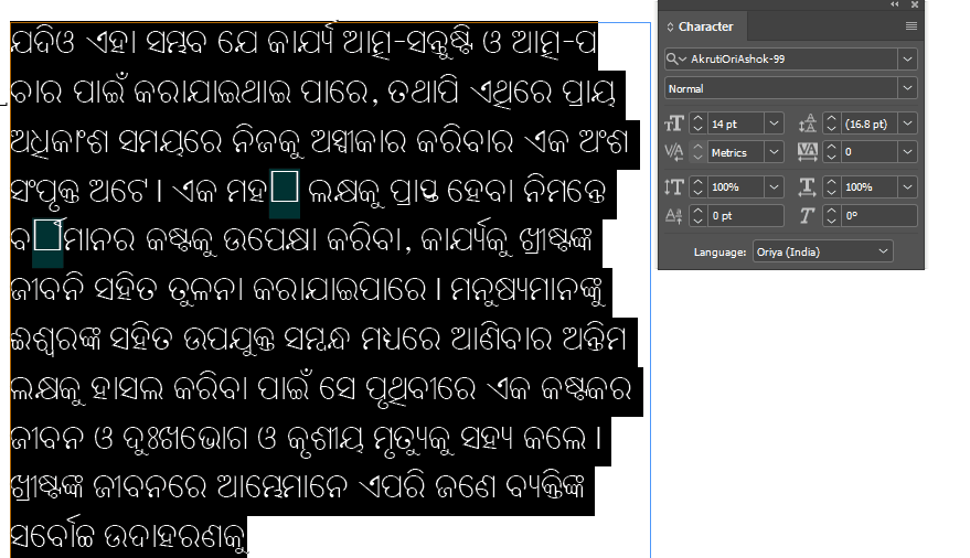
My source file is in Word, and that is showing correctly. I change the columns to match the ones in InDesign and it moves the whole words down to the next line. I attached some PDF exports from both Word and InDesign to show. I also included a screenshot from InDesign so you can see. Every place where there's no space at the end of the line is where there's a problem.
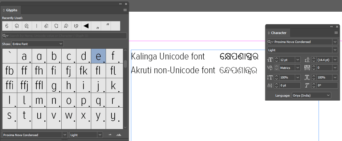
The fact that there are Latin-script style hyphens showing up in there makes me believe that this not a Unicode font. There are a few things going on here, but the upshot is that I don't think that you can trust your font to render with correct line breaks, either in Word or in InDesign.
First, I downloaded your PDF from Word, and found that the font you used was Akruti Ori Konark 99. That "99" makes me think that the font is at least twenty years old, so it was made long before Odia was included in the Unicode specification. Not a good sign, from a complex-script-DTP point of view.
I then did a side-by-side comparison between some known-good Odia text pulled from omniglot.com set in Kalinga, and the same word set in Akruti Ori Konark. Here's the animation; note that the Latin-script and the Odia in Kalinga are reported as the correct characters, whereas the Akruti font is just Latin-script codepoints replaced with Odia symbols:
So, InDesign is always going to try to hyphenate your Odia text, because it's not actually Odia text "under the hood." You need to make sure that hyphenation is turned off in InDesign on all of your Odia text. Next up, you need to make sure that you have an Odia reader to proof you work in InDesign, because as you can tell, you can't rely on InDesign to end your lines in places that make sense in Odia, because as far as InDesign knows, it's not Odia, it's just a jumble of nonsense Latin script, so it'll wrap wherever is appropriate for the underlying jumble:
A few final notes: I don't know what your project is, here, but I would never suggest that anyone try to do a typesetting project in a complex-script language in one of these old-fashioned twentieth-century fonts. There are ways to handle the stuff, but it's always a time-waster with a bunch of undesirable compromises. For instance, if you needed to make sure that the Akruti text never ended the line anywhere but a space, you could use a GREP style to apply No Break to all non-space characters. (Because, as in my example above, InDesign will happily break a line at an @ symbol, or an underscore, even if it's not surrounded by spaces.)
Additionally, the trick of trying to make the columns the same width in InDesign as in Word usually won't work, even with English documents, because InDesign renders fonts (and their spacing & sidebearing & etc.) very differently from how Word does it. So there will be minor differences in rag between Indy and Word, even if your column widths are precisely identical.
So, finally, here's an easy way to keep your old Odia font from wrapping in places that aren't spaces:
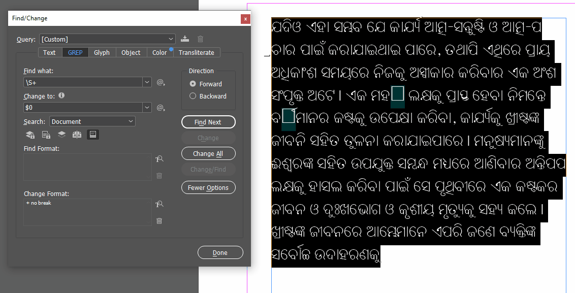
The GREP query being used here is \S+ which means "find all groups of one or more non-space characters" which then applies No Break to those groups. In your first example, in the places where it's breaking and leaving one character on the previous line, the misbehaving character is actually an underscore, and it won't break there if you apply No Break to it.
