Exit
  • Global community
    • Language:
      • Deutsch
      • English
      • Español
      • Français
      • Português
  • 日本語コミュニティ
  • 한국 커뮤니티
1

Optical Margin Alignment

New Here ,
Jul 23, 2019 Jul 23, 2019

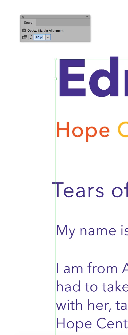
Hi, I'm wondering if there is a way to optically align left-flush characters without having to use the space before and negative kern trick.

In the below image you'll notice I've already enabled optical margin alignment but the E still sits very far from the edge of the frame.

2.5K
Translate
Report
Community guidelines
Be kind and respectful, give credit to the original source of content, and search for duplicates before posting. Learn more
community guidelines

correct answers 1 Correct answer

Explorer , Jul 23, 2019 Jul 23, 2019

Normally from my experience this also has to do with the font itself. You can try changing the title to use Optical Kerning as opposed to Metrics Kerning (if not already done) and see if that helps.

Otherwise because the Optical Margin Alignment point size is only set to 12pts (because that is most likely your body font) InDesign may simply not work the way you want it to for the large Title font, and you will need to manually kern it.

Large titles anyway are often manually kerned as it is more im

...
Translate
Community Expert ,
Jul 23, 2019 Jul 23, 2019

I'm wondering if there is a way to optically align left-flush characters without having to use the space before and negative kern trick.

I don't think so. Every font character includes a side-bearing, which is proportional to the font size and is more obvious with a sans serif. So you would have to reverse track a space in front to move the first character relative to the frame boundary.

Translate
Report
Community guidelines
Be kind and respectful, give credit to the original source of content, and search for duplicates before posting. Learn more
community guidelines
Explorer ,
Jul 23, 2019 Jul 23, 2019
LATEST

Normally from my experience this also has to do with the font itself. You can try changing the title to use Optical Kerning as opposed to Metrics Kerning (if not already done) and see if that helps.

Otherwise because the Optical Margin Alignment point size is only set to 12pts (because that is most likely your body font) InDesign may simply not work the way you want it to for the large Title font, and you will need to manually kern it.

Large titles anyway are often manually kerned as it is more important typographically to have just the right spacing between letters for a title.

Translate
Report
Community guidelines
Be kind and respectful, give credit to the original source of content, and search for duplicates before posting. Learn more
community guidelines