Participating Frequently
February 28, 2016
Answered

Pantone+ vs. Pantone Colors?

  • February 28, 2016
  • 5 replies
  • 34524 views

I just did a major upgrade going from snow leopard to el capitan and from CS3 to CC. In CS3, when I wanted to add a new color swatch I went to Swatches > New Color Swatch > Pantone Spot Coated. When I do that now, there are colors that I have used consistently in the past that are no longer showing in the list. In searching for answers, I am getting mixed results ranging from manually creating the pantone color I need to importing libraries from my old system. Some say to add, some say to delete the pantone+ and replace. I would appreciate any and all suggestions and feedback. Thanks!

This topic has been closed for replies.
Correct answer rob day

Ok, this is making more sense. So basically use the pantone+ when the color is available for a true cmyk definition, use the older library when the pantone color is not listed understanding it will be a simulation. Fyi, 99.9% of my jobs are printed cmyk so I do convert all my spot color selections to cmyk.

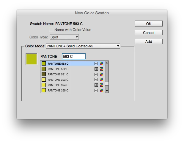
Having said that... what is the difference between the Pantone+ and the Pantone + Color Bridge Libraries (which I have never used). Maybe an example of what I'm trying to do will help. I want to use pantone 583. It is not listed in the Pantone+ solid coated... what are my options?

I really appreciate all the info. I have been in the business for 30+ years but as I am a "one man show" I do not have the benefits of networking with others who can help keep me up to date on changes/technology. I'm feeling like a nube right now. lol...

Rob... for the libraries I downloaded from the drop box... do I need to install all of them?

Thanks everyone!!!


Fyi, 99.9% of my jobs are printed cmyk so I do convert all my spot color selections to cmyk.

If you use the Pantone+ spot libraries, the conversion to process CMYK will be color managed Lab-to-CMYK and that's the biggest difference in InDesignCS6 and later—the output values will depend on your color settings. So that can be an effective way of simulating the spot color if you have the correct printer or press profile and you understand how the Color Settings' color intent choices work. So if you don't want to get into the intricacies of color conversions and the job is going to a typical offset condition then you'll want to start using the pre-defined Bridge libraries.

583 is not a new color so it should be in the installed libraries. Try typing 583 plaus a space in the search field:

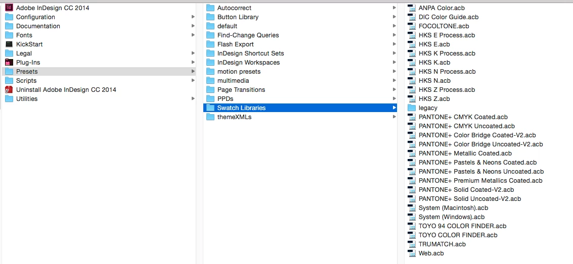
The Pantone Color libraries work like plugins. The .acb files that are in your Swatch libraries folder show up in the Swatches panel. Here's my setup:

5 replies

Participating Frequently
August 1, 2019

@ Rob - Interesting. The definition I have been using for PMS 280 for over 10 years is cmyk 100 | 72 | 0 | 18. My final product is a bright, vibrant blue (not dull like the cmyk shown in your attachment - it's more like the lab color shown). I think the gap between spot and cmyk printing has closed over the years as presses have become more sophisticated and accurate. What I have printed does match the colors in my pms books. If I was working for more corporate clients in a metro I would probably have to rethink my process.

rob day
Community Expert
Community Expert
August 1, 2019

I think the gap between spot and cmyk printing has closed over the years as presses have become more sophisticated and accurate.

I don’t think there's been much change in ink sets, CMYK still has a limited gamut relative to custom solid inks (think Pantone PurpleC).

Your 280 version is from the legacy Pantone solid library (which were all built CMYK definitions, not Lab) and if it is working for you that's great. But I don‘t think you could expect consistent results from any single set of device dependent CMYK formulas relative to the solid inks, because the color appearance of CMYK changes depending on the press profile.

The legacy 100|72|0|18 build does have better saturation, but is doesn't maintain the value of the Lab color. On my display the darker, saturated Lab value is a very close match to the printed solid ink in the Pantone book swatch.

The color managed conversion to GRACol is trying to match the dark value so saturation is sacrificed.

Participating Frequently
August 1, 2019

Hello All!

I am the original poster - I'm surprised to see this become active again after two years. Just goes to show there is a lot of interest and ideas on how to manage colors.

First - thanks to those who suggested the space after the 583 = that worked!!!

Second - As a small business, I chose to self manage my colors. My main concern was for my biggest client. Their logo contained PMS 280 which was a solid blue. When the new definitions came along it went to a very dark navy. My solution, though maybe clumsy, works. I simply copy the logo into each new file, it shows up in the swatches and I am good to go.

One more comment - I have read a lot of people using lab colors. As a print business, I convert them to CMYK before the job goes to press. If you are submitting your job for four color printing, I would make sure the colors are converted by you to assure you are getting what you want.

Thanks for all the feedback.

Rhonda

rob day
Community Expert
Community Expert
August 1, 2019

Their logo contained PMS 280 which was a solid blue. When the new definitions came along it went to a very dark navy. My solution, though maybe clumsy, works. I simply copy the logo into each new file, it shows up in the swatches and I am good to go.

I think this is a good example of why using Pantone's solid ink swatches as a reference for 4-color printing can be a problem.

The solid inks in Pantone‘s formula guides are not printed with CMYK process colors, they are custom mixed solid inks. That's the reason for the Lab definitions, is it is possible to use an instrument like a colorimeter to get an accurate color reading directly from the printed swatch. But, the accuracy of a displayed Lab color would depend on the accuracy of your monitor profile—to display a Lab color, InDesign or Photoshop has to convert the Lab values into your monitor’s RGB profile. If the monitor profile is not an accurate representation of your monitor calibration, then the Lab Pantone color could be off (or it might not be in the monitor‘s gamut).

Pantone 280 is out-of-gamut to most CMYK spaces—InDesign or Photoshop will show an out-of-gamut warning for the provided Lab values—and it's not really printable with any CMYK ink set. If the client cares about matching the color, the solid ink has to be run as a separate plate on press.

In the case of 280 neither a Bridge or converted CMYK color would match. Here the column on the left is a conversion from the Lab values to GRACol Coated. The out-of-gamut 280 doesn't match, but the other colors do because they are in GRACol‘s gamut:

arpanj8370114
Participant
July 30, 2019

I would suggest moving from CS3 or CC to the latest Photoshop edition which would automatically update all the Pantone Libraries. Furthermore, the latest Photoshop edition will have few predefined colors, but not all the Pantone colors. To avoid the translation from CMYK to RGB you must use the Pantone Color Bridge Shade Card RGB to CMYK. This shade card also comes with the Pantone software that can be used to import the color bridge libraries in photoshop. Once you have this library installed from the color bridge, you will be able to access all the spot and process colors.

The Coated & Uncoated color bridge set is a multi-purpose tool which could solve your need. It is best used for determining how Solid Colors will look when reproduced through the four-color printing process, as well as a HTML value reference for digital media display intent. This two-guide set features all the 1,845 PANTONE MATCHING SYSTEM Colors, some of which are missing as per your question shown side-by-side with their four-color process printed equivalents on both coated and uncoated paper, enabling printers and designers to quickly determine how closely Solid Colors can be matched in CMYK along with the software to install the libraries in photoshop.

Danny Whitehead.
Legend
August 1, 2019

arpanj8370114  wrote

I would suggest moving from CS3 or CC to the latest Photoshop edition which would automatically update all the Pantone Libraries. Furthermore, the latest Photoshop edition will have few predefined colors, but not all the Pantone colors. To avoid the translation from CMYK to RGB you must use the Pantone Color Bridge Shade Card RGB to CMYK. This shade card also comes with the Pantone software that can be used to import the color bridge libraries in photoshop. Once you have this library installed from the color bridge, you will be able to access all the spot and process colors.

The Coated & Uncoated color bridge set is a multi-purpose tool which could solve your need. It is best used for determining how Solid Colors will look when reproduced through the four-color printing process, as well as a HTML value reference for digital media display intent. This two-guide set features all the 1,845 PANTONE MATCHING SYSTEM Colors, some of which are missing as per your question shown side-by-side with their four-color process printed equivalents on both coated and uncoated paper, enabling printers and designers to quickly determine how closely Solid Colors can be matched in CMYK along with the software to install the libraries in photoshop.

This advice would only be correct if the company printing your work were printing to the exact same specifications that Pantone used to determine the CMYK builds in their 'Color Bridge' guides. They won't be. It's much more likely that they'll be printing to an industry standard like FOGRA39, in which case, if you want the closest CMYK match to Pantone solid, you use an ICC profile-based conversion.

Pantone has no business determining CMYK values, ever. The only useful function they have as a company is in defining spot colour ink formulas and their corresponding Lab values, for use only in spot colour print work.

Community Expert
August 1, 2019

https://forums.adobe.com/people/Danny+Whitehead.  wrote

…Pantone has no business determining CMYK values, ever. The only useful function they have as a company is in defining spot colour ink formulas and their corresponding Lab values, for use only in spot colour print work.

Hi Danny,

hm, do you suspect that the given Lab values are not as accurate as they could be?

Regards,
Uwe

hollymcalister
Participant
April 9, 2019

THANKS ROB >>2019 >>WORKED AWESOME THANK YOU

Participant
April 16, 2019

Same, and I gave it a shot because I saw your 2019 post. Thank you!

kglad
Community Expert
Community Expert
February 28, 2016

is this a photoshop question?

Participating Frequently
February 28, 2016

No. Did I post in the wrong forum? If so, I apologize. I have never put up a question before. This is for InDesign and Illustrator.

Steve Werner
Community Expert
Community Expert
February 28, 2016

See if this Adobe Help article is useful:

Pantone Plus color libraries in Adobe Illustrator CS6 and CC