

Copy link to clipboard
Copied
Does anyone know how does The New York Times achieve these perfectly justified columns without extra spacing without words?
How do I do that in In Design?


 1 Correct answer

I don’t think eliminating H&J violations means you’ll get the best setting—the violation highlight simply indicates lines where InDesign can no longer adhere to the rules you have set. So I might argue that the ideal is to not allow any hyphenation, word spacing, letter spacing, or glyph scaling (glyph scaling distorts the letter forms).
But obviously that’s not possible with a short measure—most of the lines create a violation—and it would look horrible with justified te
... 43
Replies
43
43
Replies
43
Copy link to clipboard
Copied
Without extra spacing between the words, I mean.

Copy link to clipboard
Copied
- Justified paragraph alignment.
- Hyphenation.
- (Sometimes) Editing text to avoid bad breaks and spreads.
- Spot text spacing control using tracking and text width, usually in very small amounts.
Much of that is likely done by automation, which can be used and optimized when you have a rigid overall format used across years.
—
Copy link to clipboard
Copied
I think that's the New Yorker, not the New York Times.
But to comment on spacing: They hyphenate and allow at least 2 hyphens in a row. I believe I see variations in word spacing. In the 2nd column, look at the line "great-grandfather planted a tree for my". It's definitely got tigher word spacing (probably down to a minimum value) so I think there is a range of word spacing in composition settings. There could even be variations in glyph scaling which are basically invisible to see with your eye. We would have to actually look at the compostion settings to know for sure.
Copy link to clipboard
Copied
True, it's The New Yorker, sorry.
Copy link to clipboard
Copied
The hyphenation settings suggested in this (quite old) video tutorial makes my columns look worse.
Copy link to clipboard
Copied
Here is the link:
Cornish InDesign how to make justified type look good - YouTube
Copy link to clipboard
Copied
It's not just hyphenation settings, it's also Justification settings:

Copy link to clipboard
Copied
The illustration above just shows the defaults but they can be customized for best results.
Copy link to clipboard
Copied
And half a dozen other things, to get a professional result.
—
Copy link to clipboard
Copied
Can someone share the perfect settings?
Copy link to clipboard
Copied
For 3 columns?

Copy link to clipboard
Copied
I'm interested to see what the other forums regulars post as their "perfect settings"; I'm going to throw out that I don't believe such settings exist. Perfect layouts don't exist, and close-to-perfect layouts require human intervention. The spacing on the first and second lines of any given paragraph can affect all the rest of the lines.
My quick-and-dirty settings allow one percent of glyph scaling in either direction, one or two percent of letter spacing in either direction, word spacing of 90/100/110, and then I ride the lines, looking at how every single line is rendering, and tweaking stuff a bit if I think I can get better text layout or ink density or whatever. I allow myself up to five points of tracking if I need it. Sometimes I manually hyphenate a word. (That's rare for me, in English, but in languages with higher average character count per word, I might lean on hyphenation a lot more.)
Important part is in bold 🙂
Honestly I think James and Steve already answered your question above. Maybe some copy editing, maybe some judicious manual spacing tweaks?
Copy link to clipboard
Copied
That well describes how we used to work when I was in the newspaper business.
Copy link to clipboard
Copied
So before printout, they adjust the text by each paragraph or each frame, or usually that has to be done rarely, once they found the perfect settings for their layout?

Copy link to clipboard
Copied
No. Usually, this is made by trying different settings when the templates are set up. But it can be a long process.
Copy link to clipboard
Copied
Look at the third column (left) after "prescribed burning or clear cutting" that long dash ---- and many of them, are quite annoying, I think that's what they use to fill in the gaps.
Copy link to clipboard
Copied
Sigh.
"That long dash" is exactly that, an em-dash, and it's used very specifically in typesetting to set off a clause in a certain way.
There are no "perfect settings" as you request. If there were, there wouldn't be any menus to change the values; Adobe would just set things to "perfect" and move on. But it doesn't work that way.
I and the others here are willing to help and answer questions all day long, but the answers are only going to make sense if we share the same understanding. From your many questions (and many arguments against things you are told), I think you are reaching for very advanced, sophisticated, elegant results with a very, very limited understanding of some important basics.
You need to start with basic lessons on typography, layout, etc. so that you fully understand what you're looking at in these magazine pages, and not just say "I wanna do THAT!" when you see something you like. Mastering the tool is never the same thing as mastering the task. Understand the task, then work on understanding how a tool like ID helps you complete the task and achieve the goal.
TL;DR? All of this is a lot harder, a lot more complex and a lot more dependent on broad basic knowledge than it is on learning which button to click.
—

Copy link to clipboard
Copied
- Lots of justification control. When I lay out long documents I usually have at least three versions of every body copy style: normal, loose, and tight. If I want a paragraph to be a line shorter I will try the tight version of the style. I do this often when I have a word going onto the next line (widow, I believe, although after years I still mess up which is orphan and which is widow). If I want a paragraph to be a line longer (perhaps the following paragraph is starting at the bottom of a column) I will apply the loose version.
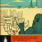
- Adjust picture sizes. That spider comic or the graphic on the left hand page (or graphics in the story on pages we cannot see) can be adjusted to take up more or less space, allowing the story to fit the required area.
- Pull quotes. Pull quotes main function is to fill space and give the designer options to fit the story in the space provided.
- Edit.
Copy link to clipboard
Copied
And maybe the most important step:
5. Iterate.
Once in a while one straight pass through a layout will get you to a satisfactory result. But often, when it's important to get it somewhere between "right," "perfect" and "elegant," you will likely have to back up and start again several times. Undo all the text tweaks and start with another major change like resizing a graphic or increasing a headline spacing a bit, then tweak it paragraph by paragraph, using all the options, until you get to the end and you just can't do a better fitting.
—
Copy link to clipboard
Copied
One other facor which affects the paragraph that hasn't been mentioned is the relationship between the column width and the nuber of glyphs that will fit in that width. The narrower the column in ratiuon to the glyph count, tha harder it beomes to get a smooth look.
Copy link to clipboard
Copied
Ah I thought it's getting easier with narrower columns. I'll experiment then with wider columns.
Copy link to clipboard
Copied
Some letters definitely seem thicker and more black when looking at the screenshot at a small size, and indeed there are spacing changes between the letters, plus extensive use of dashes wherever possible, it seems that's how they create the perfect justification.
Copy link to clipboard
Copied
So yes it works great, the hyphenation and justification settings in the paragraph style settings, I found a ratio that seem to perfectly justify for 3 columns:

No need to stress out ( I thought I can't justify it).
Copy link to clipboard
Copied
It seems that justification actually works extremely well.
I turned on H&J violations in composition highlighting and I played with my justification settings until all the yellow highlighting disappeared, meaning that it's possible to find a setting without any visible artifacts, if anyone is interested in the setting, the font size is also visible:

-
- 1
- 2

Find more inspiration, events, and resources on the new Adobe Community
Explore Now
 AdChoices