Copy link to clipboard
Copied
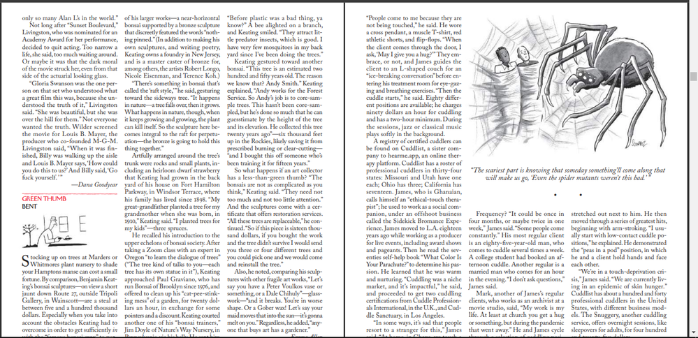
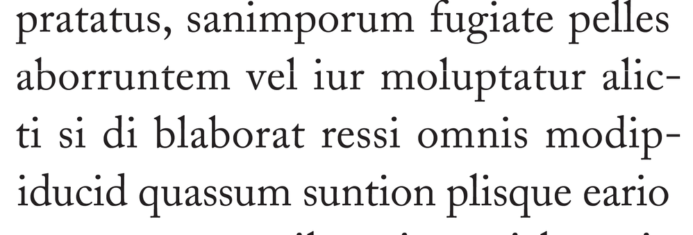
Does anyone know how does The New York Times achieve these perfectly justified columns without extra spacing without words?
How do I do that in In Design?
 1 Correct answer
I don’t think eliminating H&J violations means you’ll get the best setting—the violation highlight simply indicates lines where InDesign can no longer adhere to the rules you have set. So I might argue that the ideal is to not allow any hyphenation, word spacing, letter spacing, or glyph scaling (glyph scaling distorts the letter forms).
But obviously that’s not possible with a short measure—most of the lines create a violation—and it would look horrible with justified te
...Copy link to clipboard
Copied
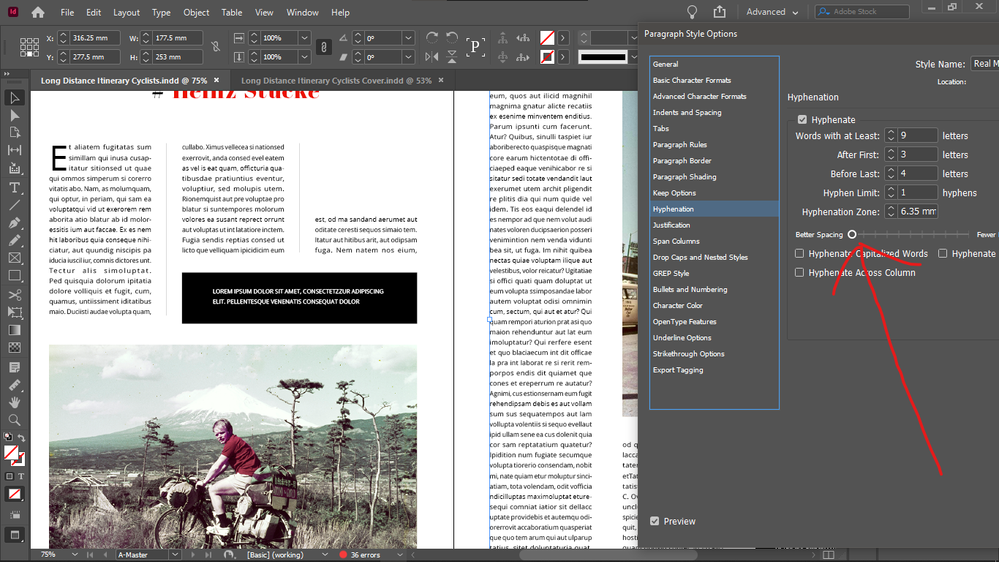
And if the Hyphenation slider is dragged down totally to "Better spacing" it's even better, and no H&J violations highlighting at all in 2 pages.
Copy link to clipboard
Copied
Right. And now you have a perfect solution for those two pages.
Which is how it works. All the tools will do almost anything... but not by themselves.
—
Copy link to clipboard
Copied
I don’t think eliminating H&J violations means you’ll get the best setting—the violation highlight simply indicates lines where InDesign can no longer adhere to the rules you have set. So I might argue that the ideal is to not allow any hyphenation, word spacing, letter spacing, or glyph scaling (glyph scaling distorts the letter forms).
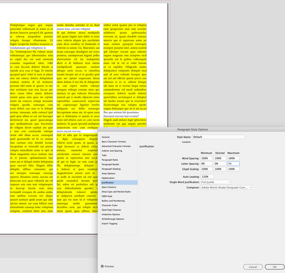
But obviously that’s not possible with a short measure—most of the lines create a violation—and it would look horrible with justified text as InDesign makes adjustments without knowing what your preferences are:
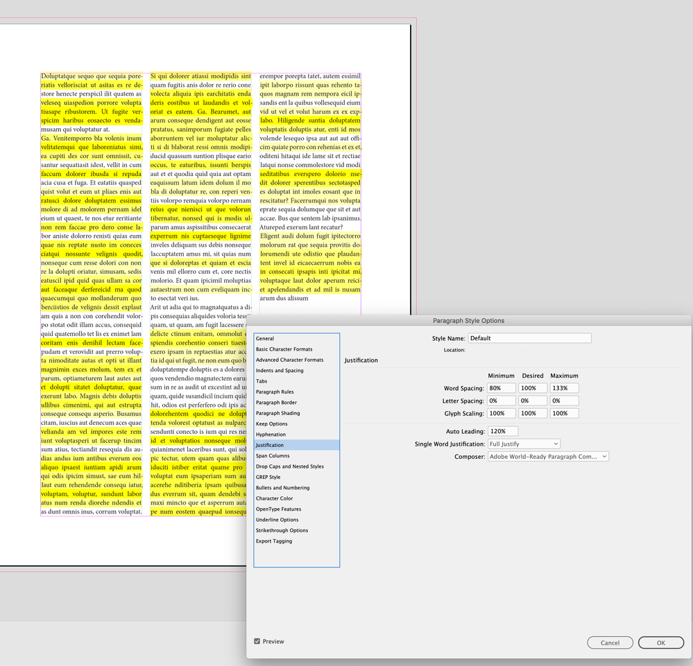
The InDesign default loosens up the rules for Word Spacing and allows word spacing to flex between the 80% and 133% , with the ideal being 100%. However, there will still be violations because there is no flexibility allowed with letter spacing and glyph scaling
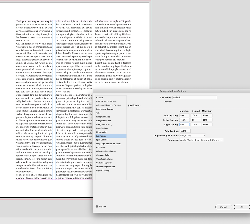
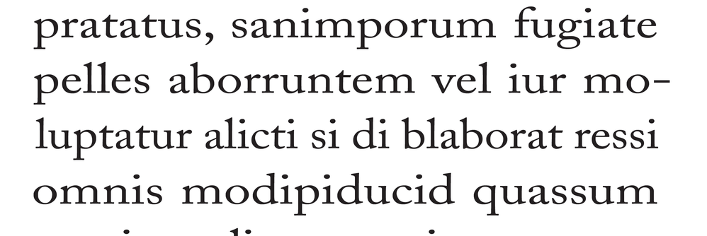
If I set very liberal rules for word/letter spacing and glyph scaling, I can get rid of the violations, but at the cost of distorting and tracking the text:
I can tighten up the rules, get less distortions and tracking, and live with the violations:
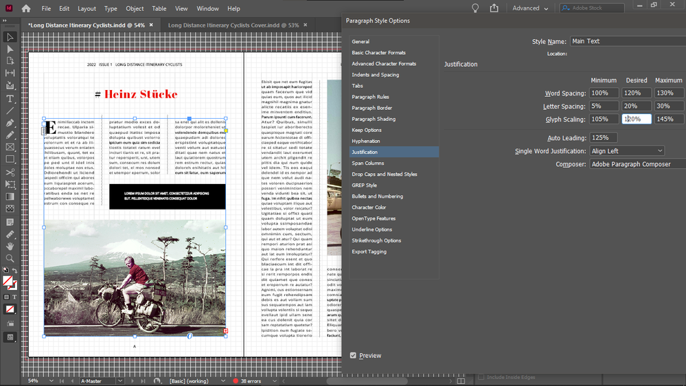
I would rethink your 105% |120% |145% Glyph scaling—it’s distorting the the horizontal scaling to the point where it would be obvious to the reader. You want the desired setting to be 100%, and only allow a slight Minimum and Maximum change so the scaling is not discernible.
105|120|145 distortion:
Copy link to clipboard
Copied
I see. I thought that no violations means perfect text, thanks for sorting this out.
Copy link to clipboard
Copied
Hyphenation: 9, 3, 4, 1, 1p6, off, off, off
Justification:
80,100,120
-5%, 0%, 5%
95%, 100%, 105%
Keep Lines 2 and 2
Also, set the paragraph style to Optical kerning.
I promise you nearly perfect typesetting right out of the gate.
Copy link to clipboard
Copied
Thanks.
Copy link to clipboard
Copied
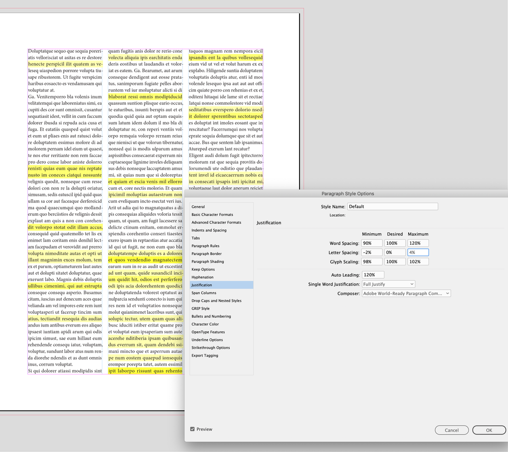
Using your settings:
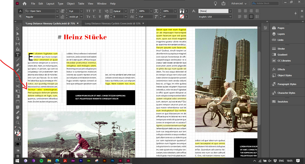
Only the line pointed by the red arrow has rivers.
Compared with my "no H&J violations" setting (metric kerning, default hyphenationa and hyphenation slider all the way down to "better spacing") which has been declared as wrong way to justify:
Your settings work very well.
Copy link to clipboard
Copied
I don’t see any hyphens in the problem paragraphs—are you sure Hyphenation is turned on for those paragraphs? I think the built in greeked text isn’t hyphenating the way you would expect with normal text.
Copy link to clipboard
Copied
It's the hyphenation recipe of Mike, so it's definitely activated, but as I mentioned, " the hyphenation slider is all the way down to "better spacing":
Copy link to clipboard
Copied
I have set it all the way down to better spacing because the slider doesn't seem to change or shuffle the actual hyphenation settings above it.
Copy link to clipboard
Copied
So Mike's settings are still valid.
Copy link to clipboard
Copied
What do you mean by "lines 2 and 2"?
Copy link to clipboard
Copied
I believe Mike means in the Keep otions you should set it to keep two lines together at both start and end of paragraph.
Copy link to clipboard
Copied
Ah, I see.
Copy link to clipboard
Copied
One hint from me:
If you setup your details with typography, any details, always do this on actual readable text and never do this on "Lorem Ipsum" filler text.
Regards,
Uwe Laubender
( Adobe Community Professional )
Copy link to clipboard
Copied
Copy link to clipboard
Copied
Copy link to clipboard
Copied
Great stuff.
Copy link to clipboard
Copied
Don't demo it on fake latin text. Use English. I promise you, the previously denoted numbers will do some nice typesetting for you!
-
- 1
- 2
Find more inspiration, events, and resources on the new Adobe Community
Explore Now
