Answered
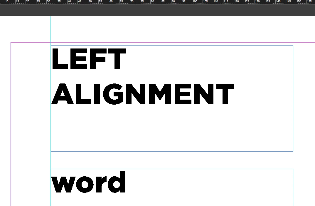
Precise alignment of text
How can I align the first alphabet of the word to the left most edge of the text box? By default InDesign leaves some gap on left even when I create text in text box within a new document.

How can I align the first alphabet of the word to the left most edge of the text box? By default InDesign leaves some gap on left even when I create text in text box within a new document.
Ok. Below another screenshot and the link to that document on my Dropbox.
Text frame on top with kerning the special character and the first character of the paragraph.
Text frame at the bottom: No special character and no kerning.
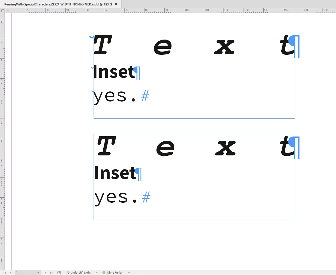
Download my sample document ( InDesign 2020 version 15.1.1.103 ) :
Regards,
Uwe Laubender
( ACP )
Already have an account? Login
Enter your E-mail address. We'll send you an e-mail with instructions to reset your password.