Copy link to clipboard
Copied
Hey everyone,
I'm trying to set up a new document / booklet for printing and I was wondering were to find a sort of rule for having visually pleasing proportions and grids in my document.
As long as I don't have any specification I can choose each dimension the way I want to, but I'm a bit indecisive how to set up the document correctly in order to have a good final result.
The final document will be about 50 pages in total (facing pages) and presumably it will be binded with regular large-sized staples. According to that I already know that I want a similar look to the image below:
Example
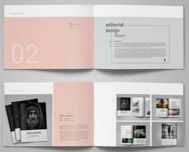
which, in words, means: wider format with a relatively short height.
When it comes to printing I usually work with a space/channel of 3/4 mm in between grids and I usually like to have at least 6 colums / rows per page (not necessarily in equal number) as I like to split the text in two colums if the text is too long.
In terms of content I will be mostly adding pictures (moodboards) and graphs, so I need also some flexibility.
Ideally I have established that a good height could be 160 mm (not too small but not too big), but I'm kind of stuck here.
How to establish the lenght, how many colums, the margin sizes and so on.
Any suggestions?
Are there any scientific rules to follow?
Copy link to clipboard
Copied
Copy link to clipboard
Copied
There are so many things that go into designing a document including the aesthetic for the client. But some things like the grid and the ratio of the font from headline to body text can be determined. If you have access to LinkedIn Learning, you might want to look at some of Nigel French's courses where he discusses these issues in detail.
Copy link to clipboard
Copied
If you want a rule to follow, it would be the golden ratio. If your document height is 160mm, then I would make the width 259mm.
Copy link to clipboard
Copied
@Jeffrey_Smith @michelew83603738 @Willi Adelberger
I'm sure we're all overcomplicating things here as I was just asking for a quick suggestion in terms of measurments and proportions.
Going in order:
- I have a student discount, which means that the printing price will be very low regardless of the document size.
- Still not sure about the main font I'll be using, but I'd opt for something relatively modern. I don't know, maybe Helvetica Now Display or Montserrat. Will see... or eventually something else.
This is the document that I've started to set up:
Draft
As you can see from the image I want a relatively wide document that will still maintain well its proportions.
These are the measurements that I've been using so far:
H: 160 mm
L: 240 mm
Top Margin: 10 mm
Bottom Margin: 14 mm
Inside Margin: 10
Outside Margin: 14 mm
Channel: 4 mm
Of all these dimensions I know for sure that I want to have a channel of 4 mm as I've already used it in the past and I liked it... but I'm still a bit confused about the other measurments. What would you do instead?
Get ready! An upgraded Adobe Community experience is coming in January.
Learn more