

Problem with font jonction

Copy link to clipboard
Copied
Hello,
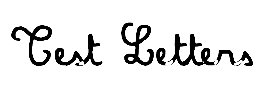
I'm trying to use a font and I'm having some troubles with it.
I used it before on Illustrator and other and never had any problem with it, but now that I'm on Indesign I get some negative effect on the junction of the letters.
How could I avoid it?
Thank you for your answers !


 7
Replies
7
7
Replies
7
Copy link to clipboard
Copied
Questions that would assist in helping: Please tell us what operating system (exactly) you're running. Please tell us (exactly) what InDesign version you're using. EXACTLY what font are you having problems with.
Do you have a "clean" copy of the font in case the one you're using has become corrupted (yes, fonts can get corrupted; they're just another kind of software)?
Copy link to clipboard
Copied
Hello,
For the system I run on Windows 10, 64 and I'm working with InDesign 16,1.
I have few copies of the font, an original one that I used before and had no problem with in InDesign and a fresh one incase it got somehow courupted. The font is Amandine from philing.net it's pretty old but has been working fine.

Copy link to clipboard
Copied
If this typeface is one you got from a "free" website, chances are it wasn't created very well. This effect is caused by a flaw in the typeface where one or more of the letters' outlines were drawn "in the wrong direction" so in essence is cutting a hole in the character before it when they overlap. Why it's happening for you in InDesign specifically and not in others, I don't know, but if it is indeed a flaw with the typeface, there won't be much you can do with it: There's nop 'setting' to fix it. If you are just using it for a small amount of text, I suggest you create it in Illustrator and place it in ID.
Speaking of Illustrator, if you type the exact same sentence and convert that text to outlines, does it show the knockouts there also? Curious.
Copy link to clipboard
Copied
Hello,
I've used that font a couple of months ago with InDesign without any problems.
It does work fine in Illustrator and doesn't create that negative effect when overlapping, I though that it could be the default setup of InDesign that changed to that.. The "Hole" is really the area where two letters are overlapping for cursive.
Copy link to clipboard
Copied
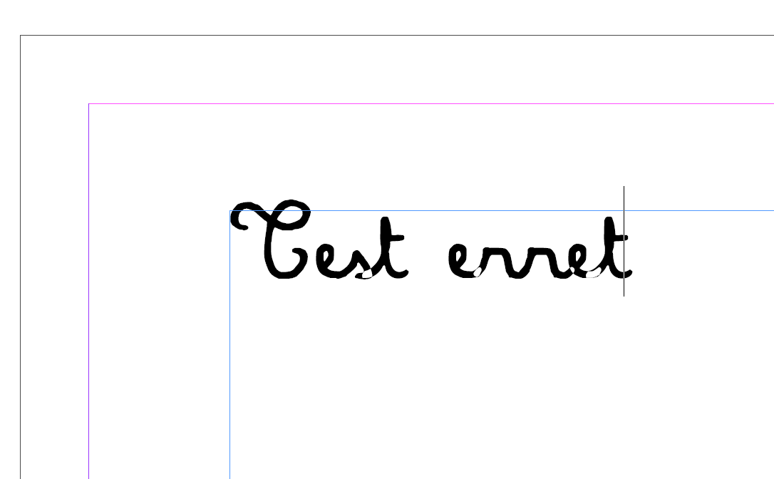
So, I downloaded that font, both in TrueType and Type 1.
The TrueType version did exactly the same thing as you've experienced, but the Type 1 worked fine, so there's a flaw in the TrueType one. I also converted it to OTF and that worked fine as well. Since Type 1 is on its way out, you might do the OTF converrsion: there are a few online converters to do just that if you want to do it for yourself. just search for "convert to OTF"
Copy link to clipboard
Copied
Hello and thank you for the answer,
Folowing what you said I converted to OTF. It looked like it work in the first place but after exporting I get the same result as well as i zoom in I see that I get the same trouble.
Copy link to clipboard
Copied
So, I looked at trying both flavours of OTF. I took the TTF version and made an OTF out of that: the problem still existed, which is what you just experienced.
However, when I took the Type 1 version and made an OTF out of that, it works fine.
So again, there seems to be a flaw in the TrueType version this fellow created.
Since it's freeware, I will send you the OTF I made directly to you to test. But this is the problem with getting fonts from the Internet... they aren't necessarily the best-made fonts you can get, expecially ones made with software that's over 20 years old since he made this font in 1998.
Make sure you remove all other versions before doing this as they will conflict, name-wise.

 AdChoices