Recent changes to GUI scaling
Copy link to clipboard
Copied
Hi all.
Am I the only one having experienced strange GUI-scaling issues lately?
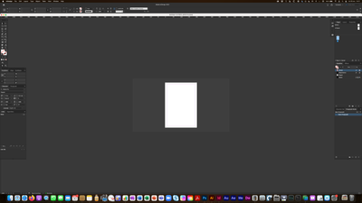
InDesign has always behaved quite flawlessly GUI-wise for me, but for a few weeks, I've noticed that View –> Actual Size results in a very tiny display of my document, not by any means the 100% stated in the window header.
Today, things went to the next level: when I started up InDesign just now, all my menus were upscaled to the point of looking really silly. The solution was to go to Preferences –> User Interface Scaling and select Small. I've never had to do that before.
In short time, there have been two major changes in the way InDesign behaves on my screen. Both these issues are completely new to me. Are they the result of the latest upgrade?
I'm now on CC 17.0.1, my hardware is a MacBook Pro with Big Sur 11.6 and an external Samsung 4k monitor (GUI scaled to 3360x1890 in the Mac's prefs).
Copy link to clipboard
Copied
Here is a screenshot of a document viewed in (according to InDesign) Actual Size (the document is in A4, similar to US Letter).
Copy link to clipboard
Copied
Now that I have been forced to set Preferences –> User Interface Scaling to Small, I notice that the resulting GUI is slightly smaller in scale than what I had the last time I used InDesign. A bit too small for me.
It would be great to have more stops on the scaler.
Copy link to clipboard
Copied
With UI Scaling set to Small in InDesign 2022 and comparing with InDesign 2021, the GUI of both applications is the same size.
Copy link to clipboard
Copied
Hi, thanks for your reply, but not on my computer, I'm stuck with slightly smaller menus than before, unfortunately. If this is not supposed to be the case, there is a bug somewhere.
(And the next step up gives me far too big menus.)
Copy link to clipboard
Copied
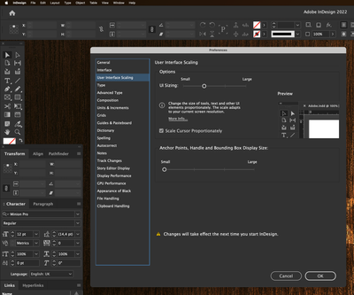
I'm not able to produce any screenshots from the previous version, but what I can do is show another strange thing: how the preview in the UI scaling pane does not match what I actually get.
In the image below, I have set the UI to the second (of four) stops (which – as I mentioned – renders far too big menus) and then restarted InDesign. The screenshot is taken with those second-stop menus in place. But when I go into Preferences again and select different stops on the scale, the preview of the second stop does NOT match the menus I have. The width of the vertical toolbox has grown from ~173 px to ~210 px, some 20%.
Something is definitely fishy here.
Copy link to clipboard
Copied
>With UI Scaling set to Small in InDesign 2022 and comparing with InDesign 2021, the GUI of both applications is the same size.
This is my experience too--same size.
Windows 10,
Scaling set to 125% on 27-inch 4K monitor,
ID 17.x set to small setting
Copy link to clipboard
Copied
Hi @H Chinaski:
Yes, this is the result of the latest upgrade. User Interface Scaling is a new feature in 2022 (v17) that's why you haven't encountered it before. Also, the scaling options differ based on the resolution of the monitor. For example, on a 4K monitor you may have 5 stops, but on the Full HD monitor, you might just see 2 stops.
If you are unhappy with how it is working, I encourage you to post feedback on this feature on the InDesign User Voice page—this is a user-to-user forum. We can explain features, but can't fix anything that isn't to your liking.
https://indesign.uservoice.com
~Barb
Copy link to clipboard
Copied
Thanks for info, I just realised that this is the case when I ditched my prefs and got a welcome screen telling me about this new "feature".
I know Adobe (sadly) never monitors the conversations here and I hope I didn't give the impression that I expected them to do so. Just wanted to discuss these issues and get a grip on whether anyone else has experienced them – and maybe offer some consolation and advice to anyone googling for reasons why their computer behaves strangely.
I'll post on User voice and ask them to include more stops on the scaler in future versions. My screen is 5k (not 4k as I thought above) and still I only see three stops. I only run it in 3360x1890, but still.
Copy link to clipboard
Copied
Also, I'll ask them to review that 100% setting, it seems to be based on the old assumption that 100% always equals 72 ppi or something.
Copy link to clipboard
Copied
At 3360 x 1890, UI Scaling Slider should show 4 stops. Could you clear your cache/prefs and try to see this again?
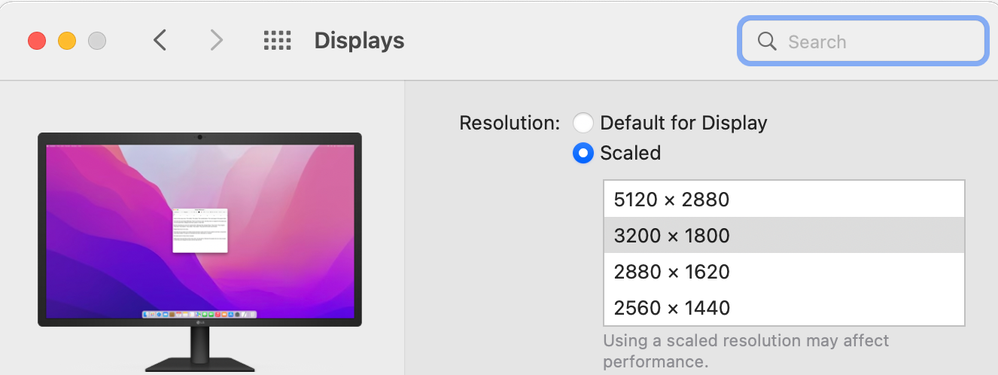
Also, if could you recheck what's the Scaled Resolution in the Displays section of System Preferences that you have set for your 5K monitor? The Default for Display resolution should be 2560 x 1440 and the next higher Scaled Resolutions available should be : 2880 x 1620, 3200 x 1800, 5120 x 2880.
Copy link to clipboard
Copied
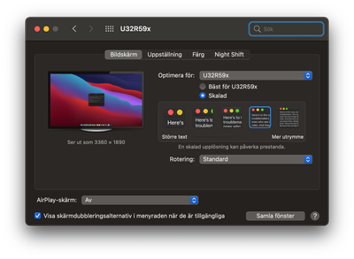
Here is my settings pane, with the 3360x1890 option selected:
There are four stops on the slider now. 😕
Copy link to clipboard
Copied
If you can Option-click on 'Skalad' there, then you should see something like this:
can you post a screenshot of that?
Copy link to clipboard
Copied
Nice trick! (The same info is stated in my previous screenshot, under the image to the left.)
(And I realise now that the highest resolution is 4k, meaning that my screen is not a 5k monitor after all.)
I get more resolution options with your trick. But please note that my problem is not whether I have the correct screen resolution or not. To recapitulate: my first problem is that View –> Actual sice gives me something like a 25% view, thought it says 100%; my second problem is that my menus are either just too small or way too big, depending on which stop on the UI scaler I select.
Find more inspiration, events, and resources on the new Adobe Community
Explore Now


