keithconover
Inspiring
March 7, 2019
Question

running section header DESIGN

  • March 7, 2019
  • 4 replies
  • 4304 views

This is not a technical question about how to create or format running headers. I've got that down (finally) and have posted on it elsewhere on this forum.

This is a question about using InDesign's running header/footer capability to best effect on the page.

I am writing a textbook that I am self-publishing online, and have to choose a design for the running headers. I would like to have page numbers, a notation of which chapter it is, a section header, and a subsection header.

I have developed two completely different styles of running headers/footers and can't decide between them. I would like your help, and I think the discussion might be of wider benefit, which is why I am posting this here.

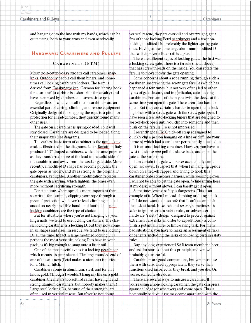
The first uses traditional positions: top and bottom, both towards away from the spine and towards the spine. This gives you four places to put headers, though one of them you should use for a page number. I think most would agree that the top away from the spine is the most prominent place, the bottom away from the spine the next most important place, and then towards the spine on the top and then towards the spine on the bottom. So, you can place your headers and page number based on position, and this provides some sort of hierarchy.

You can also differentiate your section headers by using typeface weight or tinting. In general, I like tinting (fading) more.

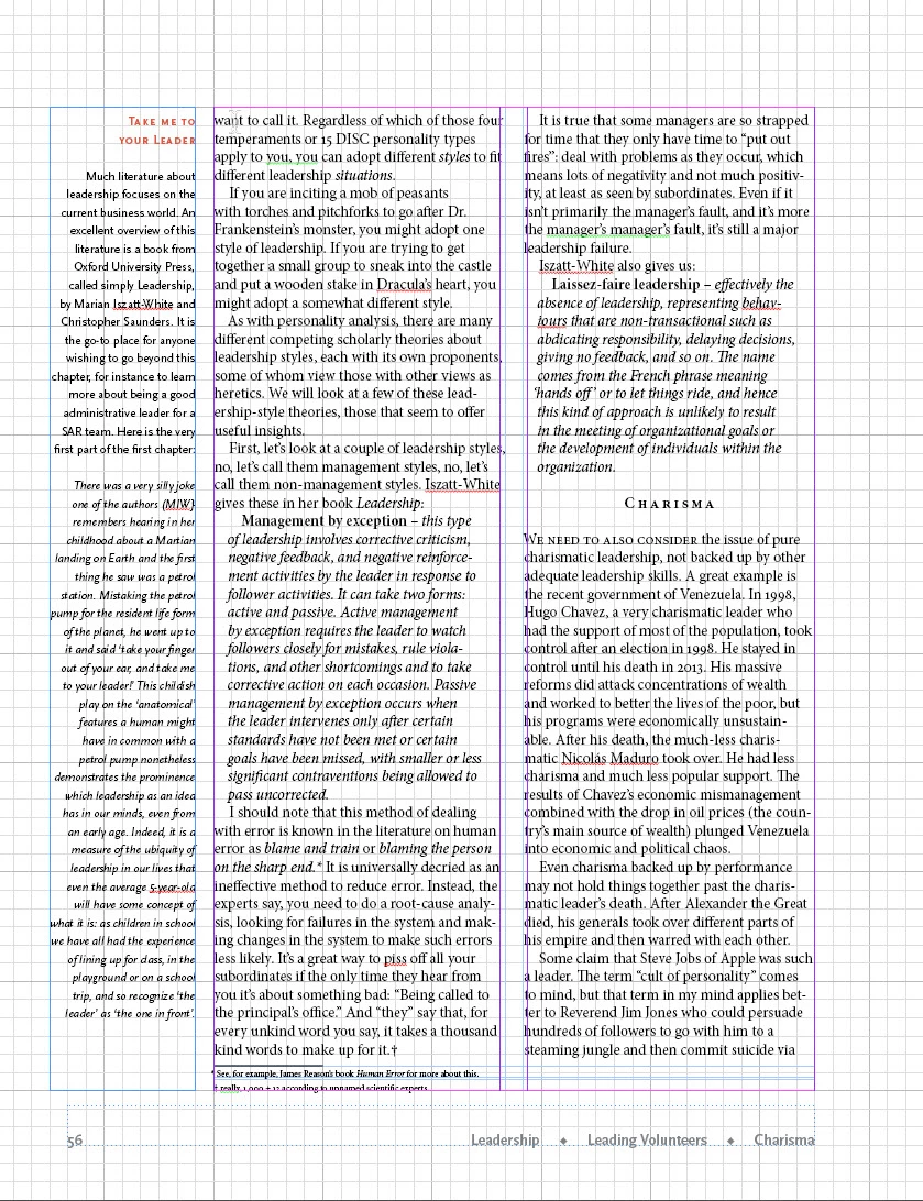
But on websites, people are getting used to what we call breadcrumb trails to provide a sense of where you are in the website, something that for a printed book is provided by physical clues as well as section headers.

For example, at the top of a webpage, it might say Main Page > Subpage > subsubpage to give you an idea of where you are in the hierarchy.

So, here are two pages with two different ways to manage chapter title and section and subsection headers using InDesign. Please help me choose between them.
Thank you for your thoughts.

    This topic has been closed for replies.

    4 replies

    keithconover
    Inspiring
    March 21, 2019

    Thanks, Cindy. I decided that it makes more sense to have the "breadcrumb trail" at the top, so here is a spread with it that way.

    Community Expert
    March 22, 2019

    Hi Keith,

    I wonder why you are doing all body text with Justify Left instead of Justified.

    Regards,
    Uwe

    keithconover
    Inspiring
    March 22, 2019

    Actually it's not even justify left, it's just left. I finally decided I like that better after having read through Robert Bringhurst Elements of Typography and digested it for a bit. At least for this particular text book. But also in general as a default.

    Community Expert
    March 8, 2019

    Hi Keith,

    if you want to discuss different designs show at least facing pages with no guides at all, only the edges of the pages.

    And if we should compare designs show the same contents with different designs.

    Regards,
    Uwe

    Dave Creamer of IDEAS
    Community Expert
    Community Expert
    March 7, 2019

    I p[refer the placement of the first example, but the overall page design of the second.

    Also, are the page numbers in either example (and the section head on the first example) actually aligning to anything? They seem to be floating on the page.

    David Creamer: Community Expert (ACI and ACE 1995-2023)
    keithconover
    Inspiring
    March 8, 2019

    Here are the pages without the grids. The page number is deliberately hanging out there. I should align with the minimum sidebar/graphic, which I will do.

    jane-e
    Community Expert
    Community Expert
    March 8, 2019

    Hi Keith,

    Although you aren’t asking, the second layout has two sets of duplicate words and the gutter does not match the underlying structure.

    Are you using a baseline grid to automatically align the baselines or a document grid to manually check that they are aligned?

    Jane

    Known Participant
    March 7, 2019

    Hi, Keith,

    It's hard to tell what either will look like with all the grids and guides showing, but I think I prefer the second only because it's less traditional and would take up less space on a digital page. However, I'd want to see both without the grids and guides; I'm concerned that the gutter between the marginal note (?) and column 1 may not be wide enough.