Copy link to clipboard
Copied
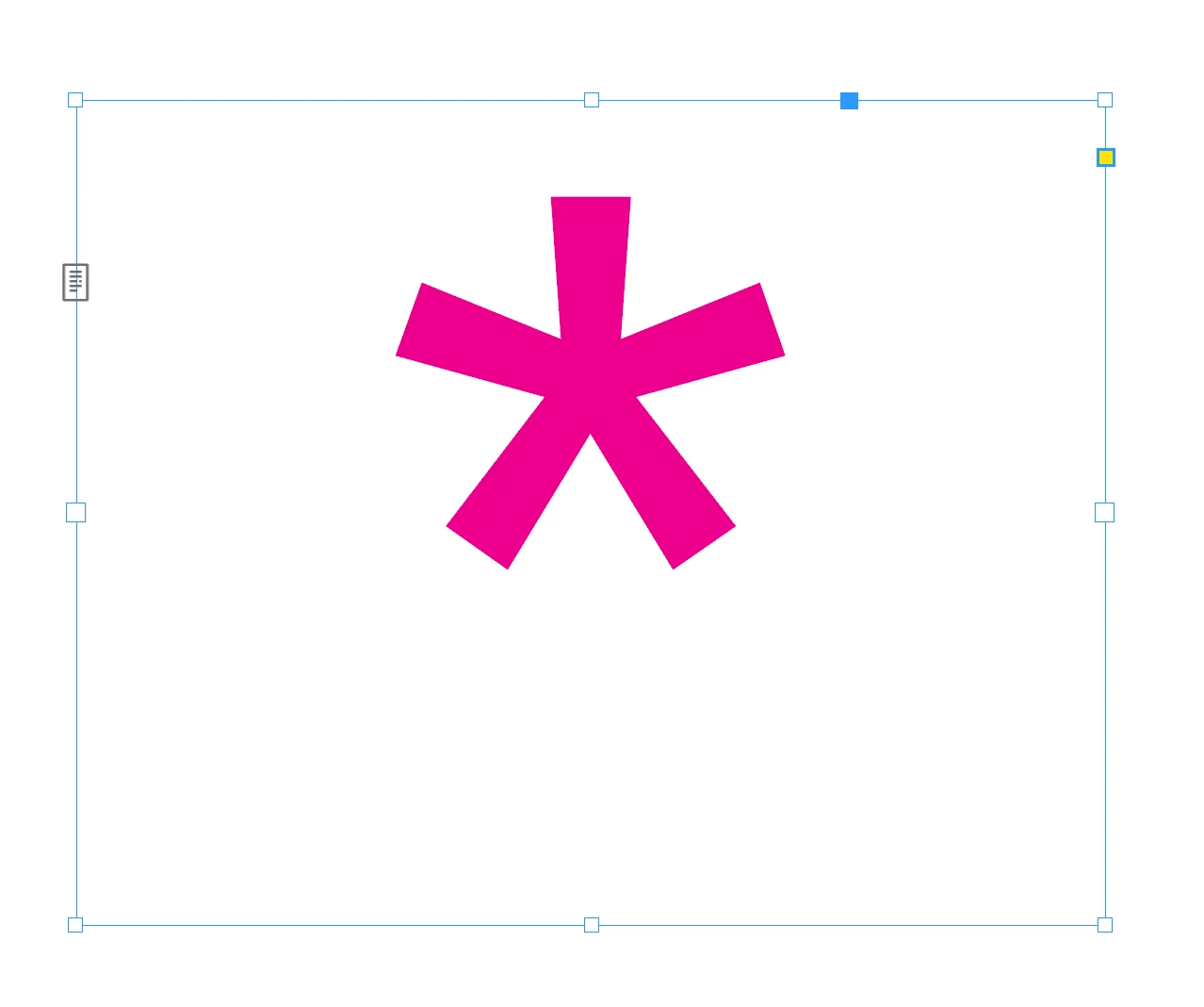
Here's what I've got. Can't make the box any shorter without the asterisk disappearing...
Can this be adjusted?
thanks
Copy link to clipboard
Copied
Using a wingding 2 glyph, instead of an asterisk will allow for a tighter fit of frame.
Copy link to clipboard
Copied
If what Jeffrey suggested isn't suitable for you, you can convert the sterisk character to outlines, which gives you a precise fit.
Copy link to clipboard
Copied
Good suggestions (since an asterisk is a small, offset glyph, a more centered one is probably a good choice). But if the box is invisible, why does the space around it matter? Can't you just position the box so that the glyph is where you want it?
Copy link to clipboard
Copied
Good question. It's going into a box that isn't transparent. 🙂
Copy link to clipboard
Copied
It... seems like it could be, if all it holds is the asterisk. Even if that's being attached to, say, another text frame that does have a tinted background.
Copy link to clipboard
Copied
That's what I thought/expected, too, but it seems to treat the asterisk as a full-height letter to the baseline.
Copy link to clipboard
Copied
I'm still unclear on the need here. For example, this works fine with the box being "oversized":
Find more inspiration, events, and resources on the new Adobe Community
Explore Now