- Home
- InDesign
- Discussions
- Spot-to-CMYK conversion: Pantone vs. ID
- Spot-to-CMYK conversion: Pantone vs. ID
Spot-to-CMYK conversion: Pantone vs. ID
Copy link to clipboard
Copied
I know this is not a new issue, and was discussed here, but more from the point of view of the visual aspect of colors on one's screen.
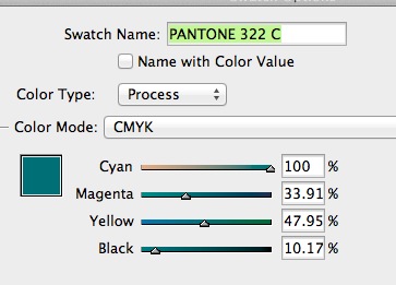
I'm baffled as to the conversion of spot colors for printing purposes (sheet-fed).... My client wants me to use PMS 322c in a CMYK job, and she's been always very picky about colors and the way they print. The difference in the conversion formulas between ID and using Pantone's website -- is striking.... See how ID has a significant amount of M, yet low K, while Panton suggests ZERO M and lots of K.... So I'm asking, WHO CAN I TRUST???....

Copy link to clipboard
Copied
Well the colour you want is 322C
not P 125-16C
The CMYK for Pantone 322 C clearly states "n/a"
I suggest you do a sample with the colours and ask the printers to provide you with printed samples so you can make an informed decision.
Copy link to clipboard
Copied
Copy link to clipboard
Copied
But Pantone still is offering P 125-16 C next to the 322 C.... The RGB values are quite close, so I can assume that an official accurate conversion is not available, but this is the closest... Still it's quite different than ID's....
Asking a printer to do what you suggest is not realistic, certainly not in the price range of this job (5,000 copies)....
How did you get to this, your "own" formula?
Copy link to clipboard
Copied
PMS 322c in a CMYK job, and she's been always very picky about colors and the way they print.
In CS6 the conversion of Pantone Solid colors to CMYK is always color managed—you'll get different CMYK values depending on the CMYK profile assigned to the document. If you want to use Pantone's recommended CMYK simulation values you have to use PANTONE + Color Bridge Coated (322 CP).
The problem with the recommended values is you can send to same values to different printing conditions—100|0|41|35 will have a different appearance on a US Newsprint press than on a Japan Coated sheetfed press.
Copy link to clipboard
Copied
Part of the “problem” is that of how you actually represent the Pantone spot colors. Yes, Pantone provide CMYK equivalent values, but in exactly what CMYK color space? According to what I have been told by Pantone, those CMYK values are nominally SWOP.
You didn't indicate what your full workflow looks like, but the most reliable method of dealing with spot colors, whether used as real spot colors (i.e., you actually have those spot color inks at the press) or you are simulating them, is to pass through the spot color information in the PDF file exported from InDesign or at least as LAB colors otherwise. Preferably, you are using a PDF/X-4 workflow.
Bring in the swatch at follows:
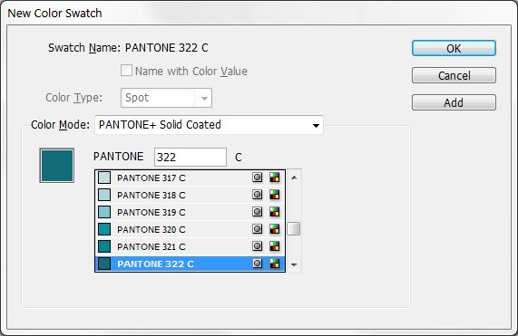
The swatch will then look like:
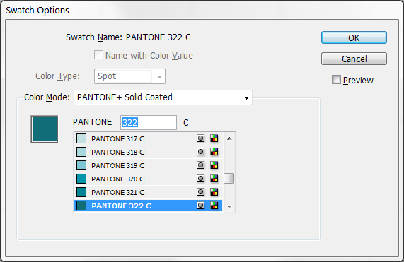
When you export PDF, you have two choices. If you are actually printing spot color or if you don't know whether real spot color inks are available, set the Ink Manager as follows:
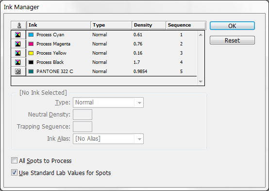
In this case, the RIP will use the spot color if available or if not, it will convert Pantone's more precise LAB color values specified as the “alternate color space” to the press' CMYK color space.
If you know that the press definitely won't have the spot colors, set the Ink Manager as follows:
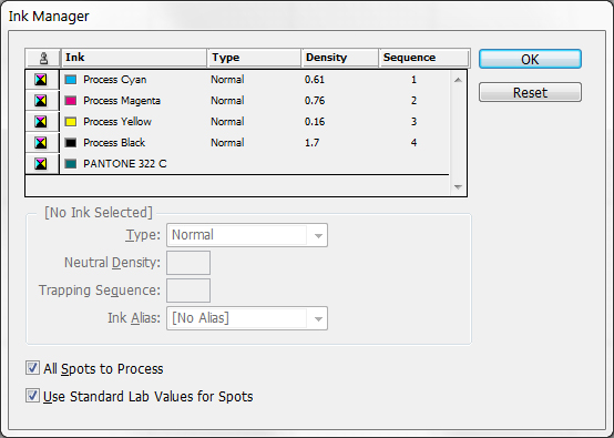
On PDF export, all references to PANTONE 322 C will be output to the PDF with the exact LAB color values which your RIP will convert to CMYK and no references to the spot color at all.
This is the method getting precisely what Pantone defines for the spot colors and how they will look in process color.
Note that many Pantone spot colors cannot precisely be matched in process color simply because such colors are outside the gamut of whatever process CMYK color space your printing workflow supports.
- Dov
Copy link to clipboard
Copied
Thanks, Dov (and others too...)... I've been producing my design projects for years now, so I definitely know if a project is for spot or process printing.... In this particular case the client is using her own printer, to whom I will supply a hi-res PDF file.
What you're saying I should NOT convert the PMS to CMYK, but let it be done automatically when creating a PDF? Must I use PDF/X-4 workflow ? I;ve been using one of my regular printer's own work flow that uses NO compresion and also creates crop-mark...
Also, the piece has also a logo that's using the same 322c spot color, and in a case like this I would alwys convert the colors in AI using the same formula I'd be using in ID.... Should I leave it as is, as a spot color?....
Copy link to clipboard
Copied
Obviously (or maybe not), you need to have a “meeting of the minds” with your print service provider as to workflow.
We most strongly recommend a PDF/X-4-based workflow simply because it maintains content at the highest level of abstraction including live transparency and full color management all the way to the RIP. You don't need to know the resolution or the color space of the press being used or for that matter, whether or not it really has spot colors or not. All recent vintage RIPs support this type of workflow although many “printers” most regrettably are not even aware of this capability.
If you are using this Pantone 322C color in multiple contexts, you must be consistent in how you specify it. You can't specify it as a true spot color in one place, a CMYK equivalent someplace else, an RGB equivalent in a third place, and in new documents use the LAB values. You must choose one and then make sure all your usage is consistent. Again, my recommendation is to keep it as spot with the LAB alternate color space. If your printer is really insistent on CMYK-only, you can accomplish that spot-to-LAB-to-CMYK transformation when you export the PDF from InDesign.
- Dov
Copy link to clipboard
Copied
OK, so I created a test file. In AI I created 2 boxes with 2 spot colors and some black. Placing the artwork in ID I added some text in both PMS colors and black.
I saved the ID file and then exported as PDF, using the PDF/X-4:2008 work flow. Opening in Acrobat Pro X, checking "Output Preview" it shows 4-color, no spot colors.... So that's working...
I then tested the same, using my printer's work flow (no compression, yes crop marks) and the result is the same, all CMYK, no spot colors —— BUT THE FILE SIZE IS 1/10 of the previous, PDF/X-4:2008 work flow... I tend to believe that a larger file means better quality.... Still, I would add those crop-marks option to it.
So I guess that's what I should do, not mess around with converting spot colors to CMYK, be careful to select the 2 bottom options in the Ink Manager, and let the RIP do the job....
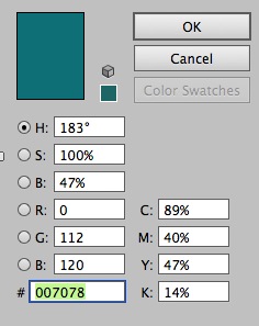
...BTW, when opening the PDF file in AI, I checked the values of that 322c and this is what I got, yet another, NEW "interpretation" of the same color, never seen before:
Copy link to clipboard
Copied
The larger file size of the PDF/X-4 file is possibly due to the fact that PDF/X files have an embedded ICC color profile. Typical ICC profiles for CMYK printing conditions are about one half megabyte in size.
By the way, you absolutely should not attempt to use Adobe Illustrator as a PDF editor. The only PDF files that Adobe Illustrator can safely and accurately edit are PDF files that originate from Illustrator's save as PDF feature.
To check color output values, use the Output Preview function of Acrobat! The Separation Preview feature will tell you the exact CMYK values that would be used. The Object Inspector feature allows you to see exactly what color is specified in the PDF file itself for whatever object the cursor is pointing at!
- Dov
Copy link to clipboard
Copied
Yes, large file must mean better quality, better file to use for production....
So I followed your instructions (I use Separation Preview all the time, but was never aware I can check color values, nor was there ever a need for it in the past...). See below... These values are closer to how ID was interpreting 322c, compared to Pantone...
STILL, AT THE END OF DAY, I MUST KNOW IF THIS IS THE ONE RELIABLE WAY TO TRANSFORM MY ID DOCUMENT FROM USING SPOT COLOR TO CMYK.
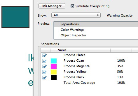
Copy link to clipboard
Copied
At this point there should be no question that this is certainly the most consistent manner of specifying spot colors and yielding CMYK for print. And assuming that you have specified the proper output CMYK color space in InDesign (and that is carried through via the output color profile in PDF/X-4), you will reliably and consistently get these results for any mixture of InDesign and Illustrator assuming you use the LAB colors for the spot definitions in both applications.
That having been said, the real question is then whether the resultant color is what your client really wants. If not, then either the color space is improperly specified, the printing is not consistent with the color space specification, or a different color should be specified in lieu of Pantone 322C.
- Dov
Copy link to clipboard
Copied
For my background: production-wise, I work only with sheet-fed printers, I never use newsprint, only coated stock, mostly dull/matte.
So that I REALLY do it right, miss nothing here, let me check item by item:
"proper output CMYK color space in InDesign" -- is it under Edit > Color Setting ? If so, please tell me what s.b. my setting... Currently, under "working space" my CMYK is set to SWOP... See below.
"output color profile in PDF/X-4" -- ?
"assuming you use the LAB colors for the spot definitions in both applications" --- ID I know, you showed me. Not sure about AI...
"the real question is then whether the resultant color is what your client really wants." -- As long as I do it RIGHT, I know I did the utmost to satisfy my customer's wishes...
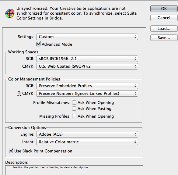
Copy link to clipboard
Copied
Yes, this is the location for your color settings for the document. You should consult your printer as to which CMYK color space they use. The default, U.S. Web Coated (SWOP) v2 may or may not necessarily be appropriate for your printing (don't worry about the word web in this).
By default, the output profile in the PDF/X-4 file will match the document's CMYK working space. Nothing more to set there.
For Illustrator, from the Swatches panel, choose Spot Color Options and make sure that it is set for Use Lab values specified by the book manufacturer. (This is the default for recent versions of Illustrator and is in fact what Pantone provides as the authoritative device independent color!)
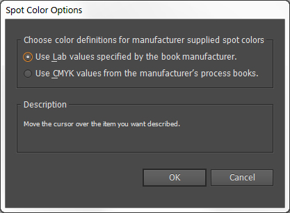
At that point, you should add your Pantone color. Selecting Pantone 322 C, for example, you would see:
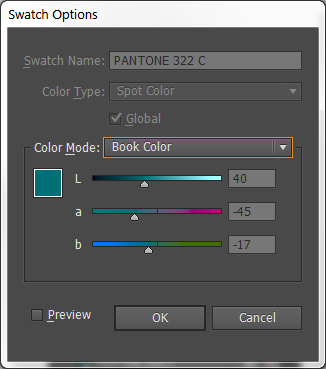
Leave as-is and click OK. This is the equivalent of what I prescribed earlier with InDesign.
Again, if you do everything this way, you are internally full consistent with your workflow. If the color doesn't match your customer's preconceived view of what the color should be, then there may be a problem with your printer's color management process or you need to choose a different color (i.e., a swatch that is closer to what both your client wants/needs and how well your printer can reproduce same with process colors).
- Dov
Copy link to clipboard
Copied
"proper output CMYK color space in InDesign" -- is it under Edit > Color Setting ? If so, please tell me what s.b. my setting... Currently, under "working space" my CMYK is set to SWOP... See below.
Color Setting's Working CMYK space is for future documents. For existing documents it's the assigned CMYK space (Edit>Assign Profiles...) that manages document CMYK (unless there's no assignment).
The assign profile can be different than the Color Setting's Working Space.
I work only with sheet-fed printers
SWOP is a web press profile.
Copy link to clipboard
Copied
SWOP is a web press profile.
That's not what Dov said: "(don't worry about the word web in this)."
Copy link to clipboard
Copied
So the profile readings were from press proofs off a sheetfed press and they named it US Web Coated SWOP? My experience with SWOP is you better be ready to go on press and hold back the ink.
Copy link to clipboard
Copied
Amikoe wrote:
SWOP is a web press profile.
That's not what Dov said: "(don't worry about the word web in this)."
In this context "web" refers to the roll of paper that is running through the press continuously, rather than the cut sheets of a sheet-fed press. The SWOP standard can be achieved on just about press, but it has a slightly smaller gamut than the Sheetfed profiles so you may lose some vibrancy depending on the colors you use.
Copy link to clipboard
Copied
but it has a slightly smaller gamut than the Sheetfed profiles
It's more than gamut, the profiles produce significantly different separations. If I take the Pantone 322 (out-of-gamut) lab color and convert it to SWOP I get 100|35|50|13, with US Sheetfed I get 100|28|45|8—not a trivial difference.
Copy link to clipboard
Copied
In this particular case the client is using her own printer, to whom I will supply a hi-res PDF file.
Asking a printer to do what you suggest is not realistic, certainly not in the price range of this job (5,000 copies)....
But the printer should be able to provide a reasonably accurate digital proof.
Copy link to clipboard
Copied
Trust InDesign.
Make your client to sign a calibrated color proof, and your printer to match the proof.
Or better, be there when your work is about to be printed, you can always make manual adjustments to match a specific color.
Copy link to clipboard
Copied
Fede Gianni wrote:
Trust InDesign.
Make your client to sign a calibrated color proof, and your printer to match the proof.
Or better, be there when your work is about to be printed, you can always make manual adjustments to match a specific color.
Yes, I'm aware of that. Many of my productions I take the time (and mileage) to be there for a press check... This particular project is between the client and her printer.
Copy link to clipboard
Copied
Some responses to posts made while I was offline (yes, I do stay off the d*mned machine for at least a few hours each day):
With regards to color settings, Edit=>Color Settings is indeed to set the default color spaces for InDesign and thus the color spaces for whatever new documents you create. To change the color settings of the currently open document, you must go to Edit=>Assign Profiles which assigns the designated profiles as the working space profiles for the currently open document or Edit=>Convert to Profile which not only assigns new profiles but does an actual conversion of color space. The latter can be really problematic for conversion from one CMYK profile to another; InDesign does not use device link profiles for such conversions and purity of primary colors (such as pure C, pure M, pure Y, and pure K) can and probably will be lost.
In terms of CMYK press profiles, each of these represent a press printing condition which may or may not directly correlate to whether the printing is sheet-fed, web, digital, or whatever. Especially with digital printers, the device can simulate any number of such printing conditions. That is why it is important to have such a discussion with one's print service provider. As shown by Rob above, depending upon which CMYK printing condition and profile you use, the LAB values for Pantone 322C will differ significantly. (That is also the best argument for leaving the spot color “alternate color space” as LAB; you can change the output profile and the spot color rendition using process colors will automatically adapt at the RIP!)
- Dov
Copy link to clipboard
Copied
3 questions:
1. Since I never use web-printers, only sheet-fed (my clients and quantities are both not large enough...), why not just go with "US Sheetfed Coated v2" instead of the SWOP?
2. Are the rest of my setting in the Edit > Color Setting that I showed above -- OK?
3. As for the future: Starting any next NEW projects, what should I be doing when working on a (1) spot-color project, vs. (2) pure 4-color project, vs. (3) 4-color based on solid colors (like this current one)? What are the settings I s.b. carefully taking care of before starting each of those kinds of projects?
Copy link to clipboard
Copied
If you don't have contact with the printer then the profile selection is a guess—there's nothing magic about the default SWOP that makes it the correct profile. I think US Sheetfed is a better guess, but there's also Coated GRACoL, which I've started using when the destination is an unknown US Sheetfed press.
You might consider using AdobeRGB as the RGB space in ID and PS. Color gamuts go both ways—there are CMYK colors that can't be displayed and sRGB will exacerbate that problem.
Using the Pantone solid ink system for selecting colors for a job that will be process CMYK has inherent problems. 322 is on the edge of the gamut so it can't really be matched via CMYK. But even in gamut colors are problematic—the colors you are looking at in the swatch books are not printed with CMYK inks, so the process version will always be a simulation.
If the color will be printed as a spot you always want the Lab definition.
-
- 1
- 2
