Exit
  • Global community
    • Language:
      • Deutsch
      • English
      • Español
      • Français
      • Português
  • 日本語コミュニティ
  • 한국 커뮤니티
0

Strange looking font in InDesign

New Here ,
Jan 23, 2023 Jan 23, 2023

Hi All,

I've activated a font in the web, it appears in InDesign, but looks a "little bit" weird. Checked the font on the creator's page, I think there is OK, for me it is strange. Is it a normal thing? Is it only a preview to buy directly form the creator or something wrong with my setup? All apps are updated. The font is DomLovesMary Pro, but for example Nori Regular also the same quirky thing.
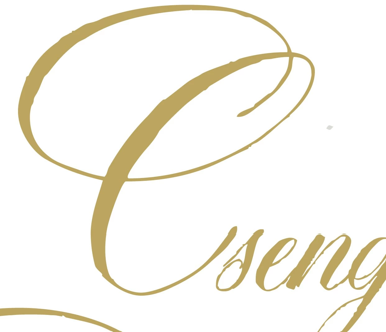
Marypro_ID.jpg


Thank you for your answer.


291
Translate
Report
Community guidelines
Be kind and respectful, give credit to the original source of content, and search for duplicates before posting. Learn more
community guidelines
Adobe Employee ,
Jan 24, 2023 Jan 24, 2023

Hi @Tündér Lala,


Thank you for reaching out. Would you mind telling us from where you've activated the font? Is it from the Adobe Fonts website? 


I see the font looks the same on the font's website, InDesign, and other Adobe apps.


HARSHIKA_VERMA_0-1674578650539.png


Could you please share the screenshot of the font from the Creator page to see the difference?


We will try our best to help.


Thanks,

Harshika


Translate
Report
Community guidelines
Be kind and respectful, give credit to the original source of content, and search for duplicates before posting. Learn more
community guidelines
Community Expert ,
Jan 24, 2023 Jan 24, 2023

Do you have View | Display Performance set to High Quality? If it's set to Fast or Typical, rendering and resolution get rougher (as a tradeoff for speed), and whole most of a page might look okay, a very complex font such as this might show more "roughness" than  simpler ones.


Translate
Report
Community guidelines
Be kind and respectful, give credit to the original source of content, and search for duplicates before posting. Learn more
community guidelines
Community Expert ,
Jan 24, 2023 Jan 24, 2023

"little bit" weird - do you mean the rough edges? If yes, this is the intended design of the font.

Translate
Report
Community guidelines
Be kind and respectful, give credit to the original source of content, and search for duplicates before posting. Learn more
community guidelines
Community Expert ,
Jan 24, 2023 Jan 24, 2023
LATEST

@Jeffrey_Smith, I agree.

I think the font is designed to look like hand caligraphy with pen ink on rough paper.


|    Bevi Chagnon   |  Designer, Trainer, & Technologist for Accessible Documents |
|    PubCom |    Classes & Books for Accessible InDesign, PDFs & MS Office |
Translate
Report
Community guidelines
Be kind and respectful, give credit to the original source of content, and search for duplicates before posting. Learn more
community guidelines