• Global community
    • Language:
      • Deutsch
      • English
      • Español
      • Français
      • Português
  • 日本語コミュニティ
    Dedicated community for Japanese speakers
  • 한국 커뮤니티
    Dedicated community for Korean speakers
Exit
0

Superscripted footnote numbers – modifying its appearance

Contributor ,
Mar 17, 2022 Mar 17, 2022

Copy link to clipboard

Copied

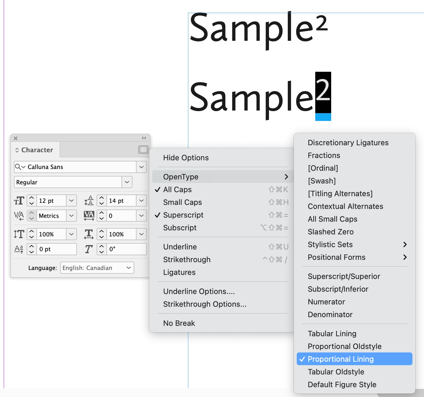
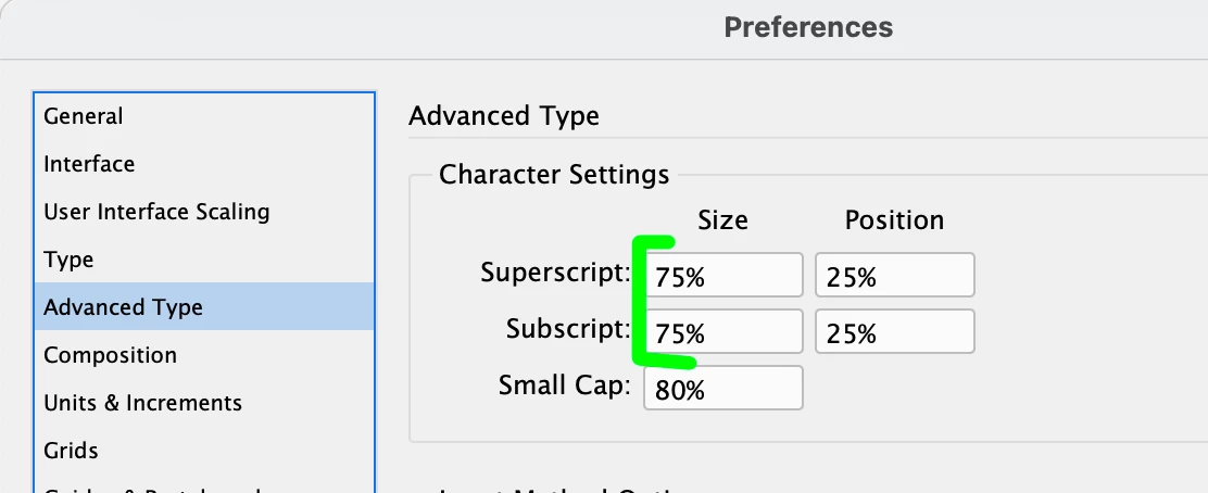
Using 10 pt. Calluna Sans as body text and finding its default superscript to be far too small for footnote numbers. How to access and control these attributes so that when manually placing and superscriptng a footnote number in the body (I do so via shortcut Shift + ctrl + =), it's set to a legible custom size? A related issue may be that the default is in oldstyle which compounds matters some, and it might be ideal to keep body text numerals OS while footnote numbers are lining, but how to do all this without going one-by-one and changing the point size and style? Many thanks in advance! 

TOPICS
Type

Views

428

Translate

Translate

Report

Report
Community guidelines
Be kind and respectful, give credit to the original source of content, and search for duplicates before posting. Learn more
community guidelines

correct answers 1 Correct answer

Community Expert , Mar 17, 2022 Mar 17, 2022

Two suggestions (the first is the most likely solution for you):

1) The Oldstyle figures are default, but you can change them to Proportional Lining figures, either on your entire Paragraph Style (this will affect ALL the numbers in your paragraph), or as a Character Style, so you can apply it as needed.

Screen Shot 2022-03-17 at 3.41.48 PM.png

 2) If you, however, prefer the Old Style figures, change your specifications for Superscript/Subscript size in your Preferences > Advanced Type to something larger.

Screen Shot 2022-03-17 at 3.44.59 PM.png

Votes

Translate

Translate
Community Expert ,
Mar 17, 2022 Mar 17, 2022

Copy link to clipboard

Copied

Two suggestions (the first is the most likely solution for you):

1) The Oldstyle figures are default, but you can change them to Proportional Lining figures, either on your entire Paragraph Style (this will affect ALL the numbers in your paragraph), or as a Character Style, so you can apply it as needed.

Screen Shot 2022-03-17 at 3.41.48 PM.png

 2) If you, however, prefer the Old Style figures, change your specifications for Superscript/Subscript size in your Preferences > Advanced Type to something larger.

Screen Shot 2022-03-17 at 3.44.59 PM.png

Votes

Translate

Translate

Report

Report
Community guidelines
Be kind and respectful, give credit to the original source of content, and search for duplicates before posting. Learn more
community guidelines
Contributor ,
Mar 19, 2022 Mar 19, 2022

Copy link to clipboard

Copied

Thank you, Brad – in your view, is it indeed a "type crime" to mix Oldstyle numbers with Proportional Lining in the superscripted footnotes? The legibility of Oldstyle is poor in for the note reference numbers in the text.

Also, the advanced type sizing option works perfectly, but how do I add an additional parameter to place a half-space between the note number and the last letter or punctuation it follows?

This book's layout, which I did not specify before, utilizes notes in the margins.

Votes

Translate

Translate

Report

Report
Community guidelines
Be kind and respectful, give credit to the original source of content, and search for duplicates before posting. Learn more
community guidelines
Community Expert ,
Mar 19, 2022 Mar 19, 2022

Copy link to clipboard

Copied

No, it's no crime to mix. 😉

Even if, say, you love the Oldstyle in general, there are places where they can be problematic: e.g charts/financial statements.

As for adding the space, there have been others that have scripted adding that space, but I don't have that at hand. (I usually just do a manual GREP search and replace myself). Others may chime in with the answer to that!

Votes

Translate

Translate

Report

Report
Community guidelines
Be kind and respectful, give credit to the original source of content, and search for duplicates before posting. Learn more
community guidelines
Contributor ,
Mar 20, 2022 Mar 20, 2022

Copy link to clipboard

Copied

Honestly, using Lining, exceptionally, just for superscripted note numbers in the body greatly improved legibility. Thank you.
May I ask, what's are the GREP terms to locate those note numbers add a touch of white space before them?

And how would one apply another tracking setting to them, globaly?

Votes

Translate

Translate

Report

Report
Community guidelines
Be kind and respectful, give credit to the original source of content, and search for duplicates before posting. Learn more
community guidelines
Community Expert ,
Mar 20, 2022 Mar 20, 2022

Copy link to clipboard

Copied

The simplest is:

Screen Shot 2022-03-20 at 9.31.20 PM.png

Search for any superscript number (one or more times ina  row) and replace with thin space plus the original number found): ~<$0.  If a thin space is too much, try a hair space : ~| $0

If you have given your footnote numbers a character style, then search for those specifically instead

Votes

Translate

Translate

Report

Report
Community guidelines
Be kind and respectful, give credit to the original source of content, and search for duplicates before posting. Learn more
community guidelines
Community Expert ,
Mar 20, 2022 Mar 20, 2022

Copy link to clipboard

Copied

As for tracking, if you are referring to how the footnote numbers themselves are tracked, you can add that specification to your character style. However, if you mean using tracking to add space BEFORE a footnote number, that's not possible. Tracking only works forward.

Votes

Translate

Translate

Report

Report
Community guidelines
Be kind and respectful, give credit to the original source of content, and search for duplicates before posting. Learn more
community guidelines
Community Expert ,
Mar 17, 2022 Mar 17, 2022

Copy link to clipboard

Copied

Create a character style that sets the numbers as you want them. Then set that style as the one to use in the footnote options window (Typpe > Document Footnote options). Set Position to Normal and select your character style in the highlighted dropdown:

PeterKahrel_0-1647553787532.png

The display of the numbers in the notes can be set with another character style which is applied to the number by a nested style.


Votes

Translate

Translate

Report

Report
Community guidelines
Be kind and respectful, give credit to the original source of content, and search for duplicates before posting. Learn more
community guidelines
Contributor ,
Mar 19, 2022 Mar 19, 2022

Copy link to clipboard

Copied

Thank you Peter – as mentioned to Barb and Brad, the notes are actually margin notes and I'm not versed in using scripts which I think is the only option to get obtain footnote functionality applied to margin/shoulder notes. 

Also, how best to add appropriate spacing between the note numbers without a footnote function, and do you see the use of both Oldstyle (hard to read as note numbers) and Proportional Lining in the same layout as a no-go? Greatly appreciated, all this input. 

Votes

Translate

Translate

Report

Report
Community guidelines
Be kind and respectful, give credit to the original source of content, and search for duplicates before posting. Learn more
community guidelines
Community Expert ,
Mar 21, 2022 Mar 21, 2022

Copy link to clipboard

Copied

LATEST

> how best to add appropriate spacing between the note numbers without a footnote function

Do as Brad explained: insert some space (hiar, thin) using a GREP replacement. If you find that not all letter+footnote number combinations need the same amount of space (e.g. you may not need any space between the letter o and the number 8, while f+2 probably does need space), you can use this script:

https://creativepro.com/files/kahrel/indesign/kern.html


> do you see the use of both Oldstyle (hard to read as note numbers) and Proportional Lining in the same layout as a no-go?


There are no absolute typographic rules. The main typographical rule is: If breaking a rule makes the type look better, break the rule. Here's one example of breaking the rule that you should use the same figure style throughout. In a text that uses oldstyle figures, combinations of capitals and oldstyle figures (C3, A5) look awkward. In these cases lining figures look better.

Votes

Translate

Translate

Report

Report
Community guidelines
Be kind and respectful, give credit to the original source of content, and search for duplicates before posting. Learn more
community guidelines
Community Expert ,
Mar 17, 2022 Mar 17, 2022

Copy link to clipboard

Copied

Hi @Typothalamus:


This is fixable using a few avenues but let's start with the easiest. Are these footnote numbers the only superscript numbers in this document? If so you can adjust the default size and position of the superscripts in Preferences > Advanced Type > Character Settings. 


Are you not using the Footnote feature to add footnotes? If so, you can superscript the figures in the body of the document automatically with Type > Document Footnote Options. You can also assign a character style at the same time and then you can control the usage of lining or old-style numbers without impacting other figures in the paragraph.


Let us know if this works for you and if you need more info, of course we will continue to help you.


~Barb

Votes

Translate

Translate

Report

Report
Community guidelines
Be kind and respectful, give credit to the original source of content, and search for duplicates before posting. Learn more
community guidelines
Contributor ,
Mar 19, 2022 Mar 19, 2022

Copy link to clipboard

Copied

Thank you Barb – straightforward and helpful, though the layout design employs margin notes/shoulder notes rather than footnotes at bottom, which complicates things somewhat. I'm aware there's a script out there for this, but I've no experience using scripts, and, foolishly, am partial to doing things manually when intimidated.


I do need to automate this further though, setting a basic distance between the margin note number in the text and the last letter of punctuation it follows. 

And I've long heard it's a typographic faux pas to mix Oldstyle with Lining numerals in the same layout, but when it comes to this particular typeface's legibility for body text note numbers in Lining, I have to wonder, when are the rules to be broken. 

Votes

Translate

Translate

Report

Report
Community guidelines
Be kind and respectful, give credit to the original source of content, and search for duplicates before posting. Learn more
community guidelines