- Home
- InDesign
- Discussions
- Re: Text appears jagged, unless zoomed into 100 pe...
- Re: Text appears jagged, unless zoomed into 100 pe...
Text appears jagged, unless zoomed into 100 percent.
Copy link to clipboard
Copied
I am having the same or similar problem as Steve [Edit: branched from Indesign 5.5 displays text with ragged edge.]. I have done my best to research this but I cannot figure it out. I am using a Macbook Pro, 15 inch (late2011) with the normal display. I have Leapord 10.7.3. My InDesign is 7.5.2.
The text appears jagged, unless zoomed into 100 percent. Here is a screen shot of the problem at 300 percent:
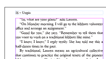
And here is the exact same file when I zoom into 100 percent:
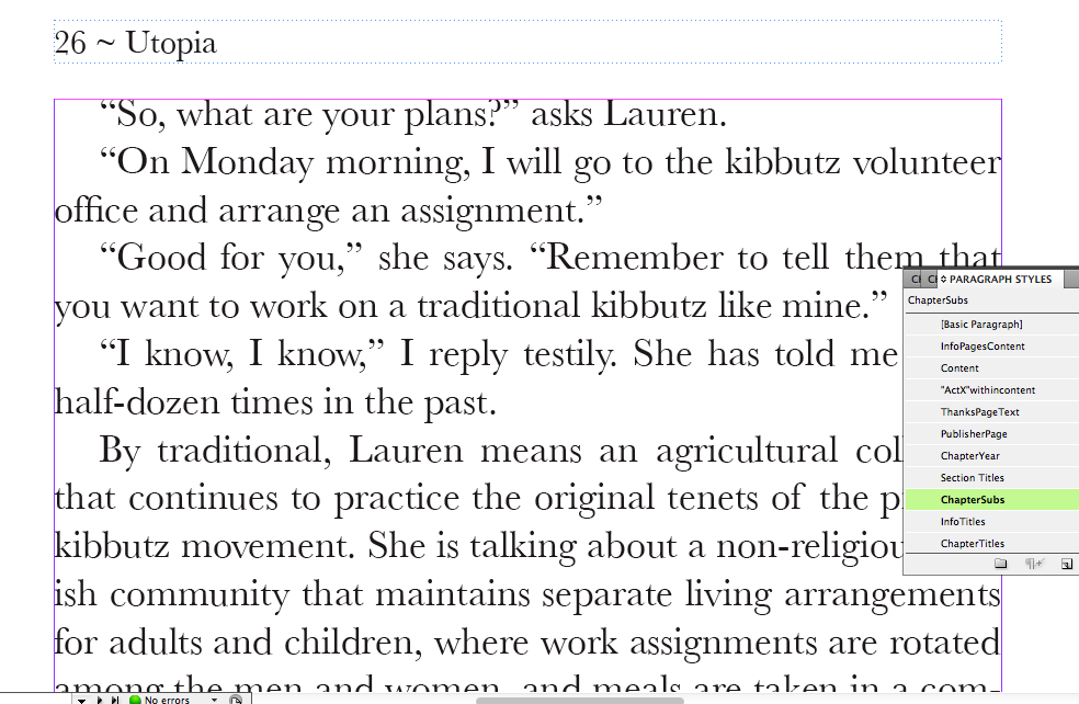
here is the same text zoomed even more:
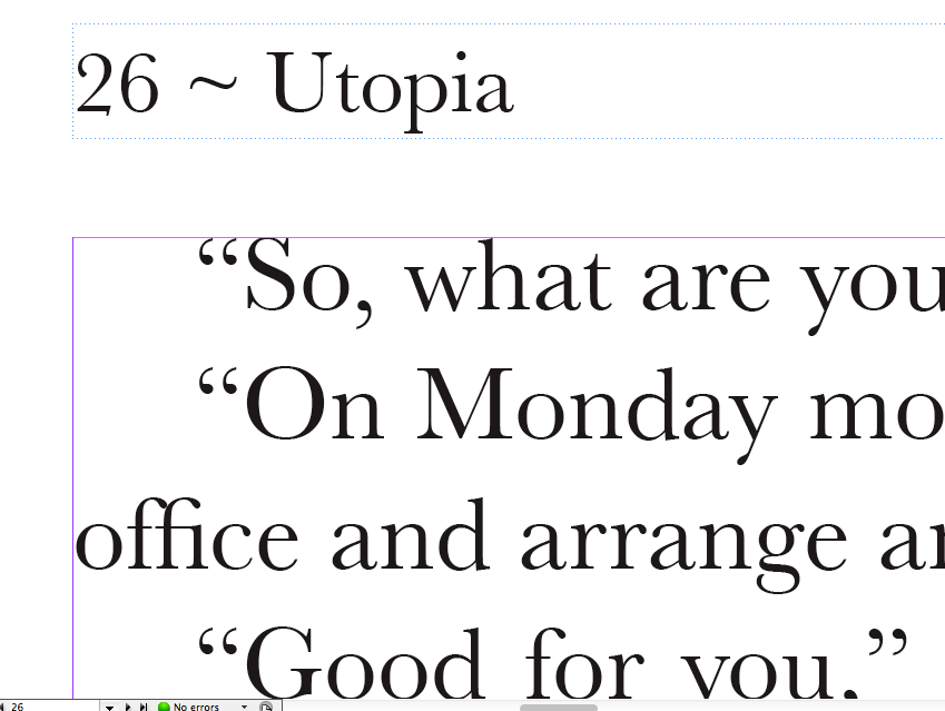
The typeface is Baskerville. It prints properly, no jagged edges.
I have tried all the display and text options
Any ideas?
Thanks. Also, do you guys think I should I post a new topic?
Message was edited by: John Hawkinson
Copy link to clipboard
Copied
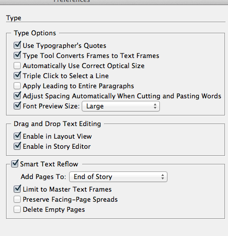
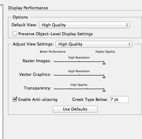
my display settings:
Copy link to clipboard
Copied
Definitely looks like a problem with the display. We've been told for years that we have WYSIWYG displays, but it isn't really true. What you see is CLOSE to what you get depending on the ability of the pixels to display it smoothly.
Glyphs with round bottoms typically extend slightly below the baseline, and it looks like at some your 100% zoom level the choice is being made to use an extra pixel on the screen rather than lose the bottoms (but look at the G in Good, which looks like the other way). As you zoom in you have more screen pixels to work with for any given part of the text so it gets better, though it wouldn't surprise me if it got wonky at some odd non-incremental zooms like 237%.
Copy link to clipboard
Copied
Are there any fixes for it? Is it not considered a bug or glitch? It does not effect output but it can be aggrevating when dealign with stuff on screen.
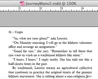
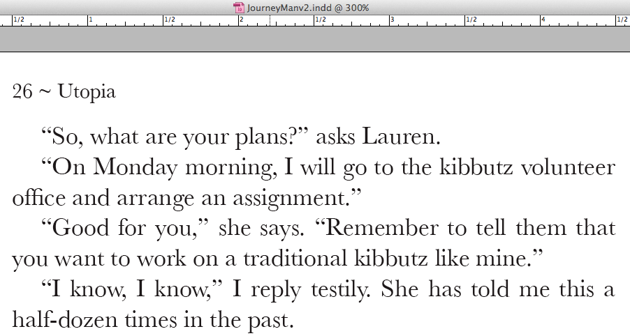
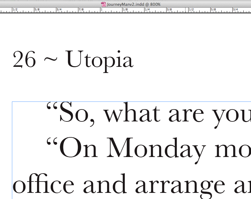
The first photo was at 100, the second photo is at 300 (which in screenshot form, the text does appear a little ragged, not like on screen when I saw it. this shot was intended to show the text how it should be) It still looked jagged so I did another zoom in, not really sure how much. It was just showing as you zoom in in gets less and less ragged or jagged. Im not sure if i messed up the numbers or something like that, if I did sorry. Im not sure why the size of the screen grabs looks weird either.
Thanks for the replies guys!
Copy link to clipboard
Copied
I believe Peter is suggesting you have hit the physical limit of the display.
I'm not yet convinced, but I remain confused about your images.
You're saying your first photo, the smallest one called Jagged300.png, is really at 100%.
And the second photo, called notJagged.png that you described as 100% is really 300%.
And the third photo, Screen+Shot+2012-04-03+at+7.23.21+PM.png, is some unspecified zoom factor?
I am not seeing jaggedness in the 2nd and 3rd photos. Are you?
Are you saying the screenshots are not faithful reproductions of the problem? That would be very interesting.
Copy link to clipboard
Copied
that should help. Pay no attention to the names of the files, cause I clearly got that wrong. I am not resizing the photos, this is just how they appear and upload.
In the second photo, third line look at the second word Monday, and notice the letter a. Also in the first line, look at "what are" The t and a (in the word are) are both smaller. (insert 8th grade girlfriend joke here)
edit: fyi in the top bar is says 100%, 300%, 800%
Copy link to clipboard
Copied
OK, I see the problem now!
(As an aside, in the unlikely event that you have to explain this to anybody else electronically in the future, circling the problematic letters might be a useful technique).
In particular, when you say 'ragged', it is that the baselines are uneven, but not that the edges of the letterforms themselves are fuzzy.
I can't quite tell at first glance whether the letters are smaller, or just shifted up.
Anyhow, I agree this is weird.
What's the precise font, font size, and leading? Any other special character or paragraph attributes?
Can you reproduce this in a blank document with the same text, or is it somehow document-specific?
To look at it differnetly, what's the minimum we need to try to reproduce this effect on our own systems?
Copy link to clipboard
Copied
Sorry if I was not clearly communicating. I guess the original post was not having the same problem, it appeared that way.
I think they are smaller, not shifted up because the top of the letterform will be the same across the *top of the* word, but not the baseleine.
The font is Baskerville Regular, 12 point at 14.4 auto leading for the content. Obviously the header is a bit smaller. I do know that the same effect will happen when these factors are changed however. In the screenshots I posted, there are character and/or paragrpah styles but the same issue happens with this typeface with or without styles.
I reproduced the problem pretty quickly with a new letter sized document and the default size settings. One thing I have not tried is reinstalling the font with new font file. But I have seen this issue with other fonts (I will try and get screengrabs for this soon, no promises sorry) so I didnt try that, naturally.
Hope this helps.
*edit*
Copy link to clipboard
Copied
OK, I can easily reproduce this under OS X 10.7.2 with Baskerville Regular (Truetype / Baskerville; 7.0d4e2; 2011-03-16), but not with Minion Pro (OpenType PostScript / 2.108;ADBE;MinionPro-Medium;ADOBE).
I suspect there's not going to be an easy fix and that this is indeed a bug. Anyone else?
Sorry if I was not clearly communicating. I guess the original post was not having the same problem, it appeared that way.
Yeah, I think it's different. I'll try branching off this discussion to a seperate thread, let's see how that works...
Copy link to clipboard
Copied
Thanks for the help and clarification.
Copy link to clipboard
Copied
Send me a link to the other thread if you would.
Copy link to clipboard
Copied
Send me a link to the other thread if you would.
It's linked from the top of the post, but the older thread was Indesign 5.5 displays text with ragged edge, and the new thread (this one) is Text appears jagged, unless zoomed into 100 percent.
There may be some confusion about what is meant by "the display." When Peter wrote earlier, "Definitely looks like a problem with the display," I thought he meant either a hardware limit or a fundamental limit. But now I guess he just meant "the part of the software the displays the font on the screen."
I certainly wouldn't worry about it; back in the days of OS8 and OS9 and Quark XPress, a user had to simply accept the jaggies onscreen, knowing that the output would be correct.
Well, I think the reason to "worry" is primarily that it's ugly and looks bad and is hard to work in. I don't think anyone is concerned that it might print like this (though that'd be a pretty severe calamity!). It's also disconcerting when the on-screen display doesn't match the printed product; if it is off in one place, then you never know where else it will be off. This means you lose confidence in your display, and even sometimes notice real problems that you dismiss as being artifacts when they aren't. That's really unfortunate.
So I think it behooves us to get to the bottom of it and report it.
Surely it's not as simple as "all Truetype fonts do this, OpenType do not"?
Copy link to clipboard
Copied
John Hawkinson wrote:
There may be some confusion about what is meant by "the display." When Peter wrote earlier, "Definitely looks like a problem with the display," I thought he meant either a hardware limit or a fundamental limit. But now I guess he just meant "the part of the software the displays the font on the screen."
I'm not sure what I meant, other than it is an anomaly in how the type is being presented. Whether that's a hardware or software limitation, or a combination, I couldn't say. And I would guess it looks different on Macs than it does on my Windows system due to differences in type rendering technology.
Copy link to clipboard
Copied
I'm not sure what I meant, other than it is an anomaly in how the
type is being presented. Whether that's a hardware or software
limitation, or a combination, I couldn't say. And I would guess it
looks different on Macs than it does on my Windows system due to
differences in type rendering technology.
Well...does it? Inquiring minds want to know!
Copy link to clipboard
Copied
I actually saw this a lot in the PageMaker era - on both Windows and Mac platforms. It was just a fact of life, one that I assumed came down to rendering of different font formats, whether or not there were bitmaps of the font installed, and so on. Haven't seen it in years - but I've not looked for it. Much like font greeking, it's something that I have trained myself to ignore, and to zoom in a bit if I need to see what is going on.
Copy link to clipboard
Copied
Considering that there must be at least a half dozen different fonts called Baskerville on my system, and I have no idea which one the OP is using (and his is probably a mac font and not testable here)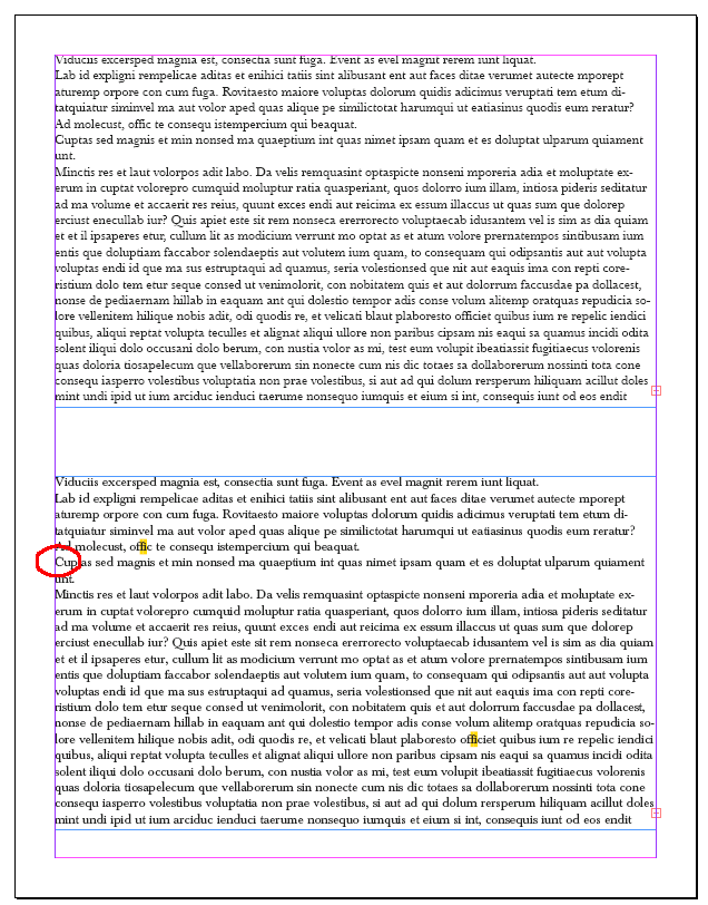 , this isn't much of a test, but here's how Baskerville (TT) Regular (Top) and Baskerville (T1) Normal (bottom) look here at 100% on my 27 " monitor at 1920 x 1200.
There's perhaps an anomaly in the capita C i circled, but hard to say.
Copy link to clipboard
Copied
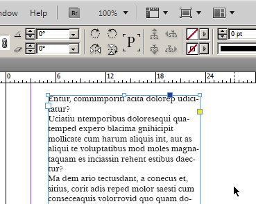
I have the Bitstream 1.01 Baskerville BT OpenType version installed.
This is at 100% zoom. Personally, I think it is a font display issue as long as it prints fine.
Take care, Mike
Copy link to clipboard
Copied
I also don't see how a limit on my display would mean the baseline changes from letter to letter. It feels like a glitch which needs a patch to appear correctly.
Copy link to clipboard
Copied
'mtf (is that "modulation transfer function"?!):
The text appears jagged, unless zoomed into 100 percent. Here is a screen shot of the problem at 300 percent:
I'm slightly confused...your first capture appears to be smaller than the 100% capture, did you resize the image before uploading it? Normally the 300% image should be 3 times bigger than the 100%. Or did you really mean 30%?
Copy link to clipboard
Copied
I'm with Peter on this one. I get the same "distortion" with some fonts, which would explain that the outline information for the font at a given zoom factor is just displaying differently based on the pixel size of the screen. The Baskerville TrueType version is obviously "built" differently than the OpenType font that John is describing. I certainly wouldn't worry about it; back in the days of OS8 and OS9 and Quark XPress, a user had to simply accept the jaggies onscreen, knowing that the output would be correct.
Just a thought...
Cheers!
Mikey
Copy link to clipboard
Copied
Are you set for View > Display Performance > High Quailty Display?
Copy link to clipboard
Copied
just a quick one: in you mac system preferences: under appearence: is "use LCD font smoothing when available" checked...
G
Copy link to clipboard
Copied
I dont see the same issue I am having with your screenshot, Peter. Or Mike.
The font is Baskerville Regular. I dont know what other way to describe it there might be. It is not Baskerville old face and it is not italic and not bold or semi-bold. It says regular in that dropdown menu in indesign.
It is set for high quality display (the problem persists whatever setting is here)
and LCD font smoothing is turned on in system preferences.
To me, if the letter right next to another letter, there is no reason why the baseleines would need to be on separate pixel lines. This leads me to believe it is a bug or a glitch.
I also just tried changing my diplsay to a lower resolution, and that did not solve it either.
Thanks again folks for the interest and repsonse.
Copy link to clipboard
Copied
Not a good reply, but some versions of some fonts just do not display well. I apologize if this is mentioned further up but I was too lazy to reread the thread. Does your page print properly or export to PDF? If so, I would say it is the font itself. If not, then it is an ID issue.
Sorry that's the best I have to offer. You are not alone, but usually it is a display issue regarding hinting in the font, or other mysterious font issues.
Take care, Mike
Copy link to clipboard
Copied
It does print correctly, yes. It prints exactly like it looks when zoomed in closely.
When exported to PDF, the display problem still occurs. I didnt think this would rule out InDesign being the problem because InDesign produced the PDF.
Thinking about it now I can see how it may not be an InDesign problem, but also how it could. Especially knowling other fonts do this as well.
I appreciate the response.
Find more inspiration, events, and resources on the new Adobe Community
Explore Now