• Global community
    • Language:
      • Deutsch
      • English
      • Español
      • Français
      • Português
  • 日本語コミュニティ
    Dedicated community for Japanese speakers
  • 한국 커뮤니티
    Dedicated community for Korean speakers
Exit
0

Text justification question

Community Beginner ,
Oct 29, 2021 Oct 29, 2021

Copy link to clipboard

Copied

Hello, I have a question regarding text justification. I am in the process of making a draft CV and would like to align these three pieces of text. I want the text 'Manager' aligned to the left, 'Example Company' aligned to the centre and '2020 - 2021' aligned to the right. In the screenshot below I have achieved this by simply adding spaces, although this seems inaccurate and would also require manual readjustment if I were to change the text.


My question is whether there is a way to align individual pieces of text in a single text frame?


Text justification screenshot.PNG

TOPICS
Type

Views

1.1K

Translate

Translate

Report

Report
Community guidelines
Be kind and respectful, give credit to the original source of content, and search for duplicates before posting. Learn more
community guidelines
Community Expert ,
Oct 29, 2021 Oct 29, 2021

Copy link to clipboard

Copied

That's what tabs are for. 

Votes

Translate

Translate

Report

Report
Community guidelines
Be kind and respectful, give credit to the original source of content, and search for duplicates before posting. Learn more
community guidelines
Guide ,
Oct 29, 2021 Oct 29, 2021

Copy link to clipboard

Copied

If you use a tab character between Manager and Example, you can set a center or left tab (depending on how you want your column to align), and use Type>Tabs to set the position of the center tab stop. To make the 2020-2021 column aligned to the right, you can use Type>Insert Special Character>Other>Right Indent Tab, which you can make quickly by holding the shift key while you hit the tab key.

Votes

Translate

Translate

Report

Report
Community guidelines
Be kind and respectful, give credit to the original source of content, and search for duplicates before posting. Learn more
community guidelines
Community Expert ,
Oct 29, 2021 Oct 29, 2021

Copy link to clipboard

Copied

Visually:


tabs.gif


~Barb

Votes

Translate

Translate

Report

Report
Community guidelines
Be kind and respectful, give credit to the original source of content, and search for duplicates before posting. Learn more
community guidelines
Community Beginner ,
Nov 01, 2021 Nov 01, 2021

Copy link to clipboard

Copied

Thanks for all the replies. I tried using tabs which worked, but instead opted to convert the text to outlines and then position the text using InDesign's smart guides as I found I could achieve more accurate positioning that way.

Votes

Translate

Translate

Report

Report
Community guidelines
Be kind and respectful, give credit to the original source of content, and search for duplicates before posting. Learn more
community guidelines
Guide ,
Nov 01, 2021 Nov 01, 2021

Copy link to clipboard

Copied

If you have a backup, I recommend you revert and not convert text to outlines for something like this. If you search the forum for "convert to outline" you will find that there are way more downsides to this, and that while there are some advantages, there's nothing you can do with outlines that you couldn't do with live type in this situation.

Votes

Translate

Translate

Report

Report
Community guidelines
Be kind and respectful, give credit to the original source of content, and search for duplicates before posting. Learn more
community guidelines
Community Expert ,
Nov 02, 2021 Nov 02, 2021

Copy link to clipboard

Copied

You really don't want to turn a live document into a non-editable graphics layout. Tabs should do what you want, even if you have to tweak them on a line-by-line basis (not usually a good practice, but better than turning the text to a graphics object).


Or adjust your visuals a little to make tabs and other line-spacing elements to create a consistent, pleasing layout. Most c.v.s should be on the "somewhat boring" end of such design and style, not arty.


┋┊ InDesign to Kindle (& EPUB): A Professional Guide, v3.1 ┊ (Amazon) ┊┋

Votes

Translate

Translate

Report

Report
Community guidelines
Be kind and respectful, give credit to the original source of content, and search for duplicates before posting. Learn more
community guidelines
Community Expert ,
Nov 01, 2021 Nov 01, 2021

Copy link to clipboard

Copied

Here are a couple of pages from my Topography Typography Basics PDF you might find useful.


David Creamer: Community Expert (ACI and ACE 1995-2023)

Votes

Translate

Translate

Report

Report
Community guidelines
Be kind and respectful, give credit to the original source of content, and search for duplicates before posting. Learn more
community guidelines
Community Expert ,
Nov 02, 2021 Nov 02, 2021

Copy link to clipboard

Copied

You teach map design, too?

(Sorry... couldn't resist. 😄 )


┋┊ InDesign to Kindle (& EPUB): A Professional Guide, v3.1 ┊ (Amazon) ┊┋

Votes

Translate

Translate

Report

Report
Community guidelines
Be kind and respectful, give credit to the original source of content, and search for duplicates before posting. Learn more
community guidelines
Community Expert ,
Nov 02, 2021 Nov 02, 2021

Copy link to clipboard

Copied

No--just demonstrating my uncanny ability to make typos from any text!

David Creamer: Community Expert (ACI and ACE 1995-2023)

Votes

Translate

Translate

Report

Report
Community guidelines
Be kind and respectful, give credit to the original source of content, and search for duplicates before posting. Learn more
community guidelines
Community Expert ,
Nov 02, 2021 Nov 02, 2021

Copy link to clipboard

Copied

Alternatives:

[1] Use different white space characters. A fixed width white space character between "Example" and "Company" and normal blanks otherwise; together with a fully justified paragraph:


FixedWidth-WhiteSpaceCharacter.PNG


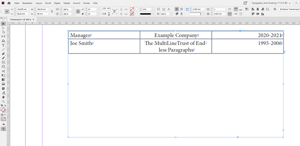
[2] If you plan to have multi-line entries in any of the three columns, better use an InDesign table:


Table-3-Columns.PNG


Regards,
Uwe Laubender

( ACP )

Votes

Translate

Translate

Report

Report
Community guidelines
Be kind and respectful, give credit to the original source of content, and search for duplicates before posting. Learn more
community guidelines
Community Beginner ,
Nov 03, 2021 Nov 03, 2021

Copy link to clipboard

Copied

Thanks for the suggestions. For suggestion 1, how do I adjust white space characters?

Votes

Translate

Translate

Report

Report
Community guidelines
Be kind and respectful, give credit to the original source of content, and search for duplicates before posting. Learn more
community guidelines
Community Expert ,
Nov 03, 2021 Nov 03, 2021

Copy link to clipboard

Copied

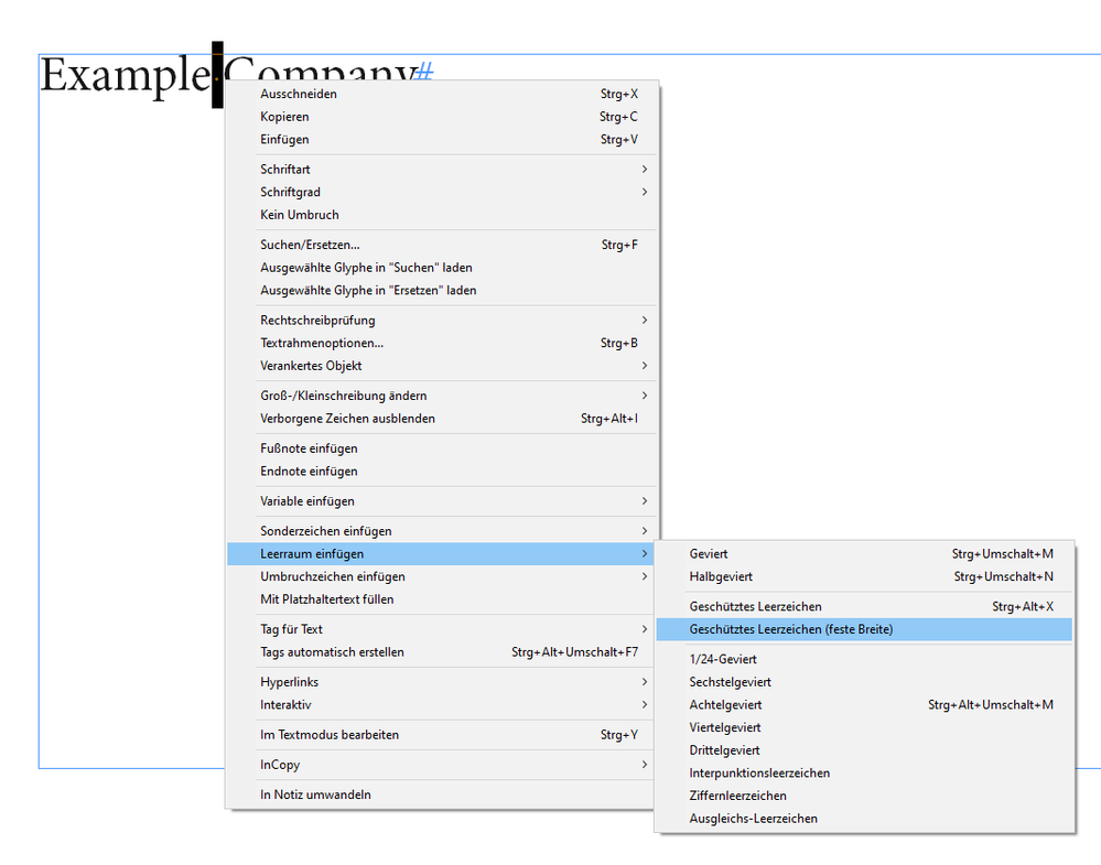
The one between "Example" and "Company"?

It's a special character you can apply with a context menu command.

Fixed width white space.


In my German version of InDesign it's named:

"Geschütztes Leerzeichen (feste Breite)"


InsertWhiteSpaces-ContextMenu.png


Regards,
Uwe Laubender

( ACP )


Votes

Translate

Translate

Report

Report
Community guidelines
Be kind and respectful, give credit to the original source of content, and search for duplicates before posting. Learn more
community guidelines
Community Beginner ,
Nov 03, 2021 Nov 03, 2021

Copy link to clipboard

Copied

Sorry if I wasn't clear. I mean the space between "Manager" and "Example Company" and "Example Company" and "2020 - 2021".


Another question I have is that in suggestion 1, what is the window you have open?

Votes

Translate

Translate

Report

Report
Community guidelines
Be kind and respectful, give credit to the original source of content, and search for duplicates before posting. Learn more
community guidelines
Community Expert ,
Nov 03, 2021 Nov 03, 2021

Copy link to clipboard

Copied

All other spaces are simple blanks.

The window I also had open is the Story Editor window.

Edit > Edit in Story Editor

with keyboard shortcut Ctrl + Y ( Windows ) or Cmd + Y ( Mac )


Regards,
Uwe Laubender

( ACP )

Votes

Translate

Translate

Report

Report
Community guidelines
Be kind and respectful, give credit to the original source of content, and search for duplicates before posting. Learn more
community guidelines
Community Beginner ,
Nov 03, 2021 Nov 03, 2021

Copy link to clipboard

Copied

By blanks do you mean just repeated spaces? Or is this something else?

Votes

Translate

Translate

Report

Report
Community guidelines
Be kind and respectful, give credit to the original source of content, and search for duplicates before posting. Learn more
community guidelines
Community Expert ,
Nov 03, 2021 Nov 03, 2021

Copy link to clipboard

Copied

Just an ordinary space. Unicode 0020.


Regards,
Uwe Laubender

( ACP )

Votes

Translate

Translate

Report

Report
Community guidelines
Be kind and respectful, give credit to the original source of content, and search for duplicates before posting. Learn more
community guidelines
Community Beginner ,
Nov 03, 2021 Nov 03, 2021

Copy link to clipboard

Copied

Great, thanks, I now have it working. My error was I inserting repeated spaces although I see that I do not need to do that.

Votes

Translate

Translate

Report

Report
Community guidelines
Be kind and respectful, give credit to the original source of content, and search for duplicates before posting. Learn more
community guidelines
Community Expert ,
Nov 03, 2021 Nov 03, 2021

Copy link to clipboard

Copied

LATEST

Never use more than one whitespace character in a row. The one exception is serial tabs, and even those should only be used in a word processor like Word, not in a page layout tool like ID.


┋┊ InDesign to Kindle (& EPUB): A Professional Guide, v3.1 ┊ (Amazon) ┊┋

Votes

Translate

Translate

Report

Report
Community guidelines
Be kind and respectful, give credit to the original source of content, and search for duplicates before posting. Learn more
community guidelines
Community Expert ,
Nov 02, 2021 Nov 02, 2021

Copy link to clipboard

Copied

The easiest way to do this is to select Full Justify.


Votes

Translate

Translate

Report

Report
Community guidelines
Be kind and respectful, give credit to the original source of content, and search for duplicates before posting. Learn more
community guidelines
LEGEND ,
Nov 02, 2021 Nov 02, 2021

Copy link to clipboard

Copied

Actually this could be a catastrophic choice for the particular case of a CV. Why? Well it's easy to assume that someone gets a crisp paper copy of your CV for their careful attention. But often, the text is scraped out, and out in a database. Then AI looks for some good candidates. In some companies the original CV is not available to the interview panel, especially if there is a photo; this is to avoid unconscious bias.  
By setting text as outline, you have deleted that text from the CV, which could cost you the job. 
Unless the CV is specifically for a job in graphic design, worrying about the layout may be counter productive. Opinions differ, of course. 

Votes

Translate

Translate

Report

Report
Community guidelines
Be kind and respectful, give credit to the original source of content, and search for duplicates before posting. Learn more
community guidelines
Community Expert ,
Nov 02, 2021 Nov 02, 2021

Copy link to clipboard

Copied

I agree 100%. With very rare exceptions, a CV/Resume should be prepared in Word.

Votes

Translate

Translate

Report

Report
Community guidelines
Be kind and respectful, give credit to the original source of content, and search for duplicates before posting. Learn more
community guidelines
Community Expert ,
Nov 02, 2021 Nov 02, 2021

Copy link to clipboard

Copied

Agreed.


Some employers/agencies ask for the original Word version of the CV/Resume in order to import it into their candidate software.

Votes

Translate

Translate

Report

Report
Community guidelines
Be kind and respectful, give credit to the original source of content, and search for duplicates before posting. Learn more
community guidelines
Community Expert ,
Nov 02, 2021 Nov 02, 2021

Copy link to clipboard

Copied

In my experience, the vast number of résumés and other job documents are submitted, accepted and managed in PDF, making the creation tool irrelevant.


Recruiters may ask any number of d*mnfool things — and, in my experience, often do — but as it's trivially easy to mark up PDF, clip text and export to Word when they want to, say, build a presentation for an employer, the notion that only Word is acceptable is... outdated at best. If nothing else, using Word carries with it the possiblity of corrupted content and all the traveling font/version issues.


What needs to be avoided is anything that creates muddled text, such as using multiple whitespaces, odd characters, or converting anything to rasterized or graphics format. Other than than, a c.v. can be created in... anything.


┋┊ InDesign to Kindle (& EPUB): A Professional Guide, v3.1 ┊ (Amazon) ┊┋

Votes

Translate

Translate

Report

Report
Community guidelines
Be kind and respectful, give credit to the original source of content, and search for duplicates before posting. Learn more
community guidelines
Community Expert ,
Nov 02, 2021 Nov 02, 2021

Copy link to clipboard

Copied

quote

the notion that only Word is acceptable is... outdated at best.


@James Gifford—NitroPress Your points are entirely valid. However, to me, this discussion is industry dependent.


My day job is in the commercial construction industry. No-one has heard of InDesign there. It's almost exclusively Word (or worse) for CV creation. Granted they're almost always delivered as PDFs initially.


Creative industries would be the polar opposite to engineering.

Votes

Translate

Translate

Report

Report
Community guidelines
Be kind and respectful, give credit to the original source of content, and search for duplicates before posting. Learn more
community guidelines