

- Home
- InDesign
- Discussions
- Re: Text looks bold on colour object?
- Re: Text looks bold on colour object?
Text looks bold on colour object?

Copy link to clipboard
Copied
I have placed a graphic ai. file in the background of texts, and now it looks like the text part on the graphic looks thicker than the other that is not. It almost looks bold.
Is this something that I only see on the screen, or will it appear the same way on the actual print?
If so, could anyone advice a way to workaround this?


 33
Replies
33
33
Replies
33

Copy link to clipboard
Copied
I think it's an optical illusion, but try choosing File > Print.
~Barb
Copy link to clipboard
Copied
I tried printing it to PDF, and indeed, I don't really see the difference like I do on the Indesgin.. you maybe right, it is illusion??

Copy link to clipboard
Copied
Hi Acai06,
it's looking a bit darker. That's all.
Why darker? Because your text is formatted with swatch [Black] and that color will overprint by default.
So all CMY percentages of the background will be added to the 100% Black of your text.
Leave it at that if the point size is smaller than 24 Pt.
Otherwise you would risk registration issues with a 4-color-print run.
Regards,
Uwe Laubender
( ACP )
Copy link to clipboard
Copied
Thank you for your advice and I'm sorry it's a bit too advanced to me... the font is mostly 8pt, sometimes 6pt.
I assume it is ok to leave them as they are?
The background yellow was made by someone else in Illustrator (I don't have Illustrator), so I simply imported it and placed it behind the text.
The text is K85 (opacity 100%), not sure if this is relevant, but is all I can tell..
Copy link to clipboard
Copied
It's probably an illusion, but there is also a small chance some type is getting outlined.
If certain conditions apply, you could be inadvertantly outlining the type over the object, which could effect the appearance on screen and when printed, here are the conditions;
-Is the background object raster?
-Does the text have a transparency effect applied?
-Are you exporting to an Acrobat compatibility of 1.3 (PDF/X-1a)
Acrobat 1.3 compatibility does not allow transparency, so some type may get outlined when the PDF is flattened.
This can be avoided by exporting to PDF/X-4, or removing the effects, if they are not wanted.
The second screen shot shows the PDF viewed in Chrome, the live type looks thicker than the outlined type (it's usually the other way around), the third screen shot shows the outlined type.

Copy link to clipboard
Copied
Thank you for your advice, and may I please ask what raster mean??
The background yellow object is made in Illustrator (not by me, someone else who has Illustrator and I imported) and opacity is changed to 80% on Indesign.
I don't think any transparency setting applied to the text, it is K85 and 100% opacity.
I am also not exporting to PDF because a printing company wants an INDD file.
Copy link to clipboard
Copied
Raster is an image, as opposed to vector, which is a shape defined by points, an Illustrator file can contain both. If you zoom in closely to the edge of a vector shape it will still look sharp, a raster image will look blurry. If your type does not have an effect applied, you should be fine. Also, type at 85% K will look darker if it is overprinting an object.
Since your printer prefers an InDesign file, package and zip your file and send them that (along with a PDF/X-4).
Copy link to clipboard
Copied
Thank you! I understood about raster.
May I ask why K85 type looks darker on objects? Is there anything I can do to improve this (or maybe I don't have to...)? I just wonder if I change it to K90 or something higher would solve the problem.
The printing company does not want PDF, only Indesign file. Is this strange?
Copy link to clipboard
Copied
When something overprints, it includes the ink from the object below. 85% K may or may not automatically overprint. Small type should overprint to avoid registration issues, as has been mentioned, large 85% K type should KO (knock out the background). It might be better to keep the type at 100% K.
It's not strange for a printer to want the InDesign file, but supplying it without the links & fonts and a PDF for reference is not a good idea, which is why you need to package it. (File> Package).
Copy link to clipboard
Copied
I realize that I do not understand what "registration issues". What is it?
I wanted to use K85 because I wanted to make the text look softer on paper, but maybe that was a wrong idea.
Maybe I should indeed change it back to 100%. Alreaedy sent a proofprint at K90 and K85 to compare. I will see how it comes out on papers.
For PDF, I realized I did not include it. I will make sure to include it in the final submission of data.
I now also realized that a smallest size for packgaing was selected. Was this also a bad idea?
The current setting in screenshot.
Copy link to clipboard
Copied
PDF/X-4 is better than smallest size, particularly if they decide to use your supplied PDF for printing.
Copy link to clipboard
Copied
Why do you want 85% k type? In samll sizes it's likely to look a bit fuzzy. It will be printed as halftone dots leaving slightly ragged edges on the glyphs.
If you really need gray type rather than black you would be much better off using a spot gray ink, but it will cost extra.
Copy link to clipboard
Copied
and in small sizes I would select the text and open the Attributes Panel to set it to overprint manually, whether you use a spot color or a tint of K. 85% K would knock out by default.
Copy link to clipboard
Copied
I wanted to use K85 because K100 looked too strong on the screen, and I wanted to make it look soft on paper when printed, but I'm startingto feel that it was a wrong idea now.
The text is mostly 8pt and sometimes 6pt.
I have searched and found this function from Windows>Output>Attribute, but what does it actually do?
Copy link to clipboard
Copied
You want to check the Overprint Fill box.
Objects stacked over other content can be set to either knock out (remove any underlying colors from behind them), which is the default condition for anything other than [Black] at 100%, or overprint (add their color on top of any color behind them) which is what 100% [Black] does by default. If for some reason you wanted to have solid black objects knock out you should make and use a copy of the [Black] swatch rather than changing the default behavior.
Knocking out sets up trapping (you don't need to do anything - it happens at the printer) which is a slight overlap of the colors at the edge - a narrow overprint - to help prevent a white shadow if the plates are misaligned on the press. You've probably seen this white shadow from time-to-time if you look at the comics in a newspaper.
Overprint is used with black type because it only makes the type a bit darker and eliminates any trapping issues. 6 pt type is probably small enough that trapping would cause it to overprint complelely anyway, but it's better to be proactive.
>> I wanted to use K85 because K100 looked too strong on the screen
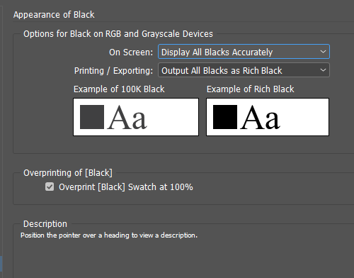
Go to the Preferences > Appearance of Black and set it to Display All Blacks Accurately if you work for print. I recommend setting to Output All Blacks as Rich Black so that 100K type and objects will print solid rather than as dots on desktop printers. This setting does not have any effect for press output.
For best results when you are doing color work for press you should be working with a profiled and calibrated monitor and you should know what the color profile of the press will be if at all possible. If you are going to have this printed by a local printer rather than an on-line service I would highly recommend you make a trip in to see the printer and talk with their pre-press person who should be able to offer you valuable guidance in file preparation. Most prepress people are more than happy to do this - properly made files make their job easier.
Copy link to clipboard
Copied
I am sorry for the late reply. The good news is, I received a proofprint, and the black text was not looking boldy as they looked on the screen. On the paper it was fine.
I still set the apprearance of black as adviced (screenshot), and now I have other question (should I start another post??).
On the print, the text looked some times bold when kerning space was rather wider than the rest of the lines.
I am wondering if that is possible at all or if my eyes are getting too old now...
Copy link to clipboard
Copied
Kerning would have no effect on the ink density (how black it prints) so I'm sure it's an optical illusion.
Copy link to clipboard
Copied
I will have a look on the print out one more time under daylight tomorrow.
It would be so nice if this is just illusion, indeed.
Copy link to clipboard
Copied
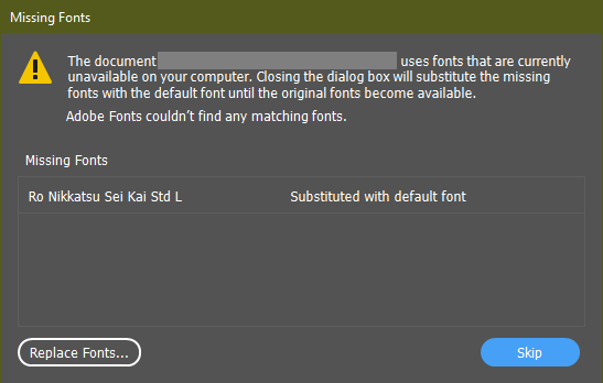
In the meantime, I have one more issue regarding fonts...
It has happened to me several times that I am using a font that was found in Indesign, and continue working with file, and then sometimes all of sudden the font type is gone and the file asks me to replace it.
Now it happens again with this font in screenshot, and I cannot find it again in the available font list from Replace window.
What do I need to do to stop this from happening again?
Copy link to clipboard
Copied
Looks like the font foundry removed this font from the Adobe library.
There is a little more information at https://fonts.adobe.com/foundries/morisawa and a link to teh foundry where you can buy a license, thyough the page came up in Japanese so I wasn't able to read it.
If that is not an optionn for you you'll need to substitute a different Japanese font that is still available and check your layout carefully for text reflow issues.
Copy link to clipboard
Copied
Oh it was a type specific issue! Thank you. I had a same problem recurring again and again for Merriweather Adobe font before, so I thought this was the same problem. I will follow the link and buy the font.
If I buy the font and download it on my PC, would it automatically be included in the package? I need to send the file to a printer later.
Copy link to clipboard
Copied
Oh dear. The font package was super pricy. I am not going to be able to afford that this time...
Copy link to clipboard
Copied
But isn't that strange, that I started using this font from October without any issue, and only now it suddenly dissapers from Indesgin file. I wonder why I could use it for two months.
Copy link to clipboard
Copied
Odd you were able to use it in October. It was supposed to be removed in September.
As far as packaging, Japanese fonts are not included when you package, so you would need to copy any Japanese fonts you use manually.
-
- 1
- 2

Find more inspiration, events, and resources on the new Adobe Community
Explore Now
 AdChoices