Copy link to clipboard
Copied
Hello there,
I have the next problem :
I am exporting/printing an InDesign file (labels with barcode) as PDF (press quality). The PDF looks fine but when printed (a thermal ROLLO Shipping Label Printer ) it looks terribly. The normal fonts look like bold. The barcodes are thickened and not readable. The InDesign file contains imported eps text, InDesign texts (from data merging) and PNG/JPG barcode file (600/2450 dpi). I've tried a lot of import/export combinations and setings but the printed result is terrible. I really do not have an idea about this kind of problem. Please help
 1 Correct answer
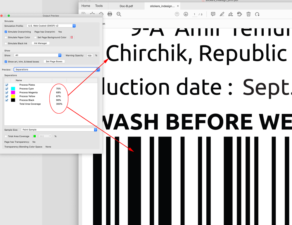
Hi @Globek , Not sure if this is causing the problem, but the placed .eps and .png barcode are RGB and when you export to a Press Quality PDF, the RGB blacks get converted to CMYK—your document has US Web Coated SWOP as the CMYK profile so the text and barcode export as 75|68|67|90 CMYK and not 100% Black:
Also the .eps text has been converted to outlines, which removes the font’s hinting—hinting improves the output of type on low res devices, so the combination of outlining and the 4-color
...Copy link to clipboard
Copied
I think this is a function of the thermal print technology. Have you discussed this with the printer? Do they have a custom profile with a large dot gain, perhaps, that you need to be using?
Copy link to clipboard
Copied
I concur with Peter, having done print work for thermal and "rough" inkjet printers.
Do the files print normally on a more usual office-grade printer? If so... there's your confirmation.
If there is not a printer profile that will make the thermal printer adjust imaging to its media, you may have to redesign the fonts and bar codes to be 'thinner' to compensate for the blurring of the printer output. Check with the printer maker. They surely have supporting information if not print drivers and profiles that might help.
—
┋┊ InDesign to Kindle (& EPUB): A Professional Guide, v3.1 ┊ (Amazon) ┊┋
Copy link to clipboard
Copied
Suggestions:
Since this is a print layout, avoid using EPS. Make them Adobe Illustrator .ai files instead. Save with max compatibility.
Also, consider using .PSD files instead of .PNG files. PNG is ideal for the screen, but PSD is better for print products.
Copy link to clipboard
Copied
Hi @Globek , Not sure if this is causing the problem, but the placed .eps and .png barcode are RGB and when you export to a Press Quality PDF, the RGB blacks get converted to CMYK—your document has US Web Coated SWOP as the CMYK profile so the text and barcode export as 75|68|67|90 CMYK and not 100% Black:
Also the .eps text has been converted to outlines, which removes the font’s hinting—hinting improves the output of type on low res devices, so the combination of outlining and the 4-color black might be contributing to the poor quality.
You can export a the PDF so that the text and barcode are black only—that might help. Set your Export preset to PDF/X-4 with the Output tab set like this:
That exports the PDF as black only:
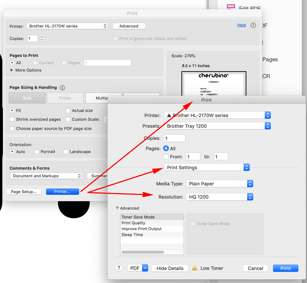
Also check the Acrobat Printer... or Print Setup settings to make sure the print driver is set to its highest resolution:
Copy link to clipboard
Copied
I think this is 100% a rough, low-rez printer issue. All the file adjustments and fine-tuning of resolution are in the face of, basicallly, printing on toilet paper.
If the material prints acceptably on a regular office printer, the file qualities are not what's causing the problem.
—
┋┊ InDesign to Kindle (& EPUB): A Professional Guide, v3.1 ┊ (Amazon) ┊┋
Copy link to clipboard
Copied
If the material prints acceptably on a regular office printer, the file qualities are not what's causing the problem.
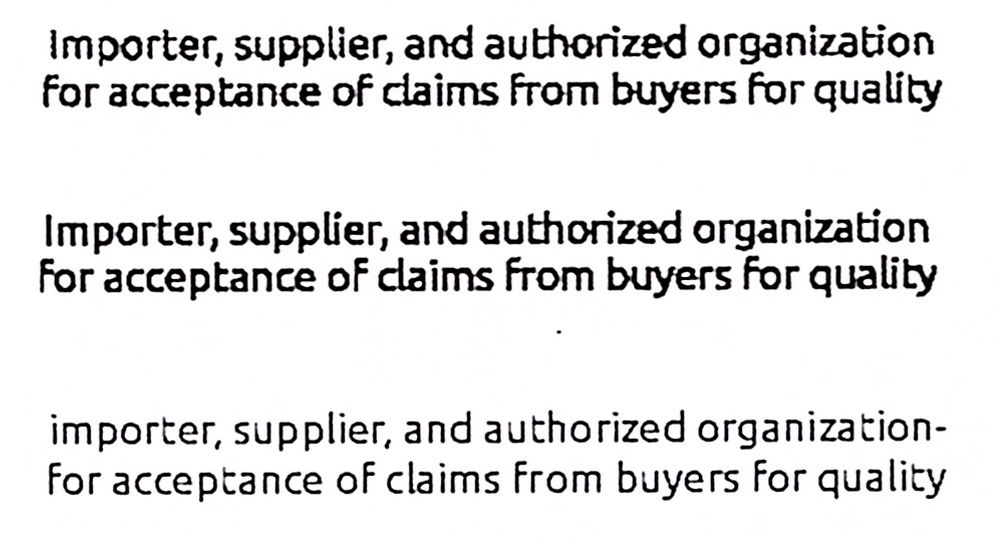
Hi James, I can see the affect of 4-color black, and outlining the text, printing from my B&W Brother laser. The affect of the color conversion is not as dramatic as the outlining problem. The descriptive text is very small (5pt), so the outlining with no hinting is a real problem for the small text at low res:
Here I’ve printed the CMYK outlined text (top), Black only outlined text (center), and the text set in InDesign at 5pt (bottom) at 300dpi—here’s a scan of the print:
Copy link to clipboard
Copied
Maybe. But we're talking about a printer that's back in the "enhanced dot matrix" era, not something from this millennium. It may be possible to fine-tune ID's output for it, but it's more a matter of working to the printer maker's specs, which are probably lousy. (Ever done design for printing on cardboard boxes? I've done t-shirt silk-screening with finer parameters.) I think this is much the same case. The solution will lie with the maker's specs and, probably even more than just a profile, an optimized print driver.
—
┋┊ InDesign to Kindle (& EPUB): A Professional Guide, v3.1 ┊ (Amazon) ┊┋
Copy link to clipboard
Copied
The benefit of hinting increases as the print resolution drops—looks like the Rollo res is 203dpi. An obvious test would be to set some black 5pt type in InDesign and print the text without outlining.
Copy link to clipboard
Copied
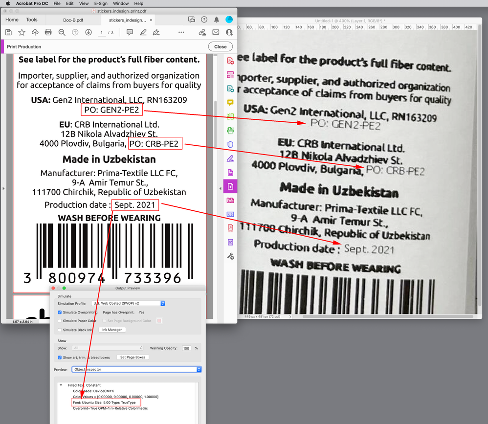
Ya, sadly, there's not much good news. Here's a side by side comparison of what the label would look like printed on a typical 600dpi printer vs their Rollo at 203dpi. That's as good as they can expect from their printer on the right. If the type was left native, yes, it would look much better, bit it will still pixelate visibly (like PO: GEN2-PE2)
Copy link to clipboard
Copied
- Don't use EPS.
- Take care, that text is on a layer above images or transparemcies is.
Copy link to clipboard
Copied
Hi @Globek , looking more closely at your photo of the printout, I can see that there is some text in the PDF that hasn’t been outlined, so we can see the affect of the font hinting in the print. (https://en.wikipedia.org/wiki/Font_hinting)
Obviously there are going to be some quality limits when you are trying to print 5pt text to a 203dpi printer, but the outlining is causing the text to fatten at the low resolution:
Copy link to clipboard
Copied
Alright. There's a multitude of issues here.
1. The first "problem" is that your Rollo is not a high quality printer (as Rob mentions it's printing at only 203 dpi. That's low in this day and age.).
2. Although there is nothing inherently wrong with using EPS that are properly constructed, you should avoid using that format these days especially if you are going to be printing directly from InDesign. In that context EPS only print properly if you are printing to a Postscript printer which your Rollo definitely is not. What happens instead is ID will send the low-res chunky preview instead. Your EPS was made in CorelDraw 2020, so you should export them as PDF or AI from there which will solve that issue. Make sure your workflow is to export print PDFs instead.
3. Regardless of the file format, the bigger issue is that all the text on your CorelDraw base layer has been converted to outlines (curves). Fonts converted to outlines become simple vector objects and lose any hinting that is built into the font. Most fonts included this "hinting" as a way to improve the appearance of type at smaller sizes on low-res printers. Without the hinting, your type will very definitely look bolder than type that has not been converted. And since the type you are adding on top of the base graphic has NOT been converted to outlines, the printed result will be inconsistent, as your native text will look less bold than the type that was outlined beside it. Hopefully, your CorelDraw file still has editable text, just make sure when you export that you do NOT select "Export Text as Curves".
4. Re: barcodes. Your barcodes have very thin lines that on a low-res printer can easily fatten by one or two pixels depending on where the barcode falls on your printers 203 dpi "grid". It doesn't matter how high-res your PNG is. This will make it look like your thin lines are inconsistent/bolder across the barcode. This is a limitation of the printer.
Copy link to clipboard
Copied
Could this be a printer driver issue, specifically a print setting issue? Such as setting the correct type of paper? I had an episode where the incorrect setting was set in the Advanced print setting, causig the printer to over-compensate and printing a way-darker photo.
Copy link to clipboard
Copied
The ROLLO Shipping Label Printer has a maximum output resolution of 203dpi.
Copy link to clipboard
Copied
Hi @Globek ,
Thanks for reaching out. In addition to suggestions shared above, I found this similar discussion which you can refer to here https://community.adobe.com/t5/indesign-discussions/random-bold-text-in-printed-pdf/td-p/11925591#M4...
Let us know if this helps or if you need any further assistance.
Regards
Rishabh

