 Adobe Community
- Home
- InDesign
- Discussions
- The text will not extend to the right side of the ...
- The text will not extend to the right side of the ...
The text will not extend to the right side of the column

Copy link to clipboard
Copied
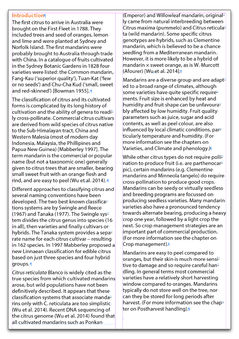
Hi I am having layout difficulties where the text will not extend to the right side of the column, even though it is obvious there is room for more words. I am trying to improve the layout of the text and reduce the white space, but for some reason the text is not optimising all the space available across a column, and moves text to a new line when there is obvious space for it on that line. Changing the Composer setting under justification from Adobe Paragraph Composer to Adobe Single line Composer results in some improvement, but it is not a recommended practice for a whole document. Would you have any suggestions or reasons why this is happening?


 36
Replies
36
36
Replies
36
Copy link to clipboard
Copied
Thank you all fro your advice.
I really wish the ragged lines being balanced was the issue, but I did not have it turned on.
I am using CS5 and the OS is Windows 7, 64-bit operating system.
In reference to the screen shot the bolded paragraph, for example the second line down there is room for the word 'of' to sit on this 2nd line as I was able to add it to the beginning of the line, but the program is not allowing it to happen. As a consequence I seem to be getting a lot of white wasted space on the right side of both columns.
I also turned on hyphenation but it had not effect on this issue.
I look forward to a solution to this problem, thank you.


Copy link to clipboard
Copied
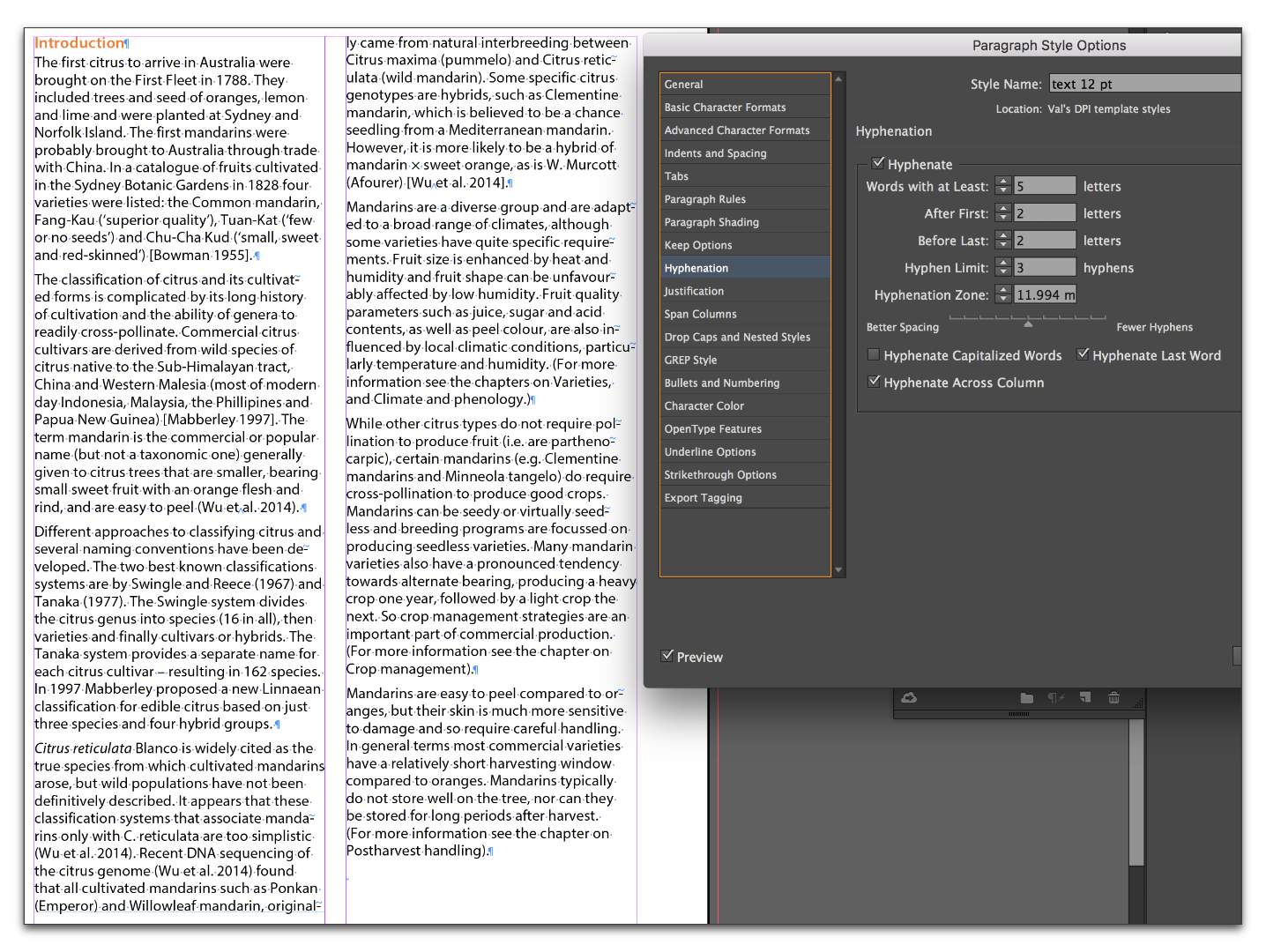
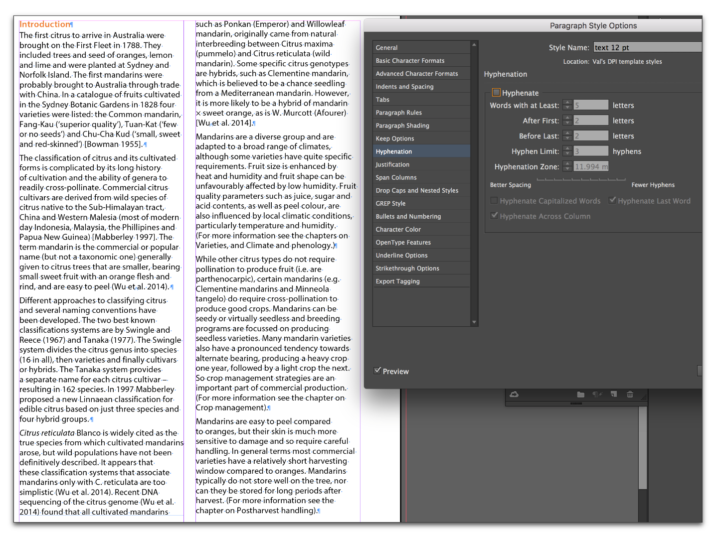
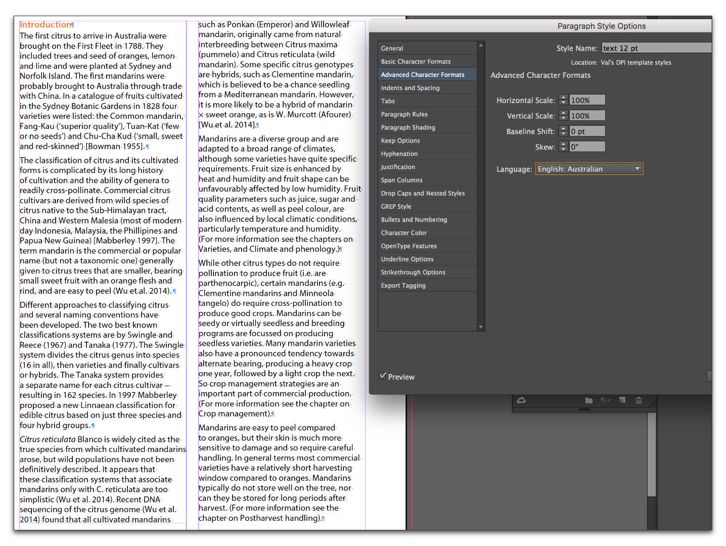
Please show your Hyphenation panel

and your Character panel (both with a paragraph selected)


Copy link to clipboard
Copied
Good morning!
Also I do not want all those words being hyphenated as it looks stranger than the original problem so do I just turn hyphenation off?
Of course, the answer to this question is sure, you should do whatever you think looks best.
I have learned that hyphenation is sensitive topic for people—a message sent home when I observed two of my students raising their voices in class as they argued over whether one should or should not use hyphenation on body paragraphs. Witnessing that event taught me that hyphenation falls into the same category as religion and politics—something best not discussed with strangers. Yet, I make a living teaching hyphenation controls in various applications. I long ago chose to simply present the facts, and leave my opinions out of it. So here are the facts:
1.) With Paragraph Composer on, the dictionary set to English: UK and hyphenation on, the right rag is minimized:
2.) With Paragraph Composer on, the dictionary set to English: UK and hyphenation off, the right rag is more prominent:
3.) With Paragraph Composer on, the dictionary set to English: Australian and hyphenation on or off, the right rag is identical to English: UK with hyphenation off:
4.) With Single-Line Composer on, the dictionary set to English: UK and hyphenation on:
5.) With Single-Line Composer on, the dictionary set to English: UK and hyphenation off:
Hopefully by comparing the various combinations of composers and hyphenation settings, you get to pick what you think looks best and then go on and enjoy the rest of your day! 
~~~~~~~~~~~~~~~~~
If you want to learn more about hyphenation and the impact on legibility:
Hyphenation | Butterick’s Practical Typography

Copy link to clipboard
Copied
I'm trying to figure out how to mark Barb's reply/explanation as Super Awesome Amazingly Helpful. But "helpful" will have to suffice.
Copy link to clipboard
Copied
Copy link to clipboard
Copied
BarbBinder wrote
1.) With Paragraph Composer on, the dictionary set to English: UK and hyphenation on, the right rag is minimized:
2.) With Paragraph Composer on, the dictionary set to English: UK and hyphenation off, the right rag is more prominent:
3.) With Paragraph Composer on, the dictionary set to English: Australian and hyphenation on or off, the right rag is identical to English: UK with hyphenation off:
4.) With Single-Line Composer on, the dictionary set to English: UK and hyphenation on:
5.) With Single-Line Composer on, the dictionary set to English: UK and hyphenation off:
opefully by comparing the various combinations of composers and hyphenation settings, you get to pick what you think looks best and then go on and enjoy the rest of your day!~~~~~~~~~~~~~~~~~
If you want to learn more about hyphenation and the impact on legibility:
Hyphenation | Butterick’s Practical Typography
@Erica: how's this?
![]()
Copy link to clipboard
Copied
Thank you all for your help, especially those staying up late into the night,
Val
Copy link to clipboard
Copied
We are always happy to help, Valerie.

Copy link to clipboard
Copied
In reading this, I was wondering what the Hyphenation vs Justification settings were. I love these settings for my bodytexts:
Hyphenation: 9, 3, 4, 1 and the three switches turned off.
Justification:
80/100/120
-5%/0%/5%
95%/100%/105%
Oh! and let's not forget setting the Kerning Method to Optical, too!
Maybe Valerie could dial these numbers into her paragraph style and see if it moves anything around.
Copy link to clipboard
Copied
The kerning change to optical did have the effect of moving some words back a line which was what I desired, but not all of them. I always thought it had to be set to metric.
I think it is a case of accepting some of the whiteness which Barb mentioned could be altered paragraph by paragraph, but ther is no time for that.
Thank you
Copy link to clipboard
Copied
I think it's still a reasonable hour for Barb and Erika, but in my time time, I am closing down and going to bed. Have you solved this yet?
Another idea is to use tracking to change the bad spacing. But do it when you think the document is finished. It is time-consuming and needs to be re-done if there are text edits. It is not the first choice if you can get it to work another way.
Copy link to clipboard
Copied
Jane, I would be more inclined to try exporting it out to IDML and open it back in to see if it gets rid of kangaroos loose in the top paddock. That might make it fit as a Mallee bull. Also, if the Australian English dictionary has gone troppo, I would switch to the British English and not look back. Should be ripper.
-
- 1
- 2

 AdChoices