
Participant
December 30, 2020
Question

Typeface appears uniform in digital but is different weights when printed

  • December 30, 2020
  • 3 replies
  • 1307 views

Relative newbie to InDesign here; thanks for your assistance. I've got a simple InDesign document that I've converted to PDF. When viewed in ID and in the PDF, the typeface looks perfectly uniform throughout. Yet when I print the document, some sections of the text are heavier than other sections:
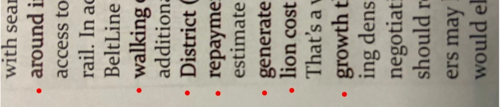
(I turned it sideways to emphasize the weight; red dots indicate lines that are heavier.) I checked every variable I know of but so far the only thing changing from line to line is the kerning - everythng else appears to be exactly the same (color is uniformly black, 13pt font, all Constantina regular).  Any ideas why this might happen? Thank you!  

This topic has been closed for replies.

3 replies

rob day
Community Expert
Community Expert
December 31, 2020

Are you sure the text fill is all the same black—0|0|0|100 CMYK is a different black than 0|0|0 RGB? The heavier weight black looks like it is printing as a 4-colors—there seems to be a magenta fringe on the edges of the text. Is there any transparency on the spread?

LL Tool JAuthor
Participant
January 19, 2021

Hey all - apologes for the delay in replying back info on my own post!  And thanks for the questions. I actually saved it as a High Quality Print format, in Adobe 9.0 version and higher, and the different font weights went away.  No clue what caused it but once I saved it for 9.0 and above, the issue went away. Never look back... 🙂  Thanks again.


LL 

Dave Creamer of IDEAS
Community Expert
Community Expert
December 30, 2020

Check to see if you have any glyph scaling applied:

David Creamer: Community Expert (ACI and ACE 1995-2023)
Typothalamus
Known Participant
March 2, 2022

David, may I ask, what amount of glyph scaling would need to be applied in order to (potentially) run into this issue? My understanding was that a range of 1–2% either way (that's 2–4% total) would be safe for body text. Is that in error, or any caveats? Kind thanks.

Typothalamus
Known Participant
March 4, 2022

Offset inks are somewhat transparent, so the addition of CMY affects the color of "black". But the affect becomes less discernible in line art and small text, and has the downside of creating registration problems and changing the apparent weight of small text.


InDesign can preview th affects of Black + CMY when the Appearance of Black Preference is set to Display All Blacks Accurately, and the correct CMYK color profile is assigned to the document (Edit>Assign Profiles). Here the fills with CMY added are obvious when the coverage is large, but not noticeable in the small type:


The CMYK profile also affects the appearance of black. Black will print differently on an uncoated sheet and an uncoated profile will soft proof that effect. Here the assignment is GRACoL Uncoated 2013:


why it's a bit of a 'type crime'


Whether you need Glyph Scaling depends on what you are trying to justify. I wouldn’t use it in a headline Paragraph Style because there would be no added benefit in fitting the text.


But with small, justified body text, set in a narrow measure, there would be noticeable copy fitting benefits—you might solve white space "river" problems at the cost of a 1% or 2% distortion. Also, when you use Glyph Scaling it isn’t necessarily applied to all of the text—it’s only used for copy fitting difficult lines.


Tremendously helpful @rob day  – I have a clear sense of what's being conveyed with that. The book will be printed on coated stock but not ultra high-gloss. As such, is it common practice to leave body text in standard black, not CMYK? Sounds as if doing so might yield sharper results, avoid registration problems, and keep the font from appearing heavier.


At the same time, sidenotes to the text set in grey. Since they're not black, should they be a percentage of black or,  in CMYK?


Are profiles to be obtained directly from the paper manufacturer in order to be accurate?

My glyph scaling is very moderate (min. 99.33% and max 101.5%) and so to the word and letter spacing adjustments. It's applied to body only, and resolves all H&J violations. Thank you again.


Steve Werner
Community Expert
Community Expert
December 30, 2020

Can you post the PDF file on Creative Cloud or Dropbox or some other service so others can download and test? (You can't upload a PDF file in our forum.)