• Global community
    • Language:
      • Deutsch
      • English
      • Español
      • Français
      • Português
  • 日本語コミュニティ
    Dedicated community for Japanese speakers
  • 한국 커뮤니티
    Dedicated community for Korean speakers
Exit
0

Understanding InDesign's First Baseline Offset: Is Ascent Actually Aligned to the Em Square?

Community Beginner ,
Sep 17, 2024 Sep 17, 2024

Copy link to clipboard

Copied

In Text Frame Options, Baseline Options there's an option to align the First Baseline Offset to a selection of Ascent, Cap Height, x-height, etc.


Left at the default (Ascent), swapping through typefaces it's clear the offset doesn't align to the ascent. As I understand it, it's meant to be the lowercase 'd'. Though I haven't seen an explanation as to why it doesn't align.


It makes me wonder if it instead is aligned to the top of the Em square defined in the design of the typeface. Would anyone have any confirmation or evidence of this?


<Title renamed by MOD>

TOPICS
Type

Views

649

Translate

Translate

Report

Report
Community guidelines
Be kind and respectful, give credit to the original source of content, and search for duplicates before posting. Learn more
community guidelines

correct answers 1 Correct answer

Community Expert , Sep 18, 2024 Sep 18, 2024

Nowadays, the ascent is much larger to enclose these glyphs, and have become even bigger as fonts are getting more glyph support; they increase the ascent to accomoodate the new glyphs above the ascenders.


Not exactly. In most fonts (that I have seen) some diacritics, especially complex ones, are above the font's ascender value:
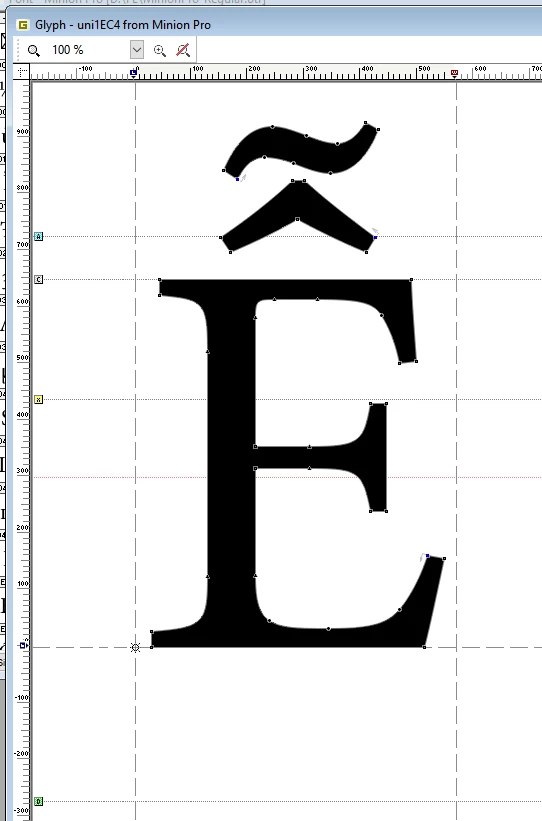
PeterKahrel_0-1726662659019.png


Votes

Translate

Translate
Community Expert ,
Sep 17, 2024 Sep 17, 2024

Copy link to clipboard

Copied

Ascent uses the highest letter. It is different in different fonts. More reliable results you will get with cap height (= H-height). 

Votes

Translate

Translate

Report

Report
Community guidelines
Be kind and respectful, give credit to the original source of content, and search for duplicates before posting. Learn more
community guidelines
Community Expert ,
Sep 17, 2024 Sep 17, 2024

Copy link to clipboard

Copied

It's built into the font. Some fonts set the ascent to the highest ascent, others leave some space. This screenshot is from the Minion Pro in a font editor, which shows that its top is a bit below the ascent value set for the font. The ascent is the top horizontal rule labelled A in the light-blue box on the left.


PeterKahrel_0-1726566988142.png


Votes

Translate

Translate

Report

Report
Community guidelines
Be kind and respectful, give credit to the original source of content, and search for duplicates before posting. Learn more
community guidelines
Community Beginner ,
Sep 17, 2024 Sep 17, 2024

Copy link to clipboard

Copied

Interesting! Peter, thank you.


If I understand that correctly, an ascent value (line A) is listed as part of the fonts' features, which InDesign can read. But it doesn't necessarily refer to the ascenders in the font, nor does it mean the ascenders align to this value.


Is this just one of those odd quirks in font design? Screenshot 2024-09-17 at 13.34.39.png

Votes

Translate

Translate

Report

Report
Community guidelines
Be kind and respectful, give credit to the original source of content, and search for duplicates before posting. Learn more
community guidelines
Community Expert ,
Sep 17, 2024 Sep 17, 2024

Copy link to clipboard

Copied

Correct, it is one of those.

Votes

Translate

Translate

Report

Report
Community guidelines
Be kind and respectful, give credit to the original source of content, and search for duplicates before posting. Learn more
community guidelines
Community Expert ,
Sep 17, 2024 Sep 17, 2024

Copy link to clipboard

Copied

" it's meant to be the lowercase 'd'. "

No. Ascent is the designed distance from the baseline to the top of any potential glyphs (accents, etc). Yes, in the old days, ascents were based on the tallest ascender (and any accented glyphs were placed above this line). Nowadays, the ascent is much larger to enclose these glyphs, and have become even bigger as fonts are getting more glyph support; they increase the ascent to accomoodate the new glyphs above the ascenders. Open source fonts are especially bad at this as they keep "tinkering" with the offsets, so the, say, Open Sans you used 2 years ago can be quite different than the one you can download today. This is troublesome for InDesign documents composed based on Ascent if they are opened by somoen using differently designed fonts.

Baselines are also all over the map due to the design of the font, so yes, in the traditional EM square sense, a font with larger descenders will have a higher baseline relative to a font with shorter descenders.

Votes

Translate

Translate

Report

Report
Community guidelines
Be kind and respectful, give credit to the original source of content, and search for duplicates before posting. Learn more
community guidelines
Community Expert ,
Sep 18, 2024 Sep 18, 2024

Copy link to clipboard

Copied

Nowadays, the ascent is much larger to enclose these glyphs, and have become even bigger as fonts are getting more glyph support; they increase the ascent to accomoodate the new glyphs above the ascenders.


Not exactly. In most fonts (that I have seen) some diacritics, especially complex ones, are above the font's ascender value:

PeterKahrel_0-1726662659019.png


Votes

Translate

Translate

Report

Report
Community guidelines
Be kind and respectful, give credit to the original source of content, and search for duplicates before posting. Learn more
community guidelines
Community Expert ,
Sep 18, 2024 Sep 18, 2024

Copy link to clipboard

Copied

@Ciaran25473599uu11 asked: "… Is Ascent Actually Aligned to the Em Square?"


Well, the only thing I have to add is that there is also an option to the First Baseline Offset that is not available through the user interface; it can be assigned by scripting with e.g. ExtendScript (JavaScript). Here all the possible options for scripting:

https://www.indesignjs.de/extendscriptAPI/indesign-latest/#FirstBaseline.html#d1e76521


The one that is missing in the user interface is: FirstBaseline.EMBOX_HEIGHT


If one selects a text frame (not the text, the frame itself) one could apply the value with the following script code:

app.selection[0].textFramePreferences.firstBaselineOffset = FirstBaseline.EMBOX_HEIGHT;


From my German InDesign 2024 where the selected text frame is showing first baseline set to EMBOX height. No idea why this option is not available in the user interface, when applied you see an empty field for "Offset" ("Versatz" in German):

Bildschirmfoto 2024-09-18 um 09.02.45.png


Regards,
Uwe Laubender
( Adobe Community Expert )

Votes

Translate

Translate

Report

Report
Community guidelines
Be kind and respectful, give credit to the original source of content, and search for duplicates before posting. Learn more
community guidelines
Community Expert ,
Sep 18, 2024 Sep 18, 2024

Copy link to clipboard

Copied

O, yes, that one. I've never found any use for it. It's available also for anchored frames (to position them vertically relative to the anchor point). InDesign's em corresponds to the point size, so in 10-points text the em is 10 points.

Votes

Translate

Translate

Report

Report
Community guidelines
Be kind and respectful, give credit to the original source of content, and search for duplicates before posting. Learn more
community guidelines
Community Expert ,
Sep 18, 2024 Sep 18, 2024

Copy link to clipboard

Copied

Just in case you want to align the first line's ascent with the top of the text frame, first get the real ascent's value. You can use the following script. Select an ascender letter and run the script. Note the value.


Then set the text frame's first baseline offset to Fixed and the Min: value to the value you recorded.


if (app.selection.length === 0 
			|| !(app.selection[0] instanceof Character)) {
	alert ('Please select a single character', '', true);
	exit();
}

ch = app.selection[0]
bline = ch.baseline;
x = ch.createOutlines()[0];
realAscent = bline - x.geometricBounds[0];
app.activeDocument.undo();
alert (realAscent.toPrecision(4), 'Real ascent');


Votes

Translate

Translate

Report

Report
Community guidelines
Be kind and respectful, give credit to the original source of content, and search for duplicates before posting. Learn more
community guidelines
Community Expert ,
Sep 18, 2024 Sep 18, 2024

Copy link to clipboard

Copied

Hi @Ciaran25473599uu11 , Also, you can see that the ascender line is determined by the font’s designer (not InDesign), by comparing different versions of the same named font.


Here is the cloud activated Adobe Type version of Roboto compared to the Google freeware version, which I have installed in my user Fonts folder. The AdobeType version sets the Ascender line above the diacritic marks plus some padding, while the Google version sets it on the lowercase ascender:


Screen Shot 28.png

Votes

Translate

Translate

Report

Report
Community guidelines
Be kind and respectful, give credit to the original source of content, and search for duplicates before posting. Learn more
community guidelines
Community Beginner ,
Sep 18, 2024 Sep 18, 2024

Copy link to clipboard

Copied

Thank you Rob, another good point in the discussion around this subject.


Seems the answer is another maddening quirk between the design of a typeface (occasionally arbitary position of the ascent) and the function of the program like InDesign.


Perhaps I should put in a feature request for programs like InDesign, Illustrator etc to allow the program to visualise the various constructions line: Baseline, x-height, cap height, ascent and descent. As well as their overhangs and overshoots.

Votes

Translate

Translate

Report

Report
Community guidelines
Be kind and respectful, give credit to the original source of content, and search for duplicates before posting. Learn more
community guidelines
Community Expert ,
Sep 18, 2024 Sep 18, 2024

Copy link to clipboard

Copied

If you are looking for more consistency use Cap or x-height—those lines are less ambiguous.

Votes

Translate

Translate

Report

Report
Community guidelines
Be kind and respectful, give credit to the original source of content, and search for duplicates before posting. Learn more
community guidelines
Community Expert ,
Sep 18, 2024 Sep 18, 2024

Copy link to clipboard

Copied

LATEST

What's particularly confusing to some users (who unkowingly have diffferent versions of the same font) is why a document they received from someone else will look fine when they open it, but the moment they attempt any edits, the first line will change position. It's because InDesign (and PageMaker before it) only recomposes the text when it needs to. So, the file has been composed and saved according to the first user's font, and any edits will elicit a recompose to the current user's fonts.

Speaking of PageMaker, this is kinda how we got here. When PM first came out, there was only one opton; the first line of text was always positioned according to the baseline of the first line's leading(line space). This annoyed most of us because there was always space above the characters at the top of stories, making it nigh impossible to line up the tops of stories on a page to the top margin. In later versions, PM tried to address that by coming up with what they called Proportional spacing, where the assumption was made that, on average, 2/3 of the linespace was above the baseline and 1/3 below, so this brought the first line up to eliminate* the space (*depending on the design of the typeface). This became PM's new default, and it annoyed even MORE people, particularly if Auto line spacing (ick) was used.  (There was also a Cap height option, but most usage fell between the other two.)  Thankfully, Proportional spacing didn't carry over to InDesign, but when I had to convert clients' old legacy PM files to InDesign who used Proportional, to make the layouts match, I needed to apply a Fixed space with a minimum equal to 2/3 of the first line leading and everything popped back into place.

Votes

Translate

Translate

Report

Report
Community guidelines
Be kind and respectful, give credit to the original source of content, and search for duplicates before posting. Learn more
community guidelines