 Adobe Community
- Home
- InDesign
- Discussions
- Re: [Feedback] Usefulness for below types of fancy...
- Re: [Feedback] Usefulness for below types of fancy...
[Updated] Usefulness for below types of fancy fonts and hybrid glyphs.

Copy link to clipboard
Copied
-Updating the description
Some key aspects:
1. Glyphs can be partitioned into any number of segments
2. There is no convert to outline. Text remains live and editable
3. User can control the thickness of the bold and slant angle of the italics.. something like variable fonts
Hi Everyone,
We wanted to know if there is any usefulness to generate custom fonts whose glyphs are a combination of bold and italic typeface. We call these glyphs “Hybrid Glyphs”. So, to say, each glyph is segmented into regions and each region may have a different typeface replicated.
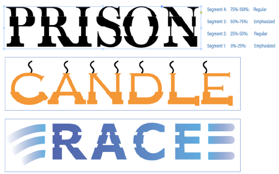
In terms of workflow, the user selects the font, say regular, and defines the segment marks in terms of how low it is from the font ascender line. Let say he marks two points at 20% and 50% above from the fonts descender (total font height=ascender-descender). This will generate three segments. For each segment he then may choose a different typeface to be replicated. For example, he may choose Bold-Italic-Bold. This will even be possible if the designer does not have the bold and italic typefaces of the font. In such cases, it will replicate a false bold in the first segment, a false italic in the middle segment and a false bold in the third segment. In case the user has the required typefaces of the font family, then that portion of the glyph will be taken from the corresponding font. The user may choose any typeface like semi-bold, semi-italic, condensed etc
We primarily want to know...
- Will this "feature" be useful to designers?
- How often will you use this capability?
- Under which scenarios and product will this most likely be useful? (maybe for Logos in AI? and titles in InDesign?)
- Do you see any missing aspects to this which can increase its usage?
- In light of the latest typography advancements (SVG fonts, variable fonts) how do you place this capability?
PS: This is not something we are implementing in any product for now. We just want your opinions and feedbacks.
-Aman


 13
Replies
13
13
Replies
13

Copy link to clipboard
Copied
I think it looks horrendous. And I think that type designers will be horrified to see their typefaces abused like this.
Peter

Copy link to clipboard
Copied
Useful? NO! Not even in the least.
With all due respect, please don’t use up valuable resources on solutions to problems that don’t exist.
Instead, please check all the open bugs and start fixing them. Revisit all of the interactive features and improve them. They haven’t been looked at since CS5.
Copy link to clipboard
Copied
I have to agree with Bob and Peter. With the thousands of well-designed fonts available from many, many sources, these look just awful.
What it reminds me of is bad typography from the early days of desktop publishing like the "shadow" effect automatically applied to type, or artificially slanted letters.
Copy link to clipboard
Copied
If you want to do something useful with fonts, here are a couple of ideas:
- Substitute fonts. A system where the user can set up a table that automatically fixes the dreaded pink boxes: A table (or whatever) that says 'if character x can't be found in font A, use font B'. This is already possible with composite fonts, but these are not exposed in the non-ME versions of InDesign and aren't exactly user-friendly. If you're looking for a word-processor precedent: WordPerfect has had substitute fonts since the 1980s.
- Expose the dreaded pink boxes to scripting: we should be able to test whether a selected character is present in the selected font and we should be able to find all missing glyphs in a text.
- Expose all font metrics to scripting. Currently, ascender, descender, and baseline are exposed to scripting, but cap- and x-height aren't. Sidebearings would be useful too.
These three things are languishing in User Voice after spending many years in Adobe's previous feature request database. Thought I'd mention them here anyway. You never know what good it does.
P.
Copy link to clipboard
Copied
Hi all,
Thanks for spending time and providing your valuable feedback.
However, i would like to clarify that this is only a personal research.
The only intention is to seek feedback from expereinced and professional Adobe users, like all of you, regarding when can such custom fonts be useful. How often? If at all useful? Does this in any way excite you?
I would like to add that in doing so, text remains completely live and fully editable. There is no convert to outline kind of thing in the process.
Thanks
Copy link to clipboard
Copied
It's just that one of InDesign's "claims to fame" is that it produces the highest quality typography. As teachers, we can point to the fact that it was an early decision not to allow fonts to be artificially slanted or substititued without letting the user know as Microsoft Word does.
Including a feature that makes type look bad is counter to that principle and debases the program. Just my opinion.

Copy link to clipboard
Copied
As a special effect idea, it is not really that bad. As with all such effects, it might come in handy, once, for just a single design. Certainly rare enough to not warrant a special UI and live editability. If we want, we can do this (without a UI, though) with a deftly applied compound object mask.
Our in-house cover designer has done tons of things very much like this: usually a one-off, a special design for a single client, and if someone else fancies it and asks for "the very same thing but with a wildly different title and font" (so literally re-using the same effect would be totally inappropriate), we go and design something new instead.
I see no need for this as an available instant-effect. A very real outcome – also, the worst possible one – could be it makes non-designers apply it as a Stock Effect to everything, just because You Can.
I vividly remember the first series of DTP software that all provided faux slant, outline, drop shadows, at the click of a button – and so everybody used that. Fortunately, there is no single button for that in InDesign –


Copy link to clipboard
Copied
Too much time on your hands? Here's another example of InDesign software developers traveling down a dark road for nothing. Turn around. Come home. And fix stuff that needs fixing.
Thank you!

Copy link to clipboard
Copied
I don't mean to "pile on" here, but I do agree that it's something most designers who use InDesign will never need nor ask for. It might be a cool idea for someone, but not the harried users who just need to crank their work out and get paid by the client. If I was going to do something like this, I'd probably create some effect in Illustrator and drop it into my ID document as a graphic, and editable live text wouldn't be a big need.
There are definitely bigger fish to fry. InDesign CC 2019 was released with a properties panel that went blank when undocked, and although that bug was fixed in .0.1, it shouldn't have escaped in the first place. Just one example, but it was a doozy.

Copy link to clipboard
Copied
My 2 cents, if I want Word Art, I'll use Word Art.
No need for this type of thing, pardon the pun.

Copy link to clipboard
Copied
Interesting from a technology viewpoint, but I can't see my design team using it here more than once in a blue moon for a one-time special design.
One comment: in the samples, the changes in width values is abrupt, creating the chunky effect. Wondering if it's possible to have the effect gradated over a range. Example: from 0-50%, the shape would be gradated from expanded to regular.
But it still would only be used once in a while.
| PubCom | Classes & Books for Accessible InDesign, PDFs & MS Office |

Copy link to clipboard
Copied
I would personally not find it useful.
Copy link to clipboard
Copied
Hi,
Thank you everyone for your feedback.
As stated before, this is only a personal research and experimental idea am working upon and has no link to any feature/bug fixes that are done by the team.

Adding some few more use-cases and designs which can be accomplished with this capability.
Looking for more feedback.
Thanks,
Aman

 AdChoices