

- Home
- InDesign
- Discussions
- Re: Using InDesign's Drop Shadow Effects. Good or ...
- Re: Using InDesign's Drop Shadow Effects. Good or ...

Copy link to clipboard
Copied
I'm laying out a book in InDesign 5.5. The book gets sent as a PDF to the book publisher. The book has about 400 photos in it that many are wrapped in the text (Text Wrap). My question is: What are the pitfalls or problems that might accrue if I apply a drop shadow to the photos using InDesign's drop shadow feature?
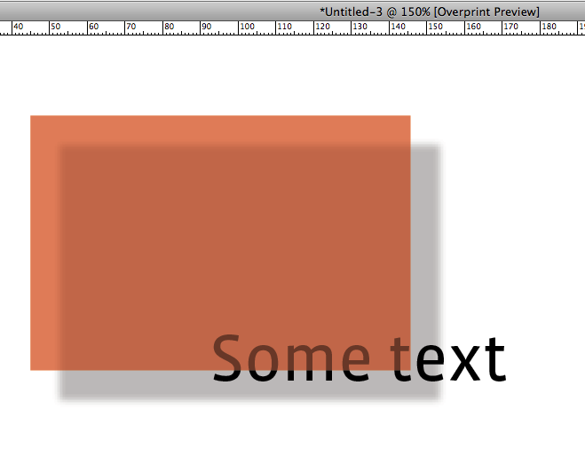
I see two check boxes in the Drop Shadow Effects dialog box:
Object Knocks Out Shadow & Shadow Honors Other Effects. I'm guessing I want the object to knock out the shadow?


 1 Correct answer

You are most likely going to want to knock out the shadow. There are times when you might want to do otherwise, but unless you are very familiar with overprint and knockout, I would reccomend staying away. Here is more information on the subject: http://help.adobe.com/en_US/indesign/cs/using/WSa285fff53dea4f8617383751001ea8cb3f-7038a.html
The only pitfall I can think of in aesthetics. Drop shadows are used best when used subtley. To make your job easier, instead of individually applying a drop s
... 35
Replies
35
35
Replies
35
Copy link to clipboard
Copied
You are most likely going to want to knock out the shadow. There are times when you might want to do otherwise, but unless you are very familiar with overprint and knockout, I would reccomend staying away. Here is more information on the subject: http://help.adobe.com/en_US/indesign/cs/using/WSa285fff53dea4f8617383751001ea8cb3f-7038a.html
The only pitfall I can think of in aesthetics. Drop shadows are used best when used subtley. To make your job easier, instead of individually applying a drop shadow to your objects, you might want to apply an object style. This would allow you to easily make changes to all the objects with the drop shadow effect. More on that here: http://help.adobe.com/en_US/indesign/cs/using/WS5CEDB81A-0011-4dc9-9DE8-AC7AD4C80076a.html
Copy link to clipboard
Copied
Alec, thanks for those link on the subject. One other quetion: In the "Transparency Flattener Presets" dialog box, Do I need to make any different settings? For some reason tears ago I was having problem with appiling drop shadows and other effects and it was looking screwy when it printed. Someone said to make a different setting in the "Transparency Flattener Presets" dialog box.
Copy link to clipboard
Copied
This I am not as familiar with, but I would reccomend going to the default [High Resolution] for print. You should take a look at this document: http://help.adobe.com/en_US/indesign/cs/using/WSa285fff53dea4f8617383751001ea8cb3f-6ea7a.html
Someone else might be able to provide better direction though.

Copy link to clipboard
Copied
Honestly…in the year 2012 you shouldn’t be flattening transparency so it’s pretty safe to ignore it unless you’re dealing with luddite printers.
Bob
Copy link to clipboard
Copied
"dealing with luddite printers". LOL! Bob, that might be the case. The book is being self published, (Print on demand). So I need to really make sure I have everything correct and fool proof. A few years ago I called the tech person at one of these self publishing outlets and the guy didn't know what CMYK was. That's some scary stuff!
Copy link to clipboard
Copied
In that case, the best advice I can give you is to design accordingly and that may well mean minimizing the use of transparency.
Bob

Copy link to clipboard
Copied
For some reason tears ago I was having problem with appiling drop shadows and other effects and it was looking screwy when it printed. Someone said to make a different setting in the "Transparency Flattener Presets" dialog box.
Transparent pages always get flattened when you print, and usually you can control how the flattening happens from the Advanced tab by picking a preset.
When you export a PDF transparency gets flattened when you choose PDF 1.3 from the Compatibility popup in General. So, the PDF/X-1a standard is flattened by you , while the PDF/X-4 standard postpones flattening until the PDF is printed.
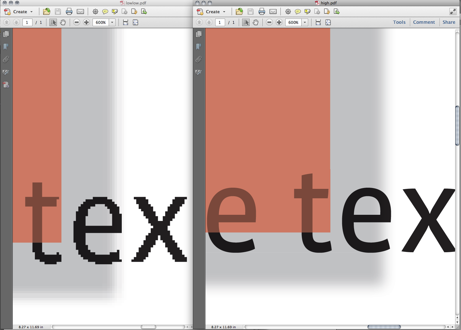
99% of the time the default high resolution flattener preset will be fine—if you had a lot of very small type on a transparent page you might need a text resolution higher than 1200.
If you export your own transparency it's easy enough to look at the quality in Acrobat. Here's an exaggerated low res flattener where I've forced the text to rasterize vs. the default high res:

Copy link to clipboard
Copied
Here are the visual effects of these options, they only come into play if the object you are applying the drop shadow has another transparent effect applied.

Copy link to clipboard
Copied
So I started applying the drop shadows to my b/w images in InDesign and what I am finding is when I click to apply the drop shadow, the image get lighter. What's up with that?
Copy link to clipboard
Copied
That depends. Are the images REALLY grayscale, or are they RGB with a B&W Adjsutment applied, or perhaps a color image withthe color info removed in some other way?
If they're RGB, you're probably seeing the effect of having the transparency flattener space set to CMYK, bu tif htey are really grayscale, waht you are seeing is due to ID not having any notion of a grayscale source profile. Grayscale data is ooutput onthe Black black of the current CMYK working profile, and introducing transparency (including the drop shadow) forced ID to redo the screen preview. Rob has given a pretty good explanation of this, I think, at http://forums.adobe.com/message/3469367#3469367
Copy link to clipboard
Copied
Hi Peter, All the images are grayscale. I read through Rob's explanation from the link you provided and it looks like I'm screwed as far as applying the drop shadow in InDesign. I tryed doing the "Load Gray" idea but when I do that an open dialog box comes up that wants me to pick something. I don't have a clue want to pick. This job is going to a self publisher and there is no way I am going to get any kind of file or profile from them. Is there anything else I can do?
Copy link to clipboard
Copied
it looks like I'm screwed as far as applying the drop shadow in InDesign.
Keep in mind this is simply a preview change the output numbers are not affected—when you add transparency the document's CMYK profile is always used to display black values. The output gray values are not changing.
I don't have a clue want to pick.
The accuracy of your CMYK preview depends on the accuracy of the document's assigned CMYK profile and your system's moniter profile. So if your only concern is matching the preview of a grayscale in PS and ID, pick your ID document's CMYK profile (see Edit>Assign Profiles...) from your system's profile folder.
Copy link to clipboard
Copied
Hi Rob, okay you are saying that the output numbers are not affected. Then that would be fine. Here is something else I found. When I export a PDF, the images in the PDF look like the images in InDesign as far as them being effected as to being lighter or more transparent. Is it the same case when I view the PDF, that is the image will still keep it's output numbers from Photoshop?
Copy link to clipboard
Copied
Is it the same case when I view the PDF, that is the image will still keep it's output numbers from Photoshop?
Yes. You can track the output numbers in all 3 apps via Info panel in PS, Separation Preview in ID and Output Preview in Acrobat.
Copy link to clipboard
Copied
I did the "Load Gray" thing in PS and it now says "Black Ink - Generic CMYK Profile". Do I now need to do a "Covert to Profile" to all my Grayscale images before bringing them into InDesign, or just leave them alone?
I also loaded the custom setting file in the "Color Settings" in InDesign. So now when I bring a Grayscale image into ID, and apply the drop shadow, it still gets lighter.
Not sure where Separation Preview is in ID.
I looked at the Output Preview in Acrobat and the output values were the same as in Photoshop. That's after I exported the PDF as a PDF/X-4.
Copy link to clipboard
Copied
Genereic CMYK isn't a particularly useful output profile -- it doesn't match anything.
Try making a couple of copies of one of your grayscales, then on one Edit > Assign profile and pick the new gray profile, and on the other Edit > Convert to Profile to the same new profile and determine which on, if either, seems to be more correct. Place them both in a sample ID file that uses the Generic CMYK profile as the working space, and apply the drop shadows. They ought not to change.
Choosing whether convert or assign is giving you the results you want is going to be a judgement call. Assigning will leave the gray values alone, converting will change them so they appear the same in the new space, but since the genericc profile doesn't match your output intent, I'm not sure that it's going to help you. How did you arrive at the use of Generic CMYK for a working space?
Copy link to clipboard
Copied
"Generic CMYK" was the only CMYK icc to pick from. But I came across this. I went to View>Proof Setup>Custom and picked "Generic CMYK". Then turnned on "Proof Colors". Now when I bring my Grayscale images into ID, and apply the Drop Shadow, it stays the same. So would you say I am good to go?
Was there somewhere else I could find diffent CMYK icc's?
Copy link to clipboard
Copied
Windows or Mac?
What part of the world are you in?
There should be at least a dozen, maybe a hundred or more, cmyk profiles loaded on your system someplace. Did you do a file search for *.icc? That should pick up the folders where they are being stored.
Copy link to clipboard
Copied
Mac, and I live in Tucson, AZ. There are over a hundred icc's, but they all have to do with a particular printing like HP, Epson, Canon and, so on. What's weird is that I do a search for icc and the Generic CMYK doesn't show up at all.
The CMYK Profile is set on "U.S. Web Coated (SWOP) v2" in the Assign Profiles dialog box. Should that be changed?
Copy link to clipboard
Copied
ALL CMYK profiles are descriptive of some specific output device, or an output standard. SWOP (Specification for Web Offset Printing) is a generic CMYK standard that is achievable on almost any press (it was designed for high-speed, high-volume printing like magazines) and would be preferable to the profile you've currently chosen. Absent some specific recommendation from the printer, this should give acceptable, if not spectacular, results in the US.
Did you make a note of where those profiles you found are stored? You're going to nned to navigat to that folder to select the CMYK profile to assign to the grays.
Copy link to clipboard
Copied
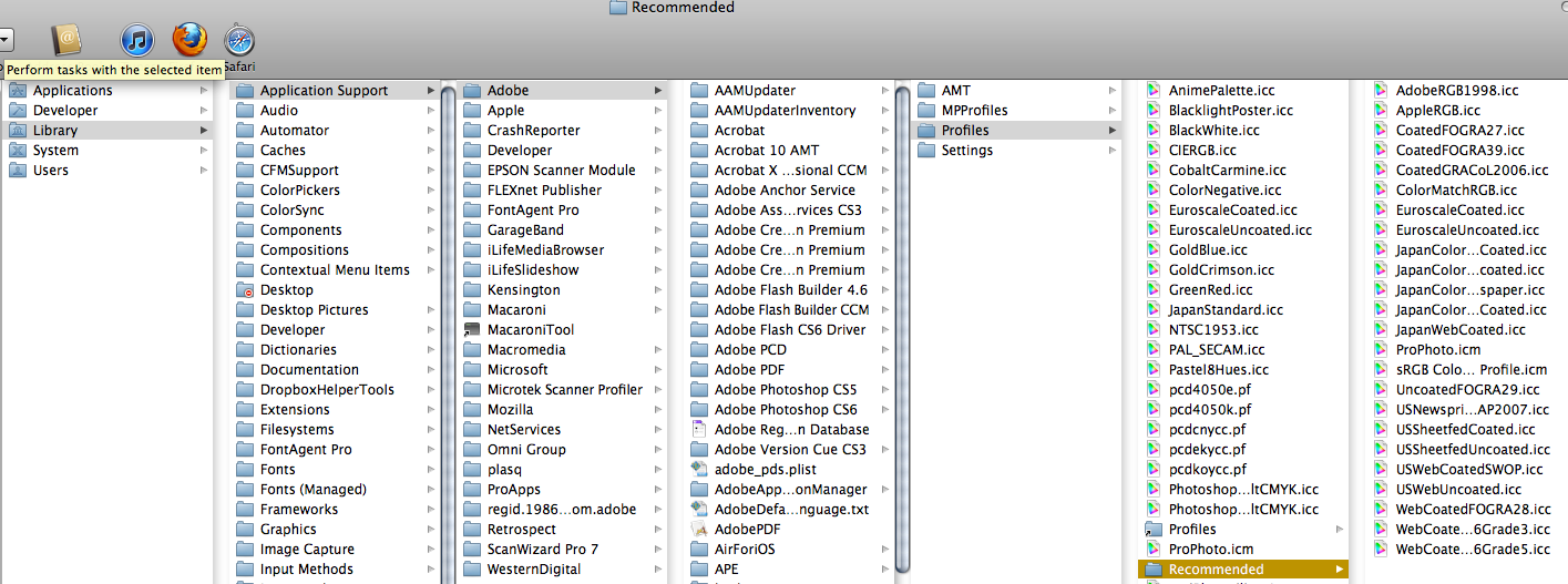
The Adobe recommended profiles should be here:
System/Library/Application Support/Adobe/Color/Profiles
But profiles can also be in:
Users/user/Library/ColorSync/
System/Library/ColorSync/Profiles
The CMYK Profile is set on "U.S. Web Coated (SWOP) v2" in the Assign Profiles dialog box. Should that be changed?
What kind of press will print the project?
Copy link to clipboard
Copied
It's "Print on demand" I would have to call them. But it could take going through many people to get the answer, If they would even understand what I am asking for. Note: there are no color images that are in this book. Here is what I get when I look for profiles:
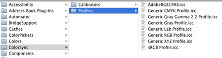
Copy link to clipboard
Copied
Is there an Application Support folder in your Sytem
/Library/Application Support/Adobe/Color/Profiles/Recommended
POD halftone quality is marginal, so don't expect much. You should be able to order a sample at little cost.
US SWOP or US Sheetfed.
Copy link to clipboard
Copied
Yes, I can get there by way of "/Library/Application Support/Adobe/Color/Profiles/Recommended".
"US SWOP or US Sheetfed" I would have to ask them. But they are not very helpful. When I do find out, what are the steps I need ot change the icc?
-
- 1
- 2

Find more inspiration, events, and resources on the new Adobe Community
Explore Now
 AdChoices