- Home
- InDesign
- Discussions
- Re: What font value does InDesign use for Ascend/C...
- Re: What font value does InDesign use for Ascend/C...
What font value does InDesign use for Ascend/Cap height of a font? InDesign bug or font bug?
Copy link to clipboard
Copied
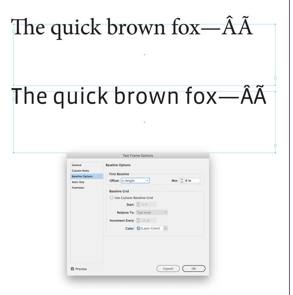
My document uses Gill Sans (macOS standard font) for a section heading, which is (and must be) a normal paragraph. When I change this to the Cabin font (Google Fonts), suddenly my section head takes up extra vertical space, like this (left: Cabin 102pt, right: Gill Sans 102pt)
The only thing I changed was the font. I dug into this and I found out that the Basic Text Frame Object uses the ascend of the font to calculate the position of the first line. Gill Sans apparently has an ascent height that is identical to the cap height. Cabin, apparently, produces a weird ascent height value for the font.
If I do the same trick in Textedit or Word, no such large white space happens at the top, which suggests InDesign is using a wrong (in this case even crazy) value for the ascend. Or maybe there is a bug in the font (but then, I have to say, this is a bug in many fonts because many fonts behave like this in InDesign). I am wondering how to handle this. Using Cap height minus a fixed amount to get to ascend height is not a good idea as some text frames will start with a large font, and others with a small one. And I get the impression this produces other issues as well (but I am not certain yet)
What value from the font does InDesign use when it looks for Ascend height? Does this example actually show an InDesign bug or a font bug?
Copy link to clipboard
Copied
Hi @Gerben Wierda , The designer of the font sets the font metrics—cap height, x height, ascender line descender line, etc. InDesign uses the font metrics for the First Baseline Offset choice relative to the text frame. Here Adobe’s MinionPro does not include diacritical marks for the Ascent line, but Emigre’s Vista Sans does
First Baseline Offset set to Cap Height and X Height:
Copy link to clipboard
Copied
I am completely at a loss, here. I need to know why Cabin produces this huge white gap. The designer tells me "I have no idea, I don't know InDesign, I hope you find a solution". I see many other fonts on my system with the same behaviour, some more, some less, but others without that behaviour. Most of the standard macOS fonts that show that behaviour are TTC files.
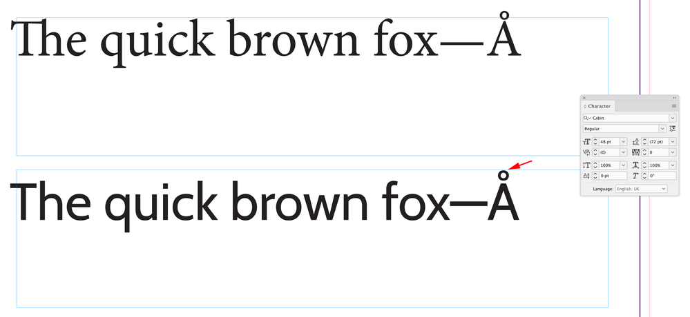
I would be obliged if someone could tell me why with the files attached (ID test doc, font file) ID creates the ascent height on the first line that it does. The ID doc has three text objects, all with first baseline set to ascent and it looks like this:
The first text block has that extra ascent height.
Copy link to clipboard
Copied
First, "ascent" refers to the amount of space designed into the font to accomodate the ascenders of the font's glyphs. An excellent definition and demostration is at https://stackoverflow.com/questions/27631736/meaning-of-top-ascent-baseline-descent-bottom-and-leadi...
Ascent and any of the other settings that position a glyph are part of the font's metrics — the programming within the font that controls each glyph's positioning veretical and horizontal (tracking/kerning).
If you don't like what Cabin has programmed into the font, then look for another version from another vendor that might have different metrics programming. Cabin is available from Google Fonts at https://fonts.google.com/specimen/Cabin
| PubCom | Classes & Books for Accessible InDesign, PDFs & MS Office |
Copy link to clipboard
Copied
As mentioned, the Ascent distance is part of the design of the font and is defined in the font accordingly by the font foundry, as well as the descender distance, x-height, glyph padding (left and right), etc. Here are the two fonts internally:
This is not an InDesign bug as it's using the information given to it.
Should you want it more consistent, consider changing your default First Baseline Spacing to Cap Height.
Copy link to clipboard
Copied
I am completely at a loss, here. I need to know why Cabin produces this huge white gap.
The designer of Cabin decided to set the ascent line at the top of the diacritical marks and not the top of the lowercase acenders:
As others have suggested it sounds like you want to use Cabin’s Cap Height as the First Baseline Offset
Copy link to clipboard
Copied
I need to know why Cabin produces this huge white gap.
Please keep in mind that Word was designed as a word processor and has always had limited typography controls and no baseline options or first line offset controls. If you feel that you have located an InDesign bug you can report it here: https://indesign.uservoice.com. If you think you found a bug with the font you can report it here: https://github.com/google/fonts/issues.
My two cents is that InDesign is honoring the font metrics build into Cabin and Word is not because it's just not that sophisticated. The next step is up to you: work in Word or find a different font or work with the baseline options. I don't know that we can be of any additional assistance.
~Barb
Copy link to clipboard
Copied
Thanks all. One additional question:
- What is the easiest way for me to find out what the font designer has set? E.g. what value am I looking for e.g. when I open the font in FontForge? Or any other way I can find out?
Copy link to clipboard
Copied
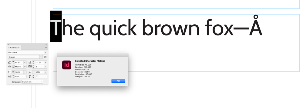
You can get some font metrics via scripting. This gets point Size, Baseline, Ascent, Descent, Cap Height, X Height
// the selected character
var s = app.activeDocument.selection[0];
// the fixed decimal place
var dn = 3;

if (s.constructor.name == "Character") {
    var p = getFontMetric(s).pointSize;
    var bl = getFontMetric(s).baseline;
    var a = getFontMetric(s).ascent;
    var d = getFontMetric(s).descent;
    var ch = getFontMetric(s).capHeight;
    var xh = getFontMetric(s).xHeight
    alert ("Selected Character Metrics\rPoint Size: " + p + "\rBaseline: " + bl + "\rAscent: " + a + "\rDescent: " +d  + "\rCapHeight: " +ch   + "\rXHeight: " +xh )
} else {
    alert("Please Select a Single Character")
}


/**
* Gets the selected character’s font metrics
* @ param the character selection
* @ return an object with pointSize, baseline, ascent,descent, xHeight, and capHeight
*/
function getFontMetric(s){
    app.scriptPreferences.measurementUnit = MeasurementUnits.POINTS;
    var o = new Object;
    o.pointSize = s.pointSize.toFixed(dn);
    o.baseline = s.baseline.toFixed(dn);
    o.ascent = s.ascent.toFixed(dn);
    o.descent = s.descent.toFixed(dn);
    app.copy();
    var tf = app.activeDocument.textFrames.add({geometricBounds: [0,0,500,500], textFramePreferences: {firstBaselineOffset: FirstBaseline.CAP_HEIGHT, insetSpacing: 0, minimumFirstBaselineOffset: 0, verticalJustification: VerticalJustification.TOP_ALIGN}});
    app.select([tf.parentStory.insertionPoints[0]]);
    app.paste();
    tf.texts[0].alignToBaseline = false;
    o.capHeight = tf.texts[0].insertionPoints[0].baseline.toFixed(dn);
    tf.textFramePreferences.firstBaselineOffset = FirstBaseline.X_HEIGHT;
    o.xHeight = tf.texts[0].insertionPoints[0].baseline.toFixed(dn);
    tf.remove();
    app.select(s)
    app.scriptPreferences.userInteractionLevel = UserInteractionLevels.INTERACT_WITH_ALL;
    return o
}
Result for the selected font:
Copy link to clipboard
Copied
@rob day Thanks Rob, you this script saved my life. You hav always been so helpful to the community.
Copy link to clipboard
Copied
Some font managers will shown them. My examples came from FontLab. Font Forge doesn't necessraily always show them, but the parameters are specified.
Copy link to clipboard
Copied
I entered a suggestion (naive as I am ) to have the option to have the baseline calculated from the actual max height of the glyphs on the first line. After all ascend is unreliable and cap height is not perfect too (as some fonts have a really low cap height compared to possible other glyphs)
Copy link to clipboard
Copied
I entered a suggestion (naive as I am ) to have the option to have the baseline calculated from the actual max height of the glyphs on the first line.
But then every time you edit the text on the first line all the baselines below might move.
Copy link to clipboard
Copied
Yes, that is the consequence. Note that is true anyway as some of my chapter headings have a single line and others have two. Maybe something could done about that with multiple text frames on that master.
Copy link to clipboard
Copied
Ugh... breaking a page into multiple text frames is almost always an ugly hack. It can confuse many downstream operations like TOC and indexing, and it's inherently locked to one document page.
Use style adjustments instead. In this case, I'd experiment with baseline shift to align headings where you expect them to be with other fonts.
┋┊ InDesign to Kindle (& EPUB): A Professional Guide, v3.1 ┊ (Amazon) ┊┋


