- Home
- InDesign
- Discussions
- What the heck? Why black looks NOT black at all !
- What the heck? Why black looks NOT black at all !
Copy link to clipboard
Copied
My black background looks perfectly black on the screen:

But when I export to PDF, high quality, it looks TOTALLY GREY. Why?
http://musicfortheliturgy.org/In_Design_Questions/PRIVATE_SAMPLE_SPREAD.pdf
 1 Correct answer
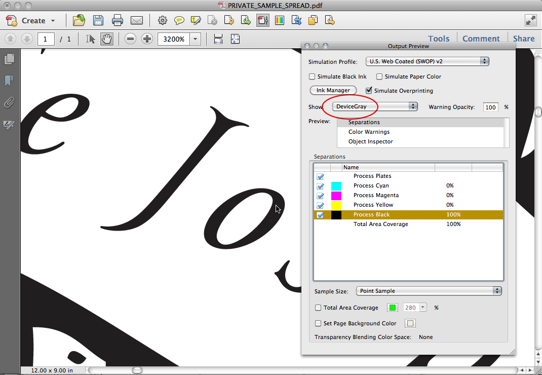
In AcrobatX: Tools>Print Production>Output Preview
Copy link to clipboard
Copied
Before, it was looking like this (see how the outside black was lighter?):
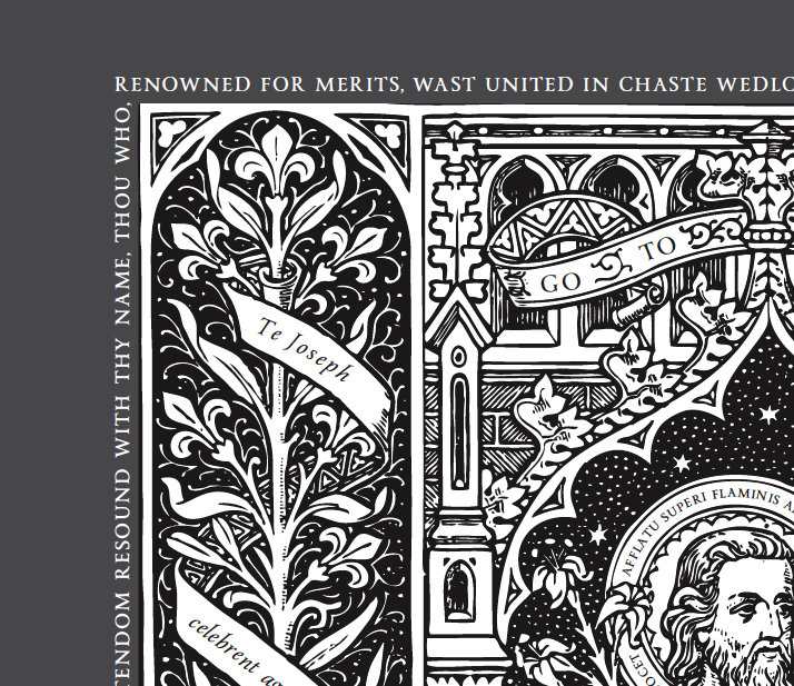
But changing to CMYK from RGB seems to have fixed this.
Copy link to clipboard
Copied
Hmmm.
The screen shot in your last post is the first time I've seen any difference in the black. How odd.
Copy link to clipboard
Copied
Peter, I exaggerated the difference so you could see what I see on my screen.
thanks again!
Copy link to clipboard
Copied
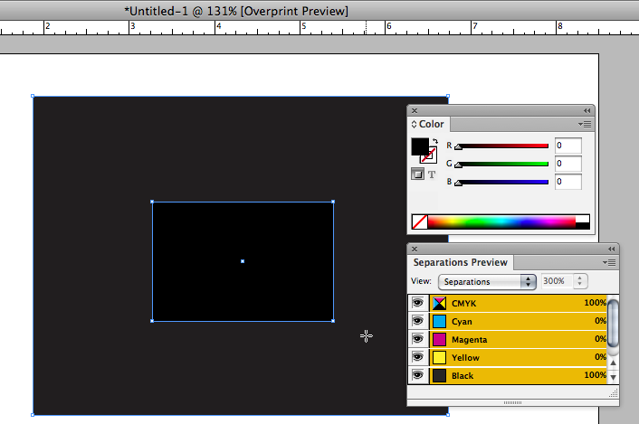
It's because your border is in InDesign and set to CMYK 0|0|0|100. When you changed the illustration to 0|0|0|100 it matched the border. 0|0|0 RGB and 0|0|0|100 CMYK are different colors, see my #50.
Copy link to clipboard
Copied
Here's RGB black on a field of 0|0|0|100 in ID:
Copy link to clipboard
Copied
Rob,
I don't know quite whre you're going here. In all of the PDFs I looked at the border and the field of the illustration were both 0/0/0/100 and I don't see any diffference in the screen captures posted above until the last one (which apparently is modified). Only the RGB type generated anything but a black separation in my testing, and I thought yours as well. That was what I found odd about the RGB mode illustrations -- the B&W tracings were in CMYK even in a docment set to RGB.
Copy link to clipboard
Copied
I don't know quite whre you're going here.
Illustrator (unfortunately) has a document color mode and ID doesn't. The document color mode can make color management and soft proofing even more complex. In Illustrator if you set the document mode to RGB and fill an object with a CMYK color, the object color is really the RGB conversion of that CMYK color—works the same as Photoshop. 0|0|0|100 will convert to something like 39|37|35 RGB depending on the current Working CMYK profile.
You can see this if you make an RGB document, fill a square with 0|0|0|100 CMYK, and open the doc in Acrobat—the square will show as an RGB object even though you spec'd it as CMYK. If you place the illustrator file in ID and look at Separation Preview the output numbers will be the conversion of the 39|37|35 RGB color to 4-color CMYK and not 0|0|0|100.
Copy link to clipboard
Copied
I understand all of that, but I don't see that it has anything to do with the observed behavior of the PDF samples posted above (which all seem to have been taken down by the OP). Back in your own post 25 you also recognized that the illustration, except for the added type, was showing in Acrobat as 0/0/0/100.
Copy link to clipboard
Copied
Back in your own post 25 you also recognized that the illustration, except for the added type, was showing in Acrobat as 0/0/0/100.
Right there's no way to get 0|0|0|100 CMYK to preview differently in the same document in any CS app, so I don't think we're actually seeing the problem document.
Copy link to clipboard
Copied
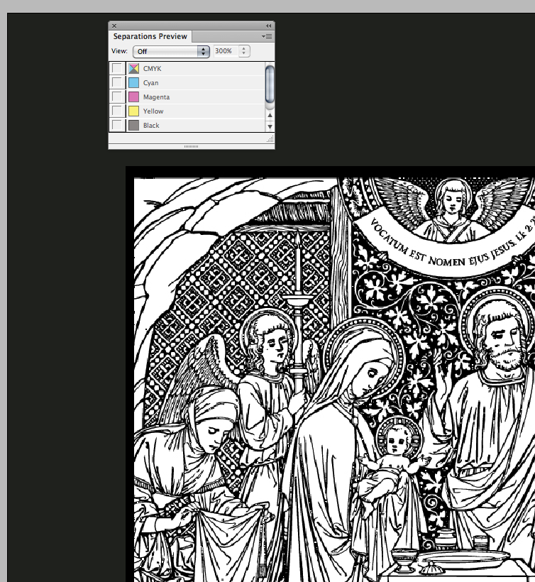
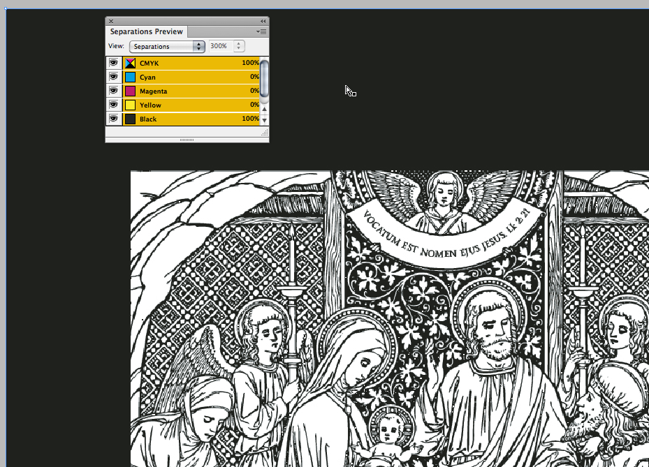
there's no way to get 0|0|0|100 CMYK to preview differently in the same document in any CS app
Actually in InDesign, because it previews grayscales differently with Overprint/Sep Preview turned off, you could get a different preview if the art was grayscale:
Copy link to clipboard
Copied
OK, that could well be what the OP was seeing.
Copy link to clipboard
Copied
If you are not experienced with AcrobatPro, don't try my conversion example. I think the example PDF you posted will work if you comunicate to the printer that you want all blacks to output at 100%
Copy link to clipboard
Copied
I am a musician by training, so I don't understand a lot of this stuff.
FOR INSTANCE:
1. What is the big deal if there is a "rich" black on printing Black & White? After all, "rich black" is just 30/60/60/100 — since the first three don't print on B/W printing, you will end up with 0/0/0/100, right?
2. If I wanted perfectly unified black, why couldn't I just set a section black from the image as my BACKGROUND ?
By doing this:
A. bring in the picture:
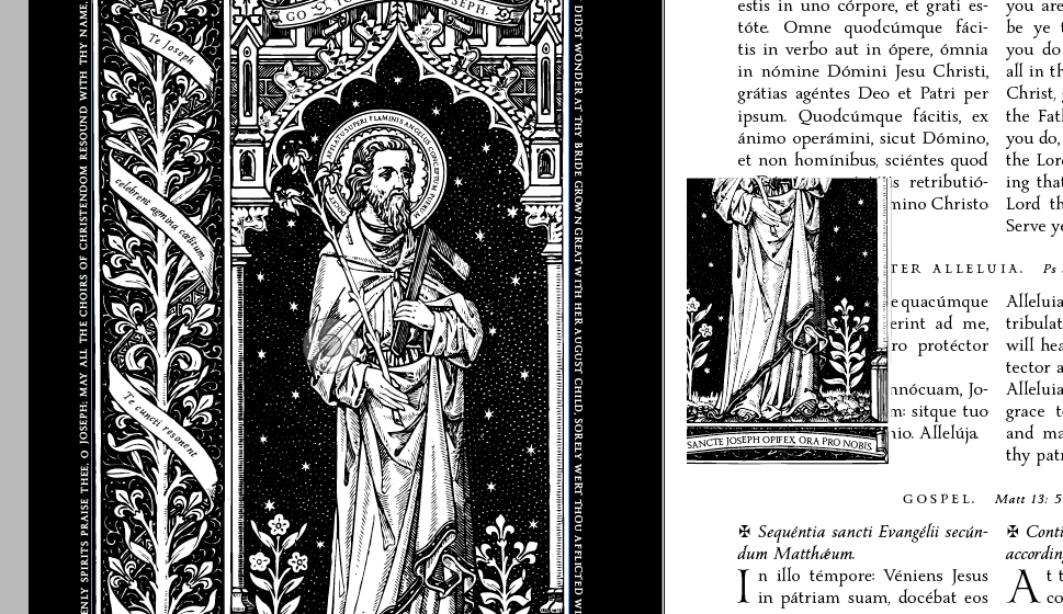
B. cut it down to only a small section of black:
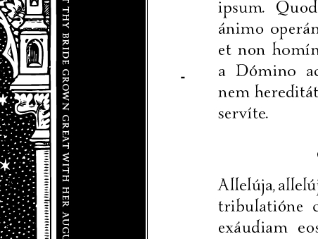
C. make it real big and use it as the background, like so:
http://musicfortheliturgy.org/In_Design_Questions/706_stupid_method.pdf
Copy link to clipboard
Copied
1. What is the big deal if there is a "rich" black on printing Black & White? After all, "rich black" is just 30/60/60/100 — since the first three don't print on B/W printing, you will end up with 0/0/0/100, right?
There wouldn't be a problem if the mix is built with black set to 100%, but RGB blacks don't convert that way. So if you have a line of text colored as 0|0|0 RGB it will be something like 75|68|68|90 when it's converted to SWOP. That's what happened on your page 42.
You would never want to use a rich black with this kind of art on an offset press even if the pages are printing 4-color–the details are going to cause registration problems.
Copy link to clipboard
Copied
Dang it.
I am sitting here using Google like crazy, but I cannot find the "output preview window" in Acrobat pro.
Help? Sorry I'm such a moron.
Copy link to clipboard
Copied
In AcrobatX: Tools>Print Production>Output Preview
Copy link to clipboard
Copied
My issue is that the outer edge looks grey, and the picture looks "rich black"
Right?
You are confusing the soft proof preview with output. You have to look at the numbers to know what the output will be.
Here I'm sampling your text and the readout is a 4-color CMYK mix:

And here I'm sampling the woodcut which reads as 0|0|0|100:
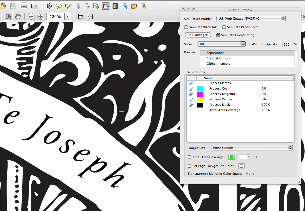
The woodcut soft proofs as a lighter value because a 4-color black would print relatively blacker than 100% grayscale black
Copy link to clipboard
Copied
Those 40 pages will be printed BLACK AND WHITE by Sheridan.
You should communicate with the printer on this so they know what you want.
The PDF you posted can be converted correctly to grayscale in Acrobat—where everything is 100% black—but you have to be careful because CMYK black (0|0|0|100) usually does not convert to 100% Grayscale black—the default US SWOP to grayscale will convert to 91% grayscale.
In AcrobatPro you can correctly make the conversion via Tools>Print Production>Convert Colors if you check Preserve Black
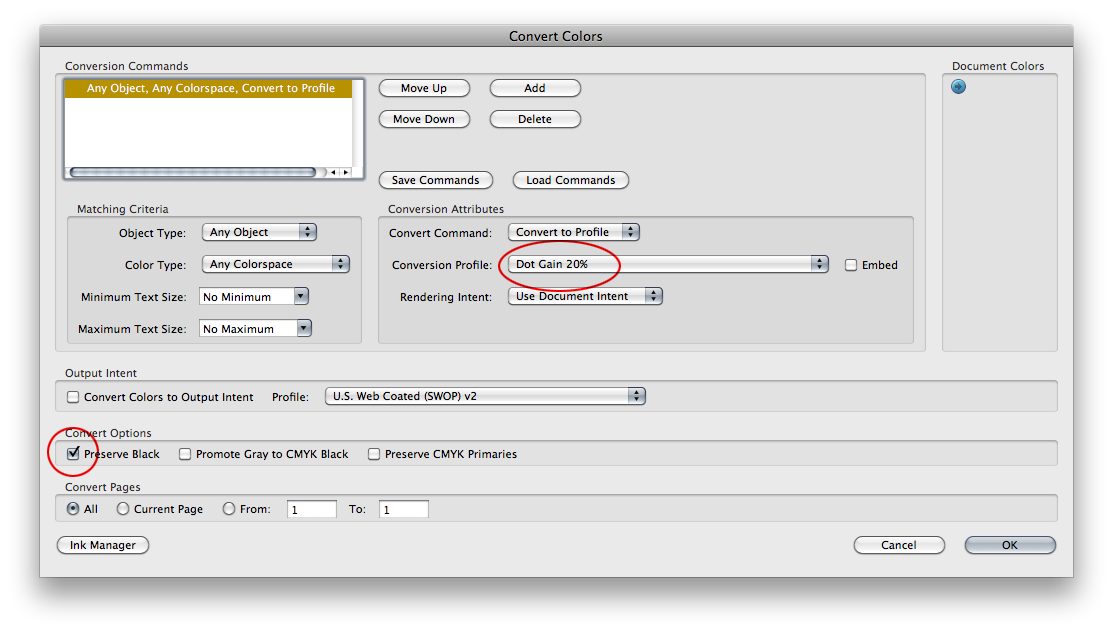
When you make that conversion the Output Preview will show your page as a grayscale object with your 4-color text converted to 100% grayscale:
Copy link to clipboard
Copied
What sort of objects are those large illustrations? At the moment they look like they are supposed to be grayscale, but, as you can see in Bo's image, all of the type is actually a rich balck as I described above. It's odd that the other other parts are 100% K only, so my suspicion is that these were images brought into Illustrator as grayscale, and then the text was added using an RGB black, but I'm not quite sure how you would have accomplished that, so perhaps a rich black was selected for the type, if in fact I'm even correct about adding the text in Illustrator.
In any case, if the backgrounds are going to be rich black it would be OK for the illustrations to be also, but anytime you have very small areas, like type, it's much better to use only black ink, and in general to set it to overprint. Printing CMYK requires that all four colors are laid down on the paper in a pattern of dots. If there is any shift in the position of the paper from where it is supposed to be as it picks up each color you start to get color ghosting along edges and some fuzziness (and probably slightly "off" colors in general). This tends to make small type unreadable. Paper tends to stretch a bit as it goes through a press, so some misregistration is pretty much inevitable. Overprinting black type rather than knocking out the background (leaving a type-shaped hole) prevents white edges from showing around the type if the print goes out of register, and at the same time makes it a little darker, essentially converting it to rich black wherever there is other color behind it.
Black vs. rich black on these pages is also going to be a cost decision. For color you need four plates, and for plain black only one. There is no savings using grayscale illustrations on a press sheet that also has color illustrations, but to add a rich black to a sheet that has no color on it otherwise is going to add a lot of expense. In books with mixed color and black-only pages the most cost-efficient approach is to have all of the color pages in the same signatures (and on the same side of the sheet) rather than scattered randomly. The number of pages and their sizes will determine how many signatures and sheets will be used to print on any particular press. For digital prints the principle is similar, but there is more flexibility in locations because you generally print more sheets/sides. Two color pages side by side on one side of a sheet with two black and white pages on the reverse is less expensive than one color and one black and white on each side of the sheet.
