- Home
- InDesign
- Discussions
- What the heck? Why black looks NOT black at all !
- What the heck? Why black looks NOT black at all !
Copy link to clipboard
Copied
My black background looks perfectly black on the screen:

But when I export to PDF, high quality, it looks TOTALLY GREY. Why?
http://musicfortheliturgy.org/In_Design_Questions/PRIVATE_SAMPLE_SPREAD.pdf
 1 Correct answer
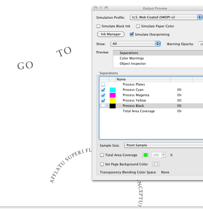
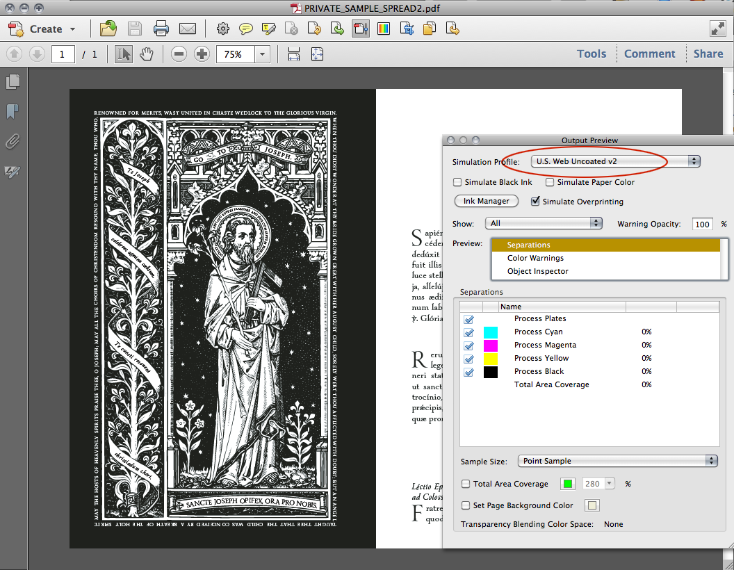
In AcrobatX: Tools>Print Production>Output Preview
Copy link to clipboard
Copied
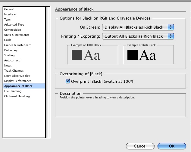
You probably have your Appearnce of Black preference set to Display All Blacks as Rich Black.
Black that is made from only 100% black ink isn't as dark as a "rich black" that also has C, M and Y inks included in the build. If you set the prefs to display blacks accurately you'll see the difference on screen in ID as well. Is you book going to be printed in color? If so, you can make that background a rich black -- ask the printer for a recommendation on the mix -- but leave your type and any linework at 100% K only.
Copy link to clipboard
Copied
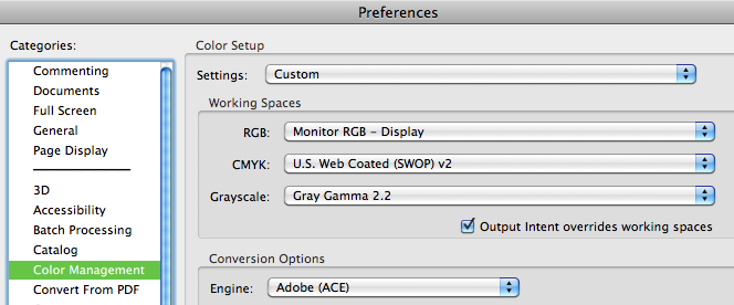
The PDF displays black in Acrobat and Preview on my screen. Here are my color management settings (sorry Acrobat 8 at work but should be similar)
This link should work (removed the space in SPREA D).
http://musicfortheliturgy.org/In_Design_Questions/PRIVATE_SAMPLE_SPREAD.pdf
Copy link to clipboard
Copied
Since I used a black box (shape) on my master page, in order to make the page black, is there not a way I can simply "color" that box as a darker black? This stuff is confusing me ...
Copy link to clipboard
Copied
Are there any full-color illustrations in this document so that it will be printed using CMYK? If yes, then you can change the fill on your box to a rich black like 60%C, 50%M, 50%Y, 100%K (but get a recommendation for the correct mix from the printer -- they all have rich black formulas that they prefer), but if everything is Black and White or grayscale the darkest you will ever get is 100% black, and that just isn't as dark as a rich black, EVER.
Copy link to clipboard
Copied
Just checked your PDF. The dak colored text in the graphic is all Rich Black.
If this was ever printed to a Color printer or on a 4-color press, this Rich Black would cause registration problems.
Copy link to clipboard
Copied
If this was ever printed to a Color printer or on a 4-color press, this Rich Black would cause registration problems.
why? how?
Our book will have 100+ color pages and 800+ black and white pages.
Copy link to clipboard
Copied
Copy link to clipboard
Copied
I need to think hard about what's been said here.
I find it very hard to understand, and I always have.
If anyone wants to try to CLARIFY for me, please do !
Can I not solve all my problems by simply making the box a "rich black" ?
Copy link to clipboard
Copied
The only problem you have at this point is viewing your PDFs shows the blacks as grey (though I am not sure how bad this is looking on your screen).
Talk to your printer, as sometimes they run an entire job on a 4 color press and would allow you to have rich blacks at a minimal plate cost addition. Most printers can get a dark black on the 1-color line work artwork you are showing, as they run black heavy, but not too heavy so you get dot gain in your fine white sepckled areas.
You don't have tints of black, so they should be able to get you a good enough black running 1-color only, but again talk to them as paper choice can be a factor in this.
But clean up your blacks as Bo suggested, and you can find the problem areas quick;y using InDesign >> window >> output >> seperations preview, which is the equivalent of what he showed you in acrobat.
Copy link to clipboard
Copied
If anyone wants to try to CLARIFY for me, please do !
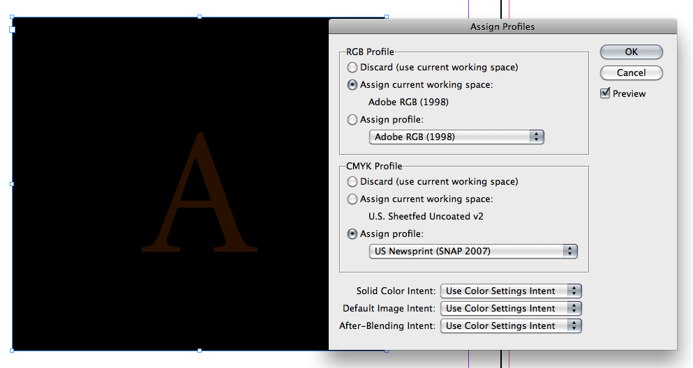
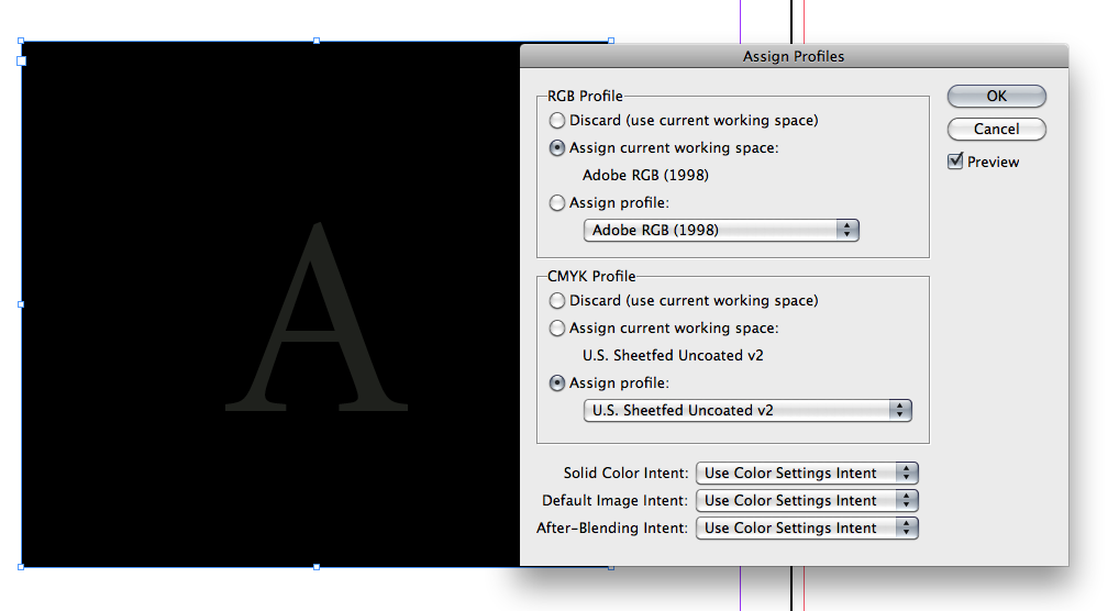
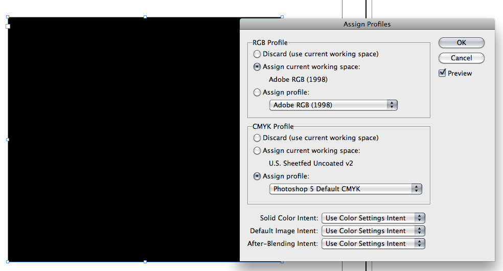
The preview of CMYK color, including black mixes like 0|0|0|100 or 65|50|50|100, is managed by your document's CMYK profile. The current generation of CMYK profiles correctly previews those two colors differently because that's what happens on press. The difference is more pronounced on an uncoated sheet than a coated sheet, and the correct profile will show that difference. You can check your document's profile via Edit>Assign Profiles... Below are examples of black only on a rich black field
US Newsprint (SNAP):
US Sheetfed Uncoated:
US Sheetfed Coated:
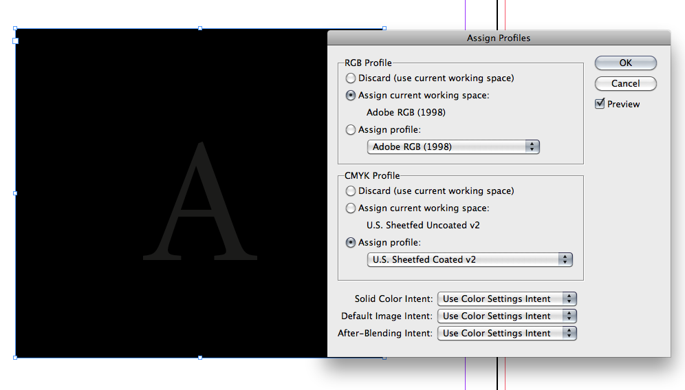
First generation profiles like Photoshop 5 Default do not show the difference:
When an image like your's is alone on the sheet the effect of black vs. rich black is not as noticeable. Because of the details you don't have much choice but to run black only.
Copy link to clipboard
Copied
Copy link to clipboard
Copied
I am going to carefully study all these helpful hints.
I notice there is a color swatch called "BLACK" and a color swatch called "REGISTRATION" — any difference?
Copy link to clipboard
Copied
Registration is 100|100|100|100, [Black] is 0|0|0|100
Copy link to clipboard
Copied
Registration is only used for "registration marks" like Crop marks, etc.
It should never be used for any elements that you place/create in InDesign.
For the above mentioned reasons, never use Registration for Black text.
Even elements like a large black box should never be colored Registration.
400% ink coverage is to much ink for the paper to handle!
You could make a large box with a Rich Black, but don't use Registration.
Copy link to clipboard
Copied
These are my current settings, just FYI. I just now discovered them.
Copy link to clipboard
Copied
The Appearance of Black setting lets you override the CMYK profile effect on black that I'm showing in post 11. It has no effect on printing separations for press or exporting to CMYK.
Typically you would use the setting you are showing if you are designing for screen display or output to a composite color printer. In those cases you may not want the offset press preview (accurate blacks), which previews the difference between black and black +CMY.
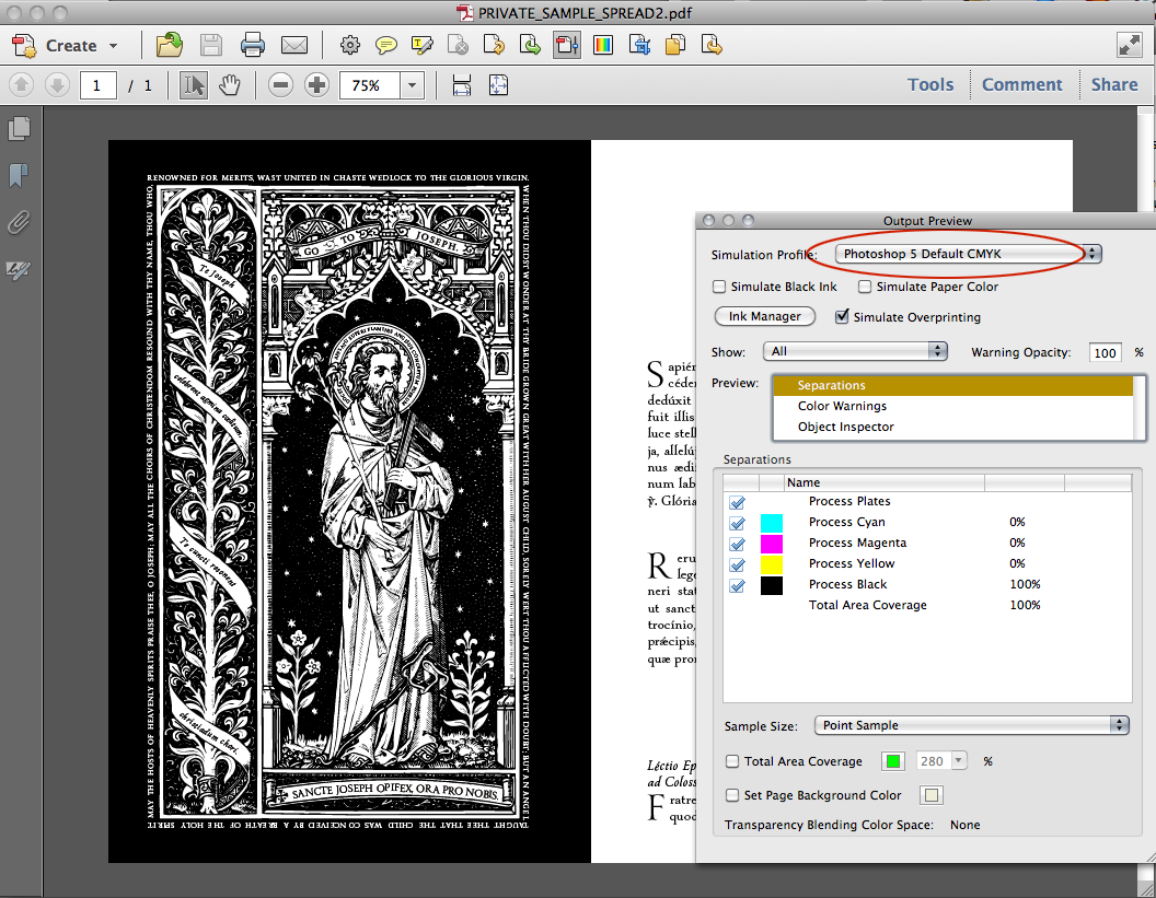
If you want to preview black as absolute black in Acrobat use the Photoshop 5 profile I'm showing in #12 as your Simulation profile
Copy link to clipboard
Copied
OK, first of all, your kind responses have been VERY helpful to me.
I cannot thank you enough.
Now, here's the deal — those black and white images were created in Illustrator using "live trace" — and you were right, the black ink used was some kind of "rich black" mix.
Those 40 pages will be printed BLACK AND WHITE by Sheridan.
So, I have no idea what will happen ... obviously, the "rich black" background will not print CMYK, since it will be printed B/W
I am not sure what will happen ..... hmmmm....
Copy link to clipboard
Copied
Ceencha wrote:
Now, here's the deal — those black and white images were created in Illustrator using "live trace" — and you were right, the black ink used was some kind of "rich black" mix.
OK, the live trace probably is NOT rich black. since it's the added type that is the problem. The way to fix this is to go back to Illustrator and change the fill color on the type. If you don't the printer is either going to reject file, print the pages in color and charge you accordingly, or print only the black separation (and of the three possibilities, this is the least likely) which might work, or might leave you with grayish screened type.
Copy link to clipboard
Copied
Thank you so much for bearing with my extreme ignorance.
However, I don't understand why you say the TEXT is the issue.
My issue is that the outer edge looks grey, and the picture looks "rich black"
Right?
http://musicfortheliturgy.org/In_Design_Questions/PRIVATE_SAMPLE_SPREAD.pdf
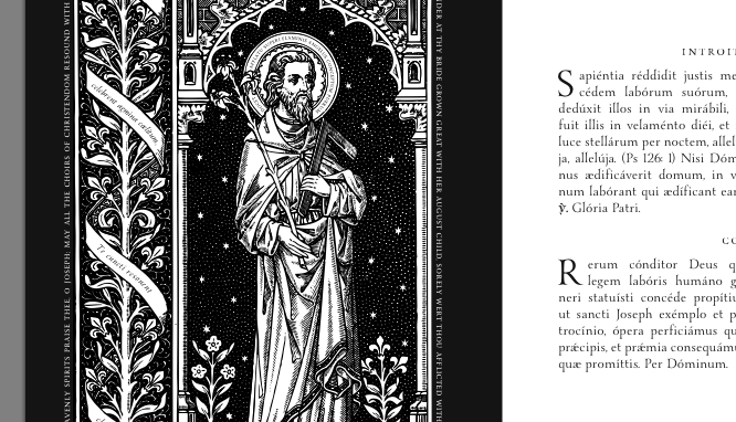
I would like the edge to look the same "darkness" of black as the pictures on the inside.
Maybe I should just take a "sample" section of the black from the pictures and blow it up as the background to the entire page? So they will "match" ?
Copy link to clipboard
Copied
Here's a screen capture of your spread with the black plate turned off:
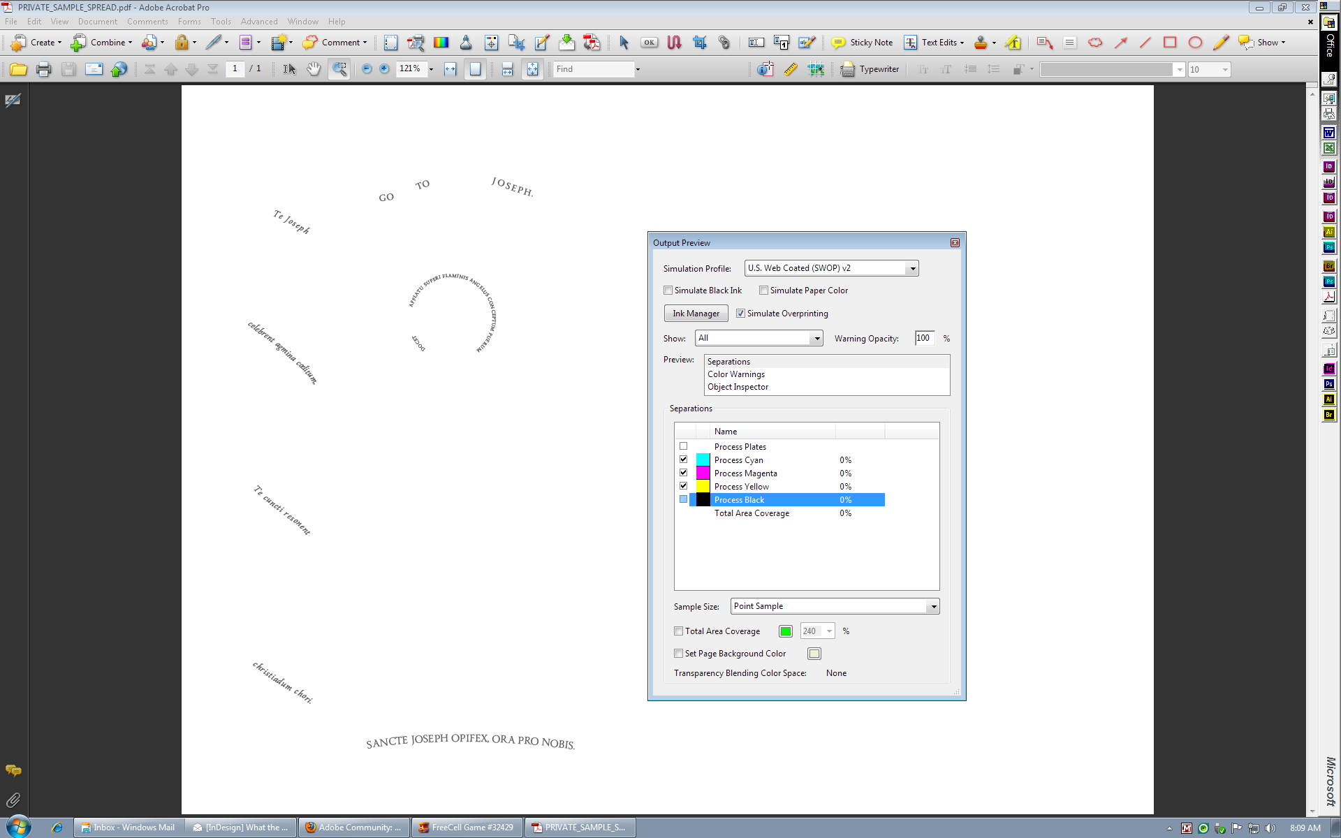
As you can see, the only things on that page that are rich black are the type in the scrolls and halo, and you DO need to fix that before going to print.
If you think the edges look gray in comparison to the illustration it's probably an optical illusion caused by the large amounts of white inside the illustration providing contrast. Remember, too, that 0,0,0,100 is not as dark as a rich black and will look gray in print if there is a rich black for comparison.
Copy link to clipboard
Copied
Let me add that it would be best when saving the illustrations in Illustrator that you NOT emebed any profile to ensure that ID presumes they are in your working space when they are placed and does not do any profile conversion to match the color appearance, which could result in the entire illustration going to rich black.
Copy link to clipboard
Copied
Peter, one problem with the posted PDF is it has CMYK, RGB, and grayscale objects, which you can see via the Show dropdown in Output Preview:
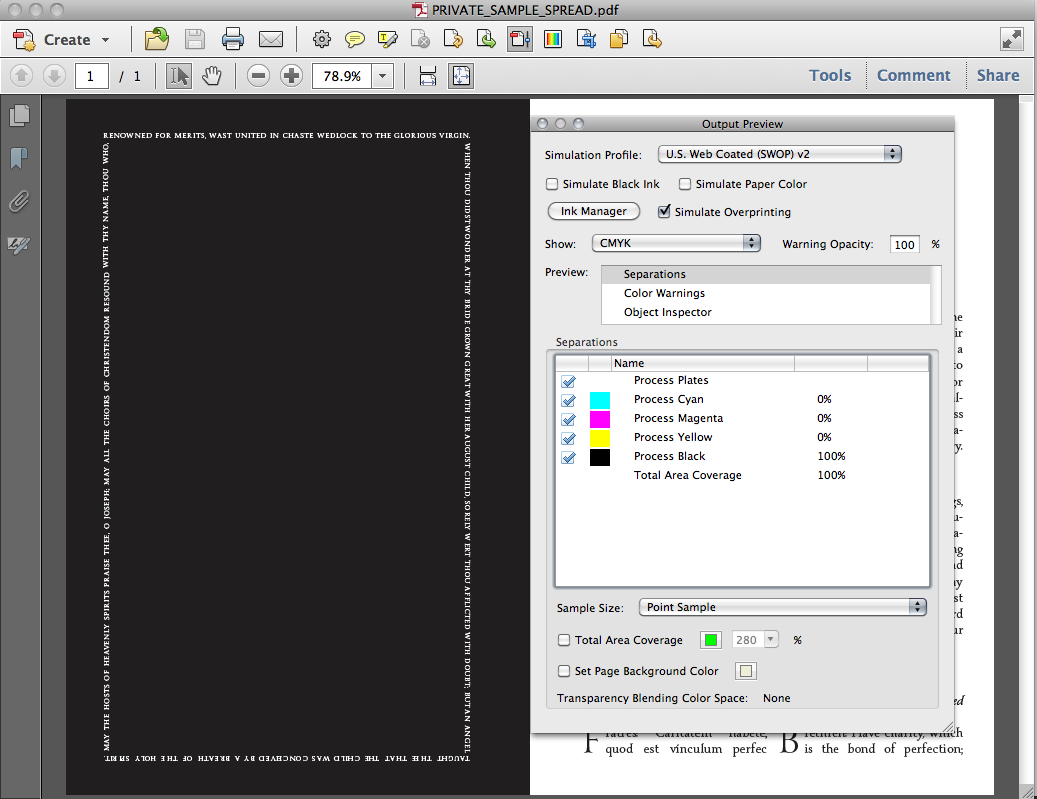
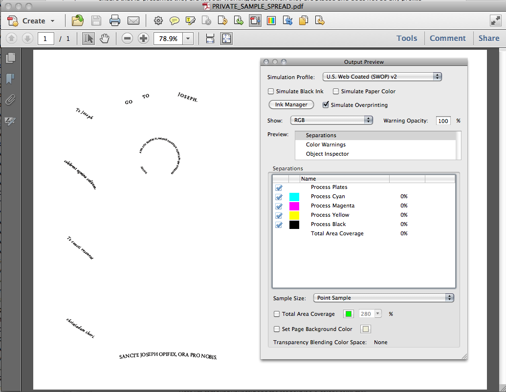
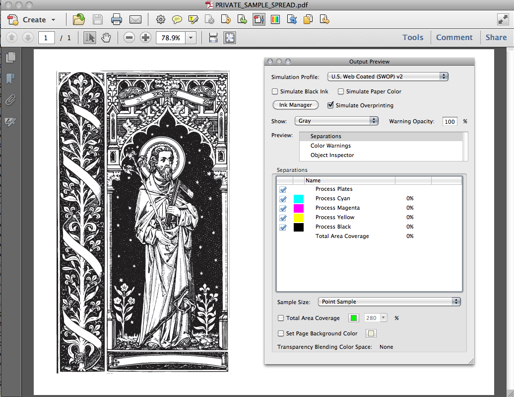
You could go into Illustrator and get everything on the CMYK black plate, but because it's a 1-color job the print operator would need to output the CMYK black plate and not convert to grayscale at print time. She probably will know to do that but it's not guaranteed—there's the risk that a print time conversion to grayscale would output 90% and not 100% black.
Copy link to clipboard
Copied
It's the text that's RGB (as I suggested back in August), and I'm not sure the grayscale is an issue. It shows as Non-device CMYK as well as when you select grayscale. It's clearly only on the black plate.
I think the only problem comes in if you attempt to "fix" the PDF instead of fixing the illustrations. If the type in the illustrations is converted to 0,0,0,100 there won't be any conversion to grayscale required anyplace. My recollection is that there are actual color pages in this file as well, but it's been quite a while since I looked at the document ceencha sent me earlier to diagnose a different problem. That makes conversion inside Acrobat much more complicated and prone to error.
Copy link to clipboard
Copied
That makes conversion inside Acrobat much more complicated and prone to error.
Why would converting a color object to grayscale in Illustrator or Photoshop be better than in Acrobat? Sounds like a lot of work if there are 40 pages similar to the post #1 link.
Find more inspiration, events, and resources on the new Adobe Community
Explore Now
