dublove
Legend
April 12, 2025
Answered

Why ttf fonts become otf missing status, can it be solved by one click?

  • April 12, 2025
  • 1 reply
  • 1369 views

My original document only used Arial ttf format, after a period of time, open the document again, it shows that the lack of fonts, and is the lack of [otf], it is amazing, I have not used Arial otf ah.


I have not used Arial otf ah. 

Found one, but it's hard to reproduce the example, so I won't post the file.

Could it still be that the font pointing was confused?

Correct answer Dirk Becker

Hi Dirk Becker.
May I ask what this means:
“Preferences have been applied to one or more styles and named grids.”

Preferences have been applied to one or more styles and named grids


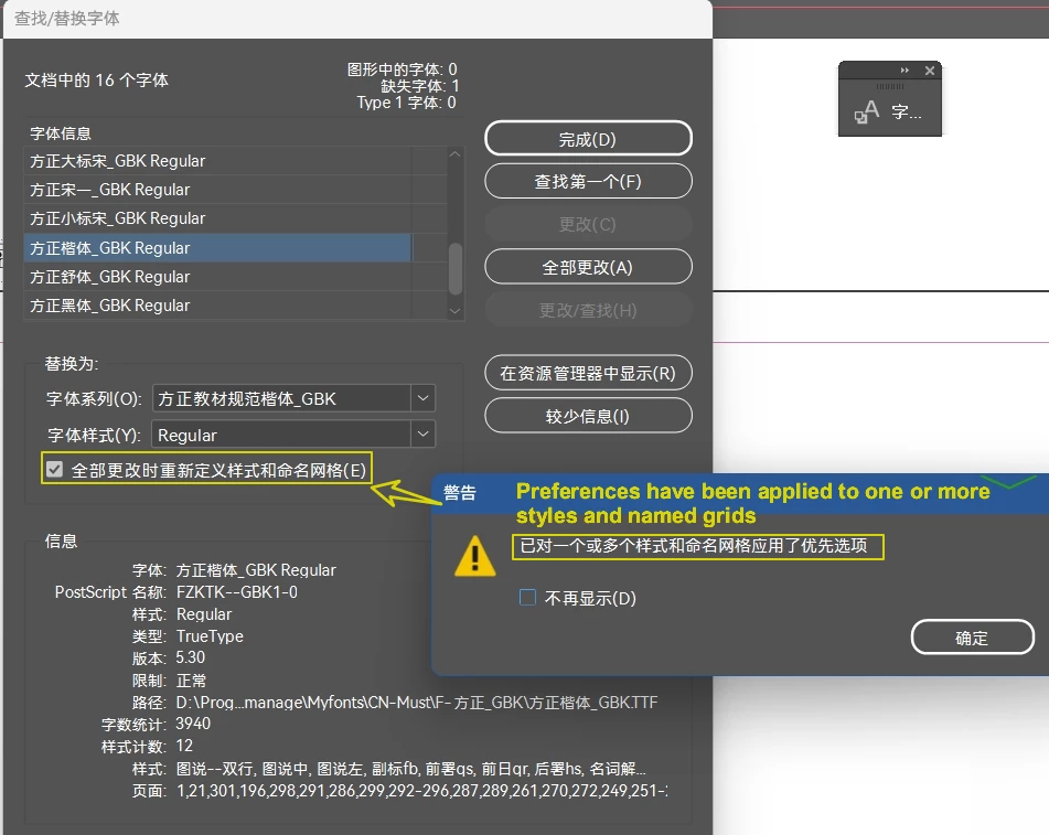
I guess your translation is wrong: Changes were applied to styles and/or named grids.

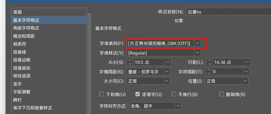
Named grids are a concept of Japanese typography, they can also specify a font.


The "Font Usage Dialog" (original name), later "Find Fonts" or "Find/Change Fonts" reports fonts as they are used with text in the document. If you replace fonts, you'd change with local overrides. This is where it works best.


As an afterthought, in western versions the checkbox below enables that you also apply the changes to character styles and character styles. This is more complicated than you initially think, as fonts are independently specified with the two attributes "Font Family" and "Font Style" and the used font is resolved from their combination.


For example there are ways to incompletely specify only one of the attributes. Create a new character style, and use only the font style dropdown to choose "extra condensed light". You can apply the character style to text using Tahoma via the paragraph style, Tahoma (on my system) has only Regular and Bold. As the combination is not backed by an actual font file, you get a "missing font" even though it never existed.


The program behind the checkbox can only deal with cases where both family and style attribute are specified. It  will fail with the lonely extra condensed italic of cstyle4, because that could also be applied in other places where it makes more sense.


So the dialog mentions that some styles were touched, better verify your entire document.

1 reply

Legend
April 12, 2025

Most of the time, Font families (fonts with the same family name) are differentiated by type.

A few InDesign versions ago the types were even shown as icons in the Find Fonts dialog, now you have to use "More Info".


Lesser known, there are multiple "OpenType" types, showing the same [otf] suffix and the same icon, but they have a different type for matching. In scripting you can see them:


For this reason (types are relevant) you can come across multiple font families with the same family name, which is already known as bad and confusing the font subsystem thus better avoided, and even multiple [otf] of them. There are some more reasons for mismatches in font family - such as native names (discussed below).


This is the easy part. Under certain circumstances a font is identified by postscript name rather than by combination of font family, type and font style. Could be the placed PDFs where name+style are lost, or a copy-paste from Illustrator, where only the postscript name is known. When you import Word texts, they can also specify fonts never known to your system, I haven't looked what exactly happens then.


Anyway in these cases InDesign tries to substitute (one of the multiple font status values). Most of the time with Latin fonts it ends up at the default font (Myriad) but there is also a mechanism to list font families with "same name", and the found font might spill over. For inconsistency sake, dependent on the program one approach is taken or the other. For example a glyph might be found by the more forgiving composer and rendered accordingly a decade later from composer output, but the missing font highlighter might disagree.


The font lookup mechanism also differentiates between font managers - a font is less likely to get found with the document fonts folder even when it should along the mechanisms mentioned above, so sometimes it is suggested here in the forum to avoid document fonts.


Other criteria come with the font style, e.g. when you have the correct Arial around but the particular semi-bold is only in the other Arial … A font style might also spill over, within the family or across types, e.g. you specify Italic and get Kursiv, Regular for Roman. There is another mechanism that matches beyond the style name, and so forth.


All of these could explain why a Arial TTF specified in a legacy document could end up showing one Arial OTF that might happen to exist on your machine, even if you never used the OTF and the [Regular] font style is or isn't supported by the OTF font family.


Back to your screenshot - could be the paragraph style editor - which is also adding to the confusion. For example when you choose a named font style for a variable font, the font style name will display different from the font menu.


Font families and styles can also have multiple native names, displayed according to the system script if it is not Latin. Not sure why you show a pstyle with that GBK font while the question is about Arial, is that the chinese native name for Arial? If so, could be there is a mismatch in native name between the original Arial and your current one?


Otherwise, was Arial substituted in that pstyle and we're seeing the result? Both font family and font style are surrounded by [], which to me indicates something is missing for both. As we don't see the language from the following dialog page, and GBK is about a specific character set, maybe you have a mismatch there, and the language setting forced the GBK font?


I don't know enough about CJK typography, also for lack of example documents, so forgive any speculation errors.

dublove
dubloveAuthor
Legend
April 13, 2025

You're amazing.

The level of professionalism is convincing. 


May I ask what software you're posting screenshots of?

Thank you very much.

dublove
dubloveAuthor
Legend
April 13, 2025

Not sure, I did the Find Font screenshot back in 2015.


I thought it was from InDesign CS5 running on OSX 10.7, but as I checked right now the blue default button in 10.7 uses the "aqua" style rather than solid blue. So it was likely an early CC version. I keep such screenshots as reference because I prefer the colorized icons, easier to distinguish than the monotone current versions when you see them at all - and my point was that they are entirely missing from the current Find Font dialog.


The Font Types screenshot is from an own plugin that I use to examine the live object model including plugin additions. It otherwise is pretty similar to the web pages at https://developer.adobe.com/indesign/dom/api/f/FontTypes/


This 40S in Chapter, where did it come from?
This font doesn't have this property.

40S is a property of the “mypar” paragraph style, but they shouldn't inherit such a property because they are two different fonts.

An instance that cannot be reproduced.
After a long time he was well again.