- Home
- InDesign
- Discussions
- Wrong font format when exporting as EPUB
- Wrong font format when exporting as EPUB
Wrong font format when exporting as EPUB
Copy link to clipboard
Copied
NOTE: There are attached files below so you can test them.
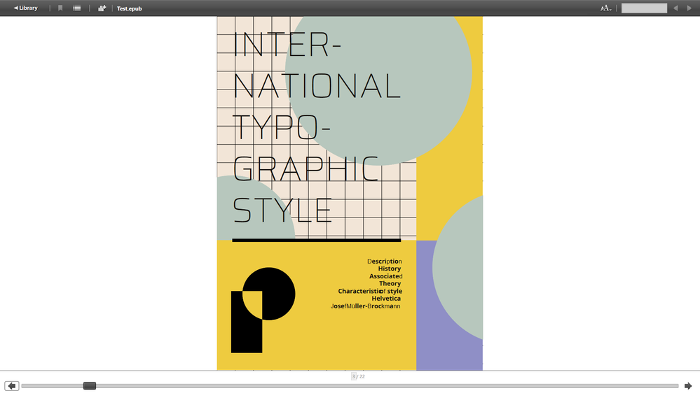
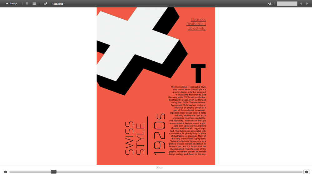
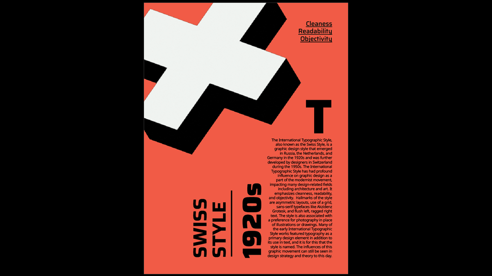
I'm a university student and I'm currently working on a EPUB project. When trying to export the file as EPUB, there are errors in font format. I'm using Noto Sans and Saira typeface for the project, but after the EPUB conversion, they are either be replaced with another font, merged together, or using a light-weight font format. I'm looking forward to hearing your response and hopefully be able to resolve this issue.
Copy link to clipboard
Copied
That looks like Adobe Digital Editions. If it is, stop using it and try it with the Apple Books app on Mac or iPad OS. For Windows, try Thorium.
Copy link to clipboard
Copied
The first and second page look fine when I open your epub in Thorium. Avoid the Adobe Digital Editions reader like the plague: it is useless. Do not test your epub files with it.
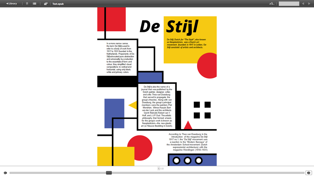
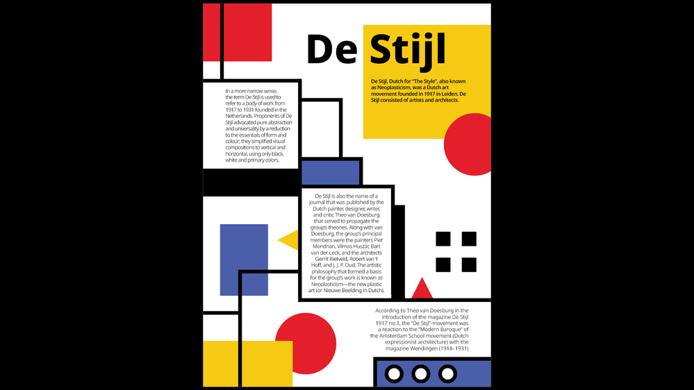
There's still an issue with the "De Stijl" page formatting. It will not even display in Sigil, and Sigil reports various code errors. You may have to convert those elements to an image. As a matter of fact, just convert any problematic font element to an image, because this is a layout type that is eminently ill suited for epub export. At least then you can be sure the fonts look allright on most readers.
Ideally convert ALL text and vector shape elements to SVGs and use those in your epub instead. Things will look perfect then. (This is what the online publishing option actually does to prevent font rendering problems: the developers realized fonts were just too fragile, and decided to throw in the towel. Now all type is converted to SVG files when published online. This should tell you something about the fragile nature of fonts and exact typography in an epub: they're like oil and water!)
2 comments:
- I wonder why you are using epub for this assignment (I guess it is an assignment for a class?). PDF is the way to go here. The animation doesn't add anything functional to your work in my opinion. If you want animation, use a different format. Convert the entire thing to a video / motion graphics project (for example, use after effects). Or to a game engine like Godot if you need an interactive version.
Fixed layout epubs are incredibly fragile, and most ebook readers have one or more issues displaying these anyway. In my opinion FXL epub as an export format is a failed experiment.
It would be better to publish your work online with the publish online option or use the In5 plugin to convert it to a web project (In5 is expensive, though...).
- Some unsollicited design advice (ignore if you like): your overall typography needs a secondary look. Leading is a major issue throughout. You are not even using a sensible and controlled thoughtful baseline grid anywhere! That is one of the keys to good typography/layout design! There are some other issues as well with missing punctuation (missing period, for example).
Alignment and spacing needs more work here and there, as does visual grouping. Some pages have a really nice design concept (Helvetica page) but the execution leaves something to be desired and could be easily taken to the next level. The overall typography is not quite refined enough yet, and on some there is a lack of an understanding how to construct a good grid/composition.
While you have a five-columnar grid to work with, a lack of vertical construction guides throws off part of your designs (pages like 13, 15, 18 and 21 are good examples of this). There is a lack of consistency across pages (and while these are very different schools of design that you are discussing in the project, the overall project still needs a certain level of consistency --a backbone-- to tie it together.
The work looks creative and okay as-is. But nowhere near the level it could be both from a technical as well as an execution point of view.
Anyway, ignore this advice if you want.
Copy link to clipboard
Copied
>Ideally convert ALL text and vector shape elements to SVGs and use those in your epub instead. Things will look perfect then.<
No! How do you search text in that case? How can Assistive Technology read out your text? That is very, very BAD advice...!
Copy link to clipboard
Copied
All advice must be taken within CONTEXT.
In this case it is a class assignment, it is a graphic design piece, it must look exactly as it was designed by the designer. And it is exported as a fixed layout epub created by InDesign, files which are by default almost unreadable by assistive technology since the code produced makes it impossible - it's riddled with tags for each positioned element, down to the letter!
In principle I agree with you @Frans v.d. Geest and I always produce documentation, websites, etc. that works well with assistive tech in mind.
In this particular case it make no sense, however, to worry about it. If the text needs to be accessible to assistive tech, I would create a separate version meant for that use.
And your comment would be another good reason to go with PDF rather than a FXL epub.
Copy link to clipboard
Copied
Ah, you were just talking about the cover then? I misread because of the 'ALL text' part 😉
Copy link to clipboard
Copied
For the entire project, not just the cover. I don't think it is an important matter to think about in this particular case.
Unless the OP's intention is to publish the work. In which case FXL epub is probably the worst choice of export format anyway.
