Participating Frequently
October 21, 2021
Answered

Color differences exporting to sRGB & soft proofing not working

  • October 21, 2021
  • 10 replies
  • 10868 views

I develop photos exclusively for web use in Lightroom Classic. That means I'm exporting in sRGB colorspace to post images on my website and social media. However, exported photos look completely different than what I see while developing. I assume this is because Lightroom uses a different ProPhoto colorspace. My monitor is a Dell S2721DGF IPS monitor. It has a wide-gamut and excellent color reproduction, though I have not done any calibration myself.

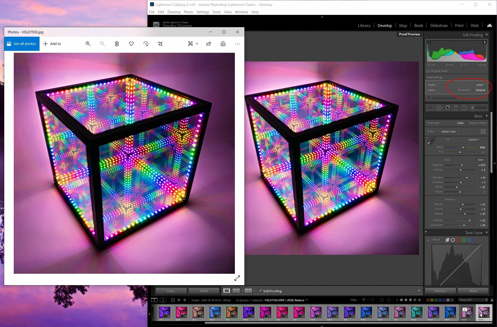
Now, I understand that Lightroom is a color managed program and windows/web is not, therefore I expect to see color differences when exporting to sRGB. I'm trying to use soft proofing to predict the differences and make changes, but the issue is that the soft-proofing doesn't appear to be working correctly. The picture I open in Windows does not reflect the soft-proofed sRGB copy displaying in Lightroom. Furthermore, the soft-proofed copy doesn't appear any different than the original in a side-by-side comparison inside Lightroom.


See the image below. The sRGB proof in Lightroom still appears different than the exported sRGB image. The exported image (left) is darker, higher contrast, and more saturated. Any ideas why these images would still be different after soft proofing? Alternatively, is there any way I can change the colorspace inside Lightroom to simply develop in sRGB and see the same colors when I export? Any help is appreciated, thank you.


Correct answer Jao vdL

Yes you're right, the differences between library and develop are gone within LR at 100% zoom. It's apparent now that this is a scaling and resampling issue. With this in mind, I want to improve my workflow. Editing at 100% (which appears extremely zoomed in on a hi-res photo) is impractical; I can't really get the image to look the way I want it without seeing the full frame. Do I have any control over how LR renders the preview in develop mode? Is there anything I can do to minmize the resampling artifacts?


You can't change the way develop renders unfortunately. The difference is minimized if you use high resolution displays such as retina screens, 4k monitors, etc. since you can't really see the individual pixels there. You can get a bit of an idea by switching back and forth to Library or by using a second display (the preview on the secondary display is rendered from the jpeg preview just like in library but it updates live (but slow) while doing changes in develop settings). One factor we haven't even discussed is what happens when you scale your jpeg upon export and use output sharpening. You'll see it actually get closer to develop again! Again, this is due to the scaling algorithm and post scaling sharpening, which will bring back some of the detail lost by the scaling.


You should realize that you will never be able to completely control this. You can't control what scaling websites, web browsers, printing layout software, etc. uses so you simply have to get used to not being able to perfectly control this. This is true for all imaging software. For example, if you are in Photoshop, you will see that the image can radically change between zoom levels. Photoshop uses a different scaling algorithm when zoomed out at powers of 2 (i.e. 50%, 25%, 12.5% etc) than at off even divisible zoming rations (i.e. 33%, 66%, etc.). Typically the image will loook more detailed (and colorful for images such as this) at non-even zoom ratios because it uses a nearest neighbor algorithm. You'll see lots of threads by people wanting to get the appearance you see in Photoshop at odd ratios and them being really upset when the file outisde of Photoshop looks completely different. 


Bottomline, do not touch sharpening and noise reduction outside of 1:1 zoom. Check your images both in Library and Develop. Best to use high resolution displays as you'll see more pixels even in zoomed-out views so less possibility of scaling artefacts.

10 replies

Participant
May 23, 2025

ProPhoto, sRGB and Adobe RGB are color working spaces.  They are not destination color spaces.  To accurately see how your colors will appear you need to view them in the destination space.  For instance, if I send my work out to a printer, I use the .icc profile that the printer provides to "soft proof" my image.  When working for the web, Monitor RGB is the same.  It displays the colors that your (calibrated) monitors profile uses and should be closer to your intent on the monitors of others.  Since you create for the web, set both LR's and PS's soft proofing to display your monitors calibration profile (monitor RGB).  Be aware that if you are starting in LR and moving to PS that LR's soft proofing, while close, doesn't agree entirely with PS.  Trust PS.  If you compare your image in PS while soft proofing in Monitor RGB and set that image as a jpg to display as a Desktop image, they should look the same.  

D Fosse
Community Expert
Community Expert
May 23, 2025
quote

When working for the web, Monitor RGB is the same.  It displays the colors that your (calibrated) monitors profile uses and should be closer to your intent on the monitors of others.  Since you create for the web, set both LR's and PS's soft proofing to display your monitors calibration profile (monitor RGB).


By @misterrick


Do not proof to Monitor RGB.


Proofing to Monitor RGB turns off all display color management. That is not what you want. It just shows you how it looks on your monitor without color management. It tells you absolutely nothing about how it looks on any other random monitor with unknown characteristics.


Furthermore, all major web browsers today are fully color managed and will correctly represent any embedded profile. Photoshop and your web browser will display identically.


There is nothing special about working for web. Calibrate and profile your monitor as usual. Convert to sRGB because sRGB has the highest likelihood of displaying roughly right in the highest number of possible scenarios. But with a profiled monitor - no proof - that will be displayed correctly by any web browser.

Participant
May 25, 2025

You've pointed out an error in the way I was thinking about color management destinations.  I suggest to those reading my post that they use the information that you have provided.  Again, and sincerely, thank you.


Leonardo Izar
Participant
September 26, 2022

Simple solution and many wrong answers. I faced the same problem. go to the color sync utility and change the default color LCD to sRgb. You may need to look for the profile in the color profiles folder on the system.

Community Expert
September 27, 2022

DO NOT DO THIS! It guarantees you will have incorrect color. You are effectively turning off any correction for the display gamut. Your display is HIGHLY unlikely to be sRGB nowadays. Most Macs have a display P3 like color gamut. Many external displays are much wider than sRGB. The only correct answers are already given above. Calibrate your display, export to color spaces wide enough to contain all the colors in the image, only use color managed apps to view your exports. Luckily nowadays all browsers are color managed.  

Participant
April 22, 2022

I have the exact same issue. I don't think it has anything to do with scaling. Left is the PNG exported with SRGB. It's applied as a desktop wallpaper. (It looks the same viewed with irfanview) Right is the SRGB soft proof in lightroom, which always looks identical no matter profile or intent I choose for the proof. The colors are drastically different after export. My monitor is calibrated with a SpyderX using DisplayCal and the profile is properly applied in Windows. My monitor is a a 10 bit monitor but only covers 99.9% standard SRGB gamut.  

TheDigitalDog
Inspiring
April 22, 2022

It's applied as a desktop wallpaper.

Which means it's not color managed. Or it would match Lr. Desktop wallpaper on Windows perhaps? 

Author “Color Management for Photographers" & "Photoshop CC Color Management/pluralsight"
October 25, 2021

FYI Dell provides "default" (uncalibrated, obviously) monitor profiles for all of their monitors.   You'll need to look on their site in the drivers section for your monitor model.  It may or may not be accurate.   My aging and surprisingly still working (why the CFL backlight hasn't burned out yet I'll never know) Dell U3011 shipped with a profile that covered the majority of AdobeRGB which it was factory calibrated for.  That's just a secondary junk monitor though, and not really relevant.   Your monitor has a downloadable profile that covers most of DCI-P3 and not-quite-all of sRGB.   Note that the monitor you have is not one of Dell's "PremiereColor" models.   Although they list their 8bpc + FRC models as 1.07 billion color, they're not 10 bit panels. Unless they changed the naming scheme again only the monitors with models starting in UP are true 10 bit.   Usually the 8+FRC ones are designed for one specific colorspace and can't really be calibrated to cover, say AdobeRGB instead, where a 10 bit panel might cover both. 


The whole thing about color managed viewers isn't quite true anymore on Windows.   I'm still a few releases back (1909 I think) and both explorer via thumbnail previews and the built in Photos program honor ICC profiles.   It's the desktop itself and programs that don't do things correctly that aren't color managed.


Here's a screenshot of a 16bpc .tif (explorer thumbnail) which was converted to the Rec. 2100 PQ W10000 profile in photoshop (for maximum visibility of the difference).   You can see a jpeg next to it in the original AdobeRGB colorspace, which looked too similar to sRGB to use as a good example in this case.  Then I used

exiftool -ICC_Profile= _DSC0202.tif 

To remove the ICC profile from the image without doing anything that might update a built-in thumbnail or manipulate the image itself in any way.   The second image is the result, where Windows defaults back to the sRGB colorspace.  You'll notice it's now less saturated than the AdobeRGB version. 


Anyway the point is, download your monitor's profile from Dell's website and set it up before bothering to compare anything, then set the monitor to the required settings for that colorspace according to the manual.  It won't be calibrated but it'll be quite a bit closer than using a random sRGB profile on top of whatever manual adjustments for viewing you might have made. 


What windows won't do is display 16bpc images @ 10bpc depth even when the monitor is set to that, which is easy to verify with a large black -> white gradient and the banding check in photoshop vs. windows Photos, so that can cause a very slight color difference.  


D Fosse
Community Expert
Community Expert
October 25, 2021

No, you misunderstand how monitor profiles work and what they do. As well as some other things.


A monitor profile isn't supposed to "cover" anything. It has one purpose: to describe the actual and current behavior of the monitor, whatever that is. A monitor profile is a map. It just needs to describe the terrain.


The monitor doesn't need to match any particular color space. It is what it is, and that's fine. You could make a monitor half way between sRGB and Adobe RGB and it would work just as well. Then the profile would describe that halway color space, and that would work exactly the same way. The reason it's not done is just for marketing reasons.


"Factory calibration" is a contradiction in terms. They can't know the monitor settings. The profile needs to take that into account.


No, Windows "Photos" and Windows Explorer are not color managed. They do not know what an icc profile is, and ignore all of them. The reason an Adobe RGB image looks roughly right on a wide gamut monitor is that it's already quite similar to the monitor's native color space. Not a match, mind you, but reasonably close.


And finally, 10 bit display works in applications that support it, like Photoshop, but not in applications that don't, like Photos or Explorer (or Lightroom). Windows itself, the operating system, supports it.


November 3, 2021

I'm aware of that.   Dell's profile will still be better than assigning sRGB.  It's not going to be accurate.


I probably phrased the thing about AdobeRGB coverage badly;  that profile was the map for the display's full gamut at factory settings.    Their "factory calibration" was their adjustment of the AdobeRGB preset on the monitor to come as close as it would get to full AdobeRGB coverage.     Change the brightness, color temp, contrast, etc and it's invalidated.  The monitor ages and it's invalidated.     I'm not rich enough for one of the really high end displays with the little robotic drop-down auto profiler / calibrator so I used a Spyder3 I got cheap (for good reason) a couple of times a year.   It was flakey and usually took several tries but I managed to keep the display accurate enough to proof prints on a Canon iPF5100 and not have mismatch unless I screwed up in the overly complicated paper selection and paper profile selection that needed to be done for canon branded roll paper (none of the names matched between the driver, the printer itself, and the profiles for reasons unknown to me so you needed a spreadsheet and it was safer to set the paper type on the printer itself and not let the driver try to mess with it, then dig out the right profile). 


No, Windows "Photos" and Windows Explorer are not color managed. They do not know what an icc profile is, and ignore all of them. The reason an Adobe RGB image looks roughly right on a wide gamut monitor is that it's already quite similar to the monitor's native color space. Not a match, mind you, but reasonably close.


I thought this too, and it used to be true so I never really bothered looking...  and you really won't notice the difference between AdobeRGB and sRGB in small thumbnails and I don't normally store images in bizarre colorspaces that no display can deal with properly...  right up until I tried that silliness with the Rec. 2100 profile above.   I don't even know why I did.   I do know that there's absolutely no reason I know of aside from Windows reading the ICC profile (or lack thereof) that the thumbnail of that TIFF in explorer which has identical RGB values after stripping the Rec. 2100 profile would suddenly revert to the original colors I'd been screwing with on it.   Exiftool doesn't mess with the image itself.  


If you've got a good explanation of why the colors shifted back over to what they were before I assigned Rec. 2100 to it with no image manipulation (just EXIF field deletion) I'd love ot hear it, because I can't come up with another one.   You can try it yourself though. It does the same thing with JPEGs (if you don't have the TIFF preview filter installed.)  I'm serious, if it's not ICC being applied it's confusing the heck out of me.  😛

Todd Shaner
Legend
October 22, 2021

To really see what the OP is seeing we need to request he export the raw file to DNG file format with all of his LrC settings applied. Timothy5C5D can you please do that and post to your file sharing site.


I added the Basic panel settings visible in his screenshots, but there may be other settings. With just the Basic panel settings applied there is substantial image content outside of sRGB gamut and even some outside Adobe RGB. The DNG export file will contain all of his settings allowing us to hopefully see what he is seeing and better understand what's happening. Thank you.

Participating Frequently
October 22, 2021

Good idea, I'm quite curious to see if this is reproduced on other machines. Here is a download link for the DNG: https://drive.google.com/file/d/1AC4SijgHij3gSDfUzQCCXT88sSfQJihM/view?usp=sharing

Community Expert
October 22, 2021

I see zero difference between library and develop when zoomed in 1:1. The original is quite noisy so this is one of those prototypical images that will suffer a bit of color distortion when zoomed out in develop but I still do not notice any significant change in color on my Mac Book Pro. The only thing is a slight difference in presence for the LEDs that are reflected in the back surfaces. They look slightly brighter in the Develop preview (zoomed out to fit). This is quite typical for images that have very high noise reduction settings (anything above 25 is very high). The retina display probably helps hide most scaling artefacts but you can't completely get rid of them. As said they are gone completely in 1:1 display and zoomed 1:1 the display is identical. 

Exported sRGB jpeg is also identical in my case when viewed at 100%/1:1. On Macs everything is color managed of course so that is not a worry. I see slight differences when zoomed to fit for the reasons already discussed. The standard jpeg app on Macs: preview.app uses a very soft scaling algorithm that tends to lose sharpness (and so will soften the very small highlights in this image in the reflected LEDs) when zoomed out but at 1:1 it is identical to Lightroom Library and Develop.

D Fosse
Community Expert
Community Expert
October 22, 2021

I suspect this is just a good demonstration of how interface color (dark vs. light) can influence your perception 😉


A light interface gives you a reference for the white point, and all shortcomings are immediately revealed. Most images tend to look darker and more muddy. A dark interface removes that reference and so everything looks good because the eye adapts to the image.


My #1 wish for Lightroom has always been a light interface option like we have in Photoshop. For this reason I do most of my critical editing in Photoshop, not Lightroom.

Community Expert
October 22, 2021

I tend to agree the option of a "light" interface would be welcome, though involving a ground-up review of the whole Library UI and the visibility of its shades-of-grey highlighting for that different scheme - so not limited to a redesign of the tool panels.


But even without such a redesign, we can already change the Lights Out mode to "white", and then at a keypress, temporarily hide everything but our image (to an selectable opacity of the overlay).


Also the Develop workspace background colour can be set to white, although in that case the side panels are still seen as dark context unless you Tab those away temporarily - the more laborious option IMO.

D Fosse
Community Expert
Community Expert
October 22, 2021

Right. There are workarounds, but pretty cumbersome.


Anyway, this turned out not to be the issue in this case after all.

TheDigitalDog
Inspiring
October 22, 2021

Oh, do not invoke soft proofing in Develop module to sRGB, kind of pointless and possibly adding to the issue. View the raw in Develop. View the JPEG in sRGB, hopefully in Photoshop. This is what I did with your image on this end, also using a wide gamut display. Is this different and a closer match? The same, worse?

Author “Color Management for Photographers" & "Photoshop CC Color Management/pluralsight"
TheDigitalDog
Inspiring
October 22, 2021

Here is another oddity. I've actually clicked on your screen capture in the first post to enlarge it, I'm viewing it in Safari on Mac. They appear to match. 

Here is a screen capture I see in Safari. Maybe it's late, but to me, I don't see the difference you describe, making me think, there is some profile or CMS issue on your end. 

Question: When you view this preview below, which is from my screen, do the two look very similar????

Author “Color Management for Photographers" & "Photoshop CC Color Management/pluralsight"
Participating Frequently
October 22, 2021

Honestly the pictures look more similar on your screen. Here is a closeup comparison, and the pixels look pretty similar, though there are minor differences:

How does this image look on your screen? I think this showcases the differences better (comparing a closeup of FastStone and LR):

Participating Frequently
October 22, 2021

There is a display profile somewhere being used, can't be avoided in color-managed apps. You don't need to create one to diagnose the issue, I suggested sRGB as a quick test to see if the mismatch still exists. Yes, ideally you would calibrate and profile the display but that's another story.

Do you have Photoshop? Can you compare that and LR for a match?


I do have photoshop. Comparison here, and the difference is quite clear on my screen. All I can think of now is that I should calibrate my screen, but I don't necessarily believe it would fix this.

TheDigitalDog
Inspiring
October 21, 2021

You simply MUST compare colors and tone in Develop module alone, at 1:1 or greater zoom. 

ALL ICC aware applications should exactly match, some browsers are not color managed and some web 'services' strip the profile of uploaded image which is problematic. 

sRGB alone doesn't guarantee any such matching as without proper color management, sRGB is an utterly meaningless concept. With proper color management, any tagged RGB color space image will preview correctly on your machine and match all other color managed previews (others? All bets are off). 

LR is 'correct', the other preview isn't. Due to a color management issue with that product or a lack of color management. 

Author “Color Management for Photographers" & "Photoshop CC Color Management/pluralsight"
Participating Frequently
October 21, 2021

Thank you for the info. Please see the new image I posted above, comaring the photo in FastStone (color managed) and LR. I still see significant differences in the export and LR. Based on the information I've received this doesn't make any sense, they should look the same. Can you think of any reasons why they would not look the same? Neither the standard develop view or the sRGB proof in LR match the exported photo viewed in FastStone.

Per Berntsen
Community Expert
Community Expert
October 21, 2021

The fact that Lightroom uses a variant of ProPhoto as an internal working space has nothing to do with this.

Color managed applications use the monitor profile to display correct colors.

Colors are converted from the document profile (in this case sRGB) to the monitor profile.

The Photos app is, as you're aware of, not color managed. It doesn't convert the colors to the monitor profile, and sends uncorrected colors to the screen.

This explains the difference, and if you have a wide gamut monitor, the difference will be very noticeable, with increased contrast and saturation. With a standard gamut monitor, the difference might be negligible.


The solution is to use a color managed image viewer, like Adobe Bridge, or FastStone, free for personal use.

Color management in FastStone must be enabled under Settings > CMS, and both boxes must be checked.

All major web browsers are color managed these days, so you should see the same in the browser as in Lightroom.

Phones and tablets are a different story.


The reason you don't see any difference when soft proofing to sRGB is that the colors in the image are within the sRGB gamut. But the image in your screenshot has very saturated colors, which makes me curious about the make and model of your monitor.

TheDigitalDog
Inspiring
October 21, 2021

@Per Berntsen wrote:

Phones and tablets are a different story.


Fortunaly, not the ones that are color managed (like everything from Apple). 

Author “Color Management for Photographers" & "Photoshop CC Color Management/pluralsight"