Copy link to clipboard
Copied
I develop photos exclusively for web use in Lightroom Classic. That means I'm exporting in sRGB colorspace to post images on my website and social media. However, exported photos look completely different than what I see while developing. I assume this is because Lightroom uses a different ProPhoto colorspace. My monitor is a Dell S2721DGF IPS monitor. It has a wide-gamut and excellent color reproduction, though I have not done any calibration myself.
Now, I understand that Lightroom is a color managed program and windows/web is not, therefore I expect to see color differences when exporting to sRGB. I'm trying to use soft proofing to predict the differences and make changes, but the issue is that the soft-proofing doesn't appear to be working correctly. The picture I open in Windows does not reflect the soft-proofed sRGB copy displaying in Lightroom. Furthermore, the soft-proofed copy doesn't appear any different than the original in a side-by-side comparison inside Lightroom.
See the image below. The sRGB proof in Lightroom still appears different than the exported sRGB image. The exported image (left) is darker, higher contrast, and more saturated. Any ideas why these images would still be different after soft proofing? Alternatively, is there any way I can change the colorspace inside Lightroom to simply develop in sRGB and see the same colors when I export? Any help is appreciated, thank you.
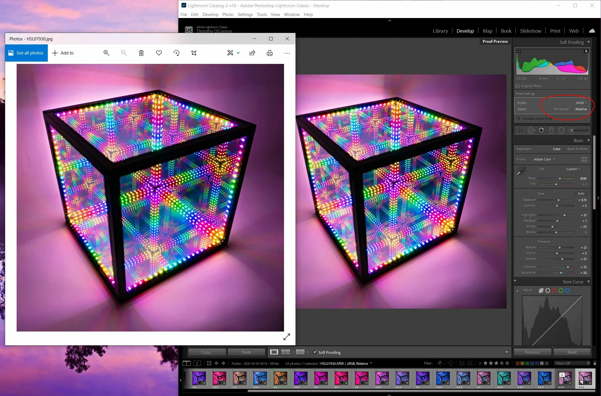
@D Fosse has the correct answer here. The images in that screenshot are identical if you consider they are displayed in different programs that use different scaling algorithms. What you are seeing is that Develop uses a different scaling algorithm to downscale your image to the display size than other places. It subsamples the original raw file for the display. This can result in an overestimation of colorfullness (it might just happen to pick out the strongly colored pixels) and this often lea
...You can't change the way develop renders unfortunately. The difference is minimized if you use high resolution displays such as retina screens, 4k monitors, etc. since you can't really see the individual pixels there. You can get a bit of an idea by switching back and forth to Library or by using a second display (the preview on the secondary display is rendered from the jpeg preview just like in library but it updates live (but slow) while doing changes in develop settings). One factor we haven
...Copy link to clipboard
Copied
The fact that Lightroom uses a variant of ProPhoto as an internal working space has nothing to do with this.
Color managed applications use the monitor profile to display correct colors.
Colors are converted from the document profile (in this case sRGB) to the monitor profile.
The Photos app is, as you're aware of, not color managed. It doesn't convert the colors to the monitor profile, and sends uncorrected colors to the screen.
This explains the difference, and if you have a wide gamut monitor, the difference will be very noticeable, with increased contrast and saturation. With a standard gamut monitor, the difference might be negligible.
The solution is to use a color managed image viewer, like Adobe Bridge, or FastStone, free for personal use.
Color management in FastStone must be enabled under Settings > CMS, and both boxes must be checked.
All major web browsers are color managed these days, so you should see the same in the browser as in Lightroom.
Phones and tablets are a different story.
The reason you don't see any difference when soft proofing to sRGB is that the colors in the image are within the sRGB gamut. But the image in your screenshot has very saturated colors, which makes me curious about the make and model of your monitor.
Copy link to clipboard
Copied
@Per Berntsen wrote:Phones and tablets are a different story.
Fortunaly, not the ones that are color managed (like everything from Apple).
Copy link to clipboard
Copied
I appreciate the response. Using a color managed image viewer will not solve the issue though, unfortunately. I use these images for business, posting to our website and social media accounts. Facebook and Instagram do not appear to be color managed, or at least do not recreate the colors seen in LR. Similarly for my website; while Chrome and Firefox may be color managed, I do not see the same colors on the web that I do in LR. Windows photo viewer and my website look nearly identical, which is to say significantly more saturated and higher contrast than LR.
Furthermore, I've opened the exported jpg in FastStone, but as you can see there are still clear differences:
Something is still amiss. If the lack of differences in soft proofing imply there the image is within sRGB, why would there still be a difference in the exported photo? Is there anything else I can try?
Copy link to clipboard
Copied
IF Facebook or Instagram, netiher of which I use, strip profiles (which isn't unexpected), there is nothing you can do. Those on wide gamut displays which you may be using, will have issues because the assumption of the data (sRGB) is wrong.
Again, this isn't an LR issue. It's previews are 'correct' and those that do not match are not. Soft proofing isn't an answer as soft proofing requires color management: recognizing the actual color space of the data, the color space of the display (both communicated by profiles) for a resulting preview.
The other possible issue could be the GPU on your system or the way you've built your display profiles. First, try disabling GPU in the preferences (Preformance tab). Any better?
If not, recalibrate and build a new ICC display profile, the old one might be corrupted.
If you are using software/hardware for this task, be sure the software is set to build a matrix not LUT profile, Version 2 not Version 4 profile.
If turning OFF GPU works, it's a GPU bug and you need to contact the manufacturer or find out if there's an updated driver for it.
Also see: https://helpx.adobe.com/photoshop/kb/acr-gpu-faq.html
Copy link to clipboard
Copied
Yep, GPU is completely off in LR. The issue is that even in color managed programs, like Chrome or FastStone, the exports still look different than what's in LR.
Copy link to clipboard
Copied
Can we see the export settings?
Can you provide a raw that causes this mismatch to allow us to export to sRGB and then provide back so you can preview? Use something like Dropbox for the upload. Upload your exported JPEG too.
Copy link to clipboard
Copied
Sure thing! Here is a google drive link to the RAW file: https://drive.google.com/file/d/17sJX3zuczuBoSo2bM7zrMaDGc_90X_6g/view?usp=sharing
And here is are the export settings:
Copy link to clipboard
Copied
Export settings seem fine.
When I export in LR using a similar setting, the preview in Photoshop and LR match:
Sorry, I didn't do a great job lining the up to match the screen capture exactly but the two appear to match otherwise.
The JPEG is in my public Dropbox here:
https://www.dropbox.com/s/4t5uagxkzuibugk/HSL07930-2.jpg?dl=0
I've exported the raw you supplied as a DNG so everything is set, locked in, as I saw on my end (I didn't alter anything whatsoever in LR, just did an import but I want you to have a DNG that honors everything I saw).
That DNG is here:
https://www.dropbox.com/s/4t5uagxkzuibugk/HSL07930-2.jpg?dl=0
So on this end, all is working as expected.
When you now import that DNG, and compare it to the JPEG, do they match or mismatch?
Copy link to clipboard
Copied
Hmm the links appear to be duplicated rather than unique files. Both pointing to the jpg. I'll give it a shot after seeing the DNG.
Copy link to clipboard
Copied
The DNG is here:
https://www.dropbox.com/s/zd4kpr8t0gbs56o/HSL07930.dng?dl=0
I seem to have screwed up the copy and paste.
Copy link to clipboard
Copied
Thanks! Your JPG and DNG look identical as far as I can tell:
The problem appears to arise after editing, when cranking up the saturation and colors. Perhaps the colors get pushed out of sRGB after editing?
Copy link to clipboard
Copied
When other color managed applications don't match Lightroom, it's usually because they are not properly configured, or because the monitor profile is defective.
Did you enable color management in FastStone? I forgot to mention that you have to restart FastStone after doing this.
There have been reports of broken color management in Chrome, but I have never experienced it.
Some websites will strip out the color profile from images, but most browsers will then assign the sRGB profile.
The exception here is Firefox, which needs to be set to color management mode 1 to do this.
To change the color management mode in Firefox, type about:config in the address field and press Enter.
Type color in the search field, then scroll down to gfx.
Click the pencil icon on the right, then change 2 (which is the default) to 1. Restart Firefox.
If this doesn't help, you most likely have a defective monitor profile. (not uncommon on Windows)
As troubleshooting, and as a possible temporary fix, try setting the monitor profile to sRGB. (use Adobe RGB if you have a wide gamut monitor)
If this fixes the issue, it is recommended that you calibrate the monitor with a hardware calibrator.
This will also create and install a custom monitor profile that accurately describes the color response of your monitor.
Close all color managed applications.
Press the Windows key + R, type colorcpl in the box and press Enter.
Add the sRGB profile, then set it as default.
Copy link to clipboard
Copied
I appreciate the detailed response. Unfortunately none of this has worked. FastStone is indeed color managed and has been restarted. I've tried setting the Windows color profile to sRGB as you suggested and restarted everything. Still, the colors in the exported image are different than what's seen in Lightroom. This is showing the same exact pixel sampled. The zoomed in shot clearly shows significant color differences:
I'm baffled at this point. The only thing I should mention is that my display is not calibrated. Is there any chance that buying a hardware calibrator and going through the process would help? They're expensive, and in my mind all it will do is apply an ICC color profile that gets me "true" colors, which will be applied similarly to both LR and exports and still result in differences.
Copy link to clipboard
Copied
You simply MUST compare colors and tone in Develop module alone, at 1:1 or greater zoom.
ALL ICC aware applications should exactly match, some browsers are not color managed and some web 'services' strip the profile of uploaded image which is problematic.
sRGB alone doesn't guarantee any such matching as without proper color management, sRGB is an utterly meaningless concept. With proper color management, any tagged RGB color space image will preview correctly on your machine and match all other color managed previews (others? All bets are off).
LR is 'correct', the other preview isn't. Due to a color management issue with that product or a lack of color management.
Copy link to clipboard
Copied
Thank you for the info. Please see the new image I posted above, comaring the photo in FastStone (color managed) and LR. I still see significant differences in the export and LR. Based on the information I've received this doesn't make any sense, they should look the same. Can you think of any reasons why they would not look the same? Neither the standard develop view or the sRGB proof in LR match the exported photo viewed in FastStone.
Copy link to clipboard
Copied
Here is another oddity. I've actually clicked on your screen capture in the first post to enlarge it, I'm viewing it in Safari on Mac. They appear to match.
Here is a screen capture I see in Safari. Maybe it's late, but to me, I don't see the difference you describe, making me think, there is some profile or CMS issue on your end.
Question: When you view this preview below, which is from my screen, do the two look very similar????
Copy link to clipboard
Copied
Honestly the pictures look more similar on your screen. Here is a closeup comparison, and the pixels look pretty similar, though there are minor differences:
How does this image look on your screen? I think this showcases the differences better (comparing a closeup of FastStone and LR):
Copy link to clipboard
Copied
@Timothy5C5D wrote:
Honestly the pictures look more similar on your screen.
Exactly. Which indicates to me, it is some local issue on your system, or one of the app's is wonky in terms of color management etc. Everything you've supplied on this end works as expected.
Again, could be some oddity with the display profile but I'd have to believe all app's that use that profile would behavie the same way. To be honest, I've never personally had a courrpted display profile in 30 years of working with displays and profiles. But it does happen.
On my display, your last screen capture (with yellow) does appear a little different. I'm now wondering, could you have built a version 4 spec ICC display profile which can be problematic with some software products?
If you load say sRGB as the display profile ONLY as a test, do the two app's match now?
Copy link to clipboard
Copied
The thing is, I haven't had any ICC profile enabled. My monitor is also uncalibrated. Just using a default windows ICC. After some advice I've also switched to the ICC profile sRGB IEC61966-2.1 and still don't see any differences. Could calibrating the monitor actually help improve the discrepency between export and LR?
Copy link to clipboard
Copied
There is a display profile somewhere being used, can't be avoided in color-managed apps. You don't need to create one to diagnose the issue, I suggested sRGB as a quick test to see if the mismatch still exists. Yes, ideally you would calibrate and profile the display but that's another story.
Do you have Photoshop? Can you compare that and LR for a match?
Copy link to clipboard
Copied
I do have photoshop. Comparison here, and the difference is quite clear on my screen. All I can think of now is that I should calibrate my screen, but I don't necessarily believe it would fix this.
Copy link to clipboard
Copied
Check again at 100%. You have 68.3%, a very odd ratio that might cause screen resampling artifacts.
Copy link to clipboard
Copied
See below. The images still look quite different, so it does not appear to be a resampling artifact. I have also exported in tiff and png with the original resolution and still see color differences.
Copy link to clipboard
Copied
Again, they don't look that different on this end. And again, you must compare in Develop mod as you were told, the preview architecture in other modules differ. And again, you must view comparisons in Develop and other applications at 1:1 (100%) or greater.