Copy link to clipboard
Copied
Hi all. When exporting from Lightroom Classic, or using the "edit in" function and editing in Photoshop 2022, the colors in my image are completely different. I have tried updating my graphics drivers. My display calibration is set to sRGB - but I do not think this is the issue as they are different even between applications.
I have not tried uninstalling and reinstalling. Version numbers are at the bottom of this post.
I've been struggling trying to find a solution for about 2 hours now and would appreciate any and all help as to why this would be happening.
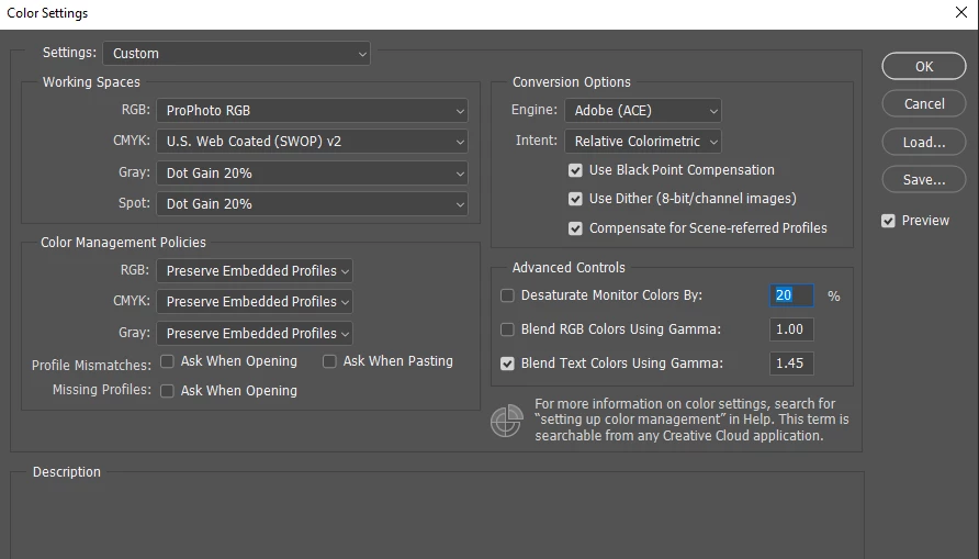
Photoshop Color Settings
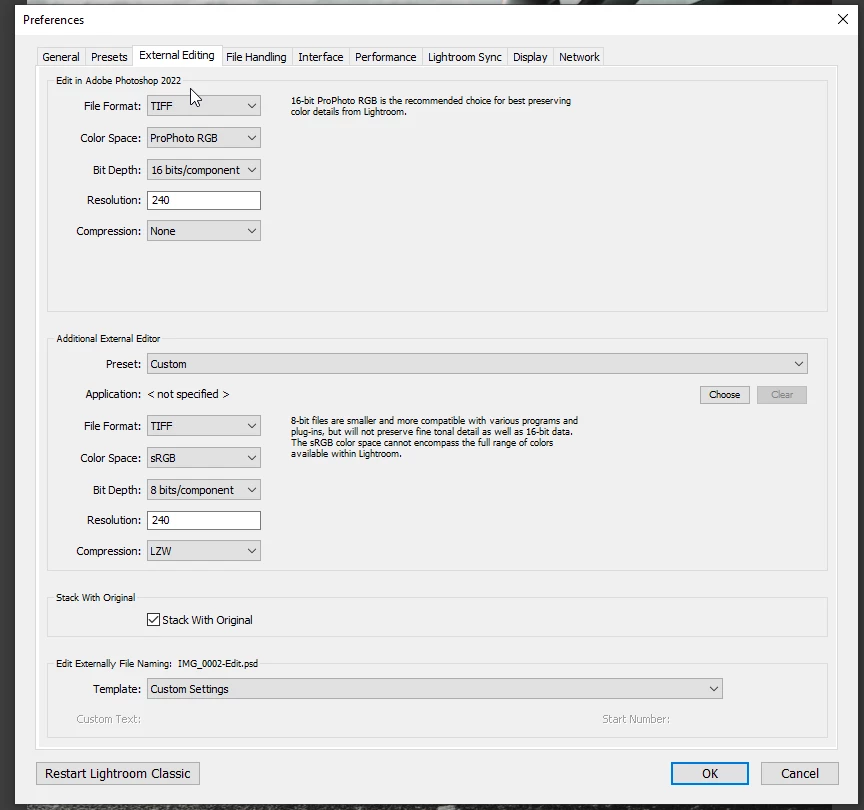
Lightroom External Editing & Export settings
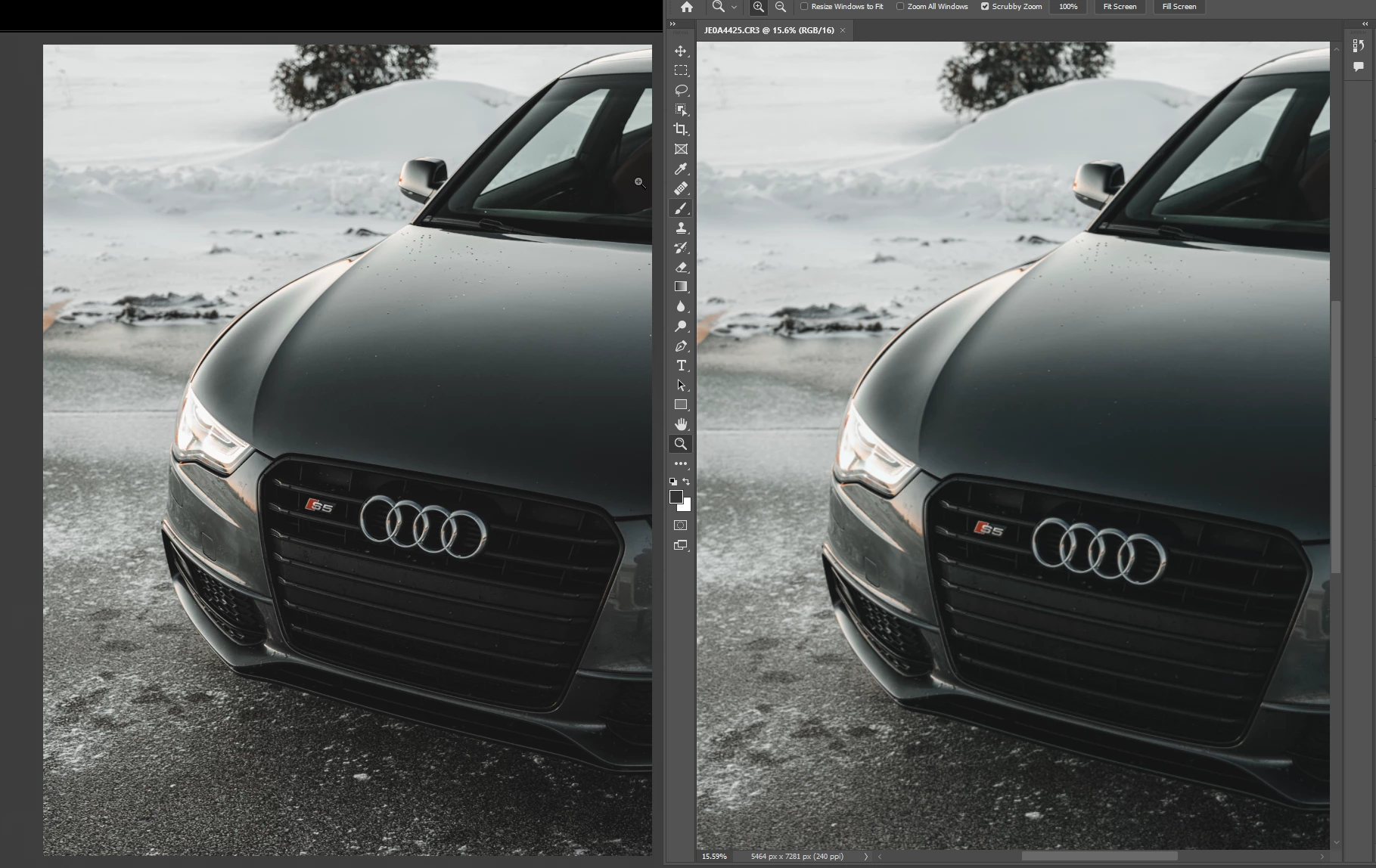
Example below. Left is lightroom(correct) right is photoshop(wrong) You can even see some weird red color artifacting on the hood in the right image.
Lightroom Classic version: 11.0.1 [ 202111111509-eae8952e ]
License: Creative Cloud
Language setting: en
Operating system: Windows 10 - Home Premium Edition
Version: 10.0.19044
Adobe Photoshop Version: 23.0.2 20211119.r.101 ace26c0 x64
Number of Launches: 2
Operating System: Windows 10 64-bit
Version: 10 or greater 10.0.19044.1387
1 Correct answer
"Here is a link to the raw and xmp sidecar. Let me know what you see when you open it up/export/edit in PS."
On my wide-gamut calibrated Eizo, I can't see any difference between:
- LR Develop,
- LR > Export to quality 100 sRGB JPEG > PS, and
- LR > Edit In > PS (ProPhoto RGB)
This suggests that what you are seeing is specific to your display, and calibrating it with a hardware calibrator (e.g. a Spyder or i1Display for about $130 - $200) should be the next step.
Copy link to clipboard
Copied
As of this evening, several updates are available, your issue may or may not get fixed.
PS v23.1
Lr v5.1
LrC v11.1
Camera RAW v14.1
Copy link to clipboard
Copied
I do not see these updates available.
Copy link to clipboard
Copied
You may need to refresh, also you can click on check for updates.
refresh mentioned in https://community.adobe.com/t5/lightroom-classic-bugs/p-headlights-dll-error/idc-p/12592127#M22763
Copy link to clipboard
Copied
Thanks - I've updated all my applications but the issue still persists unfortunately.
Copy link to clipboard
Copied
[This post contains formatting and embedded images that don't appear in email. View the post in your Web browser.]
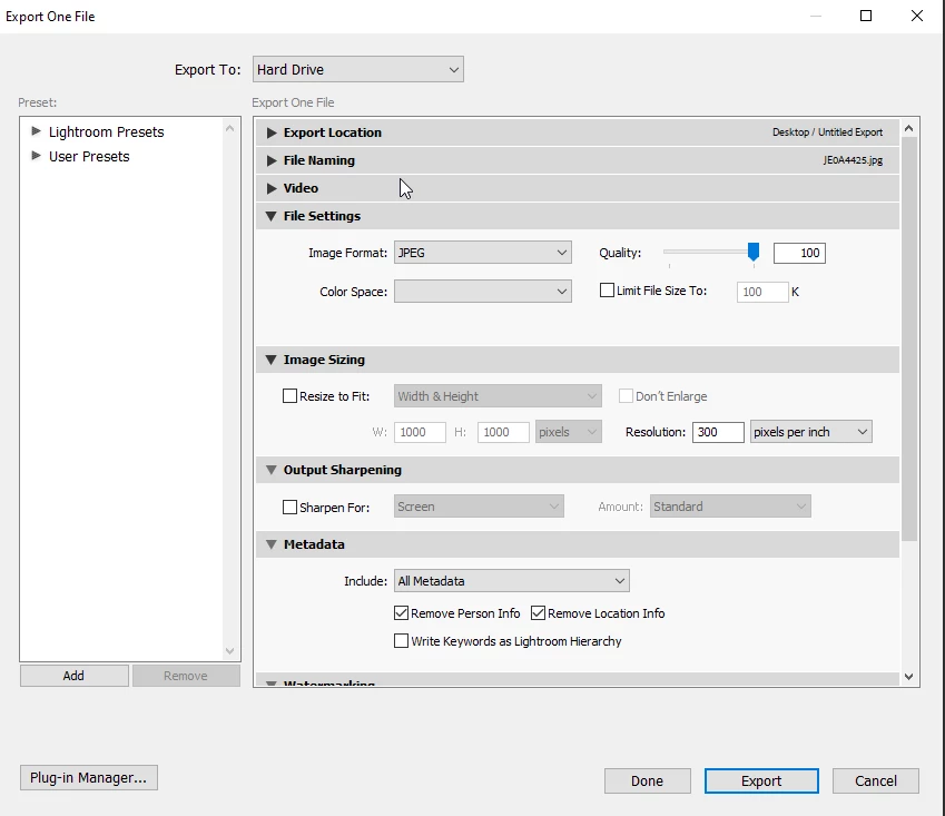
The Export settings show no color space is selected:
That's not supposed to happen -- normally, LR forces you to pick one. Try selecting sRGB and then updating the Export preset (if you're using one).
Correcting the Export settings won't affect the issue you're also seeing with Photoshop, but one issue at a time.
Copy link to clipboard
Copied
"My display calibration is set to sRGB"
1. Do you mean you've selected sRGB as the profile assigned to the display by Windows?
2. Are you on a Surface Pro by any chance?
3. Triple-check you've assigned the profile "sRGB IEC61966-2.1" to your display by following the instructions here precisely:
https://www.lightroomqueen.com/how-do-i-change-my-monitor-profile-to-check-whether-its-corrupted/
Copy link to clipboard
Copied
1) Yup! 2) No I am not on a Surface Pro. I am using a Windows desktop I built. and 3) Done. Screenshot below.
I've changed the export settings to SRGB, and double checked my monitor profile to what you described in step 3. The export is now closer, but still not exactly right. You can still see a bit of the red/magenta triangle in the right bottom right side of the hood. Right is PS, Left is LRC.
Edit in Photoshop is still bunked up though. No change there.
Copy link to clipboard
Copied
"You can still see a bit of the red/magenta triangle in the right bottom right side of the hood."
I don't see that difference -- can you circle it in both images in the screenshot? Or provide closeups of the affected areas in LR and PS?
Copy link to clipboard
Copied
Here are all 3 side by side - makes it much easier to see. The first being how it should look, 2nd being Lightoom export (it's close to being right but the grey/colors are still off and that red artifacting is ever so faintly there) and the 3rd being the Edit In>Photoshop example, of which the banding and colors are very bad.
Copy link to clipboard
Copied
The compression on here makes it hard to tell. Here's a download for the side by side.
Copy link to clipboard
Copied
I'm viewing these on my calibrated wide-gamut Eizo and my uncalibrated wider-gamut Macbook Pro Retina screen. In all three screenshots, I see a very faint, barely noticeable dark red tint across the hood, and in 10.png I might see a tiny bit of red triangle in the lower-right corner. It may be that 9.png and 10.png show just a tad bit more red tint than 8.png (Lightroom).
It sounds like the band of red across the hood and the triangle are much more noticeable on your display.
Some thoughts:
1. How are you viewing the image in LR, Library Loupe or Develop? You'll get the most accurate color by viewing at 100% zoom in Develop. In Library Loupe, there's an additional conversion to 8-bit Adobe RGB. (See the next point.)
2. There can be small differences between LR Develop, LR Library Loupe, and Edit In Photoshop. Develop's working space is Melissa RGB (16-bit, Pro Photo primaries, a linear curve); Library previews are in 8-bit Adobe RGB (wider gamut than sRGB, but with more opportunity for color banding); your Edit In Photoshop settings convert the raw photo to 16-bit Pro Photo RGB; and the display's profile is 8-bit sRGB. So the paths are:
Develop: raw > Melissa RGB > display's sRGB
Develop, Edit In PS: raw > Melissa RGB > Pro Photo RGB > display's sRGB
Library Loupe: raw > Melissa RGB > Adobe RGB, compressed JPEG > display's sRGB
Export to sRGB and open in PS: raw > Melissa RGB > sRGB, compressed JPEG > display's sRGB
Especially in the darker areas, there can be color inaccuracies with these paths due to the color-space conversions (especially to 8-bit Adobe RGB and sRGB) and from the JPEG compression. It seems plausible that the different paths will produce slightly different results in the darks.
3. By setting your display profile to sRGB, you've ensured that differences between LR and PS weren't being caused by incompatible or non-industry-conforming display profiles. But you'll get more accurate color display by calibrating your display with a hardware calibrator. (And when you do that, defer any upgrade to Windows 11 until you've verified that Microsoft has fixed its horrible bug with setting display profiles.)
4. If you provide the original raw with its edits, others of us can view the photo on wider-gamut displays, to confirm what you're seeing is caused by displaying the image on an sRGB display. Select the photo, do Metadata > Save Metadata To File, upload the raw and the .xmp sidecar to Dropbox, Google Drive, or similar, and post the sharing link here.
Copy link to clipboard
Copied
I see that in the files I posted as well - odd that the magenta/red is showing up in 8 in those images. In Lightroom, that is not present on my monitor.
I am viewing the image in Develop inside Lightroom. Great info on the conversion paths though - that's nice to know.
Here is a link to the raw and xmp sidecar. Let me know what you see when you open it up/export/edit in PS.
Copy link to clipboard
Copied
"Here is a link to the raw and xmp sidecar. Let me know what you see when you open it up/export/edit in PS."
On my wide-gamut calibrated Eizo, I can't see any difference between:
- LR Develop,
- LR > Export to quality 100 sRGB JPEG > PS, and
- LR > Edit In > PS (ProPhoto RGB)
This suggests that what you are seeing is specific to your display, and calibrating it with a hardware calibrator (e.g. a Spyder or i1Display for about $130 - $200) should be the next step.
Copy link to clipboard
Copied
Okay, that's good to know!! I just purchased a SpyderX Pro. It'll be here Wednesday - I'll get my monitor calibrated and we'll go from there.
Copy link to clipboard
Copied
Congrats on your selection of the SpyderX Pro.- I have used a Spyder for several years (now the SpyderX) and since using have never encountered color problems with Prints, Books, Slideshows, editing, on desktop and laptop systems.
Admittedly I am an amateur, so needs not ultra critical, but, as others suggest, it should be a crucial component for anyone wanting 'correct' colors.
(This is not an endorsement of the product- a personal opinion)
Copy link to clipboard
Copied
Update to this : I calibrated my display using the Spyder I purchased. My issues are gone - everything matches up wonderfully.
My primary display is an LG 34gp83a, so I was a little worried about it not working with the curved aspect of it, but it worked awesome. Thanks for all the suggestions.
Copy link to clipboard
Copied
Excellent.
Copy link to clipboard
Copied
Do you know if there is a way to see the srgb resultafter export, while in the develop module in LR. Isn't the whole thing kind of useless if you edit in LR and get a totally different result after export? I just tested it and it looks funny on Iphone as well. Way too much contrast and sat. There has to be a way to work around or within that, no? Any idea is highly appreciated
Copy link to clipboard
Copied
You need to see the exported file in a fully color managed application/environment. Phones don't qualify (they usually have a rudimentary form of color management, but not to the point where they can be trusted for anything).
Develop is showing what it will look like - the only thing that happens is that the color gamut is clipped to sRGB. Anything within sRGB will be identical. With a standard gamut display sRGB is all it can reproduce anyway, but even with a wide gamut/P3 display the difference is subtle and only in extremely saturated colors.
Copy link to clipboard
Copied
That's the issue. I have my Display set to Srgb, export in Srgb but the image looks way more saturated and has more contrast if i openit in Windows Viewer and compare it to the image in the develop tab.
I know that Win Viewer isn't Color managed, but if i understand correctly it doesn't have to be, because it gets the exported image that is set to srgb. Or does thw viewer not understand that it is an Srgb image? This is a huge issue in my opinion. How am i supposed to grade an image and if anyone watches it on a phone the colors and contrast are all messed up😅
Copy link to clipboard
Copied
I know that Win Viewer isn't Color managed
By Samuel Klein
Windows "Photos" is fully color managed now, and has been for several years. Windows Explorer and the desktop aren't, however.
And yes, every application has to be color managed to display any image accurately, sRGB or not. If it isn't color managed, it has no idea what sRGB is. The profile is just ignored, and the RGB numbers are sent directly into monitor color space (whatever that happens to be). The result depends entirely on what display it's seen on and how it behaves.
The point of color management and icc profiles - document profile and display profile - is to take the display out of the equation. If everything works as it should, the image will look the same everywhere, and whatever the document profile is. In short, it will display correctly (yes, there is a reference for correct here).
If a color managed application doesn't display correctly, the most common reasons are a) missing document profile, and b) a defective monitor profile. This is why people buy and use calibrators. If there's a problem with the profile you can just make a new one. A bad monitor profile can often affect applications differently. It may work in one and choke in another. Such a difference is often a smoking gun indicating the monitor profile.
If you're sending an sRGB image to a wide gamut/P3 display without proper color management, it will appear grossly oversaturated.
Copy link to clipboard
Copied
Thanks for the detailes reply🙏
"Windows "Photos" is fully color managed now, and has been for several years. Windows Explorer and the desktop aren't, however."
- Didn't know that, thank you for the info.
"And yes, every application has to be color managed to display any image accurately, sRGB or not. If it isn't color managed, it has no idea what sRGB is. The profile is just ignored, and the RGB numbers are sent directly into monitor color space (whatever that happens to be). The result depends entirely on what display it's seen on and how it behaves."
- i have set my montior to Srgb and exported as Srgb. Shouldn't the image look the exact same as in the Develop Tab even if i open it in a non color managed application? Also an Iphone should be able to corrctly display an image that is exported as Srgb from Lightroom, no? Same issue here.
"The point of color management and icc profiles - document profile and display profile - is to take the display out of the equation. If everything works as it should, the image will look the same everywhere, and whatever the document profile is. In short, it will display correctly (yes, there is a reference for correct here)."
- That's what i was expecting as well. I have all three setup the same and still see the shift.
"If a color managed application doesn't display correctly, the most common reason is a defective monitor profile. This is why people buy and use calibrators. If there's a problem with the profile you can just make a new one. A bad monitor profile can often affect applications differently. It may work in one and choke in another. Such a difference is often a smoking gun indicating the monitor profile."
- This would make sense if the Monitor was the only display with the shift. But i can also see it on two other monitors and 2 Apple devices. Seems to indicate an issue when exporting, since all of the displays have the same issue.
"If you're sending an sRGB image to a wide gamut/P3 display without proper color management, it will appear grossly oversaturated."
- It looks equally oversatturated on my Iphone, the Monitor and on Ipad. This is so confusing. I guess i have to keep trying. Thank you for your help, really appreciate it
Copy link to clipboard
Copied
Copy link to clipboard
Copied
I also just realized, that i looks different when i open it in Chrome. In Windows Photos it is very oversaturated, in Chrome it is still there but less pronounced
-
- 1
- 2