
Getting very different results printing from Lightroom versus Photoshop
Lightroom is printing images much differently than Photoshop, and I believe they should look exactly the same.
I printed the image on the left in Lightroom, and the one on the right in Photoshop. Quite a difference in blues and greens, and the pink/magenta patches really diverge. The differences you see here are pretty much what I'm seeing in my viewing booth. With the chart side-by-side on my display, they look the same.
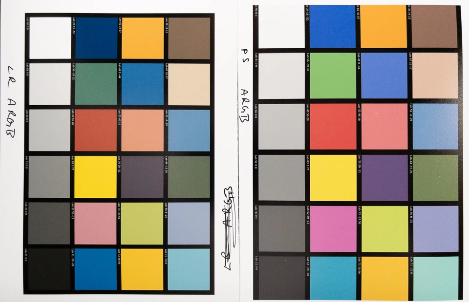
Both prints were photographed in the same shot.
The file's profile is Adobe RGB.
My Eizo display is using an Adobe RBG profile. (although I don't think that would make any difference in this test)
Photoshop's working space is set to Adobe RBG.
Lightroom's develop settings are all zeroed, and no adjustments were made in Photoshop.
Both LR and PS printed using the Epson-provided profile for their Premium Luster paper I used.
The driver's print settings are the same:
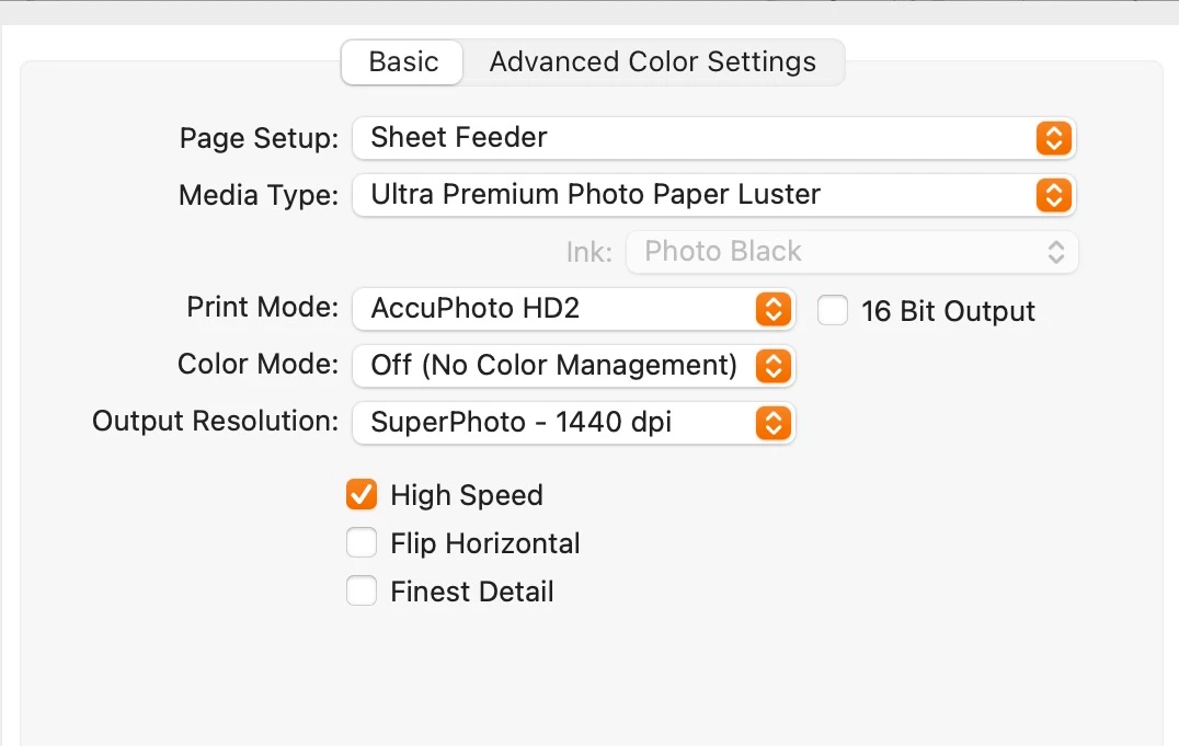
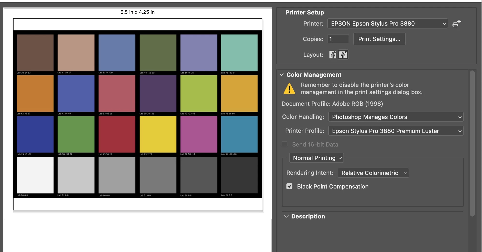
Photoshop's Print Settings menu:
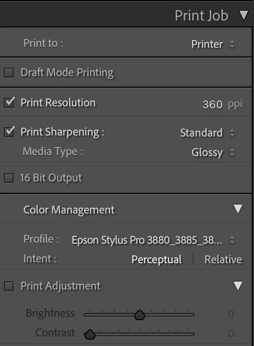
Lightroom's Print Job Panel:
The different profile names is because Lightroom seems to display the profile's Mac Script Name, while Photoshop displays the ASCII Name. They are the same ColorSync file.
Any idea why I’m getting such different results printing with LR vs PS? As you can see, the Photoshop version is more accurate. The Lightroom version is way off, so I'm posting this on the Lightroom forum.
Thanks,
Russell