

- Home
- Lightroom Classic
- Discussions
- Re: LR4 auto tone continues to be a disaster?
- Re: LR4 auto tone continues to be a disaster?
LR4 auto tone continues to be a disaster?

Copy link to clipboard
Copied
How is it that Photoshop's auto tone can produce such pleasing results, yet Lightroom's auto tone can be so wildly off the mark? This is not a recent LR4 thing, it's been a problem ever since Lightroom was released 6 years ago and Photoshop's auto tone has worked well as far back as I can remember. It just baffles me that this feature of LR still hasn't been fixed in this latest release. Lightroom's auto tone feature, as it stands, is essentially useless and I see many people posting similar experiences. It's erratic too... sometimes setting exposure wildly too high, other times wildly too low. It seems it's biggest problem is in setting exposure. All I ask for is an auto tone that behaves like Photoshop because I don't have time to manually tweak all of my photos.
Any insights on why this behaviour might be?
Does anyone have any suggestions? I saw a few people suggesting manually tweaking the text of the preset (e.g. turn off auto exposure).
I trust I'm not alone in this frustration?
Does anyone have experience with Aperture?
I realize there can never be a magic "fix any photo" button, but it would be so helpful if Lightroom could at least give me a good starting point. As it stands, I have to manually adjust every photo, which is fine for my favourite shots, but way too time consuming to perform on the rest (either I do that or I edit in Photoshop, which kind of defeats the purpose of having Lightroom in the first place).
cheers


 117
Replies
117
117
Replies
117

Copy link to clipboard
Copied
Rob Cole wrote:
trshaner wrote:
...manual PV2012 adjustments take no longer than PV2010 and the results are superior. As Rob Cole mentioned, speed in PV2012 comes with practice. You will start to see a pattern to the settings adjustments dependent on image type (normal exposure and contrast, under-exposed, heavily clipped highlights).
I noticed contrast was omitted from this procedure. I'm assuming this was on purpose.
Yes, I have found the vast majority of my images require very little PV2012 Contrast adjustment. When using Contrast in the top down settings flow I generally end up reducing it to near '0' on the second pass. IMHO, PV2012's image adaptive controls reduce the need for midtone Contrast adjustment.
By leaving Contrast out of the mix with PV2012 you reduce the number of adjustments required. This is also why LR4's Basic develop adjustments can be done as fast or faster than in LR3, at least once you gain experience. You can certainly use the Contrast control with PV2012, and it doesn't seem to matter when you throw it into the mix. I've never needed to use a setting greater than ±25, which is very subtle.
Vidlife's said,
"Is the Lightroom team working to fix this? anybody know," concerning PV2012 Auto Tone.
Eric Chan has requested image files in this post, so I am sure they are looking at improvements. My guess is that there will never be one (1) Auto Tone button in PV2012 that will work for every image type. As has already been stated, the image adaptive controls can't read your mind. What might work is to provide multiple Auto Tone settings biased to 1) maximize highlight detail, 2) maximize shadow detail, or 3) a "balance" of both.
This could be implemented using an 'Auto Tone' routine in that runs the background, and then display a "ring-around" with nine small images in the Loupe:
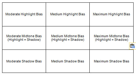
You pick the specific 'Auto Tone' image setting that best matches the desired appearance. Don't like the look? Go back and pick another one. This should enable quick auto toning with a high level of Basic panel adjustment accuracy. The review images can be kept small to reduce the background processing time. If nothing else this would be a great "learning tool" to help novice users and beginners get onboard LR!
Cheers,
TR

Copy link to clipboard
Copied
I like your idea of a auto-tone matrix. It can't read your mind, but you can tell it what you're thinking  .
.

Copy link to clipboard
Copied
trshaner,
In scanning huge amounts of black & white prints that are quite old I totally agree that there is not an obvious distinction between an old photo that lost its contrast and is overly white due to fading (even scanner time corrections have had little effects) and photos at the snow. With the options of ) maximize highlight detail, 2) maximize shadow detail, or 3) a "balance" of both, it will allow me to get very close across the whole range of photos (ie I choose one option for all scanned photos, and apply all), then on a photo by photo basis choose another option.
Copy link to clipboard
Copied
Steven Bodnar wrote:
trshaner,
In scanning huge amounts of black & white prints that are quite old I totally agree that there is not an obvious distinction between an old photo that lost its contrast and is overly white due to fading (even scanner time corrections have had little effects) and photos at the snow. With the options of ) maximize highlight detail, 2) maximize shadow detail, or 3) a "balance" of both, it will allow me to get very close across the whole range of photos (ie I choose one option for all scanned photos, and apply all), then on a photo by photo basis choose another option.
This is just another reason for providing more than one (1) Auto Tone option. I've also done B&W print scanning to archive old family pictures and many of the prints are just as you describe. LR4.1's image adaptive controls do a great job of recovering shadow and highlight detail and restoring contrast without having to resort to the Tone Curve. As has already been mentioned it is difficult to build a preset with Basic panel settings that work well across multiple images of even this same type. Small differences in exposure, contrast and tonal balance can cause the PV2012 image adaptive controls to apply less than optimum settings. The LR4 Auto Toning engine could perhaps do this with some additional intelligence applied. It might be as simple as providing multiple tonal options in a ring-around preview, with the "intelligence" being your own preference.
Copy link to clipboard
Copied
Amended quick-edit procedure for more optimized images:
0. Install Cookmarks.
1. Click Auto
2. Adjust Exposure (by a little or a lot, left or right, so it look nice).
3. Try a little more black clipping (-blacks). If it makes it better, then keep it (and consider trying another dose), else undo. Only caution is not to clip too much black in the interest of trying to accomplish more contrast/punch, instead: read on...
My experience is that, way more often than not, Lr4.1 auto-toner tends to create a natural (lower-contrast/lower-punch) image. If that's the style you want, then you will probably be done at this point. If not:
4. click "Punch" link (Cookmark), to give more punch. (what it does is increase intra-region contrast in all 3 zones (more midtone contrast, more intra-shadow contrast, and more intra-highlight contrast, without changing overall tonality very much (histogram will be slightly extended right-ward, and show a bit more overall/global contrast), and adds a little "Presence").
Now you're done.
Honestly, I've spent several minutes on some images (adjusting manually), then tried again using the above procedure and ended up with something that looked very similar in only a few clicks.
PS - "contrast" = separation of tones. Thus "intra-region contrast" means increasing tonal separation within a region, without affecting the tonality of adjacent region(s) - which is something that can be done using the basic sliders, but NOT using the tone curve.
Cheers,
Rob

Copy link to clipboard
Copied
My concept of Lightroom is that it is designed and optimized as a program for managing and processing, large volumes of, "RAW" files from Digital Cameras.
With this concept in mind I would expect the "Auto Tone" feature is designed to specifically cater to dealing with these files. I would not venture to use it for other purposes.
There are specilized scanning software programs that are better suited to dealing with the specialized needs associated with this process.
Copy link to clipboard
Copied
DdeGannes wrote:
I would not venture to use it for other purposes.
Not sure what you are driving at here. I mean, in my experience, Auto Tone works about the same for large or small volumes, raw or jpeg, scanned or shot...
Perhaps you could give an example of a situation where auto-toning is not suitable due to the Lr design/concept. e.g. what are the specialized needs of the scanning process, or in any case what would be an example of a specialized software program that might be better suited...
Rob
Copy link to clipboard
Copied
My point is designing and "Auto Tone " tool to cater for files of all supported raw file formats; jpeg/tiff files; scanned files (from current photos, historic aged photos of various aging and physical condition, color, b&w, serpia toned and whatever), negative scans in varing/aging condition to historic photos; slide scan etc.
Is this a realistic expectitation? The scanning software I use is Viewscan, but there are others.
I have no problem with the fact that the "auto tone" is useful but the hit percentage of acceptable results would depend on the individual files. My expererience is that it works fine for well exposed, normal type scenes, but not so good for poorly exposed with difficult/unusual lighting conditions. ie. Its unrealistic to expect "auto tone" to restore a poor capture.
Copy link to clipboard
Copied
Thank you for clarifying, however I do still think it's a realistic expectation for exposure to be set better - even if not well exposed to begin with.
Nobody here is expecting it to read one's mind, and know whether over-bright highlights are the subject matter, or are specular... But sometimes, it sets exposure to 2.8 instead of .7, and everything is shoved way too far rightward - it boggles the mind, and ain't good enough, in my opinion.
I mean, there are 2 issues that I see:
1. The same issue that all auto-toners have: can't read user's mind - this aspect would be nicely solved by an auto-tone matrix, as trshaner has suggested.
2. Wildly wrong calculation of exposure - this can only be remedied by an algorithm fix (or bug fix).
and for the sake of completeness:
3. the issue of not being a pixel editor, and having to use the basic sliders instead of whatever for doing the toning... - but this is as it is...
Rob

Copy link to clipboard
Copied
Man I'm glad I found this thread and now I know that I'm not crazy! I've had lots of photos imported from LR3 and they look great/auto correct nicely if stuck on PV2010 but once I switch it over to PV2012 it all goes to ****. Not to mention my D300 Standard/Portrait etc look just horrid. The only starting point I can use is "Adobe Standard" or DX Mode 2.
Copy link to clipboard
Copied
dwressler wrote:
Man I'm glad I found this thread and now I know that I'm not crazy!
Just because Lr4's auto-tone is a little iffy, does not mean you aren't going crazy .
dwressler wrote:
...but once I switch it over to PV2012 it all goes to ****.
I'm not sure how much you are talking about the conversion from PV2010 to PV2012, and how much you are talking about the auto-tone feature.
Regarding the former, one thing to note:
If PV2010 version had blacks > 5, you will almost certainly have to pull the blacks slider way leftward after converting.
(this thread is the subject of the latter)
dwressler wrote:
Not to mention my D300 Standard/Portrait etc look just horrid. The only starting point I can use is "Adobe Standard" or DX Mode 2.
I think you should report this to Adobe in another thread here:
http://feedback.photoshop.com/photoshop_family/topics/new
Rob

Copy link to clipboard
Copied
dwressler wrote:
Man I'm glad I found this thread and now I know that I'm not crazy! I've had lots of photos imported from LR3 and they look great/auto correct nicely if stuck on PV2010 but once I switch it over to PV2012 it all goes to ****. Not to mention my D300 Standard/Portrait etc look just horrid. The only starting point I can use is "Adobe Standard" or DX Mode 2.
Like Rob, I don't quite follow the connection to Auto tone. With images already imported into LR3, the strong recommendation is don't convert to PV2012 unless you want to do further editing.
However, when you talk of "D300 Standard/Portrait", do you mean the camera profiles? They haven't changed, as far as I can see. If you use a D300, I recommend you use the "v4" profiles. From LR3.6, for the D300 and one or two other Nikons, additional Camera Calibration profiles were provided with names like "Camera Standard v4" and so on. Apparently the earlier profiles weren't quite right (Eric Chan doesn't use Nikon and hadn't noticed the problem, so the word has it) and the v4 profiles handle highlights rather better. That's nothing to do with LR4; as I say, they came with LR3.6. But in my view, the v4 "Camera..." profiles are much, much better than Adobe Standard (or the Camera D2X mode profiles).
Copy link to clipboard
Copied
I just auto-toned another (extremely tricky to edit in PV2012) photo - original exposure could best be described as "slightly underexposed".
Auto-toned settings:
Exposure +4.2
Contrast -25
Highlights -37
Shadows +37
Whites 0
Blacks -42
Yep, we have a new record for most overexposed by the auto-toner.
Yet simply by lowering exposure down to 1.7, the result is better than anything I was able to come up with previously by editing manually - dunno whether to be happy (with the auto-toner, despite initial overexposure) or bummed (that I wasn't able to do it better m'self).
Sorry, but I don't have permission to post it.
PS - I just added a new flavor of punchifier to Cookmarks, we now have:
* Punch (normal)
* Punch (for auto-toned images)
I have to tell y'all I'm getting some great results in record time simply by auto-toning, exposure adjustment, maybe blacks, and if not punchy enough, hitting the "Punchifier for auto-toned images" link.
 ,
,
Rob
Copy link to clipboard
Copied
I understand your views, for me If I want to try on a particular image I click the button, if it does not suit my tast I click edit/undo.
Copy link to clipboard
Copied
Whatever works for you... For me, I clicked auto-tone a few times in the early days, decided it had been totally goofed up, then never touched it again, until my curiosity was aroused again by a couple of recent threads (including this one). But the real issue of this thread is:
Is auto-tone really working as good as can be expected? If not, then how about a remedy, Adobe? In my opinion, it is most definitely *not* working as good as can be expected.
Most of the people who really want the auto-tone to work better fall in 2 categories:
* Those who must develop a high-speed editing procedure, since editing each image individually manually is not practical, even if they are 100% proficient with PV2012.
* Those who don't know how to use PV2012, and need for Lr to come up with something that is at least in the ball park, so they have a fightin' chance...
Clicking auto-tone to see if it suits their taste, and if not, then editing manually, is not a satisfying solution, for them.
Rob
Copy link to clipboard
Copied
DdeGannes wrote:
My concept of Lightroom is that it is designed and optimized as a program for managing and processing, large volumes of, "RAW" files from Digital Cameras.
With this concept in mind I would expect the "Auto Tone" feature is designed to specifically cater to dealing with these files. I would not venture to use it for other purposes.
There are specilized scanning software programs that are better suited to dealing with the specialized needs associated with this process.
Once a raw file has been demosaic'd, color profile applied, white balanced, etc. there is very little difference between the open LR raw image and a JPEG/TIFF camera or scan image. Concerning scan images I agree with you that specialized scanning software is a better choice for "initial capture," especially with film images. This does not mean you are done processing the scan images. That's where Lightroom becomes the ideal tool for final touch-up of exposure, tonal balance, color balance, organizing, adding metadata, and repurposing (Slide Show, Web, Print, Book) ad infinitum. Scanning can take minutes and if the results aren't as expected you have to rescan the image. I generally use the scanner software for my initial capture with a custom color calibration profile and little other processing. Everything else can done faster inside LR and PS.
Using a ring-around preview with multiple graduated toning selections would make Auto Toning more useful for all image types.
Copy link to clipboard
Copied
DdeGannes wrote:
My concept of Lightroom is that it is designed and optimized as a program for managing and processing, large volumes of, "RAW" files from Digital Cameras.
With this concept in mind I would expect the "Auto Tone" feature is designed to specifically cater to dealing with these files. I would not venture to use it for other purposes.
There are specilized scanning software programs that are better suited to dealing with the specialized needs associated with this process.
Fair assumption. Scanning software perform brilliantly on color restoration, but are a poor 2nd compared to what lightroom can do for exposure management.. Unfortunately the issues for scanned photos equally apply to raw photos from cameras. With the practice of "Expose to the Right" for cameras results in similiar issues and we still have problems wilth photos that have a small bright light pointing towards the camera. It does not affect the camera exposure but auto-tone over corrects and darkens the photo inappropriately.
Copy link to clipboard
Copied
trshaner wrote:
When using Contrast in the top down settings flow I generally end up reducing it to near '0' on the second pass.
That's what happens when you try to set contrast before -blacks and/or +whites are in the ball park.
And likewise, in my experience, if it's the kind of photo that's going to need +blacks and/or -whites, the tendency is to increase contrast on the second pass, if the first pass when contrast was set was top down.
Consider BobDiN's tip:
1. Shift-double-click 'Whites' & 'Blacks' (the words, not the sliders), then
2. Adjust top down - you should be able to set contrast more accurately now, on the first pass, if you care to bother.
Note: auto-tone values for whites and blacks depends on camera profile selected, but they do not depend on anything else that I have discovered so far.
Rob
Copy link to clipboard
Copied
Yes I found this advice about the blacks/whites is sound and it makes it easy from there. I have also found that after correcting shadows, highlights and exposure auto contrast is very close.
Takes a while to get used to but should use an xRite Passport and create a shoot profile as it makes it so consistent and easy ...
Copy link to clipboard
Copied
BKKDon wrote:
Yes I found this advice about the blacks/whites is sound and it makes it easy from there.
It's a hot tip if you ask me. the auto-toner nearly always sets better blacks & whites values than 0,0 - makes it not only easier to set contrast, but exposure too - on the first pass.
BKKDon wrote:
I have also found that after correcting shadows, highlights and exposure auto contrast is very close.
Reminder: the value the auto-toner comes up with for contrast is not dependent on any other settings, thus you could set it before correcting shadows, highlights, and exposure (say along with blacks & whites) if you want.
There's more than one way to tame the beast!
Rob
Copy link to clipboard
Copied
At the risk of beating Auto Tone to death here's an image that "visually" demonstrates how the tone controls work.
http://www.northlight-images.co.uk/downloadable_2/test-ramp_2.zip
Import the above image into LR and observe the Histogram in the Develop module. You will see 21 lines representing the 21 grey scale values from 0%-100% in this image. Adjust each of the Basic panel Tone controls individually to see how they affect the Histogram and Loupe image. Now adjust the four regions in the Tone Curve. Notice that the PV2012 Highlights and Shadows Basic Tone controls work quite differently than their companion Tone Curve controls.
This image has a full 0-100% tone range and when opened in PS (sRGB profile) the values are exact. It should require no adjustment in LR, correct? Hit Auto Tone.
Yeah, it's a test image and not a picture, but the even-balanced tonal look is what I want. As we have seen, this is also the case when using Auto Tone with many "normal" pictures.
Copy link to clipboard
Copied
Very interesting - thanks for posting (I got no problems beating on it a bit ).
trshaner wrote:
This image has a full 0-100% tone range and when opened in PS (sRGB profile) the values are exact. It should require no adjustment in LR, correct? Hit Auto Tone.
It was a surprise to me too how strong the adjustments were, e.g. highlights/shadows.
trshaner wrote:
Yeah, it's a test image and not a picture, but the even-balanced tonal look is what I want. As we have seen, this is also the case when using Auto Tone with many "normal" pictures.
In PV2010, auto-tone does not do much, and unlike PV2012, other adjustments maintain a fairly even tonal distribution. This is one of those double-edged sword things in PV2012 - the characteristic (uneven) redistribution of tones is one of the things that makes it so awesome sometimes, but is not always wanted. For example, the highly stratified sky in getho's example in the "pv2012: boo!" thread - looks kinda cool, but is overly stratified for his taste, and no way to get around it other than by using locals in a fairly painstaking fashion.
One thing I noticed is that it's smart enough to realize it won't be able to unclip the blacks, so it doesn't really try. whites are another story, and it recovers highlights/whites fully, thus probably underexposing if this were a real photo where full dynamic range was wanted.
However, just setting exposure back to zero makes for what might be a nice photo if it were one - i.e. highlights are stratified and shadows are filled.
(on the other hand, if it was a sunset photo where highlights were the primary subject, it might be perfect with exposure as computed by auto-toner).
Interesting to note, that the upper-midtone/lower-highlight area is more brighter and more compressed. With lifted shadows and stratified highlights, it's an inevitability, and a characterstic of PV2012 I've noticed in reglar photos before too.
PS - Also, for fun: imagine this were a real photo, then try pulling the blacks slider left to say -15.
------------------
Regarding previous posts: I've also noticed the auto-toner occasionally setting blacks too far left for some photos, clipping blacks that are better unclipped. So, a rightward adjustment of blacks is sometimes called for too, although less often than leftward, in my experience so far.
-----------------
Other fun things to try with this image:
* set everything to zero except whites -100 & blacks +100 - note how both blacks & whites remain clipped - this exercise makes that element of PV2012 design crystal clear - how whites and blacks are decidedly NOT like the right and left sliders on a traditional "levels & curves" tool. (just beware, although tonal response of +blacks is *very* much like that of Lr3 fill light, it does NOT make use of the masking/recombining technology of the shadows and fill sliders, which is why it makes images look "softer" (it reduces contrast/separation in the midtones and highlights). Ditto for whites - highlights slider uses the masking/recombining technology, whites doesn't, which is why highlights slider is preferrable for recovering highlights if your aim is to preserve midtone (and intra-shadow) contrast).
* compare +contrast to +highlights -shadows, and -contrast to -highlights +shadows: +contrast maintains better separation than +highlights -shadows, and -highlights +shadows maintains better separation than -contrast.
* set clarity to 100, then switch to PV2010 and set clarity to 100 (while you are there, try it's auto-toner, and fill-light, and highlight-recovery, and contrast, and compare to PV2012).
Rob
Copy link to clipboard
Copied
To clarify:
-40 refers to the highlights and +40 refers to the shadows.
If you want a bright, punchy, clear, detailed picture, it's generally best to crank exposure and/or contrast up enough that it blows out the highlights a little, or even a lot, then bring them down using -highlights. Likewise, setting blacks low enough and contrast high enough that +shadows won't over brighten the bottom end.
If you don't want that kind of image (or if you are processing jpegs that already have some intelligent contrast and compensation applied) however the situation could be the exact opposite.
So, it's not a hard and fast rule. But having highlights zero or negative, and shadows 0 or positive, with same value as highlights represents a kind-of "balanced" situation, i.e. makes for smooth toning from one end to the other, e.g. is most like the original photo... Note: range of tones effected by highlights vs. shadows can vary significantly from photo to photo, so keeping them equal assures you don't get bit by wonky skewed highlight/shadows settings before you get the coveted exposure setting right.
From a design/under-the-hood point of view, -highlights uses an internal mask that facilitates dropping the highlights without decreasing midtone contrast (impossible to do using the tone curve). Likewise, +shadows uses an internal mask that raises the shadows without compressing the midtones (like Lr3 fill light). Note: +exposure -highlights +shadows is similar to what Nikon's (Active) D-Lighting does. That's why the image is punchier when you have -highlights & +shadows - all the midtone contrast is preserved. Toss +whites into the mix and crank highlights down even further, and -blacks into the mix, and crank up shadow further, adds intra-highlight & intra-shadow contrast too (respectively), without anything getting too bright/dim (or suffering any midtone contrast loss). Note: some people really hate this much punch and detail, and call it "hdr-ish" and what have you. So go easy, if you want a subtler, more natural, old-school photography look...
I will often end up with global value for -highlights same as +shadows, then if any fine tuning need be done, use locals instead - i.e. gradients or brushes with varying amounts of highlights/shadows in them. But one can also fine tune global values for highlights & shadows, skewing them as desired. The caution is against doing this too soon if you aren't very experienced with PV2012 yet, since it can be a recipe for getting all twisted around your axle.
Cheers,
Rob

Copy link to clipboard
Copied
Thanks for the clarification!
Tom

Copy link to clipboard
Copied
Now ..... if only...... the auto would be .... well, auto.
but, see the above for all the steps and theories and experience needed to use ..... can I say it one more time?..... AUTO
Maybe change the button name to .... CTSWH (click to see what happens) because.... well you know by now (see previous posts).... it is definitely NOT auto.
Is the Lightroom team working to fix this? anybody know?
Chris

 AdChoices