Copy link to clipboard
Copied
Hello, I'm using photoshop CC on amacbook pro retina. I mainly use photoshop for web design and when I open a document that is 300x200 px, the 100% view is too small on screen. Any ideas, It was this way on PS cs6 also before I upgraded. I just tried to delete the prefs file and restarted PS and it did not change. I have also tried to change my screen resolution to "best for retina" and it is still the same.
Steve
 1 Correct answer
...and just for kicks, I started to read from the beginning of this endless thread. It turns out that the whole "problem" was fully explained inside 20 posts or so. The rest of the thread, 360 or so posts by now, is just repetition, over and over and over again.
This one, post #20, from Noel Carboni, gave me an acute sense of déjà vu...
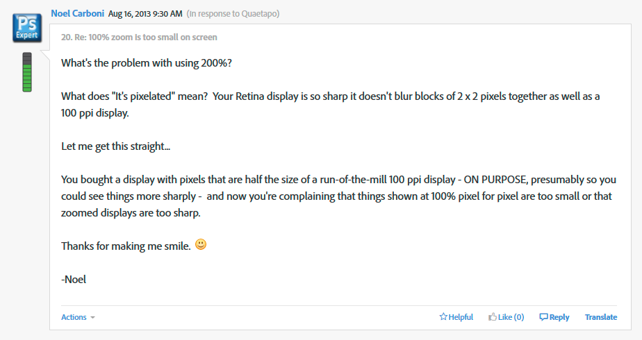
And two posts later, he went all in with a detailed and comprehensive rundown on every aspect of high resolution displays. Read it, everyone, please. And when you
...Explore related tutorials & articles
Copy link to clipboard
Copied
Travis NIO wrote:
I wish I didn't have a high-res monitor now because of this choice by Adobe.
Yes, now you're at the core of the issue. This is a basic inconsistency between old display technology and new display technology.
Meanwhile, Photoshop just does what it always has to do, and always will do: It displays the image pixels accurately. There's no choice. Hence the emphasis on "professional", a consideration web and file browsers, and other consumer-oriented apps, don't have to bother with.
Copy link to clipboard
Copied
Solution: 1. Make your image size 200% bigger 600x400 (300x200 @2x).
2. Use photoshop web preview to Google Chrome.
3. And simple zoom out 50%.
tip: Don't close the tab in browser with preview. If you make changes of your design just use web preview again. Your new design is still on 50% zoom.
Copy link to clipboard
Copied
This was a thread from a few days ago that might help:
To make Photoshop CC behave like a non-retina application, select the Photoshop application in the Finder and choose File > Get Info. If you have a Retina display, under General, there will be an option to “Open in Low Resolution”.
—Gener7 Photoshop CC with retina screen - image sizes now smaller...?
Copy link to clipboard
Copied
This is all a bit of a mess so I'll sum it up as:
"We've put black opaque windows on your car".
"Yes, but I cannot drive properly".
"I know, but this is what it is supposed to be like, your car is supposed to have black windows. One day everyone will have black windows on their cars!"
"But it's blurry, I cannot see outside the window".
"Yes but you have the future today. You'll thank us tomorrow".
"Can you add features to allow me to drive properly today?"
"If you get another window and hook it up to your car, you can drive through that. Till then enjoy the black windows".
Copy link to clipboard
Copied
Perfect.
Copy link to clipboard
Copied
SOLUTION FOR IMAC:
App called SwitchResX. Its 14€.
It gives you options for any kind of screen resolution. Choose any non-HiDPI resolutions and use photoshop as before.
Copy link to clipboard
Copied
I´ve resolved this problem by using Commands
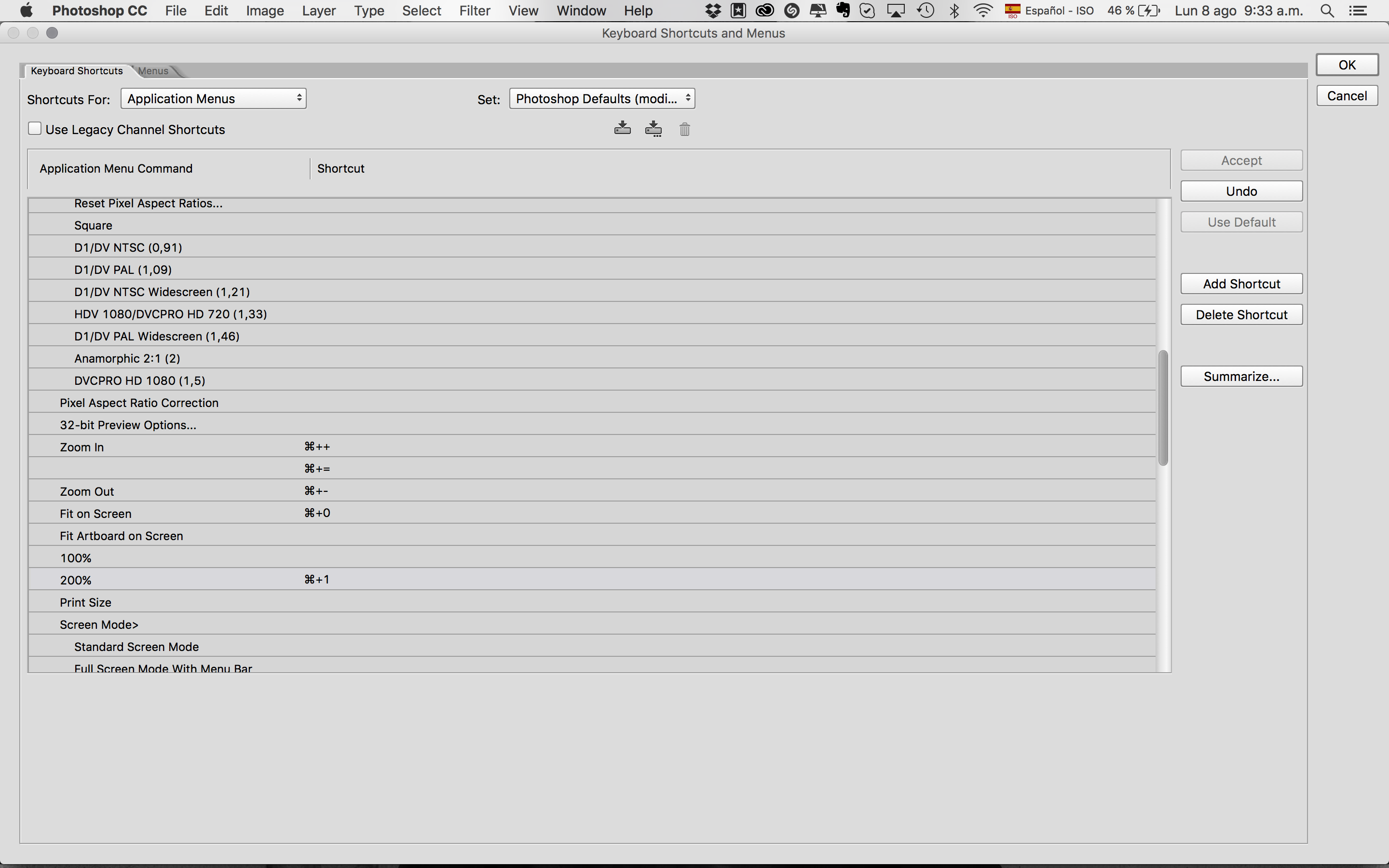
Copy link to clipboard
Copied
Just a comparison. Here's a link to a screenshot.
The image is 144ppi x 144ppi. Theoretically it should be a 2 inch wide image. My screen setting is on a MBP Retina display set to medium (1140x900 resolution).
Upper left: Firefox — measured exactly 1.3 inches across.
Lower left: Apple Preview — 1.3 inches across.
Upper right: Photoshop CS6 — 0.65 inches across.
Lower right: GraphicConverter 9 — 0.65 inches across.
http://www.americanroads.us/forum_files/144px_image_comparison.jpg
Copy link to clipboard
Copied
Parsa9 wrote:
Just a comparison. Here's a link to a screenshot.
The image is 144ppi x 144ppi. Theoretically it should be a 2 inch wide image. My screen setting is on a MBP Retina display set to medium (1140x900 resolution).
Upper left: Firefox — measured exactly 1.3 inches across.
Lower left: Apple Preview — 1.3 inches across.
Upper right: Photoshop CS6 — 0.65 inches across.Lower right: GraphicConverter 9 — 0.65 inches across.
http://www.americanroads.us/forum_files/144px_image_comparison.jpg
First using144ppi the image size is correct. It is a complete misconception that many designers have that the web work on 72ppi, as this only ever applied to Safari, and even then Safari has used 96ppi since at the latest 2004.
The web works on 96ppi, (css pixels) and you can read this in both the html5 specs and the css specs, see, (hi-dpi devices will display images at the resolution the device browser supports, (between 130ppi and 300ppi)) -
https://www.w3.org/TR/css3-images/#resolution-type
https://www.w3.org/TR/html5/embedded-content-0.html#attr-dim-width
As for Ps this displays 1 pixel as 1 pixel, and the size of the image will depend on your system settings for the monitor and graphics card in use.
Copy link to clipboard
Copied
Ok, this is what I don't get. I know next to nothing about web coding, so bear with me.
But I do regularly contribute photos to several websites, and what I can see are two options: Either the image is displayed 1:1 (or 1:4 as the case may be) - or it is scaled according to browser window size (I believe this is what they call adaptive).
I just don't get where ppi comes in?
Copy link to clipboard
Copied
Excuse me if I laugh, no insult intended ![]() , and please bear with me, as this is not an easy subject.
, and please bear with me, as this is not an easy subject.
No one used to bother about ppi on the web, this was because when an image was inserted using html4 or xhtml it was common practice to include the images intrinsic height and width as part of the image attributes, so a 72ppi image had the height and width it was created with, same for a 96ppi image.
The difference being, as you can probably see was that back in the very beginning of images on the web Apple used 72ppi as its standard display for images, (1 pixel = 1 point) but Microsoft used 96ppi. This meant an image created on an Apple computer was smaller when displayed on a Microsoft computer.
However as we all know Apple then changed to 96ppi for its display, (this was because the css specs standardised on 96ppi, and 94% of computer users use windows) so ppi did not really matter, (the image was displayed at the same size on both) then along came Apple with the retina display, html5 became the standard, responsive web design became popular, media-queries where used, and everything changed.
If you remove the viewport meta tag from any web site, then you will see everything as the device actually should display it, (try it, a site becomes unusable on hi-dpi devices). This is because the meta tag tells the device to display the page to fill the device viewport, which is not a 1:1 display. We also started to use css to tell the browser how to display an image, (max-width: 100%) which does NOT mean the image is displayed at 100% of the images width, but at 100% of the css containing element.
I wont go on with that bit, as it gets even more complicated.
Then over the last 6 years hi-dpi monitors have started to appear, and hi-dpi devices where introduced, (the original retina iPhone was about 150ppi, the iPhone 4 was about 240ppi, and the hi-dpi monitors/newer-devices are between 260ppi and 300ppi). It gets even more complicated when we start on 4k TV's and 4k consoles, as the displays are not 4k, (or whatever) until the viewing distance is taken into account, then they can become 4+/-k.
ppi starts to become important for these hi-dpi devices/monitors/consoles/tv's, when they must display images, and the range of ppi resolutions does cause problems, especially now that people are buying hi-dpi monitors, etc. as the image displayed is being created for an unknown screen size and dpi/ppi, (dpi and ppi is interchangeable on the web).
Now you may guess why I have started to recommend that images are created using inches and ppi settings, as I have found it is easier to measure the size of the image 'on screen' that I require, using a ruler, and use the ppi settings I think will cover the range of images that will cover all uses, (a loosing task, but better than nothing).
I'll leave it there, for you to ask questions, (or anyone else to ask) if you wish.
![]()
Copy link to clipboard
Copied
OK, thanks. I need to read this a couple of times ![]()
Copy link to clipboard
Copied
Hi
One thing I forgot yesterday, was the impact of 4k tv's and consoles, (and to some extent hd tv's).
4k tv's as you can imagine are on average 45+ inch screen size, and as far as I can see are all smart tv's. This means that they have a browser built in, and unlike the hd tv's, keyboard and pointer type devices are available for them, (as with consoles). At the beginning of this year the Playstation browser entered the web browser charts, (the x-box browser is IE or Edge, so no separate data is available for those).
Even though the percentage is currently less than 2%, if one estimates that x-box has a similar market share, this means that smart tv's and consoles have a higher market penetration than IE6 to IE9 combined, so ignoring these users is not advisable, as they are increasing every month.
If you can imagine creating a full width header image or even photos for inclusion in a lightbox, (a lightbox is when I think 1:1 images can be achieved using inches in the css). Then with current practices the image for the header would have to be at a minimum 90 inches wide, a width that becomes unmanageable for most standard monitors
Now srcset etc. is a standard for delivering various image to a browser, the creation of these images, that will have to cover everything from small smartphones to large tv's, is not something that many are willing to discuss sensibly. I am not saying my method is best, but until everyone is willing to stop, think and discuss 'a best way', the problem will only get worse, and 'normal' web designers ignoring it, (as is currently happening) will only cause problems for them.
8k monitors mobile devices and TV's have already been developed, and will reach the market in a few years time.
Copy link to clipboard
Copied
The issue is that Adobe created a tool to create images and inside of the tool we are unable to see how all viewers of the content might see the end result. This is a problem especially when working inside of 2x display as you cannot see mistakes that someone at 1x might see you made. We should be able to work in and preview easier in all ratios. This isn't a Mac issue, it is an Adobe issue and one that has been neglected and causes problems.
Thank you to all who are posting solutions to the problem.
Copy link to clipboard
Copied
I am amazed that this has been going on for years and it is still not resolved... I have just upgraded to CC and I am still in my 14 day period where I can cancel with no obligation.
I have just called Adobe and they have confirmed that this is STILL an issue and that I can register my feedback in their feedback section... with over 117,000 people commenting on the same issue I doubt my feedback will help.
How do people cope with this on a daily basis? do you all just work to 200% in photoshop? or is there something more sophisticated?
Should I just canx my subscription to CC? and go back to my older version of CS?
Thanks in advance...
Copy link to clipboard
Copied
Have been working on adobe XD for my web layouts in a high resolution display.
I’m using adobe photoshop CC for my web design in a 2011 iMac and it works great, but when I jump to my high resolution monitor I find the same problem that U and many thousands fellow designers are finding. So, it is not the (software) Adobe CC, its the monitor that you are using.
Bummer, I hate this too!
Copy link to clipboard
Copied
The issues was first raised over 2 years ago... the issues only affects Photoshop... Photoshop is the ONLY choice for image manipulation for professionals... the MacBook pro is also the ONLY choice for professionals on the move...
The monthly Fee for CC is supposed to KEEP ALL PRODUCTS UP TO DATE... this issue is a known issue and has been an issue for over 2 years...
Adobe state on their website "Get new features and updates as part of your membership as soon as they're released. You decide when to install them."
Maybe I just stop my subscription before the 14 days are up and I just go back to my older version?
Adobe, should be able to resolve this issue... retina screens are here and should be supported.
![]()
peace out
Copy link to clipboard
Copied
Fordrich, you really need to understand that screen resolution is a monitor property. It has nothing to do with Photoshop.
The other applications you refer to work around it by scaling up to 200%, but without telling you about that fact. Photoshop can do this too, but it doesn't force you - just in case you decided to use Photoshop for things like photography, print design, illustration, medical or forensic use - anything under the sun that is not web related.
Copy link to clipboard
Copied
D Fosse, please can you tell me where I can change photoshop to upscale it to 200? You cant just view it at 200% as it looks blurry.
Copy link to clipboard
Copied
Fordrich wrote:
D Fosse, please can you tell me where I can change photoshop to upscale it to 200? You cant just view it at 200% as it looks blurry.
It has been clearly demonstrated here several times, with full-scale screenshots, that Photoshop's 200% view is perfectly clean and sharp. What it does is represent one image pixel by exactly four screen pixels.
These screenshots all came from people who claimed 200% was blurry, but enlarging them to show the pixel "anatomy" showed otherwise.
The perceived blurriness is the fact that screen resolution is lowered to half. There is a reason why 4K/UHD displays were made in the first place.
Copy link to clipboard
Copied
Change Photoshop to Open in Low Resolution
In the Applications folder find the application and File > Get Info...
Check the box next to Open in Low Resolution.
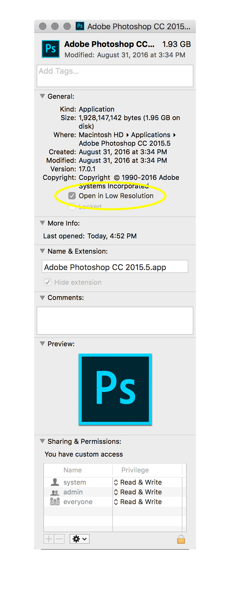
Then the results will be size identical between browser and photoshop
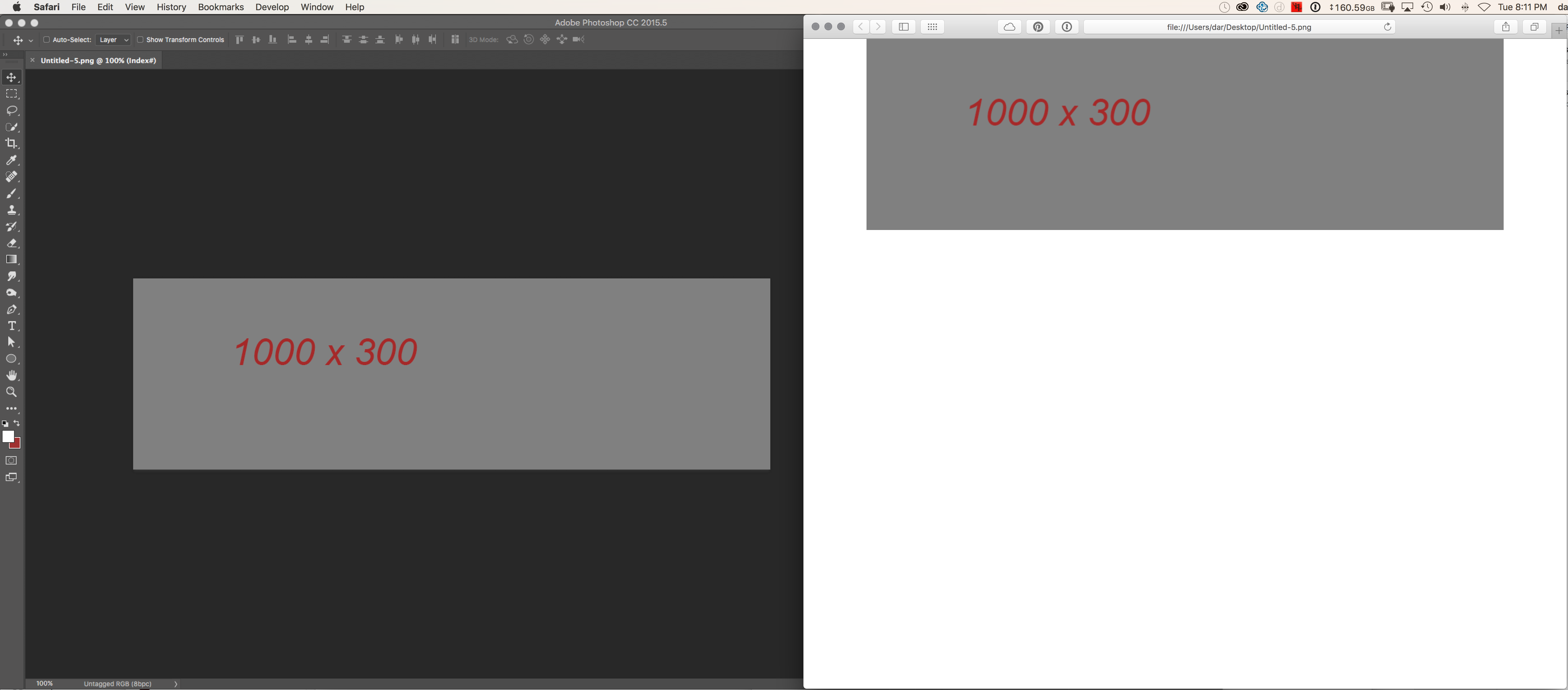
Let us know if this helps or answers your question
Copy link to clipboard
Copied
thanks D.A.R. but I don't have the open in low resolution option... is there another option or place that I can find it?

Copy link to clipboard
Copied
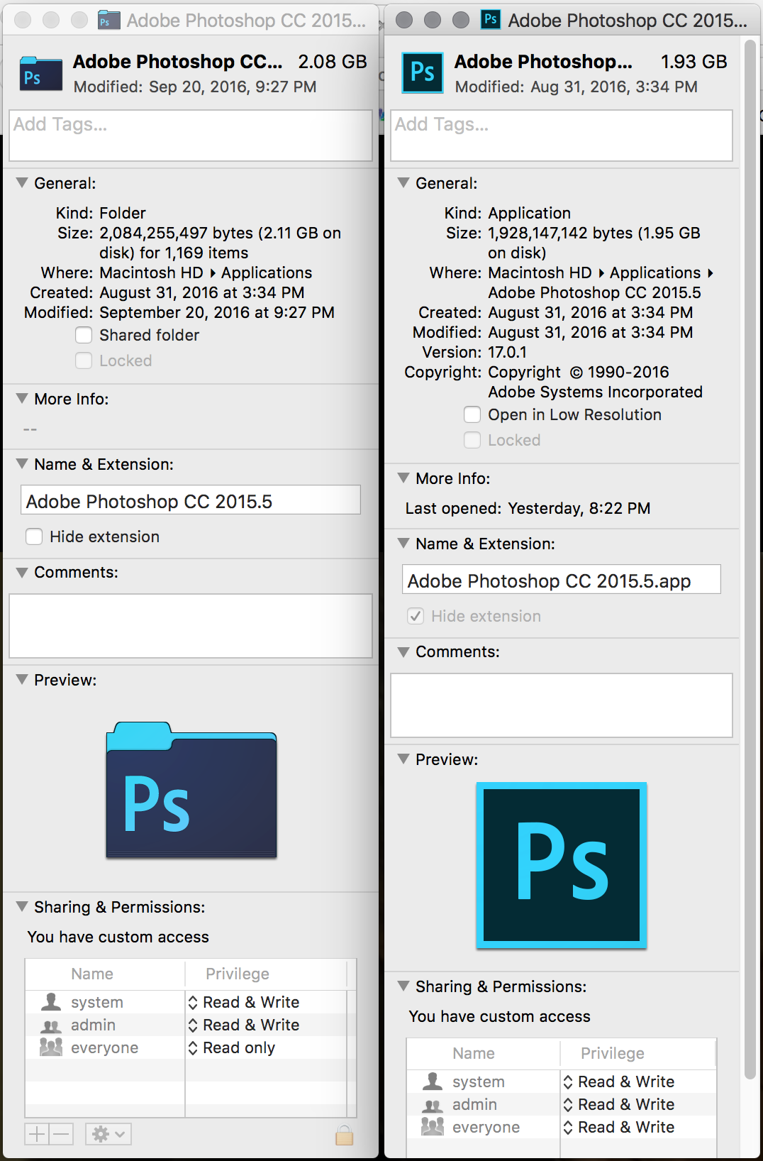
You need to click on the actual application file. not the folder before requesting the info pane.
Application Folder vs Application
Copy link to clipboard
Copied
Great, thanks D.A.R.
That does resolve the 100% issue but it does make the rest of Photoshop look blurry... but I guess that is the nature of opening it in low res mode... I will only need to open it in low res mode when I am working on web work that needs 100% to be more accurate.
Thanks again. ![]()

Copy link to clipboard
Copied
What would you all recommend if I need to resize an image to a size where it would (to my casual eye, as I'm resizing) look good in whatever document I'm working on currently? Is there a way to do this in Photoshop if I have a Retina display?

