 Adobe Community
- Home
- Photoshop ecosystem
- Discussions
- Re: beautiful print on screen, terrible once print...
- Re: beautiful print on screen, terrible once print...
beautiful print on screen, terrible once printed

Copy link to clipboard
Copied
I have been struggling for many months now with inability to print any resemblance to what is on my screen. I have spent countless hours on the phone with both Epson and Abode. Epson had me, finally, print in Preview rather than Photoshop. The print was much closer than anything I have printed in Photoshop. Epson has been a bit helpful but Adobe puts me on hold to ask "an expert" about my questions for at least 80% of the hours I am on the phone with them. I follow Scott Kelby's books exclusively and find them to be fantastic but so far I have not been able to solve this problem with his instruction. I have correct paper profiles and am.
Photoshop CS6, Mac OXS 10.6.8, Epson 2880 printer. Please tell me what other information I need to provide to give what is needed to help me. Help. Please. Thanks.
K


Explore related tutorials & articles
 21
Replies
21
21
Replies
21

Copy link to clipboard
Copied
Well, forgive me for being so straight up, but if your communication with Epson and Adobe support was as vague as this post, it's no wonder you couldn't get any help. Sorry, but you have not provided any solid technical info like what your print settings actually are, what color profiles you use, what images you are trying to print, what color tweaks you may have applied or for that matter what really the issue is with your prints. You know, "It doesn't look right." for all intents and purposes is utterly meaningless and useless. So by all means provide screenshots and the necessary info. You could simply have hopelessly mistweaked your monitor and everything be correct otherwise for instance.
Mylenium
Copy link to clipboard
Copied
Thank you for taking the time to reply. And yes, my question to this chat was begging for further instruction. Thank you for giving it. My times with Epson and Adobe were step by step, for many hours, and going through everything in this fashionthey did ascertain all of my settings, tweaks and trials. Sorry if I gave the impression that no hard information was disclosed to these help lines. Epson was very helpful and knowledgeable, while Adobe help was useless, as nobody, of the 7 reps I spoke with, knew anything more than me.
I will provide the info you suggested above. Forgive my naivete, please, we all have to start somewhere. AND please also pardon my long-windedness, as I am now afraid of giving too much information and boring all of you with my blather.
Since Epson finally did have me print through Preview and the results were far more acceptable, they and I assumed that the problem was within Photoshop, and possibly my own settings. Pardon me in advance for all of my shortcomings.
I was very comfortable with Photoshop CS2 and my film camera, F4. I have made the quantum leap to digital, D800 and CS6. I have been struggling for well over a year with all of it.
Photoshop CS6. Mac Snow Leopard OXS 10.6.8.
Presently I am working jpegs, no compression. as RAW is an entirely different dilemma.
Perfect on screen in accurate (to reality) color and contrast and saturation.
Printer version is: printing heavy purple tint in the blues
low contrast, rather grayed out
greens/yellows terribly unsaturated
general saturation/vibrance very blahhhhhh
I am in no way suggesting that you purchase Scott Kelby's Photoshop CS6 book. But I will tell you that I followed his formula, simply because I want to stay with one route and not deviate. I am happy with his instruction as it is very easy for the likes of me to follow. BUT, if you happen to have it on hand, I followed it exclusively and exactly from pages 353 to 378, all the settings, all the suggestions.
Color Settings: Working Space: Adobe RGB 1998
CMYK: US Web Coated (SWOP) v2
Gray: Dot Gain 20%
Spot: Dot Grain 20%
Color Management Policies: Convert to working RGB
Printer Setup: Epson 2880.
Photoshop Manages Color.
SRP2880 Premium Glossy
Normal Printing
Relative Colorimetric
Black Point Compensation
Print Settings: Premium Glossy Photo Paper
Color Settings, off
Print Quality, super fine -1440 dpi
High Speed, off
What color tweaks? Well, I cannot go back and look at history once the photo is saved but I can tell you that I used levels, hue saturation and vibrance a wee bit. I usualy use curves at Linear Contrast (RGB) and I use Unsharp Mask at settings of 120,1 and 3 (A,R,T) and then under Fade Unsharp Mask I simply click on Luminosity under drop down box, tho don't generally "fade".
The print I have been using as my test print for 8 months now, is of a flower of an extremely unusual color. Since I know the color of this flower in nature I am using this as my benchmark. On the screen it is the vivid and true sky-blue-hue, and background is vivid coastal Australian green. In print the flower is purple, the green (or yellow-green????????????) background is lacking in saturation and vibrance and the contrast is a bit milky. These have been, across the board, the consistent problems I have been having with anything I try to print. It is not just with this print.
Provide a screen shots????????????? Praytell, how to do. (Scott Kelby, help me!!!!!). I prefer not to disclose just how naive I am. I do take smashingly beautiful photos. I have the eya and I travel to very unusual places. But I am, admittedly, a techno-do-do. We can't all be perfect in every way. Sorry.
If I haven't scared you off with my (also) straight up reply, and the extra blather, I would love for your, or anyone else's, further help.
Techno-do-do.
K

Copy link to clipboard
Copied
my test print for 8 months now, is of a flower of an extremely unusual color. Since I know the color of this flower in nature I am using this as my benchmark. On the screen it is the vivid and true sky-blue-hue, and background is vivid coastal Australian green
first it sounds like you may have OUT OF GAMUT COLORS that SOFT PROOFING (Photoshop View> Proof SetUp> Custom) may be able to help figure it out
i would start you off troubleshooting your workflow with a copy of the Getty-Photodisc Image PDI WHACKED RGB .JPG
and review the PHOTOSHOP MANAGES COLORS WORK FLOW basics...
Copy link to clipboard
Copied
I spent all day checking settings, color management workflow and screen calibration, I checked gamut values. I have not been able to find anything grossly out of whack at all. There was much in the links that was way over my head but I stayed with it and checked what was suggested and what I understood.
Still looking for input.
Weary,
K

Copy link to clipboard
Copied
64-bit HDR imagery, displayed on an HDR monitor (still very expensive) can display virtually all the colors the human eye can see. You can mount one of those on your wall and people will think it's a window, because it's a very realistic source of natural light.
24-bit monitors cannot do the same, or anything close. But they can still do more than what could ever happen on a printed piece of paper because monitors are an RGB "source of light."
RGB is a transmissive color model. Your monitor transmits light. When you mix Red, Green, and Blue together (as light) they make white. It is actually white light.
CMYK (virtually all printerd imagery: inkjet, color laser, digital presses, offset presses, books, magazines) is a subtractive color model. When you mix Cyan, Magenta, and Yellow together (like kindergarten finger-paint), you get a muddy brown. It is nowhere close to the source of light that your monitor is. In fact, it is the opposite of a source of light. It subtracts all light frequencies except the color each ink reflects.
These two realities (transmissive and subtractive) cause us a huge problem when we want to use digital methods to create and edit imagery (transmissive), and then print them on a piece of paper (subtractive).
Fortunately, we have two wonderful things: (1) the CMYK color model, and (2) the human brain.
But CMYK is nowhere CLOSE to RGB, even with a great conversion. If I stretch my arms out as far as they can go, this can represent the number of colors possible in the RGB model. If I stretch the fingers of one hand out as far as they can go, this is representative of the number of colors in the CMYK model. (This may be a slight exaggeration.) But if we want images on paper, CMYK is what we have. Fortunately, our brains do us a wonderful service: they compartmentalize the respective transmissive and subtractive color models, and tell us that they are the "same." This is because our brains, along with our visual cortex, evaluates each color model in its own viewing environment, as if it was the ONLY color model. And so we are happy with our crappy CMYK prints.
But if you take a photo of an orange, and then create the greatest print possible of that image on paper using CMYK, you can place the actual orange next to the print and see that the print is a muddy brown mess compared to the natural brilliance of the orange from the orange tree. Try it, it will gross you out. :+)
Because of these realities, you will never get a color print that truly matches what your eyes can see in nature, or on your monitor.

Copy link to clipboard
Copied
Your problem sounds exactly like a color space mis-match. Or a double application of device profiles. Blue-turns-to-purple, and low contrast are clasic symptoms of color space mismatch.
.
Printer version is: printing heavy purple tint in the blues
low contrast, rather grayed out
greens/yellows terribly unsaturated
general saturation/vibrance very blahhhhhh
What color space are your photos captured in? ( What is the camers color space for the jpgs?)
Open them in that color space in Photoshop, or *convert* them to your working space color space, if your jpeg photos are not in Adobe RGB, when you open them in Photoshop.
Make sure that your printer driver is not 'double applying' the color profiles. If yoiu have Photoshop convert to the print profiles, then you should have the printer driver do "no color correction", or vise versa if printing the other way.
Read Andrew Rodney or Jeff Schewe for color management and printing, other wise you are just wasting paper..
Copy link to clipboard
Copied
PS,
Your work flow does not show that you are converting your AdobeRGB document (photo) to the output color space (Epson gloss print), when you print it. You have "Photoshop Manages Color" but you have no Photoshop conversion to the printer color space. You have the printer driver color management turned off.
It looks like you are printing Adobe RGB into a smaller color space. Hence the blue turns to purple colors.
Use Photoshop to "Edit > Convert to Profile > Epson Premum Glossy profile" before you print. The document profile needs to be converted to the printer color space / output color profile before you print it; you have the printer driver set to "Color Settings, off"
Your prints are Adobe RGB printed in Epson paper color space, without any correction (or so it looks, from your description)
Copy link to clipboard
Copied
PPS;
I hope that this is a simple explination. By default, photoshop recogonizes profiles and preserves colors. I can open four images in PS. One in wide gamut 16 bit per channel color space, one in Adobe RGB color space, one in sRGB color space, and one in Hanimuhle Photo Rag 308 gram color space. all four will look exactly correct in the PS workspace windows. They look exactly the way that they should. (They will open in their respective color spaces, and they will look correct on the screen)
If you print the four images, with the printer driver color managemant turned off, they will be fouir compleatly different looking prints.
You can convert each of the images to your chosen working space, Adobe RGB, (they will still look exactly the same ont the screen) and then print them, with the printer color management turned off. Then yoiu will have four identicle, bad looking, prints.
You can then convert the four of them to Hannemhule Photo Rag 308 gram profile color space, and print them on Hanimuhle Photo Rag 308, with the printer color management turned off, and you will have foiur perfict prints.
Yoiu must send the image file to the printer in the correct printer/paper/and ink color space that yoiu are printint in (the printer paper profile) when yoiu have the printer driver color management turned off.
I hope that helps!
Copy link to clipboard
Copied
Jadazu,
you have been most helpful and very concise. I have tried what I understand to be your directions and have come up with a much closer print than my months of trials have yielded. Ironically, yesterday, I also tried something completely different, out of desperation. I let printer manage colors, printed in perceptual, turned on color management and used Epson ST sRGB (and I did not convert profile). It was a rash act of desperation to tweak everything contrary to what I had ever been taught. Amazingly, I had just about the same decent results as what you suggested.
Contrast is still a bit hazy and yellows still lack a bit of saturation. BUT the awful purple printing of my blues is gone. Hooray!
Do you think this fine tuning of contrast and yellow (green???) saturation is just something I will always have to adjust before printing? Or, do you think there is one more thing I can do, to adjust to perfection, my screen/print compatibility.
Thank you so much for your time!
K
Copy link to clipboard
Copied
jadazu wrote:
Use Photoshop to "Edit > Convert to Profile > Epson Premum Glossy profile" before you print
you probably don't want to waste time going down that trail (manually converting to the print profile), it's been discussed here before by Chris Cox and it probably isn't doing what you might expect
the short answer is use Photoshop Manages Colors and set up the printer utility to convert to the Print Space...
Copy link to clipboard
Copied
Gator soup,Yes, you are correct, but "Convert to profile" does do exaclty what I know it does do. (Heck definately has some color space mismatch problem in his work flow, something 'looks like' Printing AdobeRGB in Epson paper color space. Manually converting to profile, and having the correct output/printer profile, will get proper results. For me, I prefer to have the PS engine do the profile conversion, not the printer driver. And have multiple copies of my output files, each sharpened for the paper and printer, and size they're printed at.)
I was trying to get the OP headed towards a resolution. You, and I mean you too, prob can't teach color management on a 'what's wrong?' thread.
A more important question is: Can PS do color management automaticly for users, or do users need to learn color management?
Heck, Epson RGB color space is closer to your output, so it should look better. But I don't think that you have yet correctly configured your output workflow color management.
Saturation is something that you will alwary have to adjust before printing, There is something called "Soft Proofing" that is used to see what the print will look like, so that you can make the print look like what you want it to look like. The print can't/doesn't have the color gamut and dynamic tonal range that the AdobeRGB workspace image on your screen has, so compromise adjustments must be made to get the print to represent the 'minds-eye' memory you have of the scene.
Make sure that you have the proper color profile for your printer and paper combination installed on your computer.
Heck, my long term recomendation to you is that you learn about color management, if you are serious about printing photographs; it is a deep subject, but it is cheaper than wasting paper. Bruce Frazer (sadly gone, years ago), Andrew Rodney, and Jeff Schewe, are the very best places to start, color management books by any of them. Learning color management will take the mystery out of all of these problems, and put you into the driver's seat.
Copy link to clipboard
Copied
PS,
Blue-turns-to-purple is a notorious problem in color space conversion and color space mismatch. (Not an Out-of-Gamut problem) Lack of contrast and saturation is typical of priting the un-corrected numbers of a larger color space into a smaller color space, ie Adobe RGB into any paper and ink color space.
In CIE Lab color space, used as the refrence for color space conversions, simular perceptual hues don't have constant, ie same hue angle, numerical values; ie same looking blue hues don't lie on a radial (same angle measure) line. Lines of constant perseptual hue 'spiral curve' slightly. Shrinking or expanding the color space increases and decreases the radial number values of colors (the distance from the origin) but doesn't change the angular number values. So the new color cordinates 'move into' new perceptual hues, even tho the numerical hue values don't change.
Proper color space conversions change the hue angles to maintain the same perceptual hues. Printing in the wrong color space does not change hue angles, and perseptual hues are shifted, blue/purple, orange/red, yellow/green.
Copy link to clipboard
Copied
Thanks to all of you who have helped me. So very appreciated. And yes I will take advice on learning color management, and who to learn it from.
Also, as I stated a few emails back I, simultaneous to all of your help, did stumble upon a very acceptable, albeit not perfect, print by hit and miss. For manly, many months I missed and missed and missed. I just happened to come across some combination that worked by disobeying everything I had ever learned. The steps in my process were entirely different than anything suggested but yielded the same good results as the settings that I did gleam from you.
A lesson to take away from this is that there can be many parallel paths to the same goal.
Again, thank you much for all of your time and expertise. I will return with more questions.
Keck

Copy link to clipboard
Copied
jadazu wrote:
Use Photoshop to "Edit > Convert to Profile > Epson Premum Glossy profile" before you print. The document profile needs to be converted to the printer color space / output color profile before you print it
While that'll work, it's not necessary (and it will create a lot of extra files).
As long as Photoshop manages color, and printer color management is off, Photoshop will convert to the printer/paper/ink profile on the fly. But you still have to pick the correct paper type in the printer driver as this controls the total amount of ink.
So you can print an Adobe RGB file as is, it doesn't have to be converted first. Of course out of gamut color can be a problem in either case. Soft proof to the printer profile in Photoshop to get a preview. But any soft proof is limited by the monitor gamut so that may reduce usefulness.

Copy link to clipboard
Copied
I can feel your pain.
I bought an Epson Stylus Pro 3800 in 2011, after my Epson 2000P died from clogged nozzle. The 2000P produced beautiful prints. I could not get the 3800 to do the same. All I got were dull prints from stunning images. I had a photo store pro visit and help me to set up Photoshop and the printer profile. I used Color Munki to calibrate my monitor and made all the settings changes. No luck.
Has anyone ever printed great photos from the 3800 or is its color space just too narrow?

Copy link to clipboard
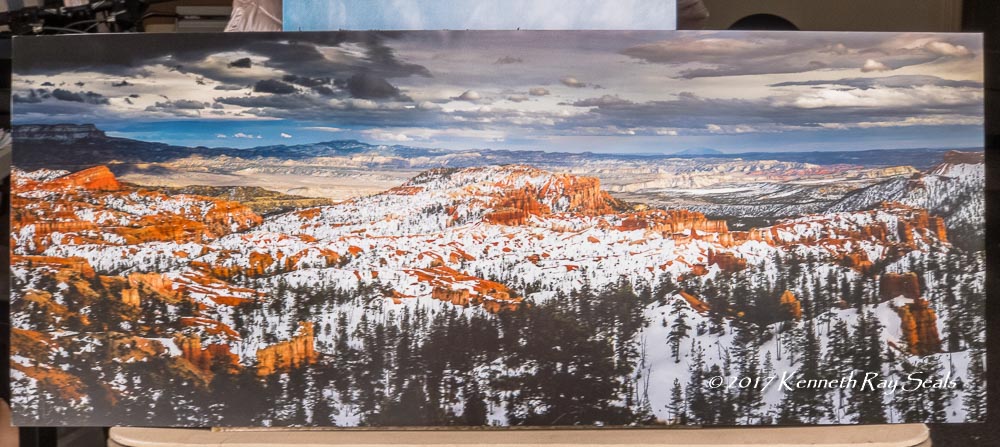
Copied
I make prints all the time with my 3880 that I'm very happy with. Here is an iPhone photo of a print I had in the San Diego Fair last summer. It's 16X38".
Is your monitor properly calibrated, including an appropriate brightness level?
Copy link to clipboard
Copied
Thanks, KR Seals, for getting back to me. I love your photo. The colors are vivid.
I have calibrated my Dell monitor many times, lately using Color Munki. The monitor is 6 years old.
The image that I want to print has appeared essentially the same every time that I've opened it in Photoshop (lately CS6) or Windows photo viewer. I've just upgraded the driver to 6.63. The result is always the same - a very flat, dull printed image.
Recently I am using View > Proof Colors (to avoid wasted paper) and the image on the monitor looks the same as what is printed.
I wonder: did you purchase a optimized printer profile and optimized paper profiles?
Best regards, Paul Edwards
Copy link to clipboard
Copied
No, I use the Epson provided profiles.
In PS View > Proof Colors, are you selecting the paper profile? I usually print from LR so I don't regularly use the PS View-Proof Colors function, but when I choose the paper profile in the first View item, Proof Setup, I get no difference when I toggle Proof Colors. I may not be using that correctly. I prefer the proof function in LR for that.
Copy link to clipboard
Copied
https://forums.adobe.com/people/KR+Seals wrote
when I choose the paper profile in the first View item, Proof Setup, I get no difference when I toggle Proof Colors.
If there's no out-of-gamut color, you're not supposed to see any difference.
And even if there is, it also has to be within monitor gamut for you to see the difference. Everything you see on-screen is already soft proofed and clipped to monitor RGB. This limits the usefulness of proofing with a standard gamut display, a wide gamut one is more useful.

Copy link to clipboard
Copied
A couple of comments - I still use the predecessor to your printer (the Epson 3800) and I am very happy with the prints.
1. Start with your monitor. This needs to be calibrated and profiled with a white that looks the same as your paper. Using an overbright , over-saturated monitor will always disappoint when printing. That monitor profile needs to be set in your system - Photoshop will then use it.
2. Light your prints to assess them. You can get "daylight lamps" and viewing booths. For my purposes I use a couple of OTTLites. The point being I have consistent view of the print in conditions that I know give a close match to the screen.
3. Whether using the manufacturer profiles or home made paper profiles - the printer needs to be set exactly the same as it was set when the profile was made. In the Epson drivers that means the paper type as advised and color management off.
Dave

Copy link to clipboard
Copied
One hint I got from Deke McClelland is to add a Brightness/Contrast adjustment layer starting with a Brightness value of 40 and a Contrast value of -40 before printing. It can be adjusted for best results.
It works best for those of us with consumer inkjets, canned profiles and sub $1000 monitors, but you might try and see if works for you.
Gene

 AdChoices