January 17, 2017
해결됨

Best way to fix up this picture?

  • January 17, 2017
  • 3 답변들
  • 687 조회

Hello

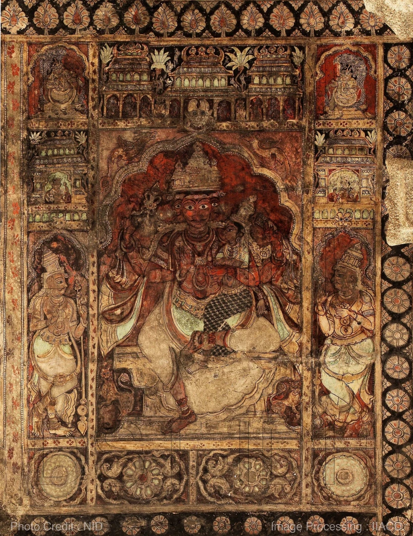
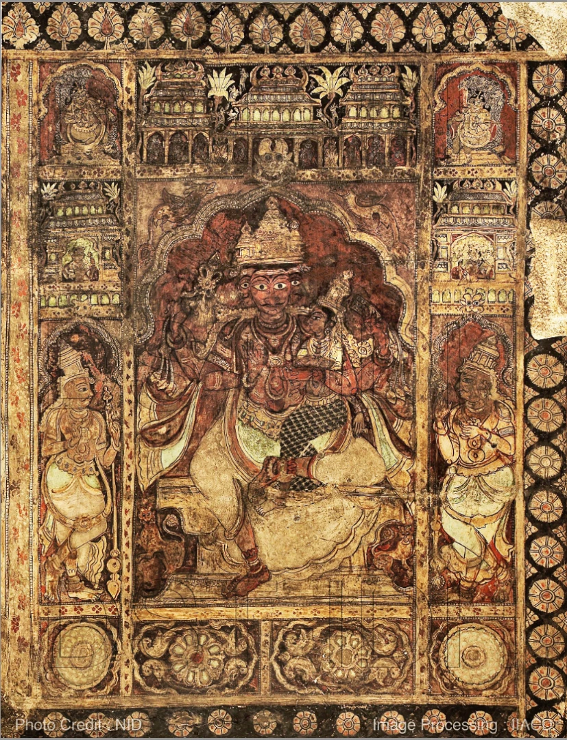
These are pictures of a historical painting, shot haphazardly, stitched even worse and everything is badly exposed and has a reddish tinge.

Attached is a sample.

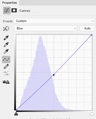
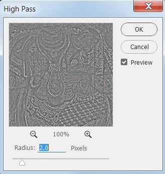
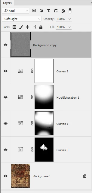
I tried various things - playing with levels, curves, exposure, brightness, White/black/gray fixing, nothing works well enough.

What I'd like to do:

1. The pictures have different exposures in different parts of the image. Compensate/normalize exposure

2. Reddish tinge - remove

3. Color correction  - fix up colors to what it should be (as best as possible).

4. Brightness/Contrast compensation - make it as best as possible for viewing, even printing

5. ? to improve image quality (not sure if there is anything else, but would appreciate suggestions).

Now, I realize there are limitations and having to work with what pictures exist, so the results can't be perfect.

But I would really appreciate if someone could point me in the right direction as to what I should do. I can figure out how to do the 'what' from other sources (or perhaps I can ask if I can't figure out) but I'm lost as to what are the best sequence of steps to follow. Some of my processing has yielded fairly good results, some not so much. The problem is I havent been able to achieve all the 4 points above with any particular series of operations.

Note: I am an intermediate PS/CS5 user. This picture is among the worst. Some of the other parts are better in quality so whatever processing works on this should work much better on the others.

Much obliged.

    이 주제는 답변이 닫혔습니다.
    최고의 답변: barbara_a7746676

    There are many ways this could be approached.

    For a relatively quick improvement, I'd suggest using adjustment layers that adjust only part of the image.

    A Curves adjustment layer to even out the light/dark areas. Fill the layer mask with black and paint with white using a soft brush where you want to show the adjustment.

    Hue/Saturation adjustment layer to calm down the red. Again, fill with black and paint with white where you want the adjustment.

    Then you could add a Curves adjustment to the whole image to bring back some overall contrast, and maybe reduce the blue a bit to give a warmer golden cast (depending on your personal taste).

    A sharpening layer to bring a little more contrast to edges. I did the sharpening layer by duplicating the Background layer, moving the duplicate to the top, choosing Filter > Other > High Pass, and setting the layer blend mode to Soft LIght.

    The face in the center is a focal point, so you may want an adjustment layer just for that area.

    Layers panel looks like this:

    Image looks like this (I'm sure you could do better because you would spend a bit more time on it than I did).

    3 답변

    Trevor.Dennis
    Community Expert
    Community Expert
    January 17, 2017

    This is a job for Lab Man!   Norman, can we persuade you to demonstrate how Lab mode would be of benefit here?

    https://c2.staticflickr.com/2/1684/25717472263_b4b100ab48_c.jpg

    davescm
    Community Expert
    Community Expert
    January 17, 2017

    Hi I did the attached in the camera raw filter

    You asked :

    1. The pictures have different exposures in different parts of the image. Compensate/normalize exposure

    A gradient from the bottom up reducing exposure - then 2 local adjustment brushes

    2. Reddish tinge - remove & 3. Color correction  - fix up colors to what it should be (as best as possible).

    I toned down the red using Camera Raw colour balance then used the HSL controls to boost the greens/blues and reduce the Reds/Magentas.

    Without seeing the original - or a colour checker in the same light - then this is impossible. I guessed at the attached but it could be a mile off

    This allowed me to push the overall saturation slider right up

    4. Brightness/Contrast compensation - make it as best as possible for viewing, even printing

    See exposure settings to get histogram below

    All the above, evened out the exposure but the colours were still off in my view. So I took a copy of the original layer balanced the colours with curves then put it above the camera raw version with color blending mode and 50% opacity

    As I said this may be way off but without anything to compare it was just based on bringing back a range of colours

    5. ? to improve image quality (not sure if there is anything else, but would appreciate suggestions).

    You could patch it - also there is a photo watermark - is this your image?

    Also look at the original , if possible, or something else shot in the same light (like a colour checker) and adjust to that

    Dave

    January 17, 2017

    Thank you, Barbara and Dave.

    Dave: Yes, there is a watermark, and no, I did not shoot the images, but I am going to be reprocessing the originals for the institution that shot the images.

    I look forward to Lab Man's method as well.

    For correcting exposure, I took an average blur of the image, overlaid the original image with a 50% opacity with Linear Light blending, and a final high pass filter with a large (100-125 - the image I attached is about 40% of the original) pixel value over it with some degree of success. Pros and cons of that method over the ones detailed here?

    barbara_a7746676
    Community Expert
    Community Expert
    January 17, 2017

    This image could be improved using myriad methods. The pros and cons of each method usually boil down to how much control you have over the results. Usually, the more control, the more time-consuming, but the results may be similar, depending on the image.

    It would be very helpful to know what the painting actually looks like so that it could be replicated more accurately.

    Here's a method that would be fast:

    Image > Auto Color.

    Add a Curves adjustment layer with a gradient mask.

    barbara_a7746676
    Community Expert
    Community Expert
    January 17, 2017

    There are many ways this could be approached.

    For a relatively quick improvement, I'd suggest using adjustment layers that adjust only part of the image.

    A Curves adjustment layer to even out the light/dark areas. Fill the layer mask with black and paint with white using a soft brush where you want to show the adjustment.

    Hue/Saturation adjustment layer to calm down the red. Again, fill with black and paint with white where you want the adjustment.

    Then you could add a Curves adjustment to the whole image to bring back some overall contrast, and maybe reduce the blue a bit to give a warmer golden cast (depending on your personal taste).

    A sharpening layer to bring a little more contrast to edges. I did the sharpening layer by duplicating the Background layer, moving the duplicate to the top, choosing Filter > Other > High Pass, and setting the layer blend mode to Soft LIght.

    The face in the center is a focal point, so you may want an adjustment layer just for that area.

    Layers panel looks like this:

    Image looks like this (I'm sure you could do better because you would spend a bit more time on it than I did).