Copy link to clipboard
Copied
Heya!
I'm really a beginner with PS and only recently started using it to create a few images of everyday objects as if they were turned into gold.
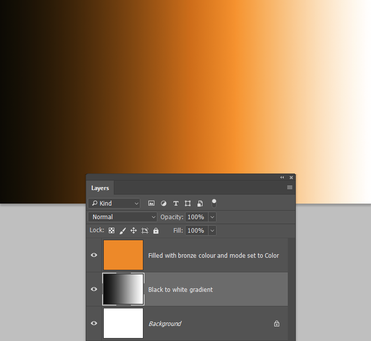
I first select the items out of the picture, then I add a solid color layer with a light yellow color and set it's mode to "color", then I add a curves layer for the shine.
The object itself looks not bad, and I don't really need any more detail, but it just seems like it doesn't blend in well, and very easily noticed to be edited.
This is probably a super common question, but I was wondering how can I make it seem as if it was natural, to blend in with the background more.
I'll attach links to 2 edited images that i've made, so you can take a look at what I mean.
I just can't put my finger on what's wrong, I believe it's something with the lighting, and if so - how can I fix it?
Thanks in advance!
Yes, I remember you from this thread yesterday
Using the Colour blend mode has some limitations, and is not my preferred method, as it depends on the tonal value of the underlying layer. Where the layer below is full black, and full white, the color overlay is not working.
You can extend the colour into the shadow areas by using a Hue/Saturation layer, and checking Colourize, and adjusting the saturation and lightness sliders
To get colour into the highlight area, you need to
...Copy link to clipboard
Copied
Yes, I remember you from this thread yesterday
Using the Colour blend mode has some limitations, and is not my preferred method, as it depends on the tonal value of the underlying layer. Where the layer below is full black, and full white, the color overlay is not working.
You can extend the colour into the shadow areas by using a Hue/Saturation layer, and checking Colourize, and adjusting the saturation and lightness sliders
To get colour into the highlight area, you need to bring down its tonal value with a curves or levels layer.
However, giving an object a gold effect is always going to depend on individual circumstances, so you would need to show us examples. It's probably not something a beginner with Photoshop is going to master right away, but good luck, and we are always happy to help and advise.
Copy link to clipboard
Copied
Hey, thanks for the response, I still don't quite understand what you mean though.
I see you added a gradient layer, should that be added over the selected area of the objects?
If you could give me an example with a picture or something that would be super helpful.
Apologies again, I just really have close to no experience with PS and i'm lost with all the layer and your explanation
Copy link to clipboard
Copied
The problem is that gold is not just about colour it is about reflections. See quick and dirty example below :
A 3D sphere rendered with a gold diffuse color.
The same 3D sphere - with same gold diffuse color but with added reflections from an image based light.
In short you have to use 3D to add reflections or use images and painting to add them
Dave
Copy link to clipboard
Copied
That does look a whole lot better Dave, but not very realistic, as it does not show all the people running away in panic after a scary UFO landed on the beach. Unless it was a Scouse beach, in which case they'd be running to get the Transit van pick up, so they could nick it.
Copy link to clipboard
Copied
Hi Trevor
I see you found out where I got the ball from then ......
From a compositing point of view there was a lot wrong with that last image I posted. The point I was making with that quick and dirty example though was how to approach gold. It is the same when painting silver or gold in acrylics or oils - you paint the reflections not just the colour.
Dave
Copy link to clipboard
Copied
Hey, thanks for the help!
Do you have any tips for adding a good looking reflection?
Also, would working on the sparkle/shine of the object give it the same realistic effect?
Copy link to clipboard
Copied
Sparkle / shine are different. What you are looking for in silver , gold, chrome etc are reflections of the surrounding environment.
You could add these three ways.
1. If you are working in 3D add reflections using a real image and let the 3D software take care of the hard work in curving them to match the surface (which is what I did in my earlier post)
2. In 2D use masking and blending to add a real image to the reflective surfaces. If the surfaces are curved you will also need to warp the image.
3. Paint on the reflections. Use a separate layer and turn down the opacity a little so you can see the surface texture and colour as well as the reflection.
Dave