

- Home
- Photoshop ecosystem
- Discussions
- Re: Can the interface menus and icons be set a lit...
- Re: Can the interface menus and icons be set a lit...
Can the interface menus and icons be set a little larger in 64bit Photoshop version CS6 ????

Copy link to clipboard
Copied
Can the interface menus and icons be set a little larger in 64bit Photoshop version CS6 ????
It would be very helpful if the tools and font size choices were enhanced to Larger, Largest or custom enhance. Anyone know if that is an idea we can send to Adobe?


Explore related tutorials & articles
 75
Replies
75
75
Replies
75

Copy link to clipboard
Copied
Best to post your question in the CS6 beta forum
http://forums.adobe.com/community/labs/photoshopcs6?view=discussions

Copy link to clipboard
Copied
I agree. The print and icons are so small you need to get close to the screen to be able to read them easily.
Copy link to clipboard
Copied
doreintl wrote:
The print and icons are so small you need to get close to the screen to be able to read them easily.
You should know that what you say is not true of everyone, and frankly the darker interface makes things a lot easier to see at the small size.
It might be better to word a statement like that along the lines of ''I need to get close...'' because you're not speaking for everyone. I personally prefer to make all menus, title bars, etc. as small as possible to leave more room to work.
-Noel

Copy link to clipboard
Copied
Noel it does not matter that you have great eye sight, because setting the bar for the likes of you precludes (or at least makes using Photoshop difficult) for all those people who don’t share your great eye sight. In actual fact, my sight is not at all flash, but I don’t mind the small icons because I know where they are.

Copy link to clipboard
Copied
Noel Carboni wrote:
frankly the darker interface makes things a lot easier to see at the small size.
I wish this were true for me! I love the darker interface - it looks much sleeker somehow and I like the way my images stand out against it. But the icons and menu items are harder for me to read against the dark background. I realize that I am in the minority here...
In any case, I would welcome the option to be able to further increase the size of the toolbars and menus.
Copy link to clipboard
Copied
Actually, no, I think most experts say a majority of folks find dark text against a light background easier to read.
What's not being talked about here very much is monitor quality. We've talked about how small the menu text is on a high dpi display, but size is not the only factor. The sharpness and gamma setting can factor in, as well as whether you've run the font smoothing tuner on your system to get the best display.
-Noel
Copy link to clipboard
Copied
I think it should be a custom size users can make when using HD 27-30 inche monitors, or any HD monitors.
And YES, the higher rez's need attention from Adobe...we need bigger interface components in CS6...
C'MON ADOBE.... I KNOW YOU HERE ME, US...ALL OF US!!!! Please, please, please!!!!
It happens in Photoshop Elements...just go and look!!!
Copy link to clipboard
Copied
Joey Rocco wrote:
...we need bigger interface components in CS6...
From what I understand from Chris Cox's previous comments on the subject, unless that is already under way, there is just no way it could happen for CS6. It is apparently a much bigger undertaking to redo all those icons than the lay person probably thinks.
Noel makes a fair point about screen quality. Even with my poor sight I can read tiny text on my little iPod Touch which has a 960 x 720 display, but surely most of the large monitors a lot of people now use for Photoshop are high quality. When I got my 30inch Dell Ultrasharp, I bumped my old 24inch Viewsonic to another system which is set up in the same room, so I still use it and can compare. Using the Viewsonic is like looking through a mud filter compared to the Ultrasharp, and I think I'd get eye strain if I had to use it for any length of time.
I often think folk like Photographers make poor choices when adding to their kit. They want lots of lenses, and pay heaps for them, whereas if I started from scratch, a dedicated speedlite would be higher up my list. We pay huge money for our first install of Photoshop, but struggle to use it on a budget screen. It makes no sense.

Copy link to clipboard
Copied
Noel Carboni wrote:
Actually, no, I think most experts say a majority of folks find dark text against a light background easier to read...
On paper yes - it reflects light. On screen the problem is - it emits light. The backlit of the LCD is like a very bright light pointed at your eyes - even at very low brightness of a properly calibrated monitor it is still like staring at a light and this is what strain the eyes - not the fact that it is dark text on white.
... but size is not the only factor
Yes, but there is a threshold for each person below which the size is the only factor. On my monitor some menus are with the size that I won't be able to read easily even if printed with the highest resolution printer on top quality paper - like the fine text on the drugs packages, I always need reading glasses. But on my monitor I have plenty of space for menus with larger text - this screen capture shows how much empty space I have for that.

Copy link to clipboard
Copied
I am glad to see qualifiers in your response (most experts & majority of folks) because light-on-dark vs dark-on-light is a topic that has been studied & debated for decades by the Human Factors community and there is no clear cut winner as there are too many factors to control. If one looks outside the scientific community, say information taken from the internet, what you find are merely preferences despite the retoric attached to the results.
The one guiding principle founded in the science of the human visual system is its contrast sensitivity . Our ability to resolve detail peaks at around 4 cycles per degree. At higher spatial frequencies higher contrast is needed to resolve detail. When discussing the readability of small UI fonts and small icons on a 100+ pixel/inch display you are talking high spatial frequencies and contrast is of paramount importance for LOD or DOL user interfaces. So yes, the quality of the display is important as is gamma.
I agree that people should qualify their statements about what they can visually resolve and what they prefer instead of making blanket statements about the UI elements being too small to read or that light on dark is better for small sizes. It is just not that simple.
Paulo
Copy link to clipboard
Copied
Yeah, there's no hard and fast rule, it's mostly preference, and it's great that we now have a choice - a PERFECT use for a preference setting in PS CS6. Thank you Adobe.
I could never understand why people could prefer dark text on light, because for me, while I can see it equally sharply, it always has just seemed much more comfortable to see light text on dark. But most systems and apps now present dark text on light, so it's pretty clear what most folks must prefer.
One thing I wouldn't mind seeing - and this might help if Adobe isn't going to be able to change the sizes of the menu text - is the ability to make the light text on the dark background a bit lighter. I think it's medium gray and light gray now. If it were light gray and full-on white that might help readability on some systems.
-Noel
Copy link to clipboard
Copied
Isn't it mostly about images? That's what Photoshop is all about, and a dark matt, or surround, as often as not gives an impression of crispness and saturation. I recently got marked down when entering this portrait in a camera club competition because I used an off white matt board, the judge saying that a black matt would have brought out the red hair and the colour of the eyes etc.
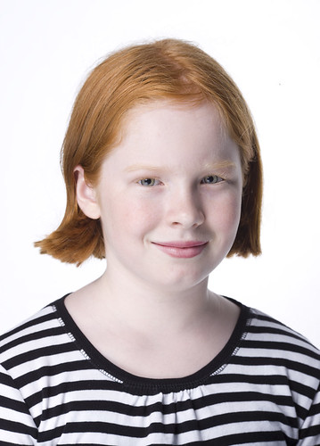
If you check the portrait on my flickr site, and click on the image, it toggles between a dark and white background, and I think the judge made a fair point. We never stop learning when it comes to image making.

Copy link to clipboard
Copied
what an idiot how can you say "the same is not true for everyone" if it were not true for you then you would not change the setting that others, who were having difficulty reading, changed would you? should everyone struggle then because it is ok for you?

Copy link to clipboard
Copied
lol, I'm actually trying to find a way to make them smaller, I want more work pace...
Copy link to clipboard
Copied
but yes, I agree there should be a way to change the icon sizes, but I don't know how

Copy link to clipboard
Copied
I am a digital illustrator and graphic designer. I have had NO problem using Adobe software until now. I have been using Illustrator and Photoshop since Illustrator 88 and Photoshop 1, and I use CS5.5 about 12 hours a day.
I just installed CS6 on a brand new 27-inch iMac with a "native" resolution of 2560 x 1440. I do very detailed work, and hoped that the new screen would improve my productivity.
But I can no longer use Photoshop and Illustrator. I literally cannot SEE the tool icons. I can barely read the menu text in spite of setting it to the "largest" size. I don't know what to do. I have to let my assistant use the new iMac and go back to the one from 2010. Any suggestions?

Copy link to clipboard
Copied
If you have CS6, then you need to install the updates to get the Retina UI scaling code.
Copy link to clipboard
Copied
Yes, but how about for CC 2014?..
I'm on a Companion Cintiq and the software is unusable like this...
Copy link to clipboard
Copied
Photoshop CC 2014 is already Retina aware on MacOS, and has the 200% UI scaling option on Windows.
Copy link to clipboard
Copied
Thanks but the "experimental" 200% UI scaling is a joke..200%?..Does Adobe take us for dumb artists?..The 200% work around is the complete opposite of tiny icons where now you lose 50% of your screen size, the icons and text are bigger than the corners of my tablet AND the resolution is like working on an Etch a Sketch from the 70's its so bad. I'm rational and resourceful but its a unbelievable that theres actually somebody inside of Adobe who makes these decisions over there breakfast cereal about who can get what screen options..I use several drawing and painting programs and have finally made the switch to PS and it doesn't work! the big bad PS CC! the mother of all design software..as I said, a joke..
Copy link to clipboard
Copied
Unfortunately that was all that Microsoft was able to enable before we shipped CC 2014.
We are continuing to work with Microsoft to address the OS issues necessary to allow more flexible UI scaling on Windows.
Copy link to clipboard
Copied
Thanks for your support Chris..
Copy link to clipboard
Copied
Wow.......a simple question for those of us who are visually challenged evoked some really dramatic answers, non of which had anything to do with the question. The sign of our times!
Copy link to clipboard
Copied
I didn't ask you to not say it. I just asked that you not speak for me.
And should I sit back and just let everyone say make it bigger without saying anything at all? Then when they just make it bigger, without any way to change it, because everyone who commented wants it bigger, I'm supposed to just like it? Sorry, I don't see the need to suppress any opinions here.
I figure if people from both ends of the spectrum speak up perhaps the worst they'll do is make it an OPTION.
My vision is far from perfect, by the way. I wear glasses.
-Noel

Find more inspiration, events, and resources on the new Adobe Community
Explore Now
 AdChoices