Changing colour mode in Photoshop shows no difference?
Copy link to clipboard
Copied
Hi everyone!
Having an issue in Photoshop. I need to convert a graphic from RGB to CMYK to see how it'll look when printed.
Unfortunately, when I go Image > Mode and select to convert to CMYK, the image looks no different.
Originally I thought it might be something to do with this image in particular, but I've tested it on a range and none of them look any different. Not sure if I have a strange setting accidentally selected somewhere? Any help would be MEGA appreciated ❤️
Charlie
Explore related tutorials & articles
Copy link to clipboard
Copied
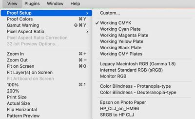
Try using the View Menu - first, set up your CMYK in View Proof Setup, then turn on View Proof Colors
Adobe Community Expert / Adobe Certified Instructor
Copy link to clipboard
Copied
I can't verify this behavior in the latest version of Photoshop on Mac, I do see the image color change when doing a conversion to CMYK.
You may wish to test this with a color reference image:
http://www.digitaldog.net/files/2014PrinterTestFileFlat.tif.zip
Convert to say SWOP V2 or worse (visually) anything for newsprint. You should see the color change.
If not, we can discuss if this is a GPU or display profile issue.
Copy link to clipboard
Copied
I can cofirm what OP is experiencing. After converting even to US Newsprint (SNAP 2007) nothing visually changes. I have tried several CMYK profiles with the same result, always. By the way, its not possible to download reference image you posted using Google Chrome.
Update:
Finally downloaded test file using Edge. It actually works with test file. Not sure why it does not work with bright and saturated images I have tested.
Copy link to clipboard
Copied
@Bojan Živković What are the starting and Ending profiles you used for testing?
Copy link to clipboard
Copied
Starting Adobe RGB (1998) and sRGB / ending various CMYK.
What seems saturated for me isn't enough. Only with huge Saturation increase I can see changes and gamut warning.
Copy link to clipboard
Copied
Hi Bojan, I wonder if my test image will download on chrome
please go here and download the Adobe RGB testimage: https://www.colourmanagement.net/index.php/downloads_listing/
you'll see that across the base is a truncated Grainger Rainbow and that’s full gamut Adobe RGB. You should see the changes in that area at least.
I hope this helps
neil barstow, colourmanagement net :: adobe forum volunteer:: co-author: 'getting colour right'
google me "neil barstow colourmanagement" for lots of free articles on colour management
Copy link to clipboard
Copied
No problem to download test image using Chrome on Windows.
Copy link to clipboard
Copied
Hi Bojan, Tested here on Mac with Photoshop 23.4.2 and my test image - the truncated Grainger rainbow area does change a fair bit even converting to a large gamut space like ISOcoated v2
neilB
Copy link to clipboard
Copied
Same thing on my end, rainbow change can not be unseen.
Copy link to clipboard
Copied
If people are not seeing a change on conversions, what OS, does disabling GPU make a difference?
Copy link to clipboard
Copied
The color reference images download fine on Safari on Mac and iOS....
Even with SWOP v2 the conversion is visibly observed. All fine on this end.
Copy link to clipboard
Copied
Hey Andrew, Hope all’s good with you.
Just FYI, clicking that link on Brave browser for Mac ( a Chrome derivative) the browser just flashes but it's not downloaded. AHA though, if I copy your download link into Chrome (yes actual chrome this time) it downloads fine. If I open the discussion page in Chrome and click it doesn’t download.
My link (for my image) works but, then, I embedded a webpage link rather than the direct link to the file.
looks like the form maybe doesn't like direct download links
let's try mine https://www.colourmanagement.net/downloads/CMnet_Pixl_AdobeRGB_testimage05.zip
strange, that one does download
neilB
Copy link to clipboard
Copied
it depends on the quality of your monitor as well. I had an older monitor where there was no visible difference between RGB and CMYK. After switching to a new one with properly color calibration, the things changed
Copy link to clipboard
Copied
It all works correctly here.
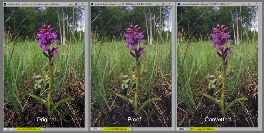
It takes quite dramatic gamut clipping before it becomes visually obvious, like this:
(for obvious reasons the screenshot is sRGB, but there isn't much clipping from the original Adobe RGB).
Also note that the CMYK profile accounts for max ink, but not the reflectance of the paper. So you'll see the blacks lighten a little, but not as much as in the actual print. To simulate that properly, you need to calibrate your monitor to a visually matching black point, which can be as high as 1.5 cd/m² for offset print.
Copy link to clipboard
Copied
Hi D' Fosse "To simulate that properly, you need to calibrate your monitor to a visually matching black point, which can be as high as 1.5 cd/m² for offset print"
would Photoshop's softproof / custom / [choose CMYK colourspace] profile AND check 'simlate black ink' do that too?
I'd think so
neil barstow, colourmanagement net :: adobe forum volunteer:: co-author: 'getting colour right'
google me "neil barstow colourmanagement" for lots of free articles on colour management
Copy link to clipboard
Copied
Simulate black ink is generic and ballpark. Calibrating black point is precise.
Copy link to clipboard
Copied
I had understood that "simulate black ink" was based on a value taken from the device profile? Its useful for those working to various CMYK outputs, maybe coated, uncoated and news.
neilB
Copy link to clipboard
Copied
I had understood that "simulate black ink" was based on a value taken from the device profile?
By NB, colourmanagement
Indeed. Doing so with display calibration is a better approach. Yes, if you only have one device to deal with or a "Smart Display" system that calibrates to multiple targets.
But we're getting a bit deep into the CMS weeds. 🥸
Why are some here not seeing the preview update making conversions (or apparently soft proofing)?
Copy link to clipboard
Copied
My experience is that this varies a lot with paper stock, or different printers, even using the same profile/process. Whether it's purely optical (diffuse reflection), or how the ink is absorbed in the paper, or a combination, I don't know. Some are just blacker than others.
This is just how I do it, and it works. I'm getting a perfect screen to print match with this method, as long as I have a sample print to work from.
Copy link to clipboard
Copied
Don't assume that there will be a difference. For example, an image that has only black would not change visibly when converted to different color modes (and yes it could look different on a press depending on rich black etc but onscreen it would look the same.)
The easiest test is to add a reference layer with some out of gamut RGB colors and see how that converts. Just delete the layer when done testing.


