Copy link to clipboard
Copied
We are wanting to create maybe one or two products and then color the products several other colors so that when a customer makes a selection it changes the color. My efforts so far have been poor looking. Here is what we have when we take all the colors with physical products: https://www.balletbarrestore.com/Architek-Wall-Mount-Ballet-Barre-Brackets_p_1116.html
The images look nice and the customer can see all the variations. On larger products that cost more to make, we want to color them.
https://www.balletbarrestore.com/Floor-Mount-Stanchions_c_166.html
Currently we have them shot in black and white. We would like it to match our brackets. Can we do this somehow where it looks close?
We have photoshop CS6 on Windows 10 if that matters.
Copy link to clipboard
Copied
Please post images/screenshots on this Forum directly.
Copy link to clipboard
Copied
Here is a bracket we have for sale. We have 10 colors if you go to the website(if needed).
Here is another larger product we offer. We want it colored in the 10 colors.
Copy link to clipboard
Copied
Yes this can be done. I have a youtube tutorial that shows how to colorize a product using shape layers. This method is one of several that could work for you.
Copy link to clipboard
Copied
Have you bothered doing a search for »photoshop colorise«?
In a case like this Solid Colour Layer set to Blend Mode »Color« and a Curves Layer to address luminosity might suffice.
Copy link to clipboard
Copied
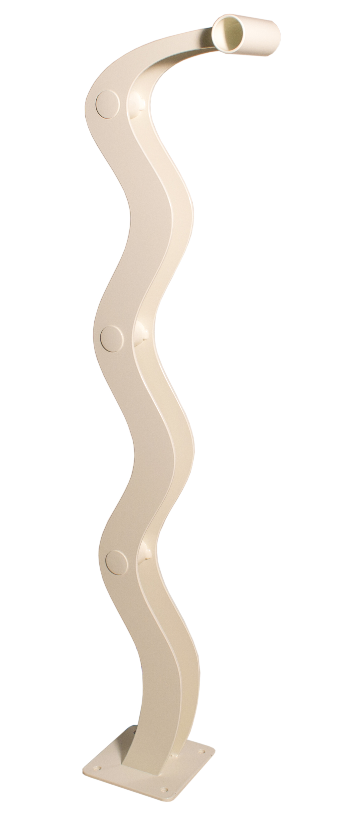
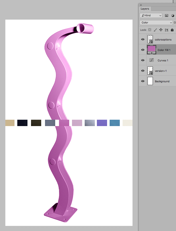
I have done research. I usually do not ask unless I have looked first. Your image is exactly why I have came here asking. You colored the hot pink on the larger product. I posted a picture of the hot pink bracket and your larger product looks nothing like the bracket. However, it is close to the swatch. It also shows what I ran into, "thin spots" and areas where the color does not look even. The white is still showing through.
I was hoping for help making it look similar to the bracket above. Is that possible with what you are speaking of?
Copy link to clipboard
Copied
It also shows what I ran into, "thin spots" and areas where the color does not look even. The white is still showing through.
To use a close to white object as the basis for colorising is not a good choice as the bright areas may lack structure.
As for the Color using a Gradient Map Layer offers an alternative that allows treating different luminance differently.
Copy link to clipboard
Copied
Do you have the RAW file of that image?
That may allow for salvaging more detail in the bright regions.
Copy link to clipboard
Copied
I would have to look. Many of the photos were shot in just high res jpeg. Some were shot raw + jpeg. I don't think these were shot in raw. I will make sure to do that in the future.
What is the best color to "start with" if not white? I also have these in black.
Copy link to clipboard
Copied
The best color is always something in the middle. From your color examples I'd probably start with the tan or the pink. White and black are the worst options because their luminous values are too extreme.
Find more inspiration, events, and resources on the new Adobe Community
Explore Now