Copy link to clipboard
Copied
 1 Correct answer
One of the limitations of working in RGB mode is caused by the fact that each channel adjustment affects both color and tone level. On the other hand, working in Lab Color, lightness (the L channel) is distinct from the color channels (the a and b).
The sample above is the result of a Lab Curve correction in the Lightness channel (you may like it even a bit lighter) and small straight line adjustment in the a channel (to reduce the Magenta component a tad). The b channel did not requir
...Explore related tutorials & articles
Copy link to clipboard
Copied
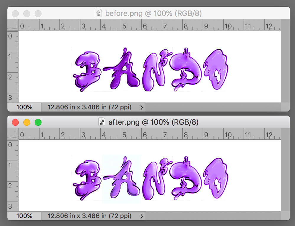
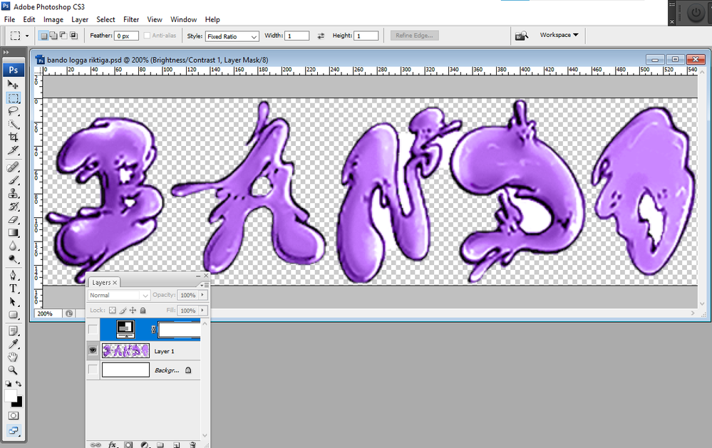
It look like layer 1 may be shading the A in the background layer to a darker purple shade. From the speak I see in layer 1 thumbnail in the layers palette.
Copy link to clipboard
Copied
One of the limitations of working in RGB mode is caused by the fact that each channel adjustment affects both color and tone level. On the other hand, working in Lab Color, lightness (the L channel) is distinct from the color channels (the a and b).
The sample above is the result of a Lab Curve correction in the Lightness channel (you may like it even a bit lighter) and small straight line adjustment in the a channel (to reduce the Magenta component a tad). The b channel did not require any change at all.
Copy link to clipboard
Copied
Please post just the layers palet with large thumbnails so we can see what is in each layer. I see you have added a brightness contrast adjustment layer. When you turn off the adjustment layer do all of the letters match?
Copy link to clipboard
Copied
The very same problem with a different title and OP appeared Feb 15 and marked Correct.
https://community.adobe.com/t5/photoshop/colour-problem/td-p/11833850
What's up?
Copy link to clipboard
Copied
I have made a Logo with 5 letters named RAMBO. The problem is that every letter is the same colour(Purple with like a graffiti type font on it) exept the A. I dont know why i cant match the A with my other letters coluour, it only turns out darker. Help?
Copy link to clipboard
Copied
Could you please post a screen shot that includes your Layers panel.
Copy link to clipboard
Copied
Copy link to clipboard
Copied
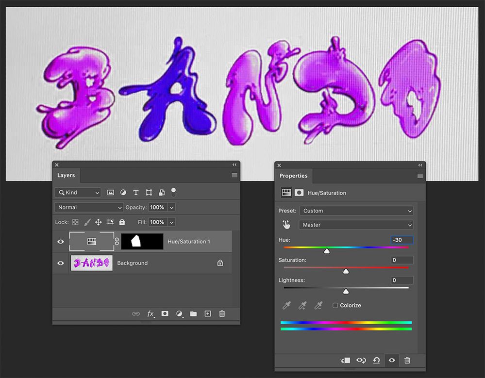
The following is an overview of a possible solution. I'm happy to dive deeper into any of the steps if they aren't clear...
- Using a suitable selection tool such as the Polygonal Lasso Tool, create a selection around the problem area.
- From the bottom of the Layers panel create a suitable adjustment layer. In this case I used Hue/Saturation. When creating this layer, the active selection is automatically turned into a mask.
- Alter the values of the Adjustment Layer within the Properties panel to create a match.
If you want to get fancy, you could apply this mask to a group within the Layers panel. Within this group you could add a series of adjustment layers with one altering the hue, another the brightness, etc...
Copy link to clipboard
Copied
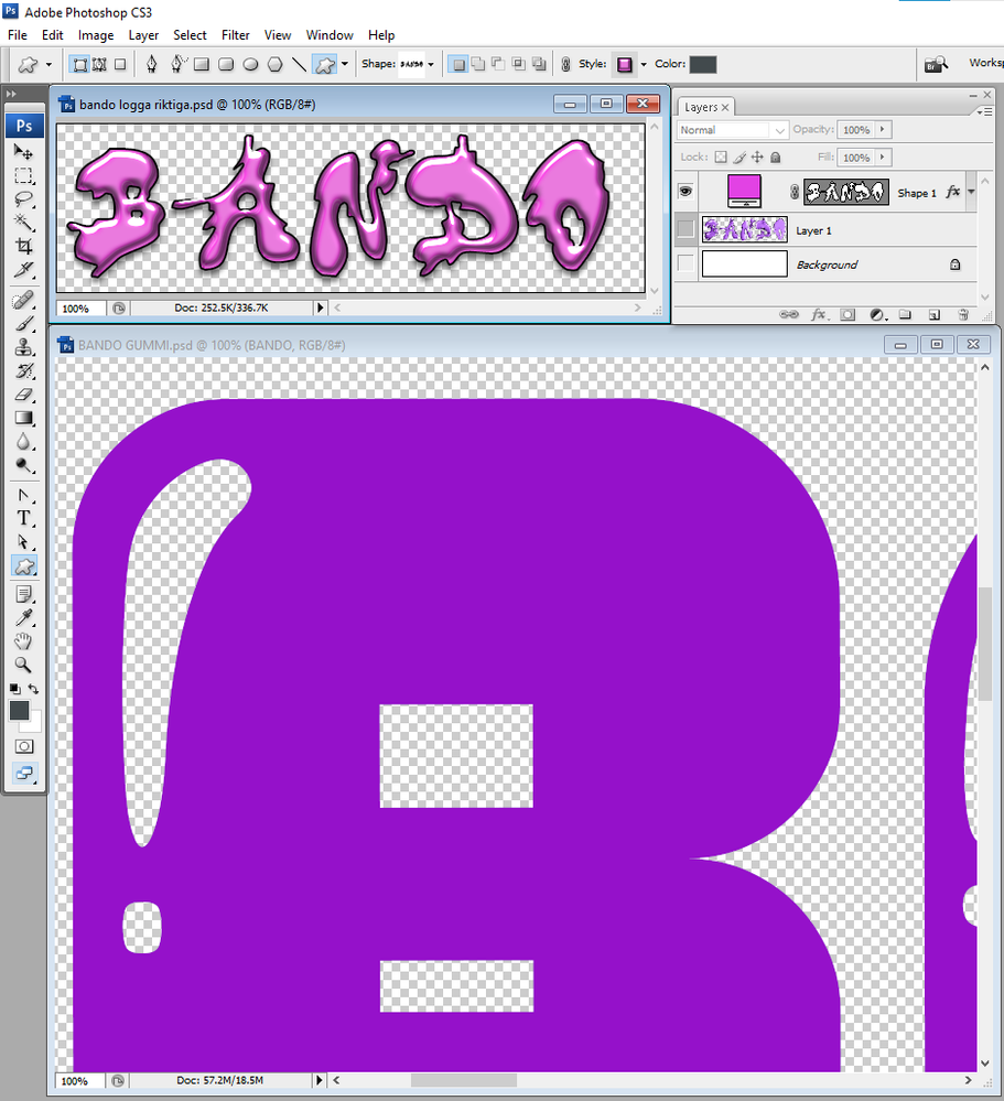
Hello I want to make the "BANDO GUMMI" file look like the "bando logga riktiga". If you say that I should press "convert to shape" it unfortunately doesn't work for me because the button does not show up when I right click the layer. If you are capable of helping me please put instructions or a picture with it down below. Any help will be appreciated and thanks in advance!
Copy link to clipboard
Copied
Your Layer 1 is a Pixels Layer that has had a lot of white pixels deleted. There is still more white pixels the need to be deleted. You can not make a shape Logo from that layer you have no vector Paths for the five characters "B", "A", "N", "D', and "O". You need to create the five closed paths to define a custom. Then you would beet to use a Layer style to give it some texture. Shape Layers are fill Layers. Fill can be empty, solid Color, Gradient or Patter, A shape will not have shading and highlights like your pixel layer. Shape Path can be stroked and Layer styles can also add strokes. You will not find an action or script or be able to create and action or script to automate a Photoshop process with what you have.
Copy link to clipboard
Copied
The problem is that the font that we used to make the logo you have taken a picture of isn't free and that is why we want to make another one that looks like that one but with a free font. Is there anyway that you could help us accomplish this?
I am extremely thankful for your help!
Copy link to clipboard
Copied
Are you able to send the file to me of the processed BANDO text, the pink one named bando logga riktiga.psd?
Copy link to clipboard
Copied
I never saved one. You need to learn how to use Photoshop vector tools. If you want to use Photoshop to create logo. Others will tell you Photoshop is the wrong tool to use Illustrator. I only install Photoshop. I would use Photoshop. You ask for instructions. Use vector graphics, Create shape layers and style them. You may want to design simpler logo. You would not have like the quick logo I made. A font could be use like a shape layer and styled. Text layers can also be converted to a shape layer, If you do the Logo text can longer be edited with the text tool.
Copy link to clipboard
Copied
I'd suggest going to fonts.adobe.com and looking for a font that's more like what you want. Here are some I found that might work:
https://fonts.adobe.com/fonts/blow-up
https://fonts.adobe.com/fonts/synthemesc
https://fonts.adobe.com/fonts/freude
You can take one of these and apply a style to it (Window > Styles). If you go to the Styles panel menu in the upper right, you can add the Legacy Styles and More. Use the search at the top of the panel to look for "Bubblegum," "Purple Glass," or "Candy." You can edit any of these styles by selecting the layer and going to Layer > Layer Style and selecting any of the options.
Also, you can do something similar in Illustrator by applying a Graphic Style (Window > Graphic Styles). The benefit to using Illustrator would be you could first add an effect to get some of the wiggly shapes with Effect > Distort & Transform > Pucker & Bloat &/or Effect > Distort & Transform > Roughen.
Copy link to clipboard
Copied
thanks a lot!
Copy link to clipboard
Copied
Hello I want to make the "BANDO ORIGINAL illustrator" file look like the "bando logga riktiga". If you are capable of helping me please put instructions or a picture with it down below.
The "bando logga riktiga" file is a photoshop file but I got adviced to download and do the work on the adobe illustrator instead so that is why the files are different.
Any help will be appreciated and thanks in advance!
Copy link to clipboard
Copied
That is probably a typeface. Identify and install it and then set your word.
Copy link to clipboard
Copied
The problem is that I made it from a website that charges money for what you make in there, but if you have any tips or are able to help me on how to identify the font it would be much appreciated!
Copy link to clipboard
Copied
Try and upload a screenshot to whatfontis.com or whatthefont.com
But maybe just don't invest all that time and pay the amount?
Copy link to clipboard
Copied
Sorry, I expressed myself unclearly. The problem is that: The typeface that I want to use which is shown in " bando logga riktiga. psd" is from a special website, so I do not have the right to use that font. But it is really that kind of look that I want for my logo. So instead I want to take a free font such as "Bando original illustrator" and shape it and edit it to the point that it looks like the " bando logga riktiga. psd" but still don't look too much like it because I want it to be my own. So I wonder how I can use illustrator to shape and form "Bando original illustrator" or any other free font(that you maybe could recommend that may be more suitable for this task) to look like "bando logga riktiga.psd"?
I'm really stuck so I would be very grateful if you could guide me a bit
Copy link to clipboard
Copied
The font is free for personal use and probably a low price for commercial use.
https://www.whatfontis.com/FF_Gummy-Regular.font?text=BANDO
I would suggest you just contact the designer and ask for the price and then pay.
I honestly don't know what you're after - it should look somewhat like that, but different? If you have a specific idea, please show a sketch of it and then someone can help.
Copy link to clipboard
Copied
I mean that I want it to look exactly like it but with the gummy bear font. I want to take a random free font, for example the gummi bear font, and shape the letters so it looks exactly like the "bando logga riktiga.psd".
I have plenty of time so to buy it is not an option due to the fact that im a student.
Copy link to clipboard
Copied
Ok, so the PSD and the PDF show two different designs. I have now downloaded it (please embed screenshots in your post in the future)
If you have enough time then I would suggest you goahead and design it, draw it (manually) and then draw it in Illustrator with the pen tool and then apply the shading by using gradients and even more shapes that you draw.
There is no way to come even close to the desired look by using effects.
Copy link to clipboard
Copied
-
- 1
- 2

