

- Home
- Photoshop ecosystem
- Discussions
- Colors on Photoshop looks different when using "Ed...
- Colors on Photoshop looks different when using "Ed...

Copy link to clipboard
Copied


 1 Correct answer
Here's what to do:
Can you check to see if there is a visual mismatch without using the BenQ display?
IF that is the only external display you have hooked up, can't replace it for a test, try a differing profile for that display. It may be the wrong profile and look odd, but does it produce a match? You could pick either sRGB or Adobe RGB (1998) as a test. EDIT: Uncheck Show Profiles for Display check box first.
Also use a color reference image for viewing, again in Develop module at 1:1 then
...Explore related tutorials & articles
 48
Replies
48
48
Replies
48

Copy link to clipboard
Copied
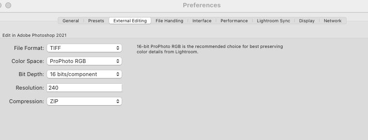
@Mawing I can only imagine you are overwhelmed by now! My apologies if I took the conversation in another direction but I was trying to help you get consistency across your workspaces and seeing the ProPhoto RGB settings in your screenshot is where you might be having the conflicts between apps so I wanted you to sync all to sRGB to see if that fixed what you are seeing. Your final output for your files is another consideration. What are you ultimately trying to achieve?
The Adobe color consistency article will tell you about setting your colors to synchronize in Bridge. Your Adobe Creative Cloud subscription for Photoshop and Lightroom will include Bridge, so be sure to install it and set the colors to synchronize there.
Please come back to let us know what you are able to work out or if you have any other questions.
Copy link to clipboard
Copied
Forget Bridge or synchronization of settings there. It has nothing to do with the problem.
Copy link to clipboard
Copied
@TheDigitalDog I see how convinced you are but how do you know that for sure until @Mawing tries changing both spaces to sRGB? I think most troubleshooting steps need a process of elimination. So far, we only know that the OP hasn't synchronized their color spaces because they didn't know they should or how to. AFAIK, a "faded and dull" look is common complaint with ProPhotoRGB unless you have a wide-gamut display. What is the use of retaining more colors if you can't see them in the first place?
Copy link to clipboard
Copied
This has absolutely NOTHING to do with Bridge or color setting sync. They do not need to be in sync, his Photoshop color settings are just fine. ONE of the applications he is using (LR/Photoshop) isn't providing a correct preview. That again is most likely due to a display profile issue. It isn't GPU, he tested that. Now the way to test is to see why one application isn't properly previewing the RGB data. He can't swap displays. He can swap profiles, and the one he tests is moot. They goal is to produce a match between Develop (at 1:1) and Photoshop at 100% preview, nothing more! Once he gets a match, we can drill down to getting the ideal and correct display profile in place. This has zero to do with any RGB Working Space or settings in other Adobe applications.
Copy link to clipboard
Copied
Be sure to always compare the color previews from Lightroom Classic in Develop module at 1:1 or greater when comparning to Photoshop. Both at the same zoom ratio.
Your color settings seem fine, leave them as is.
Copy link to clipboard
Copied
Yes I've always checked that way

Copy link to clipboard
Copied
Pro-Photo is a very large color space so unless your printing this image on a wide gamut printer I'd suggest to use Adobe RGB instead. That way your monitor has a fighting chance of displaying it properly (if you have a wide gamut display) I would remake the monitor profile. Sometimes these become corrupt and do not display your images correctly. To me the images are the same so without knowing what your intent is I don't see a problem except maybe an incompatible or bad profile.
ICC programmer and developer, Photographer, artist and color management expert, Print standards and process expert.
Copy link to clipboard
Copied
Key part here, @Bob_Hallam is "if you have a wide gamut display" monitor!
Copy link to clipboard
Copied
Adobe RGB (1998) brings nothing useful to the party IMHO, I'd stick with ProPhoto RGB (container size) simple because, there are scenes we can capture that exceed Adobe RGB (1998) color gamut. Might as well contain what you can capture for the future usage of output devices (some today that exceed Adobe RGB (1998) gamut).
Adobe RGB (1998) was a mistake in the making, hence its name. It was an incorrect interpretation of SMPTE-240M and as the date indicates, it is an old 'standard' 23 years!
The underlying color processing space used in ACR/LR happens to have the same color gamut as ProPhoto RGB and even Adobe recommends it:

Copy link to clipboard
Copied
Andrew, The OP says his images are not displaying properly. ProPhoto can not be displayed on any monitor. There are good reasons to use smaller color spaces. The image in question does not contain colors that are brighter and more saturated than Adobe 98 can hold. I suspect that this image could fit just fine in SRGB without clipping. If your worried about future proofing save RAW and work in a non distructive way. Remember saving in the largest possible gamut does not increase the gamut of the image, That said when you put image pixels into ProPhoto you don't gain if the image gamut is smaller than Adobe 98. If you must end up in a smaller colorspace anyway for print (Commercial Print) or for internet, the transform to those spaces is not as accurate. The underlying transform space is CIELAB in all Adobe softwares. CieLab is also the ubderlying connectionspace for Adobe ICC transforms. I would suggest Lab (16bit) is a good way to future proof images, but remember the workflow the OP is discussing, and understand the limitations of displaying anything larger than Adobe 98 with any accuracy.
ICC programmer and developer, Photographer, artist and color management expert, Print standards and process expert.

Copy link to clipboard
Copied
Agree with Bob - but in any case, the document profile isn't the issue here. Remember, a color managed application will display any document profile correctly (clipping aside).
This is most likely a defective monitor profile, which can affect applications differently.
Although it all ends up in the same monitor profile, the source profiles are different, so the math is different, and one may work while the other fails.
One more thing to watch: there is a bug in Lightroom when using custom/third-party camera profiles. These profiles are not always correctly transferred to ACR > Photoshop, and a standard profile substituted, so that the appearance may shift. Workarounds are to save metadata to file, or use DNG.
Copy link to clipboard
Copied
Of course ProPhoto RGB images can be displayed on his display. Just as Adobe RGB (1998) can be displayed on an sRGB gamut display. Colors outside display gamut can't but that's moot. He has a mismatch. It's not a color gamut issue.
Lstar 50 in Prophoto RGB can easily be displayed. Ditto with sRGB or Adobe RGB (1998) gamut display; all fall in display gamut. And with proper color management they preview the same. The OPs issue is a mismatch likely due to either a display profile or GPU issue but it is not due to his use of ProPhoto RGB.
There are no good reasons to funnel color you can capture and output to a smaller gamut color space.
A primer on this from Adobe and one other:
https://www.adobe.com/digitalimag/pdfs/phscs2ip_colspace.pdf

Copy link to clipboard
Copied
As The Digital Dog has written, Prophoto is fine as a working space (AKA an image container).
Also preserving the raw file for archiving and future repurposing as Bob suggests is a good idea.
I can see no reason to use Adobe RGB unless sending images to a client who wants that colour space.
Personally I prefer Joe Holmes various DCAM colourspaces as image containers, but implementation of those takes understanding and they do provide sophistication with their chroma variants, but only with knowledge.
https://www.josephholmes.com/profiles/about-my-profiles
Its true that the whole of the Prophoto colourspace cannot be displayed on a monitor screen, but with good management that’s not an issue worth worrying about.
I hope this helps
neil barstow, colourmanagement net :: adobe forum volunteer
google me "neil barstow colourmanagement" for lots of free articles on colour management
[please only use the blue reply button at the top of the page, this maintains the original thread title and chronological order of posts]
Copy link to clipboard
Copied
I'm getting a bunch of different answers I have no idea what to do.
Copy link to clipboard
Copied
1.) Re-profile your monitor.
That is more than likely the problem and is a consensus in the above answers.
ICC programmer and developer, Photographer, artist and color management expert, Print standards and process expert.
Copy link to clipboard
Copied
Here's what to do:
Can you check to see if there is a visual mismatch without using the BenQ display?
IF that is the only external display you have hooked up, can't replace it for a test, try a differing profile for that display. It may be the wrong profile and look odd, but does it produce a match? You could pick either sRGB or Adobe RGB (1998) as a test. EDIT: Uncheck Show Profiles for Display check box first.
Also use a color reference image for viewing, again in Develop module at 1:1 then Photoshop at 100% zoom:
http://www.digitaldog.net/files/2014PrinterTestFileFlat.tif.zip
Copy link to clipboard
Copied
Yep that's the only display I have available, I'll go ahead and try the Adobe RGB (1998) Display profile and see if the colors match, The link you attached doesen't work (at least for me) the page auto closes itself and nothing is downloaded
Copy link to clipboard
Copied
WOW, I think we are no the right path, now the colors match but they look awful, I'll attach some photos.
Lightroom:

Photoshop:

How the colors look on the default display profile:

How the colors look on the profile you suggested: (You can't see it much from the photo I took but in person they look a LOT desaturated)

Copy link to clipboard
Copied
But now something strange has happened, I' ve put back the default display profile and the colors now match, is it possible that taking it off and putting it on has "reset" and fixed it?
Copy link to clipboard
Copied
Could be. I have a hunch this might be the wrong profile-bug that I described above. Changing profiles may have made it load the correct profile again.
All these things are somewhat connected. A "marginal" profile, one not strictly written to icc spec, may quickly cause other things to choke, like the GPU, and it is sometimes seen that bad profiles refuse to load at all. So the system may substitute another one. Or you may end up with a totally black screen.
In any case, BenQ's record is not good and you're not the only one with problems.
Copy link to clipboard
Copied
The problem seems to be solved for now, what should I do in case it occurs again?
Copy link to clipboard
Copied
The answer to that is very simple: buy a calibrator. The monitor profile is such a critical component in the whole Photoshop ecosystem that you need to have control of it. A calibrator is essential Photoshop hardware and the whole application is built around using one.
I'd recommend the x-rite i1 Display Pro. The sensor alone is worth the price. I'd normally recommend using it with the monitor manufacturer's own calibration software (if applicable), but with BenQ I'm not so sure given the known buggy state of it. i1 Profiler will do well for now.
Copy link to clipboard
Copied
Copy link to clipboard
Copied
@Mawing wrote:
The problem seems to be solved for now, what should I do in case it occurs again?
What you did last but really, calibration with hardware or a better display option is the way to move forward.
See:
-
- 1
- 2

Get ready! An upgraded Adobe Community experience is coming in January.
Learn more
 AdChoices