Copy link to clipboard
Copied
Hello,
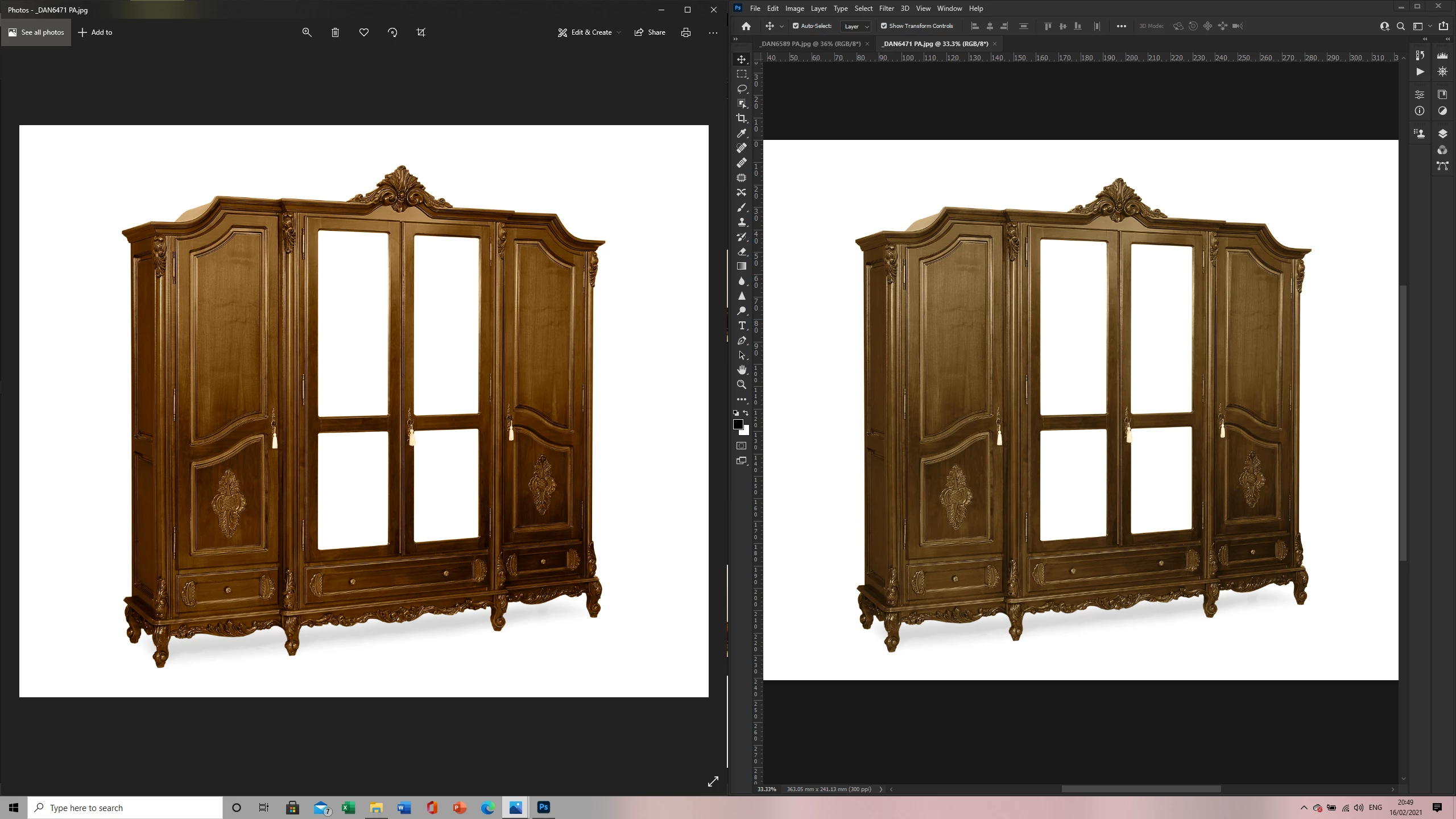
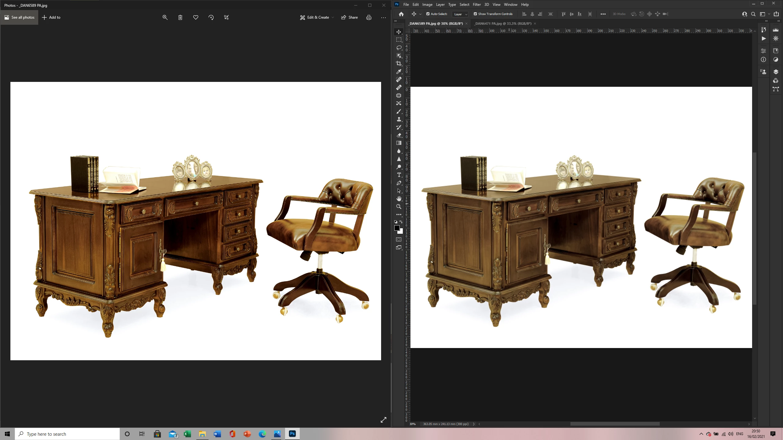
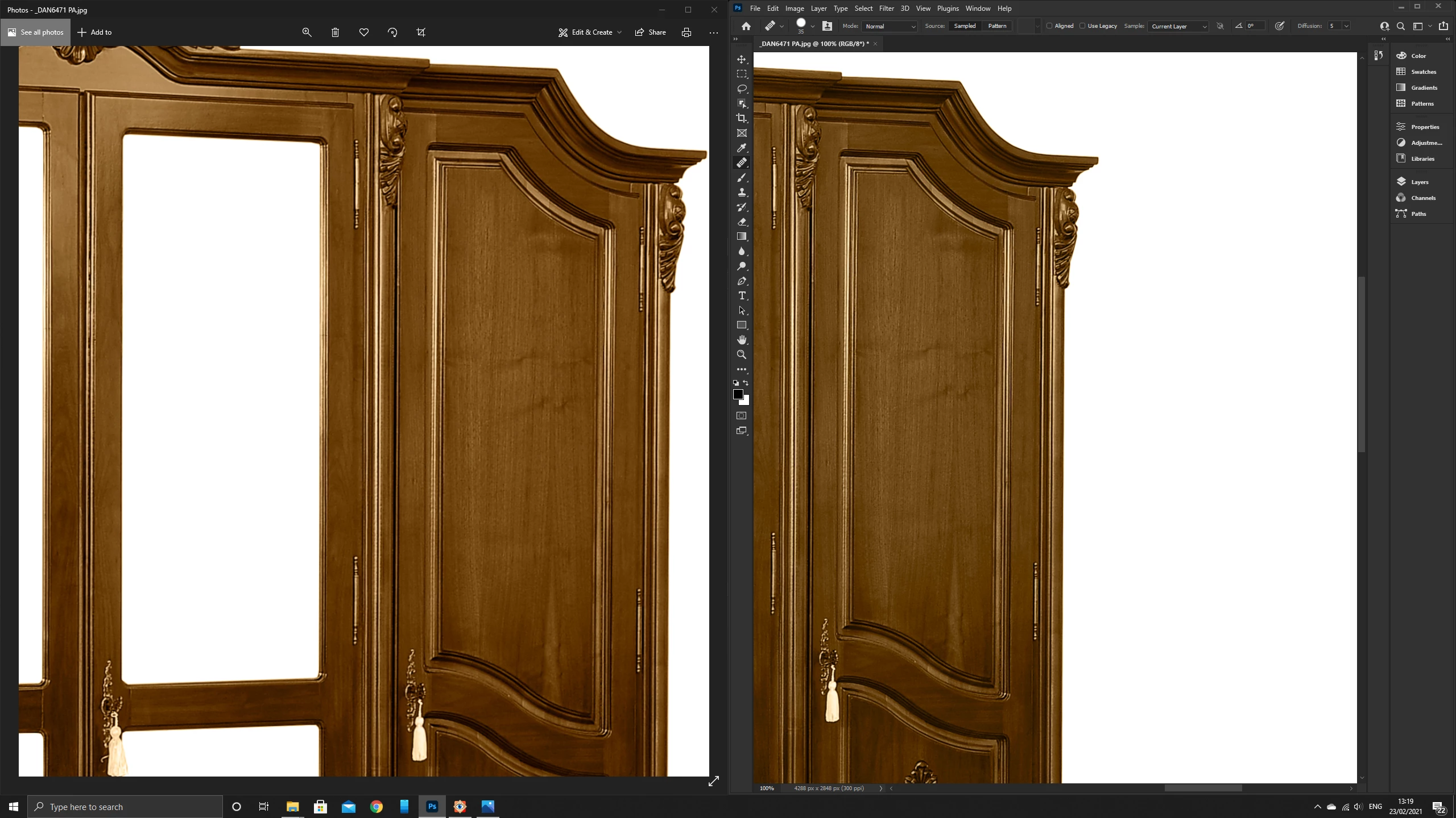
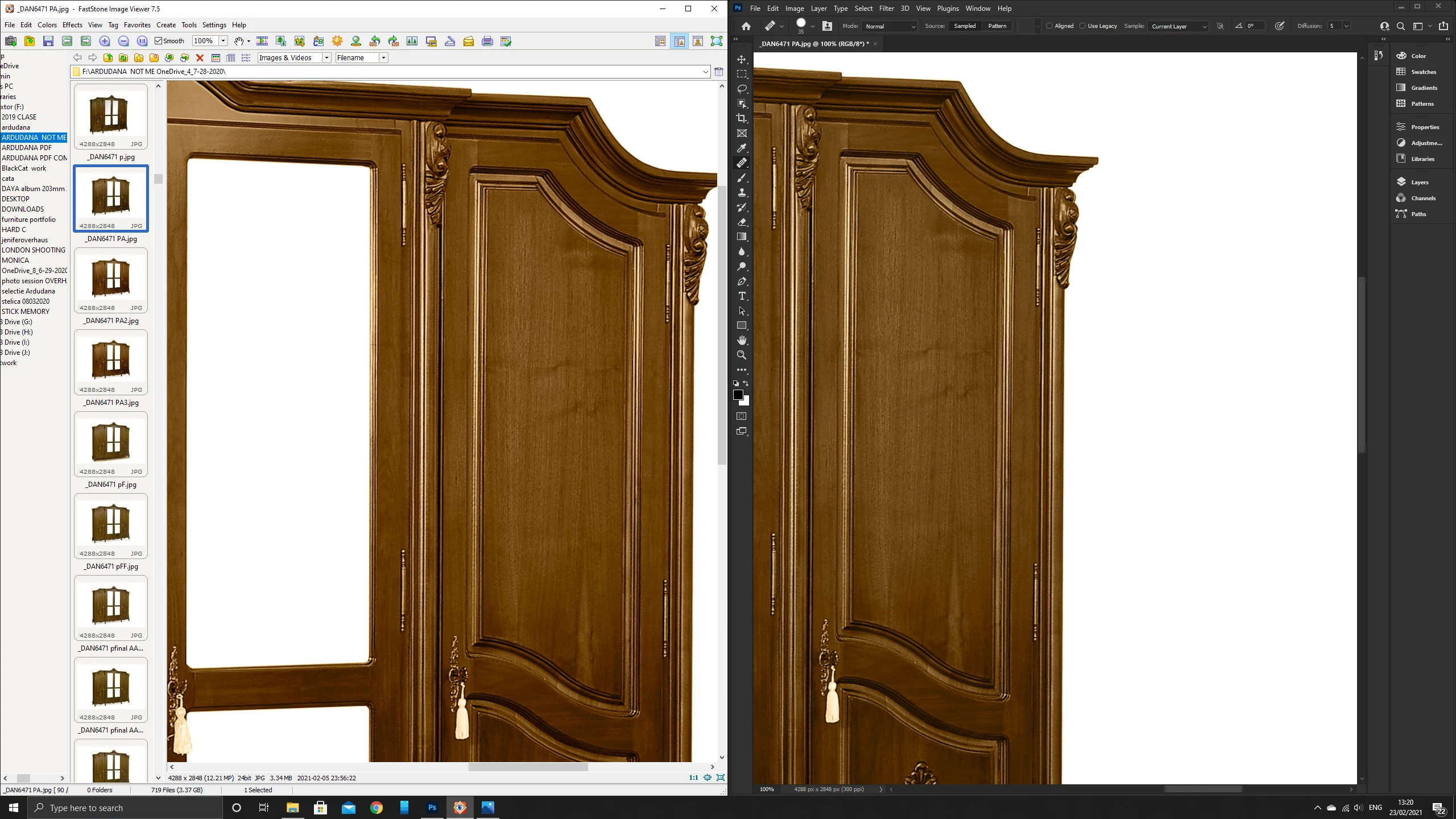
After switching to a new laptop, (Dell XPS 15), using my same old monitor (Dell as well), I spotted some really bad colour differences between Photoshop and Windows 10 Photo Viewer.
Some of the things that I've already tried & observed:
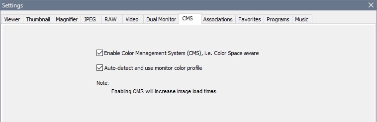
1. I did look a lot into colour management. I bought the Windows 10 Colour Managed version and exactly the same result.
2. I tried using Paint & Paint 3d for opening up the image & potential editing, same colour issue was present.
3. I did NOT change any of the settings that the photoshop comes with. I also tried to reinstall & delete the settings file of photoshop.
4. My exported versions are all in sRGB. I also tried swithing to other profiles and exporting as sRGB, without any effect.
5. The only way I managed to get it working is by changing the Proof Setup to Monitor RGB, but I don't have any idea why, after a short period of time(a few hours) this fix was not working anymore.
Tried the solutions from this post with no result. Proof setup was the only way and it now doesn't work again.
https://community.adobe.com/t5/photoshop/photoshop-jpeg-colors-different-from-windows10-photo-app/td...
I would be deeply appreciative if someone would help out!
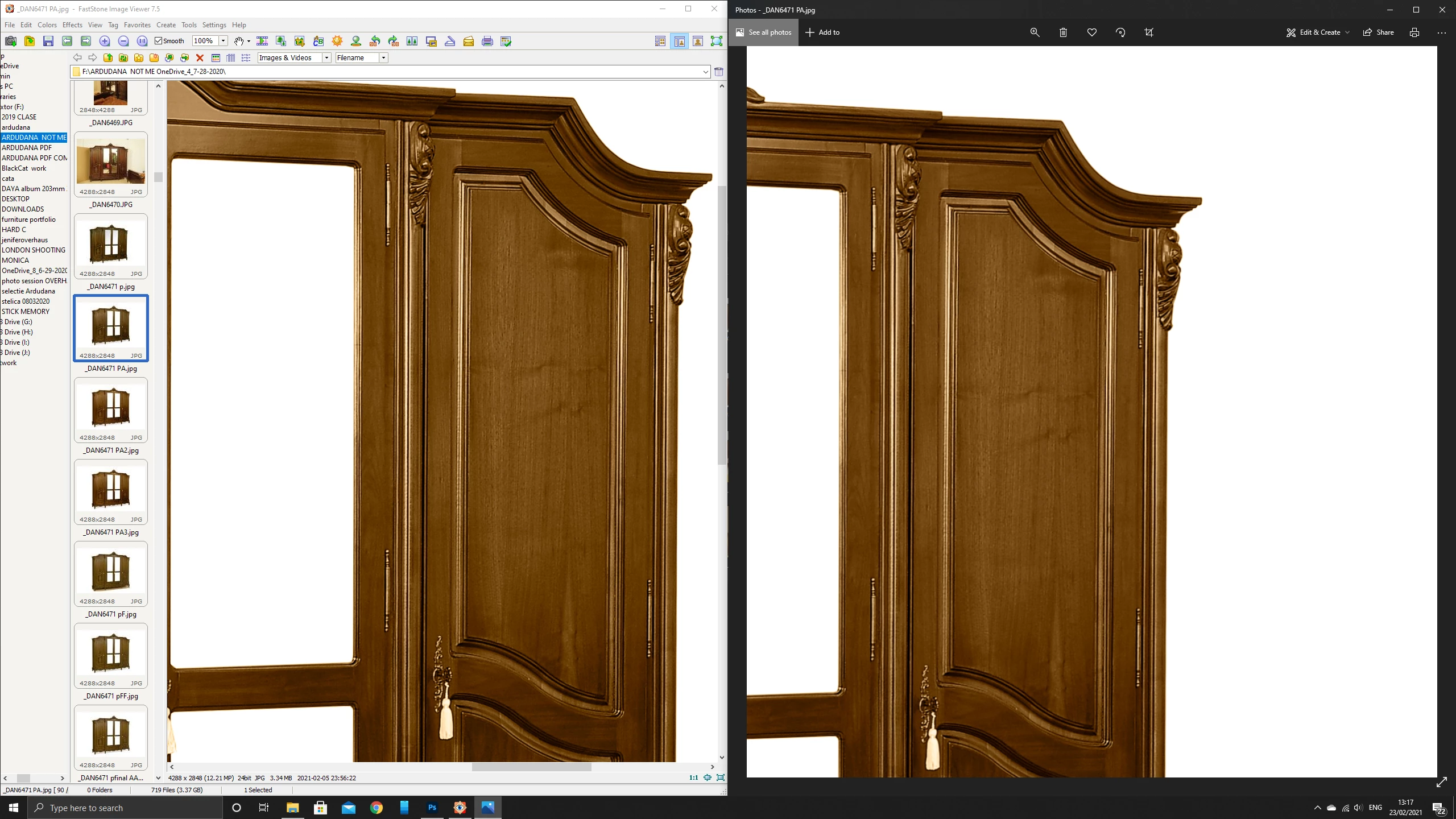
Pictures:
If you by "Colour Managed version of Photo Viewer" mean the Windows Photo Viewer, which is hidden on Windows 10, yes it is color managed.
And if it displays different to Photoshop, you have a defective monitor profile.
Defective monitor profiles are very common on Windows, because OS updates will install bad profiles from monitor manufacturers. Profiles from Dell are notoriously bad.
As a temporary fix, try setting the monitor profile to Adobe RGB. This may not be entirely accurate, so you sho
...Color management is quite simple, and relies on two things:
– The image must have an embedded profile (known as the document profile),
typically sRGB or Adobe RGB.
– The monitor profile must be correct and sound.
When you open an image in a color managed application, the colors are converted from the document profile to the monitor profile, which ensures that correct colors are displayed.
Applications without color management (like Windows Photos) do not do this conversion, send uncorrected
...Copy link to clipboard
Copied
Photoshop is color managed, and uses the monitor profile to display correct colors.
This means that colors are converted from the document profile to the monitor profile.
The Photos app and Paint are not color managed, and will not display correct colors.
When viewing images in applications without color management on a wide gamut monitor (which you seem to have), colors will inevitably display over saturated.
The only solution is to only use color managed applications to view your work.
Windows doesn't come with a color managed image viewer, so you have to use third party software.
Here are some options:
Do not use Monitor RGB for proofing, that only sweeps the problem under the carpet.
Use a color managed viewer.
Copy link to clipboard
Copied
Thanks a lot Per for your response!
1. I will be trying now to get the FastStone.
2. I was specifying in the post as well that I tried using the Colour Managed version of Photo Viewer and there still was a difference between it and Photoshop. (Weirdly enough, Paint seemed to be colour managed as it was displaying the same version that I was seeing in Photoshop)
4. I do work as a Product Photographer. How shall I sort out the issue of my client? If he won't be having this 3rd party software, he will be seeing a different version of the product.
Thanks a lot again! This issue is one of the hardest to solve and I do appreciate your help tremendously!
Copy link to clipboard
Copied
If you by "Colour Managed version of Photo Viewer" mean the Windows Photo Viewer, which is hidden on Windows 10, yes it is color managed.
And if it displays different to Photoshop, you have a defective monitor profile.
Defective monitor profiles are very common on Windows, because OS updates will install bad profiles from monitor manufacturers. Profiles from Dell are notoriously bad.
As a temporary fix, try setting the monitor profile to Adobe RGB. This may not be entirely accurate, so you should ideally calibrate the monitor with a hardware calibrator, which will also create and install a custom monitor profile that describes your monitor accurately.
With Photoshop closed, press the Windows key + R, type colorcpl in the box and press Enter.
Add Adobe RGB, then set it as default. (sRGB is used in the screenshot, but you should use Adobe RGB because your monitor is wide gamut)
4. I do work as a Product Photographer. How shall I sort out the issue of my client? If he won't be having this 3rd party software, he will be seeing a different version of the product.
By @Adrian-Petru5C1C
That depends on a lot of factors, which are mostly out of your control.
But if the client is on Windows, you can tell them to use a color managed image viewer.
It's the combination of a wide gamut monitor and software without color management that represents the biggest problem – over saturation. With a standard gamut monitor, the difference will be much smaller.
On a Mac, all software is color managed.
Copy link to clipboard
Copied
Thank you, Per!
It's my first time asking a question on this forum and I am really thankful for your answer.
It's a really great explanation, clearly structured and easy to digest!
Thanks again! It's been amazingly helpful!
Copy link to clipboard
Copied
Hi Per!
I've tried using FastStone and learned some more about colour management and got back again.
FastStone(with Colour Management enabled) displays the exact same version as the one displayed in Photos App Windows 10(Which I guess is not colour managed).
Anyways, my issue comes when opening Photoshop, I tried assigning different colour profiles just to see how the colours are working and the best profile(closest to FastStone & Photos App) is the Wide-Gammut RGB.
My question is:
How is the Profile assigned in FastStone & why is the Photos App displaying the exact same thing if it's not colour managed? Considering these two are the correct versions, what profiles are they using? Can't Photoshop just use the exact same profile?
My colorimeter is on its way as well! Thanks for the entire thread!
Photos:
Copy link to clipboard
Copied
Color management is quite simple, and relies on two things:
– The image must have an embedded profile (known as the document profile),
typically sRGB or Adobe RGB.
– The monitor profile must be correct and sound.
When you open an image in a color managed application, the colors are converted from the document profile to the monitor profile, which ensures that correct colors are displayed.
Applications without color management (like Windows Photos) do not do this conversion, send uncorrected colors to the monitor, and display wrong colors.
So don't change any settings in Photoshop to make the image look a certain way. If the image has an embedded profile, and the monitor profile is correct, that's what the image looks like.
The image will display correctly no matter what profile is embedded.
So do not try to assign a different profile to the image. Only use Assign profile if the image is untagged (has no profile), or if you have good reason to think that the embedded profile is the wrong one.
My question is:
How is the Profile assigned in FastStone & why is the Photos App displaying the exact same thing if it's not colour managed? Considering these two are the correct versions, what profiles are they using? Can't Photoshop just use the exact same profile?
FastStone should display the same as Photoshop, but color management must be enabled under Settings > CMS. like below. Then restart the application.
Color management works exactly the same way in FastStone as in Photoshop – colors are converted from the document profile to the monitor profile.
If you are still having problems, please post a screenshot of Photoshop's color settings. and verify that the monitor profile is set to Adobe RGB.
Copy link to clipboard
Copied
Thank you, Per, again!
My issues were related to monitor's ICC Profile. Set them up and it all went smoothly.
This entire journey it's been amazing for me! I've just played with the settings on a wide-gammut monitor of another laptop and set up my entire workflow in Adobe RGB.
Amazing support on your side! I don't know how to give you any kind of positive feedback for the profile, so do let me know if there's any way of doing that!
Copy link to clipboard
Copied
Thank you for that, Adrian. You have given plenty of positive feedback, so don't worry about it.
If you have further questions about color management or other things, do post back.
There is actually a dedicated forum for color management here that you may want to take a look at.
But many people post color management questions here, as well as in the Lightroom Classic forum.
Copy link to clipboard
Copied
THANK YOU VERY MUCH ............